

1. css 설계기법
OOCSS(Object oriented CSS)
- 레고처럼 여러가지 모듈을 만들어서 조합하도락 하는 방법론
- 롤의 크로마기능 처럼 구조는 같고 색만 분리하여 따로 조합하는 방법과 같음
- 구조는 레이아웃 관련 속성을 사용한다
- 스킨에는 레이아웃에 관련이 없는 속성을 사용한다.
- 콘텐츠가 컨테이너에 종속되지 않게 css를 설계한다.
/*ex 아래처럼 종속되게 하지 않는다.*/
#main .warning {
        background-color: azure;
        color: blue;
      }
SMACSS (Scalable and Modular Architecture for CSS)
- css코드를 역활에 따라 분리한다.
- 베이스, 레이아웃, 모듈, 스테이트, 테마
/*base : font-familly, font-size, reset 등*/
*{
  font-size: 10px;
 }
/*layout : header, main, footer 등 */
header{
~
}
/*module : 레이아웃 안에서 배치되는 모든 요소들, 모양이 조금 다르면 서브클래스를 만든다.*/
.btn{
...
}
.btn-small{
...
}
.btn-big{
...
}

/*state : 모듈과 비슷하지만 차이는 자바스크립트에 종속된다는 점이다.*/
.is-active {
  background-color: blanchedalmond;
}

.is-active a {
  pointer-events: none;
  color: red;
}


/*theme : 사용자에게 사이트의 느낌을 전달하는 이미지, 색상 등을 의미한다.*/
BEM (Block, Element, Modifier)
- 러시아의 얀덱스가 만든 설계방법이다. OSCSS와 같은 모듈 기반의 방법
- 아이디나 요소 선택자를 권장하지 않는다. 클래스만 사용 권장
- Block : 어디에서나 재사용 가능한 모듈을 의미, 네이밍은 목적이 명확해야한다.
- Element : Block을 구성하는 요소 , Block에 종속
- Modifier : block, element의 모습이나 상태 또는 움직임을 정의(스킨같은 느낌)
2. 실습프로젝트

피그마를 보고 클론하는 실습이다. 옆에 js를 이용하여 유효성 검사하는 페이지는 아직 진도가 안나갔으니 제외했다.
step.1 mark up
크게 다음과 같이 구분했다.
<body>
    <main>
      <section><h1>로그인 또는 회원가입</h1></section>
      <section>
        <h2>위니브에서 여러분의 궁금증을 해결하세요!:)</h2>
        <div>
          <form action="#">
            <input type="text" placeholder="아이디" />
            <input type="password" placeholder="비밀번호" />
            <input type="checkbox" />
            <button type="submit">로그인</button>
          </form>
        </div>
        <div>
          <p>회원가입</p>
          <p>아이디/비밀번호 찾기</p>
        </div>
      </section>
      <section>
        <div><p>또는</p></div>
        <div>
          <img src="./source/images/Google__G__Logo 1.png" alt="google-logo" />
          구글 계정으로 로그인
        </div>
        <div>
          <img src="./source/images/facebook.png" alt="facebook-logo" />
          페이스북 계정으로 로그인
        </div>
        <div>
          <img src="./source/images/naver-logo.png" alt="naver-logo" />
          네이버 계정으로 로그인
        </div>
        <div>
          <img src="./source/images/message-circle.png" alt="kakao-logo" />
          카카오 계정으로 로그인
        </div>
      </section>
    </main>
  </body>
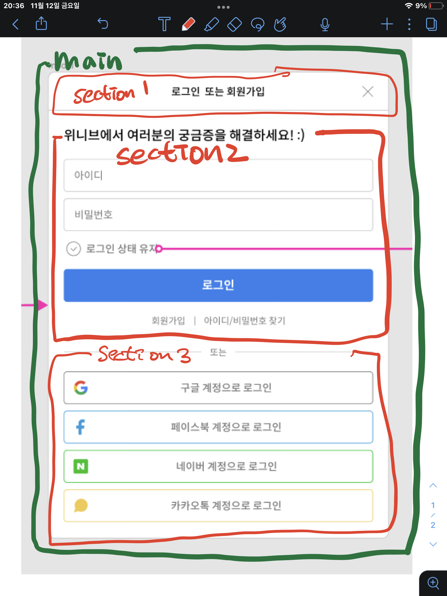
section 1
- section 1은 title-section이라 이름을 붙였다.
- text-align: center 속성을 주어 중앙정렬을 하였다.
- 닫기 이미지는 absolute속성을 주어 고정시켰다.
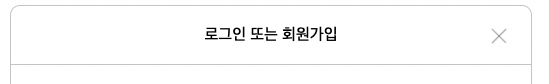
section 2

- section 2는 form-section이라 이름을 붙였다.
- 저번 실습의 부족한점인 form태그를 사용하지 않은 것을 보완하여 이번에는 form태그를 사용하였다.
- 로그인 버튼은 figma를 보니 아래 sns버튼들과 사이즈가 같아서 재사용하기 위해 btn 이라는 클래스명을 사용하였다.
- 가장 어려웠던것은 체크박스를 원형으로 바꾸는 것이였다. check-box를 직접적으로 바꿀 방법이 없어 check-box뒤에 for속성이 들어간 라벨을 넣어 라벨의 모양을 변하고 check-box는 display:none속성을 주어 숨겨주었다.
- 라벨의 모양을 변경시키고 배경에 체크 이미지를 넣었다. 또한 checked 속성을 주어 요구사항대로 체크하면 체크 이미지의 색과 배경색이 바뀌게 하였다.
<input id = "cb" type="checkbox" />
<label for="cb"></label>
<p>로그인 상태 유지</p>
input[id="cb"] {
display: none;
}
input[id="cb"] + label {
display: inline-block;
background: center no-repeat url(../images/check.png);
margin: 6px 8px 0 28px;
width: 22px;
height: 22px;
border: 1px solid #767676;
border-radius: 50%;
cursor: pointer;
}
input[id="cb"]:checked + label {
background: center no-repeat url(../images/checked.png);
background-color: #2f80ed;
border: 1px solid #2f80ed;
}section 3
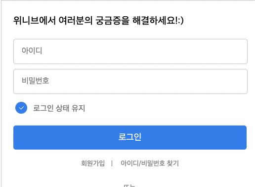
- "또는" 부분에는 flex 선언하여 텍스트 양 옆에 hr태그를 넣어 구현하였다.
- 버튼은 아까 로그인 버튼의 사이즈와 동일하여 btn 클래스에 다중 선택자를 사용하여 각 버튼의 border색을 다르게 구현하였다.
- 로고는 처음에는 이미지를 넣고 왼쪽에 마진을 두어 글자를 중앙에 있는 것 처럼 보이게 하려 하였는데 보면 볼수록 미세하게 중앙도 안맞고 이쁘지 않아서 position:absolite 속성으로 버튼 한 부분에 고정시켜버렸다. 그러고 글씨는 text-align:center; 속성을 주니 속이 시원했다.
완성본

처음에는 css 설계기법을 이용하여 정리하면서 하고있었는데 진행할수록 점점 정리가 엉망이 되었다. 또한 이렇게 간단한 ui를 따라만드는 것도 3시간 정도가 걸렸다. 더 열심히 해야겠다고 생각했다.
