들어가면서
의외로 개발을 하다보면 자주인듯 자주 아니게 트리구조 UI 들을 만나게 된다.
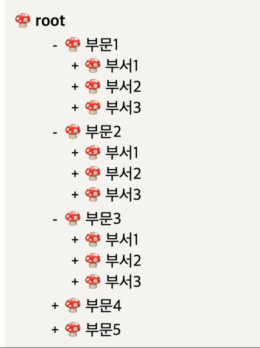
오늘 설명할 UI는 아래와 같이 토글 형태로 열리는 구조로
내가 자주 쓰는 방식에 대해 작성해보겠다.
누가 읽으면 되는지?
- 위와 같은 형태의 UI를 구현해야하는 경우
- depth의 깊이가 정해져 있지 않아 재귀방식을 통하여 UI 를 구현해야 하는 경우
- 트리구조에 토글기능도 포함해야 하는 경우
위 상황에 해당된다면, 해당 포스팅이 꽤나 유용하게 활용될 수 있을 것이다.
데이터 구조
만약, Backend 에서 어떤 형태로 데이터를 줄지 물어본다면 아래와 같은 데이터 구조로 요청드리는 것이 가장 좋은 방법이다.
{
	id:0,
    name:전체,
      children:[
        {
          id:1,
          name:부문1,
          children:[
                  {
                    id:4,
                    name:부서1,
                  },
                  {
                    id:5,
                    name:부서2,
                  },
                  {
                    id:6,
                    name:부서3,
                  },
          ]
      	},
      {
        id:2,
        name:부문2,
        children:[...]
      },
      {
        id:3,
        name:부문3,
        children:[...]
      },
    ]
위와 같은 구조로 들어온다면, 바로 UI 작업에 들어갈 준비가 되었다.
위와 같이 들어오지 않는 구조라면 프론트 단에서 위 구조로 가공을 해주어야 한다.
필자의 경우, Backend 측에서 위와 같은 구조로는 내려줄 수 없다는 이야기를 들었을 때에는 다음과 같은 구조로 요청 드렸었다.
[
  {
	id:1,
    name:부문1,
    depth:0,
    children:[2,3,4]
  },
  {
  	id:2,
    name:부서1,
    depth:1,
    children:[5,6,7]
  }
]
만약 프론트 쪽에서 요청을 드릴 수 있으나, 첫번째 보여준 구조로 받을 수 없을 경우에는 위와 같이 depth와 children id 를 배열로 받을 수 있도록 요청드리는 것을 추천한다.
저 형태로 받으면 수월하게 depth 0 부터 트리구조로 가공할 수 있다.
( depth에 따라 트리구조로 가공하는 방법은 추후에 포스팅 해보겠다. )
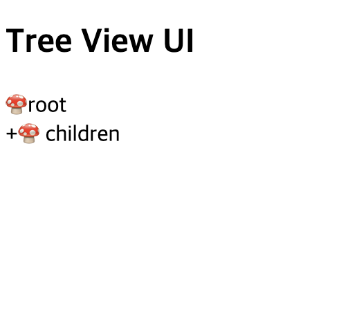
1) treeView 기본 구조 잡기
우선 다음과 같이 UI 기본 구조를 잡아보자.
const TreeView = () => {
  return (
    <div>
      <h2>Tree View UI</h2>
      <div>
        <div>🍄root</div>
        <div>
          <span>+</span>
          🍄 children
        </div>
      </div>
    </div>
  );
};

export default TreeView;
화면상으로는 아래와 같이 잡혔다.
이제 쓰여질 dummy data 를 임시로 잡아보자.
import styled from "styled-components";

type TGroups = {
  id: number;
  name: string;
  children?: TGroups[];
};

...
  const TreeGroups: TGroups[] = new Array(5).fill(0).map((_, idx) => {
    return {
      id: idx + 1,
      name: "부문" + (idx + 1),
      children: new Array(3).fill(0).map((_, index) => {
        return {
          id: (index + 1) * 12,
          name: "부서" + (index + 1),
          children: Array(3)
            .fill(0)
            .map((_, i) => {
              return {
                id: (i + 1) * 13,
                name: "팀" + (i + 1),
              };
            }),
        };
      }),
    };
  });

...
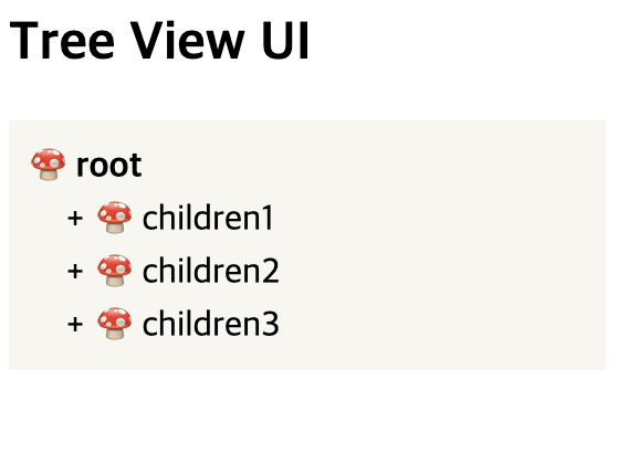
2) 기본적인 스타일 잡기
설명을 하기에 앞서, 보여지는 것도 중요하기에
트리구조다운 스타일로 한번 수정해보겠다.
import styled from "styled-components";

...
    <div>
      <h2>Tree View UI</h2>
      <ListContainer>
        <Root>🍄 root</Root>
        <ItemButton>
          <ItemPlusMinus>+</ItemPlusMinus>
          🍄 children1
        </ItemButton>
        <ItemButton>
          <ItemPlusMinus>+</ItemPlusMinus>
          🍄 children2
        </ItemButton>
        <ItemButton>
          <ItemPlusMinus>+</ItemPlusMinus>
          🍄 children3
        </ItemButton>
      </ListContainer>
    </div>
...

const ListContainer = styled.div`
  width: 250px;
  display: flex;
  flex-direction: column;
  gap: 3px;
  background: #f8f7f3;
  padding: 10px;
`;
const Root = styled.div`
  font-weight: 700;
`;

export const ItemButton = styled.div`
  cursor: pointer;
  display: inline-block;
  width: 100%;
  position: relative;
  padding-left: 30px;
`;
export const ItemPlusMinus = styled.button`
  border: none;
  background: transparent;
  display: inline-block;
  position: absolute;
  top: 50%;
  left: 10px;
  transform: translateY(-50%);
  width: 20px;
`;
화면
다음 포스팅에 이어서 토글 기능과 재귀 UI 를 만들어 적용하는 것을 소개해보겠다.

web developer