앞선 포스팅에서, 기본적인 UI 와 데이터 구조에 대해 설명하고 스타일을 적용하였으니
처음부터 따라가고 싶다면 앞선 포스팅을 보는 것을 추천한다.
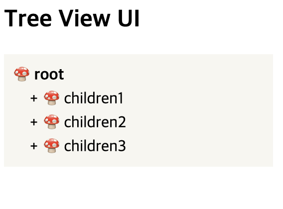
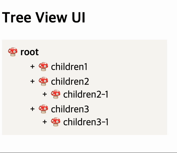
현재 UI 이미지는 아래와 같다.
3) 토글 기능 만들기
상위 상태에서 children 옆에 + 버튼을 누르면, - 상태로 변하면서 하위에 children이 열리는 토글 기능을 적용해 볼 것이다.
먼저 children 안에 children 이 있는 상태의 UI 와 스타일을 잡아보자.
 <div>
      <h2>Tree View UI</h2>
      <ListContainer>
        <Root>🍄 root</Root>
        <EntryContainer>
          <ItemButton>
            <ItemPlusMinus>+</ItemPlusMinus>
            🍄 children1
          </ItemButton>
          <EntryContainer>
            <ItemButton>
              <ItemPlusMinus>+</ItemPlusMinus>
              🍄 children1-1
            </ItemButton>
          </EntryContainer>
        </EntryContainer>
        <EntryContainer>
          <ItemButton>
            <ItemPlusMinus>+</ItemPlusMinus>
            🍄 children2
          </ItemButton>
          <EntryContainer>
            <ItemButton>
              <ItemPlusMinus>+</ItemPlusMinus>
              🍄 children2-1
            </ItemButton>
          </EntryContainer>
        </EntryContainer>
        <EntryContainer>
          <ItemButton>
            <ItemPlusMinus>+</ItemPlusMinus>
            🍄 children3
          </ItemButton>
          <EntryContainer>
            <ItemButton>
              <ItemPlusMinus>+</ItemPlusMinus>
              🍄 children3-1
            </ItemButton>
          </EntryContainer>
        </EntryContainer>
      </ListContainer>
    </div>

    {/* styled */}
const ListContainer = styled.div`
  width: 250px;
  display: flex;
  flex-direction: column;
  gap: 3px;
  background: #f8f7f3;
  padding: 10px;
`;
const Root = styled.div`
  font-weight: 700;
`;

export const ItemButton = styled.div`
  cursor: pointer;
  display: inline-block;
  width: 100%;
  position: relative;
  padding-left: 30px;
`;
export const ItemPlusMinus = styled.button`
  border: none;
  background: transparent;
  display: inline-block;
  position: absolute;
  top: 50%;
  left: 10px;
  transform: translateY(-50%);
  width: 20px;
`;
export const EntryContainer = styled.div`
  width: 100%;
  padding-left: 20px;
`;
이미지로 보면 아래와 같다.
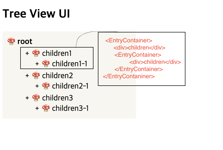
data에서 children 안에 children 이 있는 것을 UI로 구현하게 되면,
EntryContainer 라는 하나의 컴포넌트 안에 같은 컴포넌트가 쭉쭉 이어붙여진다고 이해하면 된다.
⭐️ + - 버튼에 따라 하위 children이 열렸다 닫혔다 하는 토글 기능 만들기
이제 본격적으로 기능을 적용해보겠다.
먼저는 useState hook을 사용하여, open의 상태를 통하여 하위의 div 를 숨겨줬다 보여줬다 하는 방식이다.
코드는 다음과 같다.
        const [open, setOpen] = useState(false);

        <EntryContainer>
          <ItemButton onClick={() => setOpen((prev) => !prev)}>
            <ItemPlusMinus>{open ? "-" : "+"}</ItemPlusMinus>
            🍄 children1
          </ItemButton>
          {open && (
            <EntryContainer>
              <ItemButton>
                <ItemPlusMinus>+</ItemPlusMinus>
                🍄 children1-1
              </ItemButton>
            </EntryContainer>
          )}
        </EntryContainer>
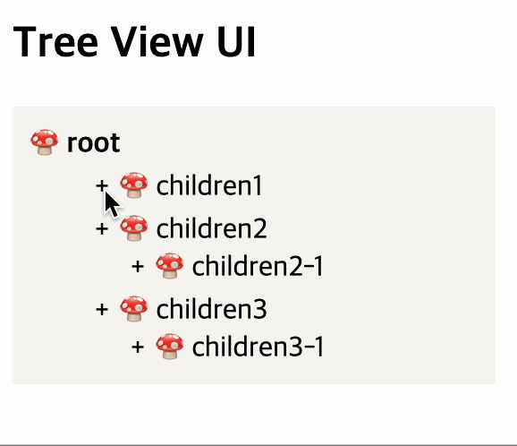
아래와 같이 동작한다.
⭐️ 접혔다 밀리듯이 열리는 애니메이션이 적용된 토글 기능 만들기
간단하게 하려면 setState 로 열림/닫힘을 표현해도 좋지만,
UI프레임워크에서 구현해주는 것처럼 접혔다 늘려졌다 하는 것을 자연스럽게 표현하고 싶어
useRef로 컴포넌트의 요소를 잡아 heigth을 0에서 auto 로 바꿔주면서
transition을 넣어주는 방법으로 구현해보았다.
코드는 다음과 같다.
  const [open, setOpen] = useState(false);
  const childrenRef = useRef<HTMLDivElement>(null);

  useEffect(() => {
    if (childrenRef.current) {
      if (!open) {
        childrenRef.current.style.setProperty("max-height", "0");
      }
      if (open) {
        childrenRef.current.style.setProperty("max-height", "60px");
      }
    }
  }, [open]);

<EntryContainer>
  <ItemButton onClick={() => setOpen((prev) => !prev)}>
    <ItemPlusMinus>{open ? "-" : "+"}</ItemPlusMinus>
🍄 children1
  </ItemButton>
  <EntryContainer
      ref={childrenRef}
      style={{
             transition: "max-height 0.15s ease-out",
             overflow: "hidden",
            }}>
       <ItemButton>
      	<ItemPlusMinus>+</ItemPlusMinus>
      	🍄 children1-1
      </ItemButton>
      <ItemButton>
        <ItemPlusMinus>+</ItemPlusMinus>
      	🍄 children1-1
      </ItemButton>
      <ItemButton>
        <ItemPlusMinus>+</ItemPlusMinus>
      	🍄 children1-1
      </ItemButton>
  </EntryContainer>
</EntryContainer>
토글에 대한 내용은 추후에 새로운 포스팅에서 다룰 계획이다!
위 코드를 적용하면 다음과 같이 UI에 대한 애니메이션이 적용된다.
다음 포스팅에서는 초반에 만들어뒀던 dummy data 를 활용하여,
재귀함수 방식의 UI 를 그려보는 방법에 대해 설명해보겠다