
지금까지는 기본적인 구조를 잡았으며, 토글 버튼 구현하는 것에 대해 다루어보았다.
⭐️ data 적용하여 재귀함수 돌려보기
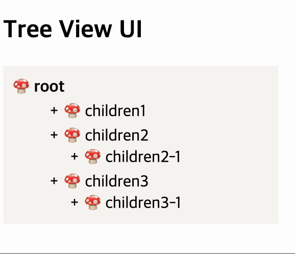
이제는 위의 이미지에서 dummy data를 적용해보겠다. (dummy data 는 포스팅 1번에서 참고)
앞서 설명하였던 것처럼 현재 children 이 있음에 따라 구조는 아래와 같이 만들어진다.
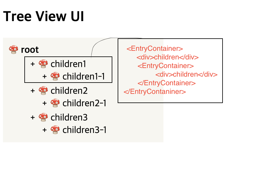
위 UI와 관련하여 dummy data의 형태는 다음 단계를 밟아 그려갈 수 있다.
⭐️ 가장 상위 뎁스의 id/name을 EntryContainer 컴포넌트 안에 담아주고, children 은 EntryContainer 안에 새로운 EntryContainer로 넣어준다.
⭐️ children 안에 만약 children 이 있다면, EntryContainer 를 넣어주고, children이 존재하지 않는다면 id/name만 담아주고 +/- 버튼은 가려준다.
위 내용을 반복적으로 실행하는 코드는 다음과 같다.
import styled from "styled-components";

type TGroups = {
  id: number;
  name: string;
  children?: TGroups[];
};

const TreeView = () => {
  const TreeGroups: TGroups[] = new Array(5).fill(0).map((_, idx) => {
    return {
      id: idx + 1,
      name: "부문" + (idx + 1),
      children: new Array(3).fill(0).map((_, index) => {
        return {
          id: (index + 1) * 12,
          name: "부서" + (index + 1),
          children: Array(3)
            .fill(0)
            .map((_, i) => {
              return {
                id: (i + 1) * 13,
                name: "팀" + (i + 1),
              };
            }),
        };
      }),
    };
  });

  const EntryLoop = ({ entry, depth }: { entry: TGroups; depth: number }) => {
    return (
      <EntryContainer>
        <ItemButton>
          <ItemPlusMinus>+</ItemPlusMinus>
          🍄 {entry.name}
        </ItemButton>
        {!!entry.children &&
          entry.children.map((children) => (
            <EntryLoop entry={children} depth={depth + 1} key={entry.id} />
          ))}
      </EntryContainer>
    );
  };

  return (
    <div>
      <h2>Tree View UI</h2>
      <ListContainer>
        <Root>🍄 root</Root>
        {TreeGroups.map((entry) => (
          <EntryLoop entry={entry} depth={1} key={entry.id} />
        ))}
      </ListContainer>
    </div>
  );
};

export default TreeView;

const ListContainer = styled.div`
  width: 250px;
  display: flex;
  flex-direction: column;
  gap: 3px;
  background: #f8f7f3;
  padding: 10px;
`;
const Root = styled.div`
  font-weight: 700;
`;

export const ItemButton = styled.div`
  cursor: pointer;
  display: inline-block;
  width: 100%;
  height: 20px;
  position: relative;
  padding-left: 30px;
`;
export const ItemPlusMinus = styled.button`
  border: none;
  background: transparent;
  display: inline-block;
  position: absolute;
  top: 50%;
  left: 10px;
  transform: translateY(-50%);
  width: 20px;
`;
export const EntryContainer = styled.div`
  width: 100%;
  padding-left: 20px;
`;
처음 이미지에 나왔던 EntryContainer 부분을 EntryLoop 의 컴포넌트로 분리하여,
반복문을 돌릴 때, depth 와 각각의 entry들을 받게 하였고, 안에 children이 존재하면 한번 더 해당 컴포넌트를 그리게끔 작성해주었다.
이미지로 보면 다음과 같이 나온다.
⭐️ EntryLoop 컴포넌트 분리하여 토글 기능 적용시키기
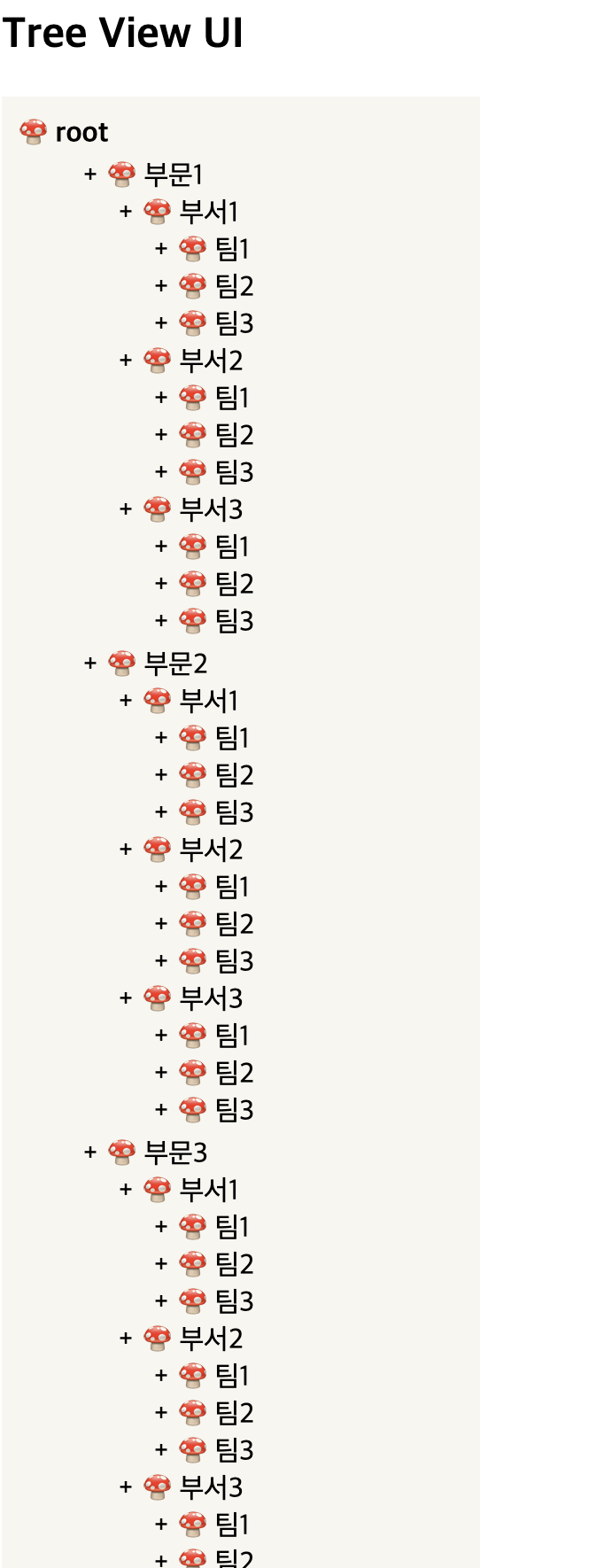
이번에는 아예 파일을 분리해보고, 그 안에서 앞전에 만들었던 토글 기능들을 적용시켜보겠다.
전체 코드는 다음과 같다.
index.tsx
import styled from "styled-components";
import EntryLoopOpen from "./EntryLoopOpen";

type TGroups = {
  id: number;
  name: string;
  children?: TGroups[];
};

const TreeView = () => {
  const TreeGroups: TGroups[] = new Array(5).fill(0).map((_, idx) => {
    return {
      id: idx + 1,
      name: "부문" + (idx + 1),
      children: new Array(3).fill(0).map((_, index) => {
        return {
          id: (index + 1) * 12,
          name: "부서" + (index + 1),
          children: Array(3)
            .fill(0)
            .map((_, i) => {
              return {
                id: (i + 1) * 13,
                name: "팀" + (i + 1),
              };
            }),
        };
      }),
    };
  });

  return (
    <div>
      <h2>Tree View UI</h2>
      <ListContainer>
        <Root>🍄 root</Root>
        {TreeGroups.map((entry) => (
          <EntryLoop entry={entry} depth={1} key={entry.id} />
        ))}
      </ListContainer>
    </div>
  );
};

export default TreeView;

const ListContainer = styled.div`
  width: 250px;
  display: flex;
  flex-direction: column;
  gap: 3px;
  background: #f8f7f3;
  padding: 10px;
`;
const Root = styled.div`
  font-weight: 700;
`;
EntryLoop
import { useState } from "react";
import styled from "styled-components";

type TGroups = {
  id: number;
  name: string;
  children?: TGroups[];
};
interface IEntryLoopProps {
  entry: TGroups;
  depth: number;
}
const EntryLoop = ({ entry, depth }: IEntryLoopProps) => {
  const [open, setOpen] = useState(false);
  return (
    <EntryContainer>
      <ItemButton>
        {!!entry.children && (
          <ItemPlusMinus onClick={() => setOpen((prev) => !prev)}>
            {open ? "-" : "+"}
          </ItemPlusMinus>
        )}
        🍄 {entry.name}
      </ItemButton>
      {open &&
        !!entry.children &&
        entry.children.map((children, idx) => (
          <EntryLoop
            entry={children}
            depth={depth + 1}
            key={`${entry.id} + ${depth} + ${idx}`}
          />
        ))}
    </EntryContainer>
  );
};
export default EntryLoop;

export const ItemButton = styled.div`
  cursor: pointer;
  width: 100%;
  position: relative;
  padding-left: 30px;
  background: #f8f7f3;
`;
export const ItemPlusMinus = styled.button`
  border: none;
  background: transparent;
  display: inline-block;
  position: absolute;
  top: 50%;
  left: 10px;
  transform: translateY(-50%);
  width: 20px;
`;
export const EntryContainer = styled.div`
  padding-left: 20px;
`;
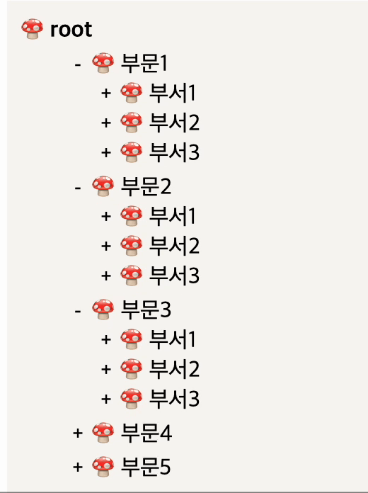
위 코드를 적용할 경우, 상위 이미지처럼 열렸다 접히는 transition이 나타나진 않을것이다!
2번 포스팅에서 언급했던 것처럼 useRef로 height을 잡아줘야 transition이 작동한다.
해당 내용은 추후에 Toggle로 포스팅 해보겠다 😉