20220524 개발일지 웹사이트 만들기
학습한 내용
플랫 디자인
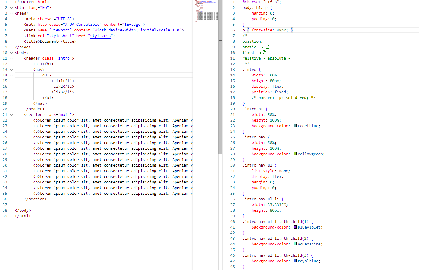
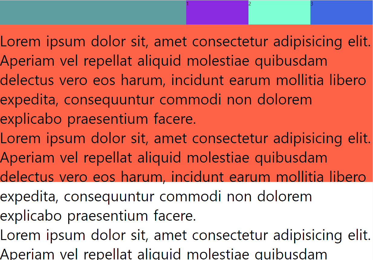
ul코드에서 정렬을 flex로 해주고
각 li코드의 색을 nth-child()로 설정해 주었다.
p태그의 문단이 h1밑으로 깔려서 padding-top을 주어서 밑으로 내려보낸 후 보이는 이미지이다.
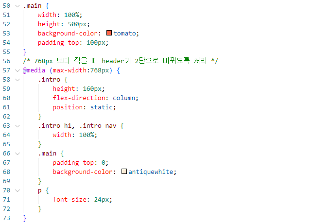
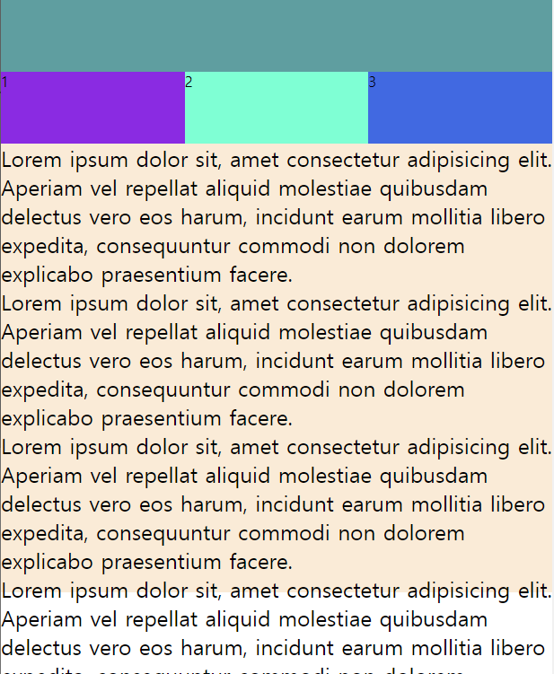
기본설정에서 미디어쿼리를 통해 768px보다 작으면 헤더부분을 column으로 만들기 위해 flex 방향을 수정, flex-direction: column;으로 하고, 기본적으로 position: fixed;설정이 들어가 있어서 h1태그와 li태그가 겹쳐져서 보이기때문에 원래 기본인 position: static;을 다시 언급해주고, 위에서 width 50% 설정해 놓은 부분이 있어서 colunm부분의 폭이 50%만 받으니 다시 선택자를 불러 100%로 폭을 맞춰줘야 캡쳐의 화면처럼 나온다.
그리드 디자인
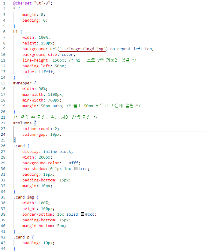
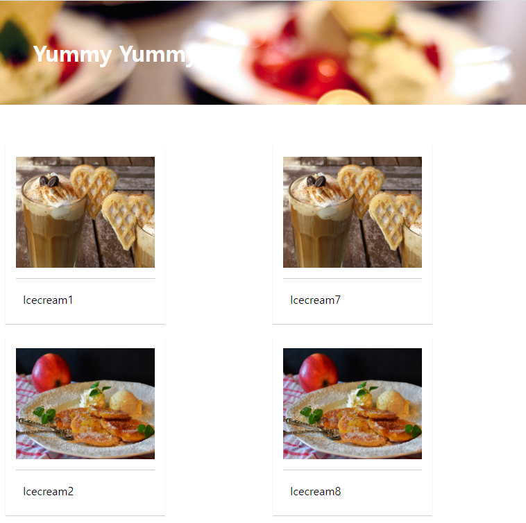
->기본 column-count: 2; 설정일 때
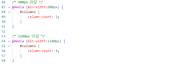
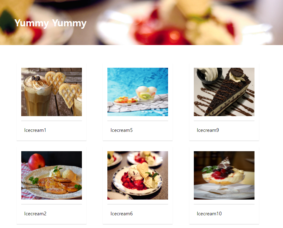
->min-width:900px이상 column-count: 3; 설정일 때
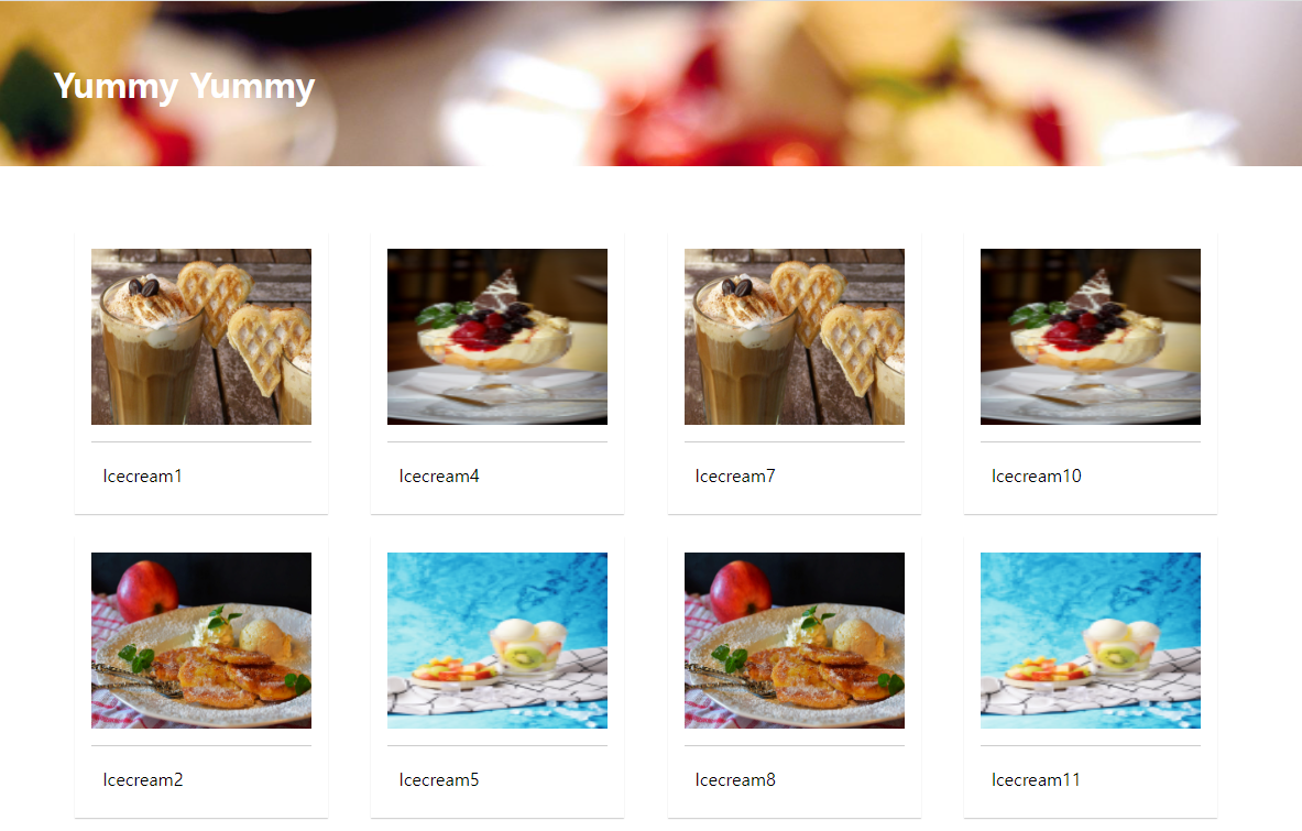
->min-width:1100px이상 column-count: 4; 설정일 때
grid-css표준
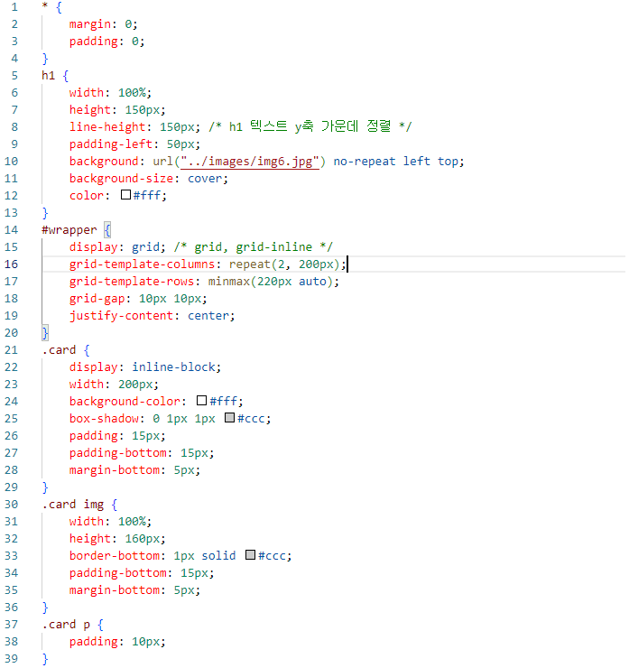
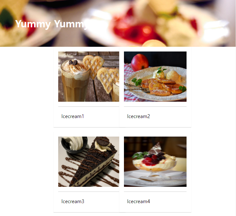
->grid-template-columns: repeat(2, 200px);으로 설정해 줬을 때
각 column의 크기를 똑같이 설정해 줄 수 있을때만 설정가능.
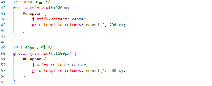
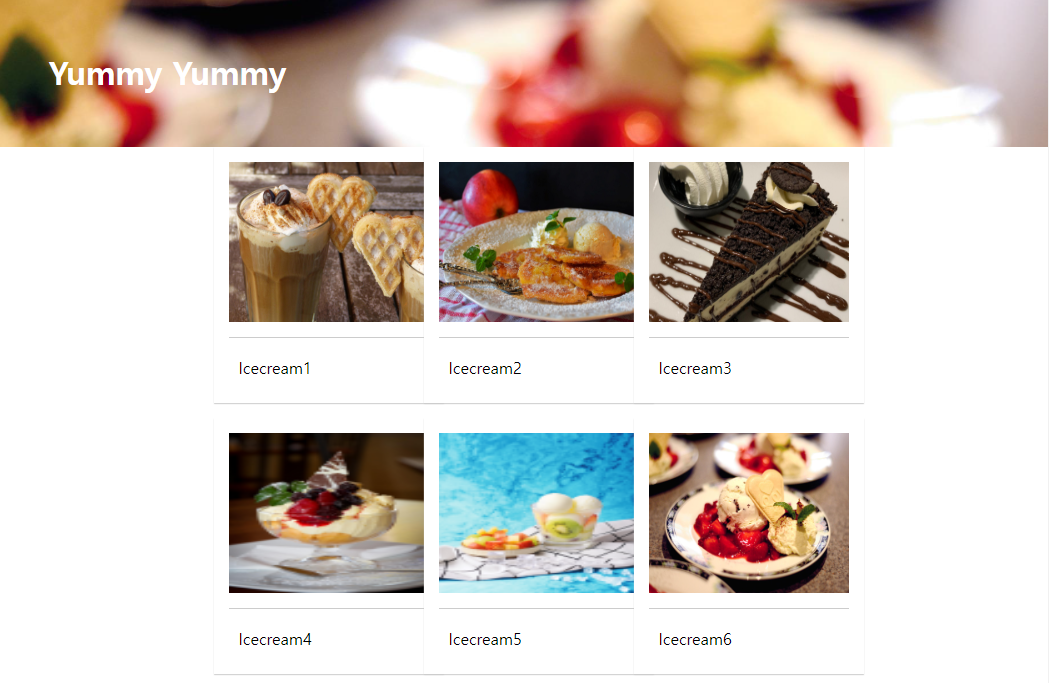
->min-width:900px 이상일 때
justify-content: center;
grid-template-columns: repeat(3, 200px);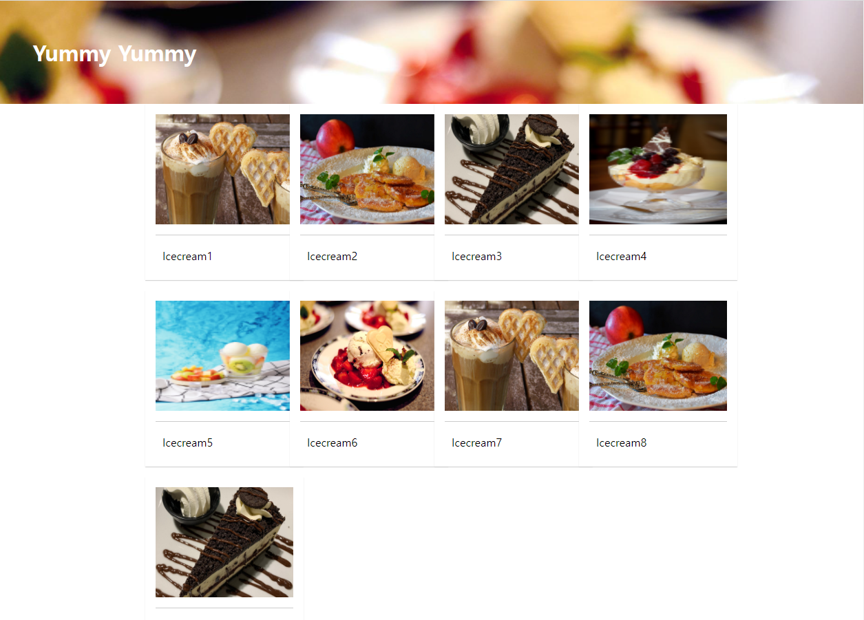
->min-width:1100px 이상일 때
justify-content: center;
grid-template-columns: repeat(4, 200px);
20220524
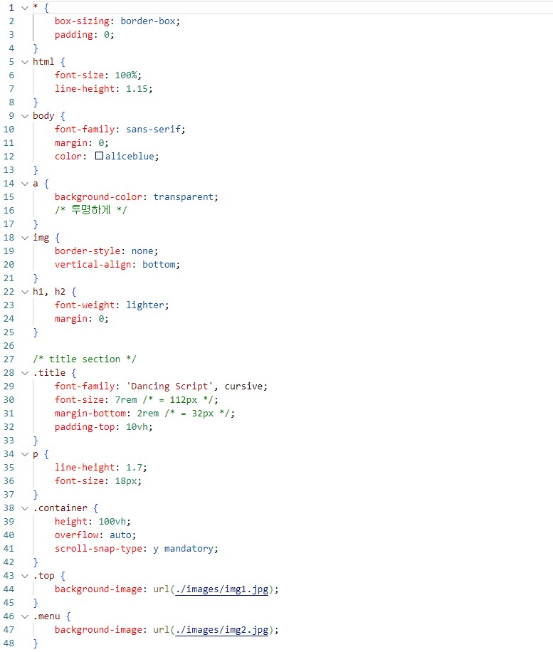
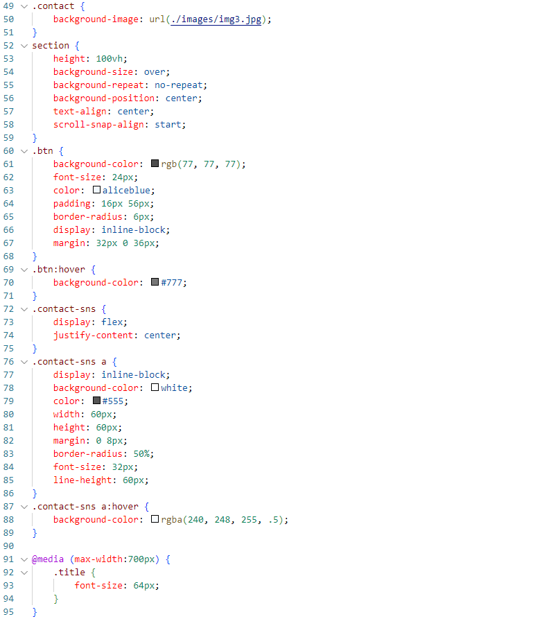
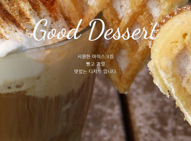
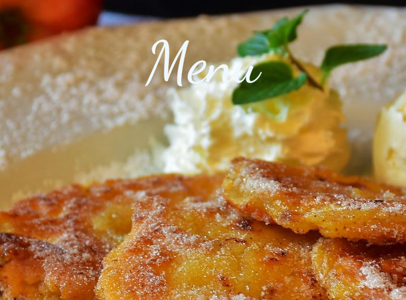
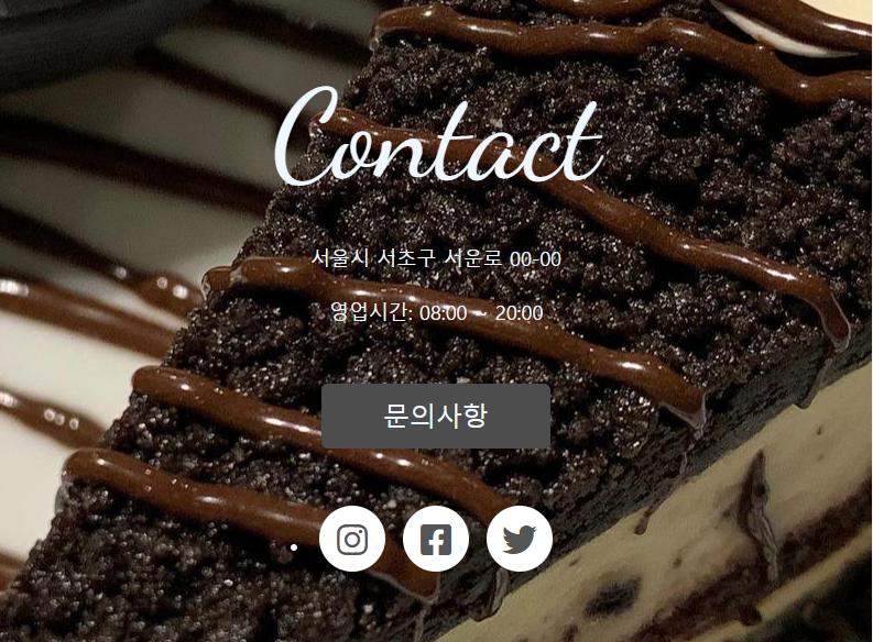
one-page과제
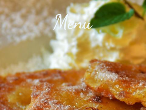
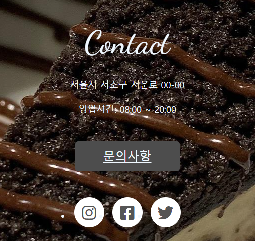 ![]
![]
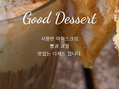
->max-width:700px 이하일 때 .title 의 font-size를 64px로 바꿔주었다.

성장하는 developer