20220525 개발일지
학습한 내용
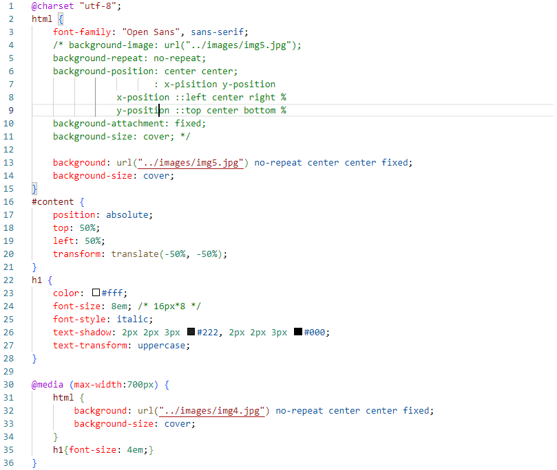
background-image: url("../images/img5.jpg");
background-repeat: no-repeat;
background-position: center center;
                   : x-pisition y-position
            x-position ::left center right %
            y-position ::top center bottom %
background-attachment: fixed;
background-size: cover;
이 코드와
background: url("../images/img5.jpg") no-repeat center center fixed;
    background-size: cover;
이 코드는 같은 코드
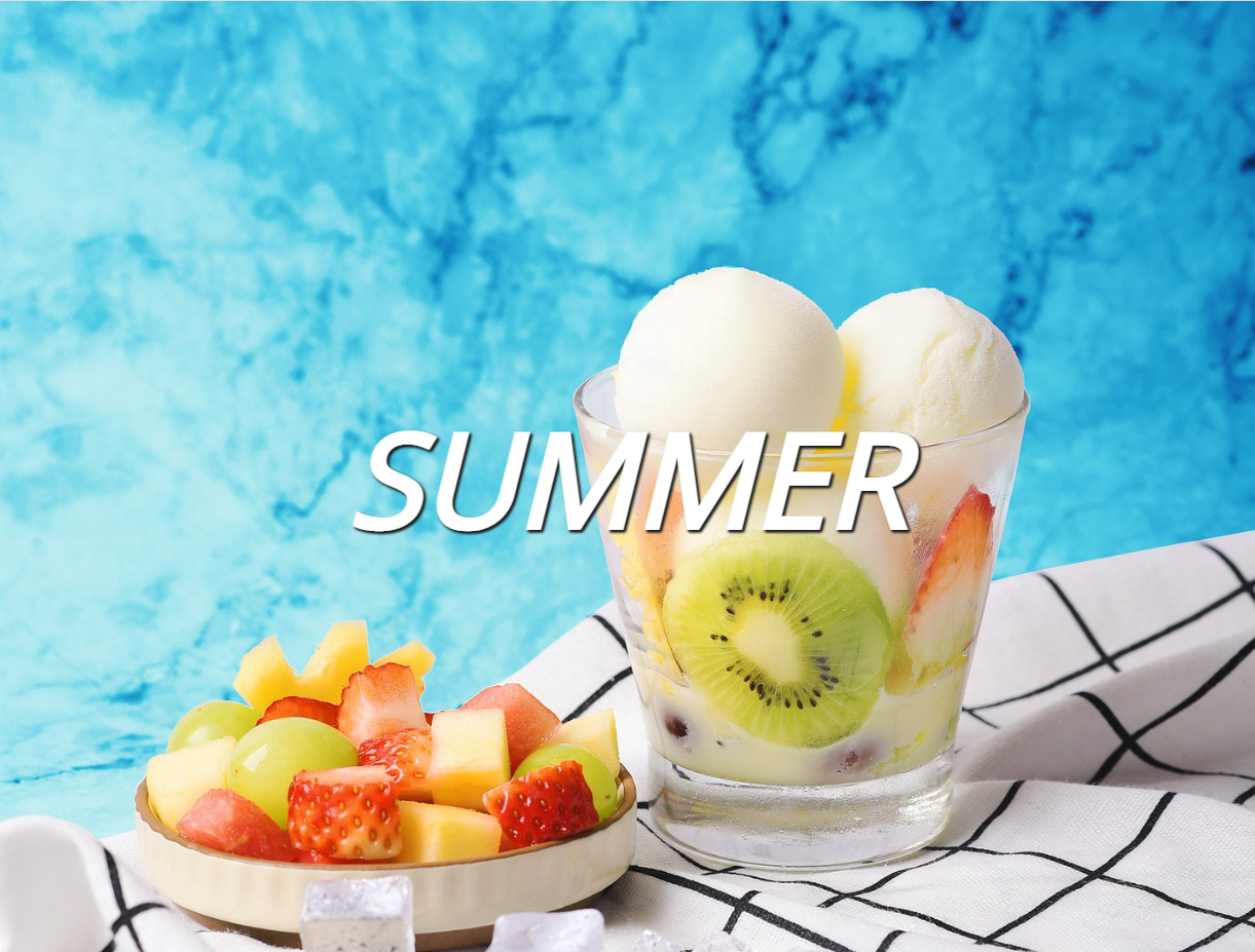
text-transform: uppercase;로 summer를 전체 대문자로 바꿔주었다.
글자의 위치를 absolute를 주고 top left 50%씩을 주면 화면의 정중앙으로 가지 않는다. s를 기준으로 다시 transform: translate(-50%, -50%)를 해 줘야 정중앙에 위치하게 된다.
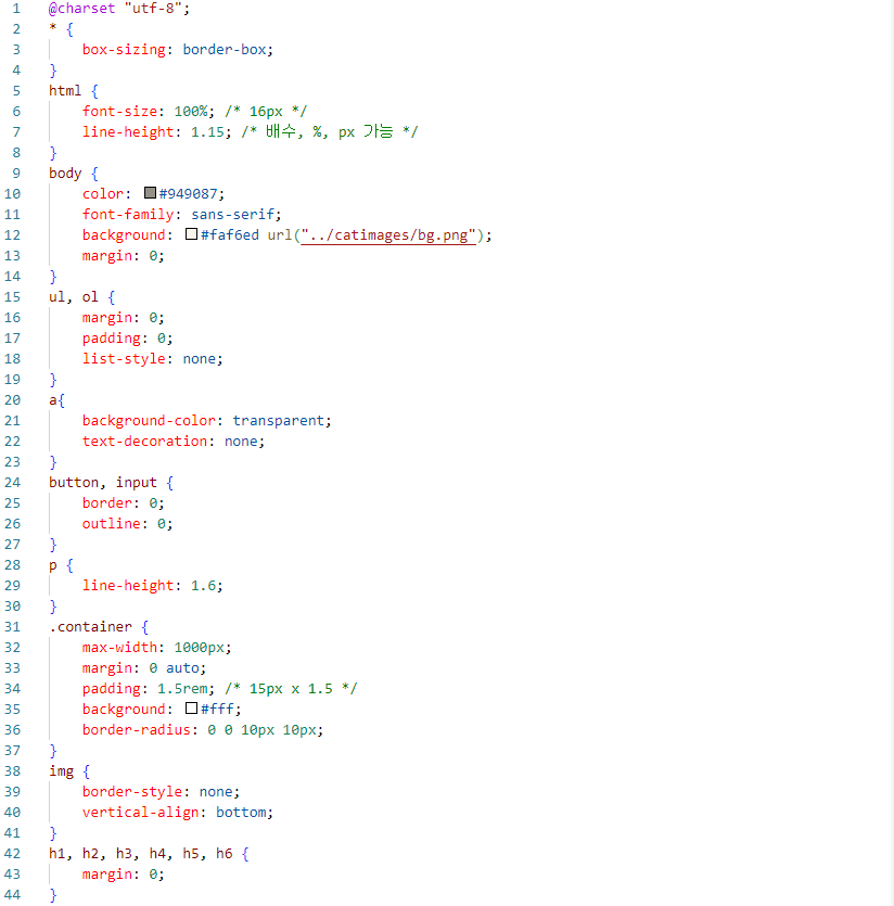
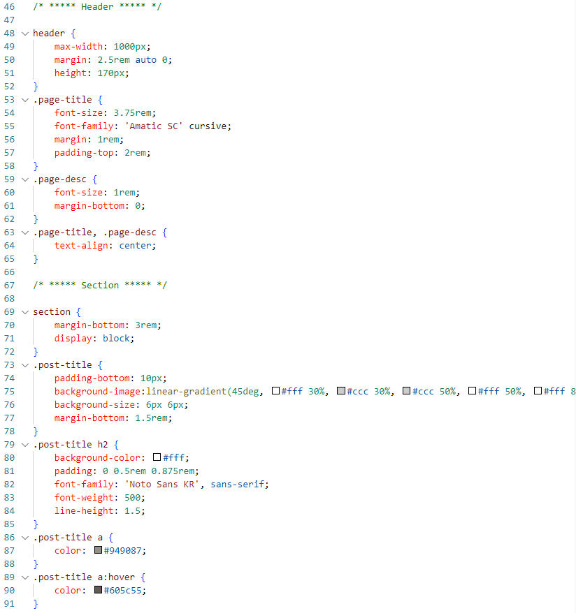
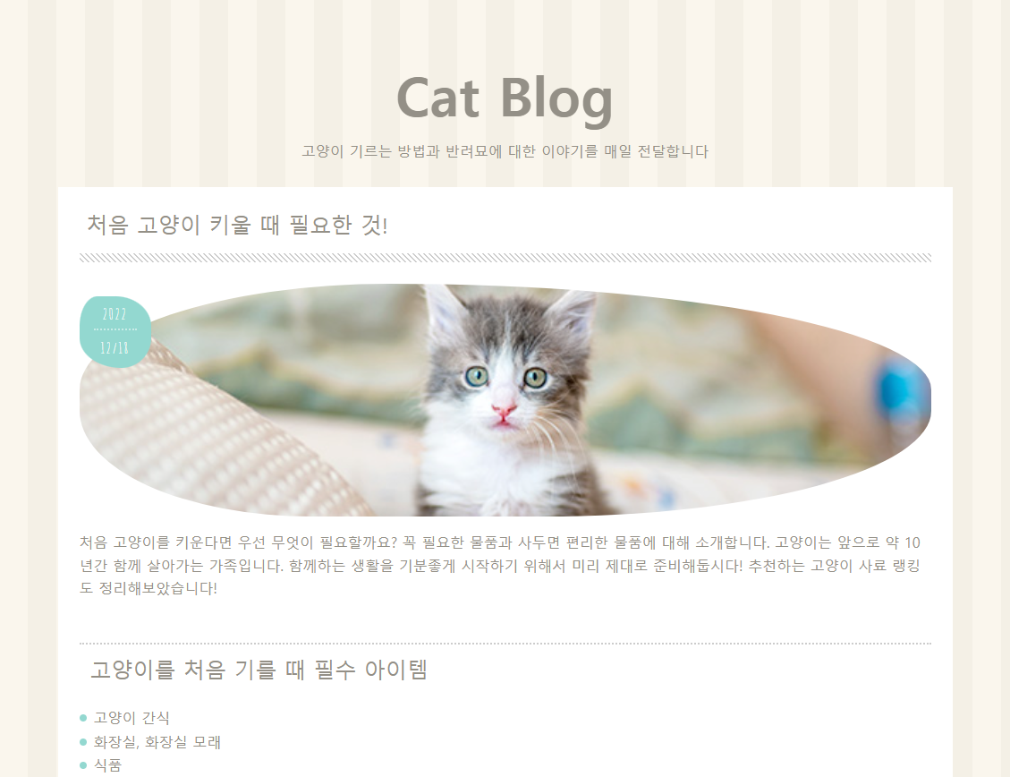
background-image:linear-gradient(45deg, #fff 30%, #ccc 30%, #ccc 50%, #fff 50%, #fff 80%, #ccc 80%, #ccc 100%);
background-size: 6px 6px;
빗금으로 만드는 코드.
background-size를 조정해서 얇은 빗금이 연달아 줄처럼 보이게 만듬.
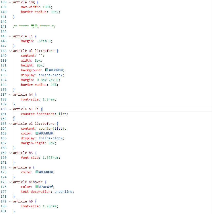
article li {
    margin: .5rem 0;
}
article ul li::before {
    content: '';
    width: 8px;
    height: 8px;
    background: #93d8d0;
    display: inline-block;
    margin: 0 8px 2px 0;
    border-radius: 50%;
}
article ol li {
    counter-increment: list;
}
article ol li::before {
    content: counter(list);
    color: #93d8d0;
    display: inline-block;
    margin-right: 8px;
}
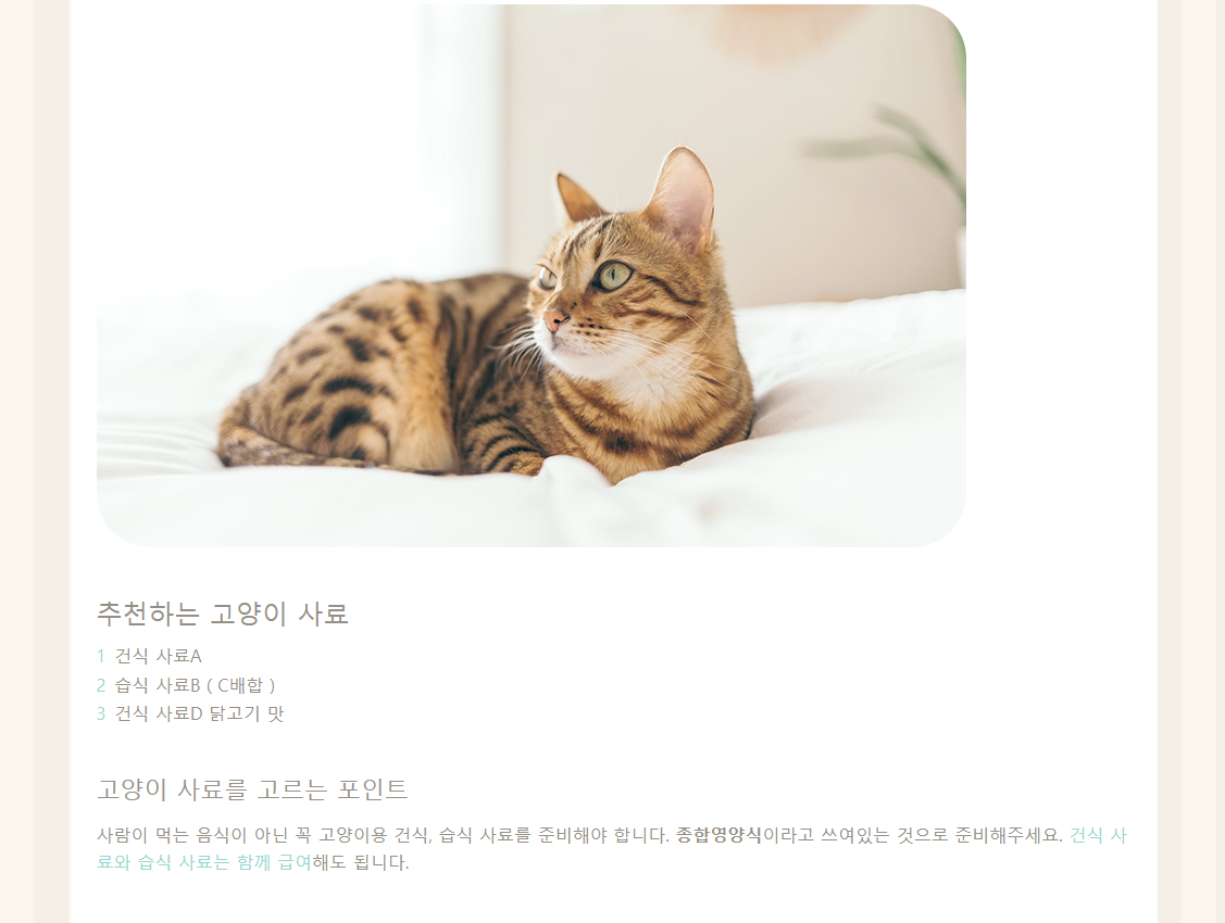
article ul li 부분의 태그는 '고양이를 처음 기를 때 필수 아이템'의 li의 before에 radius를 줘서 동그란 블릿을 주는 것이고,
article ol li 부분의 태그는 '추천하는 고양이 사료'의 li의 before에 list형식으로 숫자를 추가해줬다.
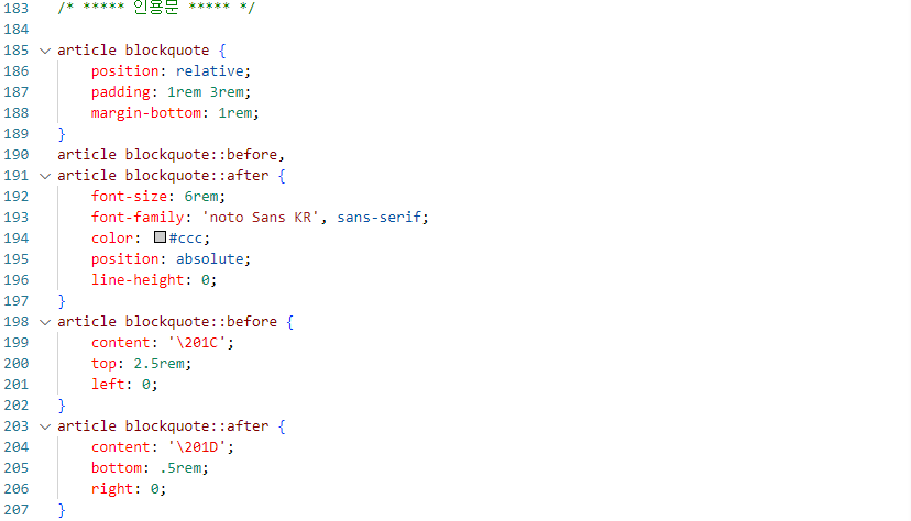
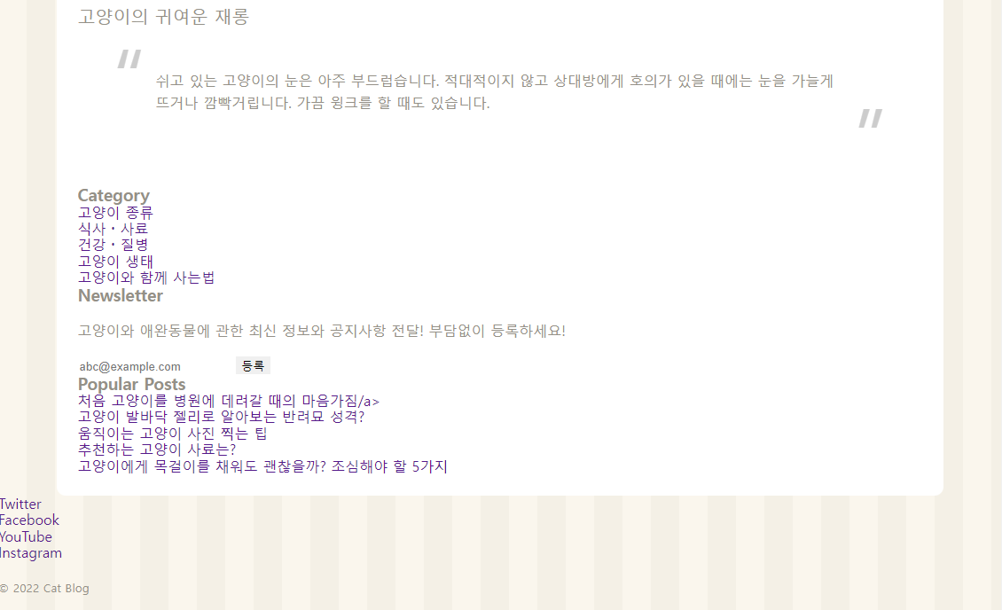
article blockquote::before {
    content: '\201C';
    top: 2.5rem;
    left: 0;
}
article blockquote::after {
    content: '\201D';
    bottom: .5rem;
    right: 0;
}
고양이의 귀여운 재롱 밑의 문단부분에서 큰 따옴표처럼 생긴 content를 사용하는 코드.
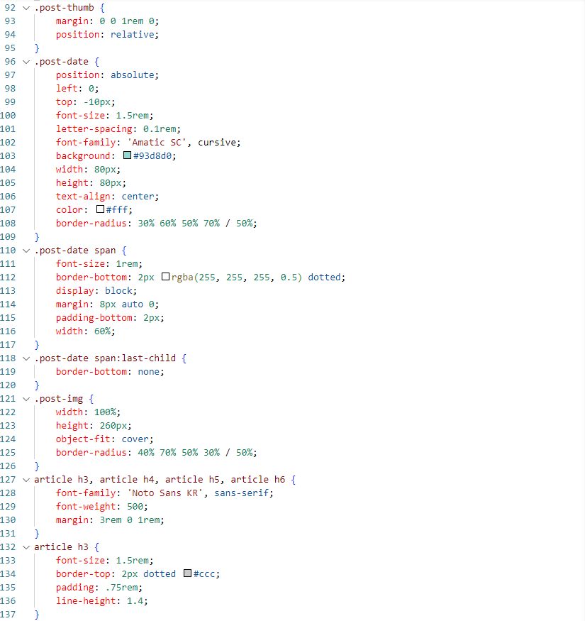
오늘은 여기까지 했지만, post-thumb의 img가 문제가 있었는데 찬찬히 살펴보니 post-date의 p태그안에 들어있어서 문제가 생긴 것이다.
항상 실수나 오타가 생기니 더 꼼꼼하게 살펴봐야겠다.

성장하는 developer