Seaborn 실습
1. 환경준비
from sklearn.datasets import load_iris
import pandas as pd
import numpy as np
import matplotlib.pyplot as plt
import seaborn as sns
import warnings
warnings.filterwarnings(action='ignore')
- 사용 데이터: sklearn iris data
iris = load_iris()
iris_df = pd.DataFrame(iris.data, columns=iris.feature_names)
iris_df['target'] = iris.target
iris_df.head()
|
sepal length (cm) |
sepal width (cm) |
petal length (cm) |
petal width (cm) |
target |
| 0 |
5.1 |
3.5 |
1.4 |
0.2 |
0 |
| 1 |
4.9 |
3.0 |
1.4 |
0.2 |
0 |
| 2 |
4.7 |
3.2 |
1.3 |
0.2 |
0 |
| 3 |
4.6 |
3.1 |
1.5 |
0.2 |
0 |
| 4 |
5.0 |
3.6 |
1.4 |
0.2 |
0 |
2. seaborn 다양한 차트들
1) 기본 차트들
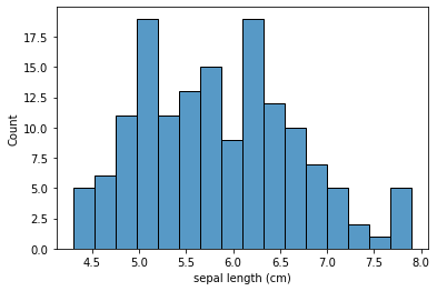
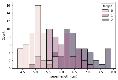
1. histplot
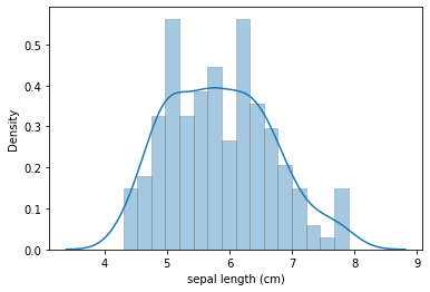
sns.histplot(data = iris_df, x='sepal length (cm)', bins = 16)
plt.show()
sns.histplot(data = iris_df, x='sepal length (cm)', bins = 16, hue = 'target')
plt.show()
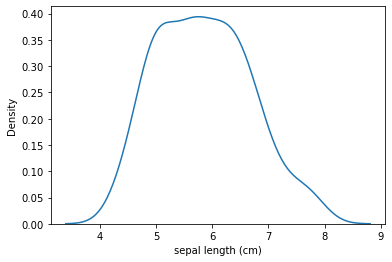
2. densityplot
sns.kdeplot(data = iris_df, x = 'sepal length (cm)')
plt.show()
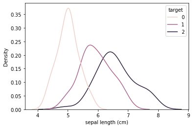
sns.kdeplot(data = iris_df, x='sepal length (cm)', hue = 'target')
plt.show()
3. boxplot
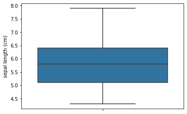
sns.boxplot(data = iris_df, y = 'sepal length (cm)')
plt.show()
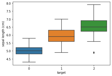
sns.boxplot(data = iris_df, y = 'sepal length (cm)', x = 'target')
plt.show()
2) distplot : histplot + density plot
sns.distplot(iris_df['sepal length (cm)'], bins=16, hist_kws=dict(edgecolor='gray'))
plt.show()
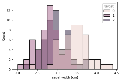
sns.histplot(data = iris_df, x = 'sepal width (cm)', bins = 16, hue='target')
plt.show()
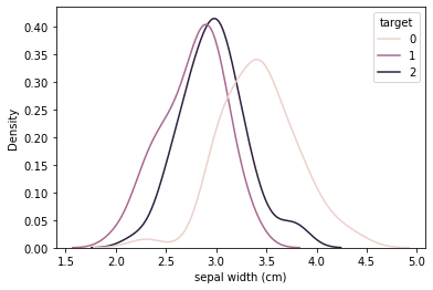
sns.kdeplot(data = iris_df, x='sepal width (cm)', hue='target')
plt.show()
3) jointplot : scatter + histplot(or density plot)
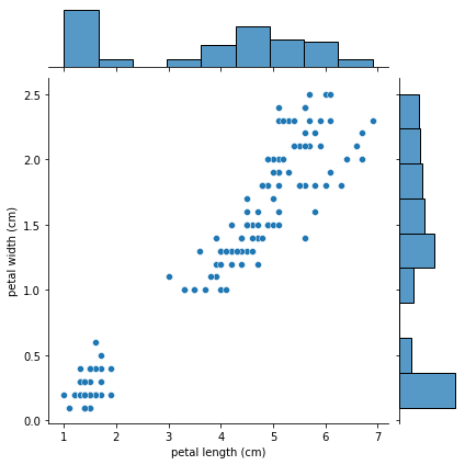
sns.jointplot(x = 'petal length (cm)', y = 'petal width (cm)', data = iris_df)
plt.show()
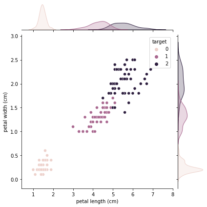
sns.jointplot(x='petal length (cm)', y='petal width (cm)', data = iris_df, hue = 'target')
plt.show()
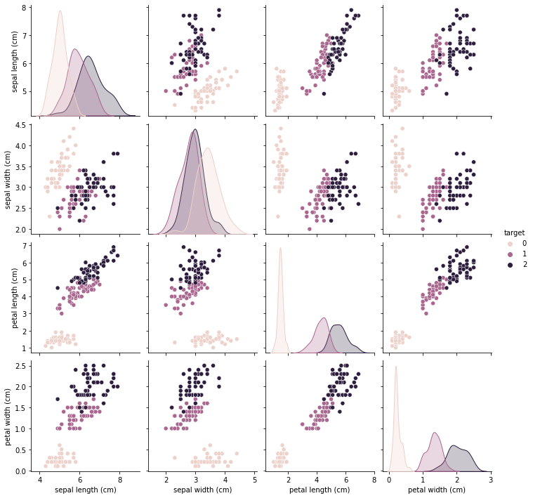
4) pairplot : scatter + histogram(or density plot) 확장
sns.pairplot(iris_df, hue = 'target')
plt.show()
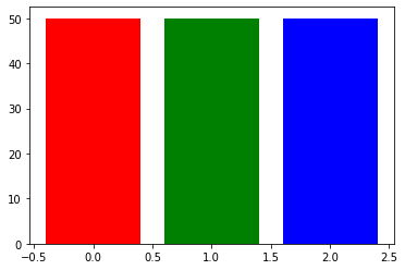
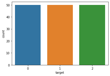
5) countplot : 집계 + bar plot
cnt = iris_df['target'].value_counts()
plt.bar(x = cnt.index, height = cnt.values, color=['r', 'g', 'b'])
plt.show()
sns.countplot(x = "target", data = iris_df)
plt.show()
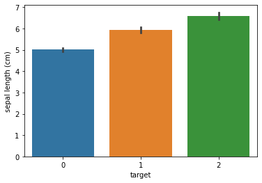
6) barplot : 평균비교 bar plot + error bar
sns.barplot(x = "target", y="sepal length (cm)", data = iris_df)
plt.show()