💻 학습내용
네이버 쇼핑 페이지 카피캣
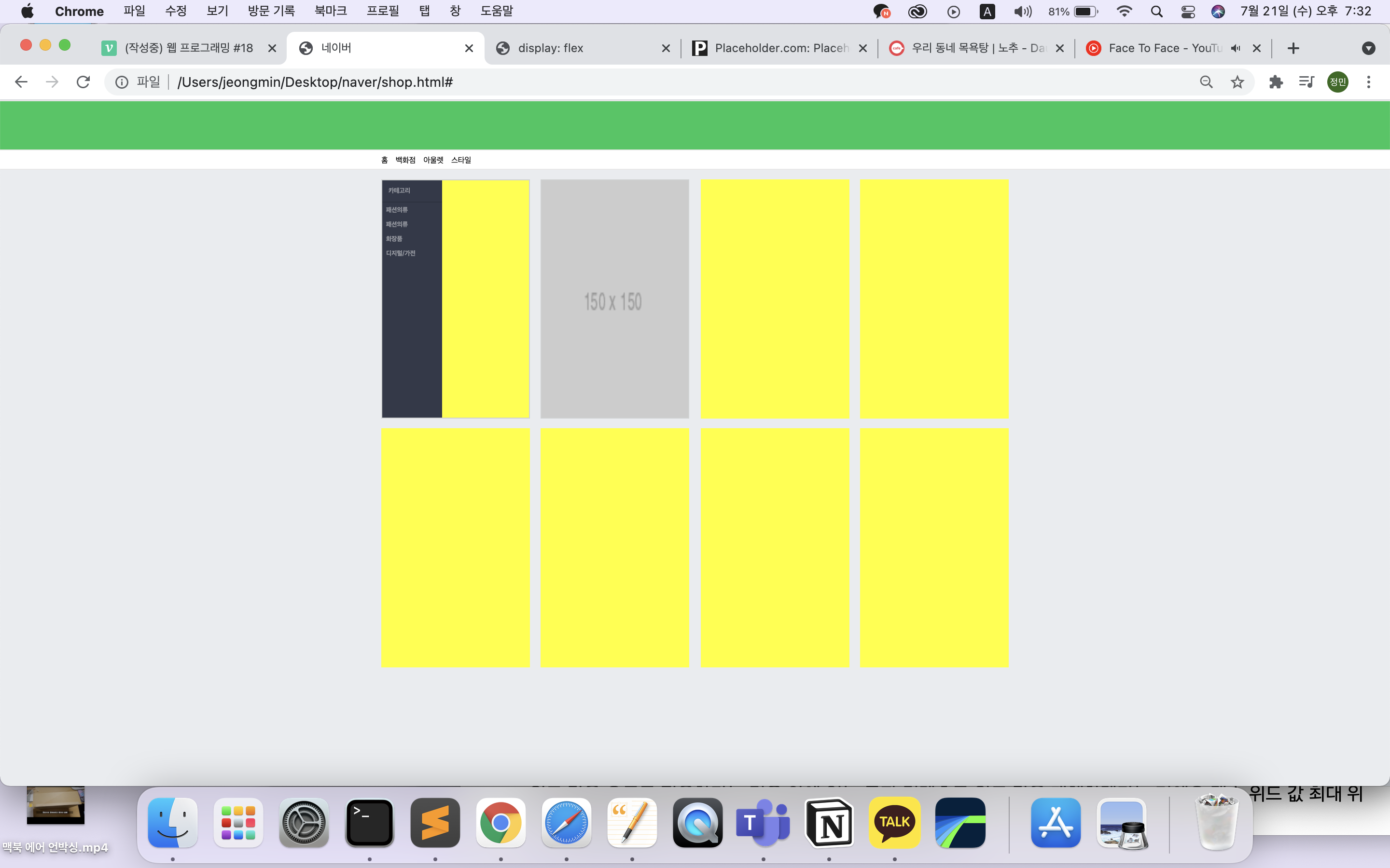
shop.html을 따로 만들어 index.html에 연결을 시켜 주었다.
쇼핑 페이지 css 디폴트 값
#shop_body{
	background-color: #e9ecef;
}
.shop_container{
	width: 1300px;
	margin: 0 auto;
}

.shop_border{
	border: solid 1px #ced2d2;
}

.w-100{
	width: 100%;
}

.h-100{
	height: 100%;
쇼핑페이지 헤더 부분

html
<header id="shop_header">
		<div id="shop_header_top"></div>
		<div id="shop_header_middle"></div>
		<nav>
			<div class="shop_container">
				<ul>
					<li><a href="#">홈</a></li>
					<li><a href="#">백화점</a></li>
					<li><a href="#">아울렛</a></li>
					<li><a href="#">스타일</a></li>

				</ul>
			</div>
		</nav>
	</header>
css
#shop_header #shop_header_top{
	width: 100%;
	height: 36px;
	background-color: #03c75a;
	border-top: solid 1px #e8e8e8;

}

#shop_header #shop_header_middle{
	width: 100%;
	height: 66px;
	background-color: #03c75a;
}

#shop_header nav{
	width: 100%;
	background-color: #ffffff;
	border-top: solid 1px #e8e8e8;
	border-bottom: solid 1px #e8e8e8
}
#shop_header nav ul {
	display: flex;
	flex-wrap: wrap;
	align-items: center;
	padding: 12px 0 8px 0;
}

#shop_header nav ul li{
	margin-right: 16px;
}
main 부분 공간 만들기
html
 <main role="main" id="shop_main">
	 <div class="shop_container">
	 	<div class="list_wrap">
	 		<div class="list_item">
	 			<div class="category_wrap w-100 h-100 shop_border">
css
#shop_main .list_wrap{
	display: flex;
	flex-wrap: wrap;
	justify-content: space-between;
}

#shop_main	.list_item{
	width: 308px;
	height: 496px;
	background-color: yellow;

	margin-bottom: 20px;
}
#shop_main	.list_item .category_wrap{
	overflow: hidden;
}
main_left부분
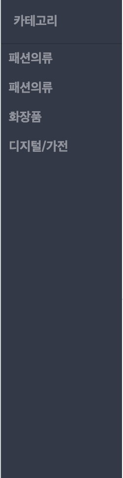
html
<div class="category_left">
	<h3>카테고리</h3>
	<ul>
	 	<li><a href="#">패션의류</a></li>
	 	<li><a href="#">패션의류</a></li>
	 	<li><a href="#">화장품</a></li>
	 	<li><a href="#">디지털/가전 </a></li>
	</ul>
</div>
css
#shop_main .list_item .category_wrap .category_left{
	float: left;
	width: 124px;
	height: 100%;
	background-color: #333949;
}


#shop_main .list_item .category_wrap .category_left h3{
	padding: 14px 0 14px 13px;
	border-bottom: solid 1px #2b313f;
	font-size: 13px;
	color: rgba(255, 255, 255, 0.46);
}

#shop_main .list_item .category_wrap .category_left ul {
}


#shop_main .list_item .category_wrap .category_left li {
}

#shop_main .list_item .category_wrap .category_left a{
	display: block;
	padding: 7px 8px;

	font-size: 13px;
	color: rgba(255, 255, 255, 0.46);
	font-weight: 700;
}
main_right_top 부분
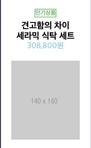
html
<div class="category_right">
	 <div class="category_right_top">
	 	<div class="category_info">
	 		<span class="headline">인기상품</span>
	 		<h3>견고함의 차이<br>
	 		세라믹 식탁 세트</h3>
	 		<span class="price">308,800원</span>
	 	</div>
	 <div class="image_wrap">
	 	<img src="https://via.placeholder.com/140x160">
	 </div>
	</div>
오른쪽 부분에서 div로 텍스트 부분과 이미지가 나오는 부분을 두 공간으로 나눠서 배치 작업을 하였다.
css
shop_main .list_item .category_wrap .category_right{
	float: right;
	width: 182px;
	height: 100%;
	background-color: #ffffff;
}


.category_right_top {
	width: 100%;
	height: 306px;
	border-bottom: 1px solid #e7e7e7;
}

#shop_main .list_item .category_wrap .category_right .category_right_top{

}


#shop_main .list_item .category_wrap .category_right .category_right_top .category_info{
	padding: 20px 0;
	text-align: center;
}

#shop_main .list_item .category_wrap .category_right .category_right_top .category_info .headline,
#shop_main .list_item .category_wrap .category_right .category_right_bottom .headline{
	display: inline-block;
    	font-size: 12px;
	border: solid 1px #00ab33;
	color: #00ab33;

	margin-bottom: 7px;
}

#shop_main .list_item .category_wrap .category_right .category_right_top .category_info h3{
	font-size: 18px;

}

#shop_main .list_item .category_wrap .category_right .category_right_top .category_info .price{
	font-size: 16px;
	color: skyblue;
}

#shop_main .list_item .category_wrap .category_right .category_right_top .image_wrap{
	text-align: center;
}
main_right_bottom 부분
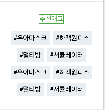
html
<div class="category_right_bottom">

	<span class="headline">추천태그</span>
	 <div class="tag_wrap">
	 	<span class="tag">#유아마스크</span>
	 	<span class="tag">#하객원피스</span>
	 	<span class="tag">#멀티밤</span>
	 	<span class="tag">#서큘레이터</span>
	 	<span class="tag">#유아마스크</span>
	 	<span class="tag">#하객원피스</span>
	 	<span class="tag">#멀티밤</span>
	 	<span class="tag">#서큘레이터</span>
	 </div>
</div>
css
#shop_main .list_item .category_wrap .category_right .category_right_bottom{
	text-align: center;
	padding-top: 20px;
}

#shop_main .list_item .category_wrap .category_right .category_right_bottom .tag_wrap .tag{
	display: inline-block;
	width: auto;
	max-width: 75px;
	height: 24px;
	background-color: #e8eef4;

	margin: 6px 1px 0 1px;
	padding: 0 5px;

	line-height: 26px;
	font-size: 12px;
	font-color: #666 ;
	vertical-align: top;
}
#shop_main .list_item .category_wrap .category_right .category_right_bottom .tag_wrap .tag{ width: auto; max-width: 75px; }➡️
width: auto;값을 준 이유
: 글자가 입력되서 늘어나는 값만큼 자동으로 자동으로 위드 값도 적용받게 된다. 즉, 안에 있는 글자 컨텐츠로 위드 값을 대체
맥스 위드 값(최대 Width값을)을 정해 줌
만약 width값이 너무 커버리면 width값 만큼 내용들이 한 줄로 나열됨.
공간의 width 값의 크기보다 tag의 위드값들의 합들이 공간보다 클 경우에는 자동으로 줄바꿈 현상이 일어나게 됨
줄바꿈의 현상으로 인하여 레이어가 y축 정렬 처럼 보이는 것
이미지로만 꽉 채우기
html
<div class="list_item banner">
	<div class="w-100 h-100 shop_border">
		<img src="https://via.placeholder.com/150">
	</div>
</div>
css
#shop_main .list_item.banner img{
	width: 100%;
	height: 100%;
}
shop_main .list_item.banner img{ width: 100%; height: 100%; }➡️ 띄어쓰기를 하지 않았기 때문에 list_item 클래스 중에서 banner라고 적힌 클래스를 호출하는 의미
📝 마무리
span 태그에 margin 값이 적용이 안되는 이유는 inline 요소를 가지고 있기 때문이다.
그렇기 때문에 inline-block 속성값을 추가해주어야 한다.
text-align 속성을 카테고리 탑 안에 넣었으면 전부다 자동으로 센터로 맞출 수 있었다.
-> 코드 분량을 간소화 할수 있었다. 부모 영역에 일관적인 디자인 정렬 코드를 입력해주면 자식도 영향을 다 받기에 한번에 코드 분량을 줄여가면서 배치 작업을 할 수 있다.
계속해서 카피캣 수업을 듣고 있다. 어제는 div태그들 에서 부모 태그와 자식 태그 관계성이 헷갈리는 부분이 있었는데 오늘은 태그를 작성할 때 제대로 이해하고 작성해서 헷갈리지 않았다.
또 css에서 class명을 임의로 만들고 적용할 효과들을 전부 작성한 후 html에 해당 클래스명을 작성해서 디자인 적용하는 법을 배웠는데
엄청 편리한 것 같다.