📰주유가격 정보 정리
import pandas as pd
from glob import glob


#파일 목록을 한번에 불러오기

glob('../data/oil_data/지역_*.xls')


#파일명 저장

station_files = glob('../data/oil_data/지역_*.xls')
station_files[:5]

#하나만 읽어보기
tmp = pd.read_excel(station_files[0],header=2)
tmp

tmp_raw = []

for file_name in station_files:
    tmp = pd.read_excel(file_name, header = 2)
    tmp_raw.append(tmp)

tmp_raw

station_raw = pd.concat(tmp_raw)
#형식이 동일하고 연달아 붙이기만 할때는 concat사용

station_raw.head()
station_raw.info()

stations = pd.DataFrame({'상호': station_raw['상호'],
                        '주소': station_raw['주소'],
                        '가격': station_raw['휘발유'],
                        '셀프': station_raw['셀프여부'],
                        '상표': station_raw['상표']
                        })
stations.tail()

for eachAdress in stations['주소']:
    print(eachAdress.split()[1])

stations['구'] = [eachAdress.split()[1] for eachAdress in stations['주소']]
len(stations['구'].unique())

#가격 데이터 형 변환 object -> float

stations['가격'] = stations['가격'].astype(float)

stations.info()

#인덱스 재정렬
stations.reset_index(inplace=True)
stations.tail()
# del stations['index']
- 데이터프레임을 만들어 인덱스를 정리하고 필요한 컬럼을 추가하는 작업 수행
📰주유가격 시각화
import matplotlib.pyplot as plt
import seaborn as sns
%matplotlib inline
import platform
from matplotlib import font_manager, rc
import koreanize_matplotlib
#boxplot(feat. pandas)
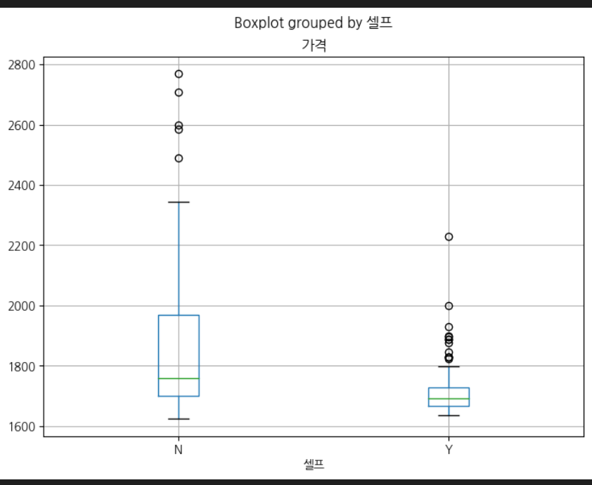
stations.boxplot(column = '가격',by = '셀프',figsize = (8,6))
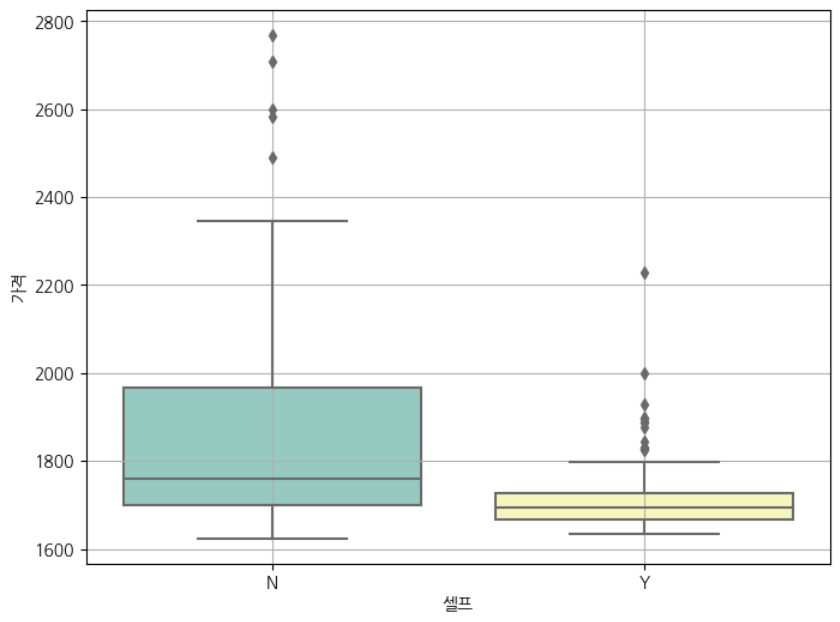
#boxplot(feat. seaborn)-1
plt.figure(figsize=(8,6))
sns.boxplot(x = '셀프', y = '가격', data = stations, palette='Set3')
plt.grid(True)
plt.show()
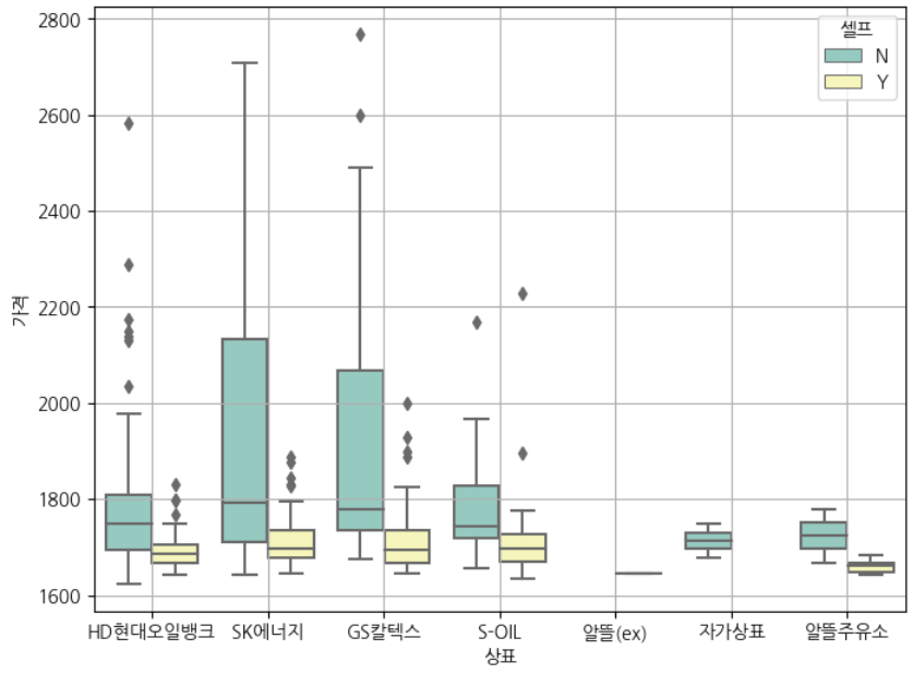
#boxplot(feat. seaborn)-2
plt.figure(figsize=(8,6))
sns.boxplot(x = '상표', y = '가격', hue= '셀프', data = stations, palette='Set3')
plt.grid(True)
plt.show()
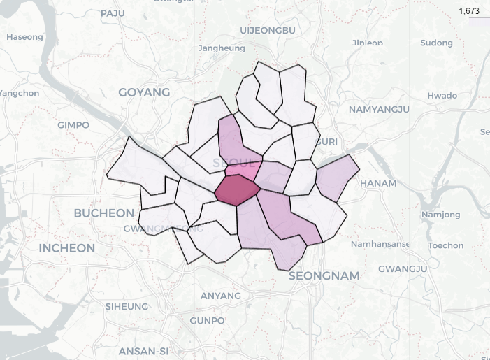
#지도 시각화
import numpy as np
import json
import warnings
import folium
warnings.filterwarnings('ignore')
#가장 비싼 주유소 10개
stations.sort_values(by = '가격', ascending = False).head(10)
#가장 값싼 주유소 10개
stations.sort_values(by = '가격', ascending = True).head(10)
gu_data = pd.pivot_table(stations, index = '구',values = '가격', aggfunc=np.mean)
gu_data.head()
geo_path = '../data/02. skorea_municipalities_geo_simple.json'
geo_str = json.load(open(geo_path, encoding='utf-8'))
my_map = folium.Map(location = [37.5502, 126.982], zoom_start = 10.5,tiles = 'CartoDB Positron')
#경계선 => choropleth사용
folium.Choropleth(geo_data = geo_str,
data = gu_data,
columns = [gu_data.index, '가격'],
key_on = 'feature.properties.name',#key on은 data랑 column을 합쳐주는 기준
fill_color = 'PuRd').add_to(my_map)
my_map<pandas를 이용한 박스플롯>
<seaborn을 이용한 박스플롯>
<seaborn박스플롯에 hue조건 추가>
<지도 시각화 결과>
🖊️회고록
- 아직 시각화 하는 부분은 코드가 어색하다. 많이 연습해봐야겠다!
- 강의에서는 folium.Choropleth부분을 my_map.Choropleth로 했는데 오류가 났다.-> folium.Choropleth로 고치기
- 강의에서 key_on 부분을 'feature_id'로 했는데 'feature.properties.name'로 고치기
('feature.properties.name'은 GeoJSON 파일의 각 구(feature)의 이름 속성을 가리키는 것으로 가정한다.)