1. 미디어 쿼리에 대하여 설명하시오.
- if, else if, else.
2. 반응형 웹디자인에 대하여 설명하시오.
- The css design gets changed depends on the conditions.
3. 아래의 가변 요소에 대하여 설명하시오.
- % : It depends on the parent length.
- em 과 rem 의 차이 : em depends on its parent but rem depends on rem.
- 이미지를 반응형으로 만드는법 : Replace the background image by media queries.
4. 커피숍 프로젝트를 완성하시오.
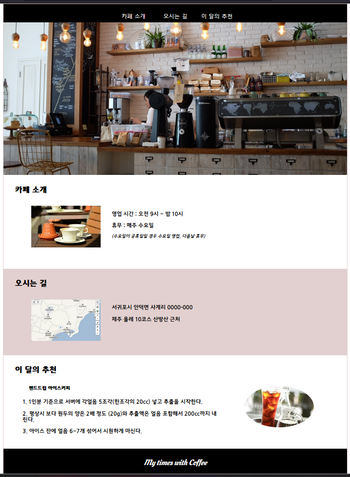
<!-- code -->
<!DOCTYPE html>
<html lang="en">
  <head>
    <meta charset="UTF-8" />
    <meta name="viewport" content="width=device-width, initial-scale=1.0" />
    <title>Cafe</title>
    <style>
      @import url(http://fonts.googleapis.com/earlyaccess/jejugothic.css);
      @import url(https://fonts.googleapis.com/css?family=Oleo+Script);
      * {
        margin: 0;
        padding: 0;
        border: 0;
        font-family: "Jeju Gothic", serif;
      }
      body {
        max-width: 992px;
        margin: auto;
        border: 1px solid rgb(226, 208, 208);
      }
      li {
        list-style: none;
      }
      h4 {
        padding: 2rem;
        font-size: 1.4rem;
      }
      h5 {
        margin-left: 4.5rem;
        margin-bottom: 1.5rem;
      }
      header {
        background-color: black;
        color: white;
      }
      header ul {
        text-align: center;
        padding-top: 1em;
      }
      header li {
        width: 100px;
        text-align: center;
        display: inline-block;
        margin: 0.5rem;
        font-family: "맑은 고딕", 돋움;
      }
      footer {
        text-align: center;
        background-color: black;
        color: white;
        padding: 1.5rem;
        font-size: 1.4rem;
        font-style: italic;
        font-family: "Oleo Script", cursive;
      }
      #header-image {
        background-image: url(images/header.jpg);
        background-size: 100%;
        background-position-y: 73%;
        width: 100%;
        height: 440px;
      }
      section > ul > li {
        width: 100%;
        height: 270px;
        background-color: white;
      }
      section > ul > li:nth-child(2) {
        width: 100%;
        height: 250px;
        background-color: rgb(226, 208, 208);
      }
      section > ul > li > ul {
        margin-top: 1rem;
      }
      section > ul > li > ul > li {
        margin-left: 3.4rem;
        margin-bottom: 1rem;
      }
      section > ul > li > p {
        margin-left: 3.4rem;
        font-style: italic;
        font-size: 0.8rem;
      }
      section div {
        width: 200px;
        height: 120px;
        float: left;
        margin-left: 5rem;
        margin-right: 2rem;
        background-size: 100%;
      }
      .cup {
        background-image: url(images/coffee.jpg);
      }
      .map {
        background-image: url(images/map.jpg);
      }
      .ice {
        background-image: url(images/ice.jpg);
        float: right;
        margin-right: 6rem;
        border-bottom-left-radius: 100% 100%;
        border-bottom-right-radius: 100% 100%;
        border-top-left-radius: 100% 100%;
        border-top-right-radius: 100% 100%;
      }
      @media screen and (max-width: 992px) {
        #header-image {
          background-image: url(images/header.jpg);
          background-size: 100%;
          background-position-y: 63%;
          width: 100%;
          height: 346px;
        }
        section > ul {
          overflow: hidden;
        }
        section > ul > li {
          width: 100%;
          height: 270px;
          background-color: white;
        }
        section > ul > li:nth-child(1) {
          width: 50%;
          height: 300px;
          background-color: white;
          float: left;
        }
        section > ul > li:nth-child(2) {
          width: 50%;
          height: 300px;
          background-color: rgb(226, 208, 208);
          float: left;
        }
        section > ul > li:nth-child(3) {
          clear: both;
          border-top: 1px solid rgb(226, 208, 208);
        }
        section > ul > li > ul > li {
          margin-left: 3.4rem;
          margin-bottom: 1rem;
        }
        section > ul > li > p {
          margin-left: 3.4rem;
          font-style: italic;
          font-size: 0.8rem;
        }
        section div {
          display: none;
        }
      }
      @media screen and (max-width: 760px) {
        #header-image {
          background-image: url(images/header.jpg);
          background-size: 100%;
          background-position-y: 63%;
          width: 100%;
          height: 253px;
        }
        section > ul > li {
          width: 100%;
          height: 270px;
          background-color: white;
        }
        section > ul > li:nth-child(2) {
          width: 100%;
          height: 250px;
          background-color: rgb(226, 208, 208);
        }
        section > ul > li > ul > li {
          margin-left: 3.4rem;
          margin-bottom: 1rem;
        }
        section > ul > li > p {
          margin-left: 3.4rem;
          font-style: italic;
          font-size: 0.8rem;
        }
      }
    </style>
  </head>
  <body>
    <header>
      <ul>
        <li>카페 소개</li>
        <li>오시는 길</li>
        <li>이 달의 추천</li>
      </ul>
      <div id="header-image"></div>
    </header>
    <section>
      <ul>
        <li>
          <h4>카페 소개</h4>
          <div class="cup"></div>
          <ul>
            <li>영업 시간 : 오전 9시 ~ 밤 10시</li>
            <li>휴무 : 매주 수요일</li>
          </ul>
          <p>(수요일이 공휴일일 경우 수요일 영업, 다음날 휴무)</p>
        </li>
        <li>
          <h4>오시는 길</h4>
          <div class="map"></div>
          <ul>
            <li>서귀포시 안덕면 사계리 0000-000</li>
            <li>제주 올레 10코스 산방산 근처</li>
          </ul>
        </li>
        <li>
          <h4>이 달의 추천</h4>
          <div class="ice"></div>
          <h5>핸드드립 아이스커피</h5>
          <ul>
            <li>
              1. 1인분 기준으로 서버에 각얼음 5조각(한조각의 20cc) 넣고 추출을
              시작한다.
            </li>
            <li>
              2. 평상시 보다 원두의 양은 2배 정도 (20g)와 추출액은 얼음 포함해서
              200cc까지 내린다.
            </li>
            <li>3. 아이스 잔에 얼음 6~7개 섞어서 시원하게 마신다.</li>
          </ul>
        </li>
      </ul>
    </section>
    <footer>My times with Coffee</footer>
  </body>
</html>

Brave but clumsy