1. 아래를 예를 들어 설명하시오.
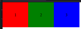
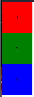
- flex-direction
- flex-wrap
- flex-flow
- justify-content
- align-items
- align-content

- order
- flex-grow
- flex-shrink
- flex-basis
- flex
#parent { display: flex; flex-direction: row; }
      #parent {
        display: flex;
        flex-direction: column;
      }
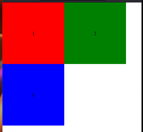
      #parent {
        display: flex;
        flex-wrap: wrap;
      }
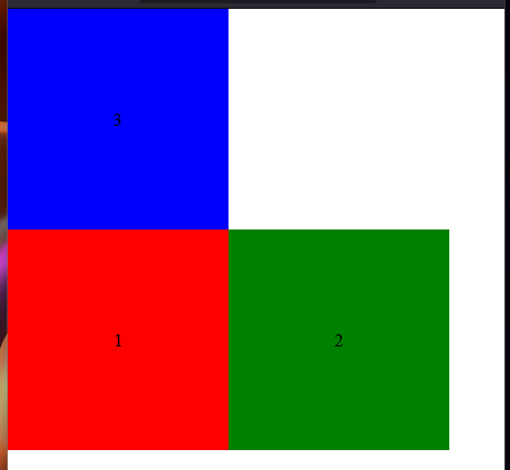
      #parent {
        display: flex;
        flex-wrap: wrap-reverse;
      }
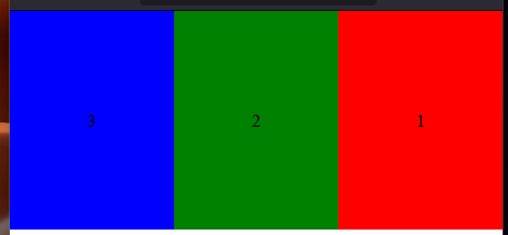
      #parent {
        display: flex;
        flex-flow: row-reverse;
      }
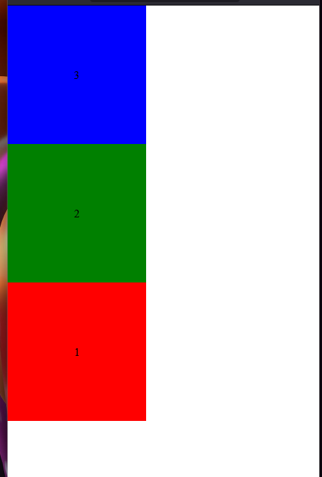
      #parent {
        display: flex;
        flex-flow: column-reverse;
      }
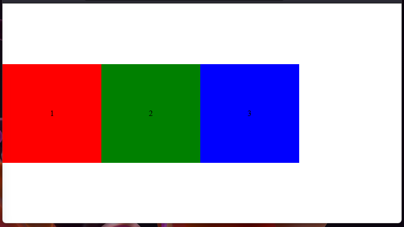
      #parent {
        display: flex;
        justify-content: center;
      }
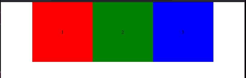
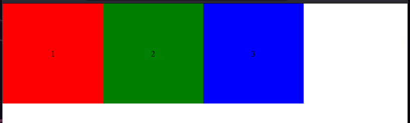
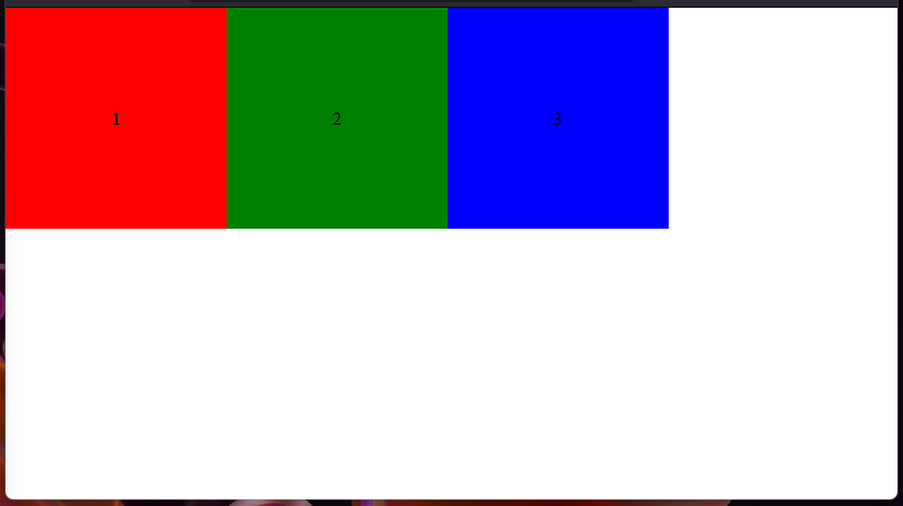
      #parent {
        display: flex;
        justify-content: flex-start;
      }
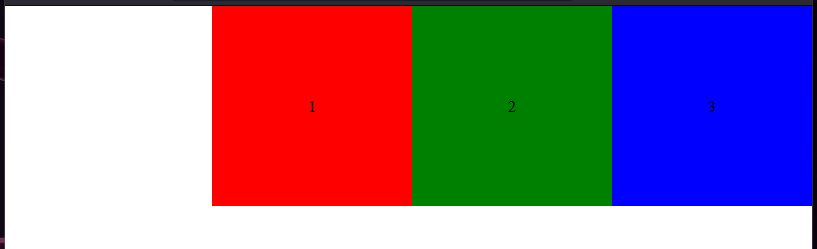
      #parent {
        display: flex;
        justify-content: flex-end;
      }
      #parent {
        display: flex;
        height: 100vh;
        align-items: center;
      }
      #parent {
        display: flex;
        height: 100vh;
        align-items: start;
      }
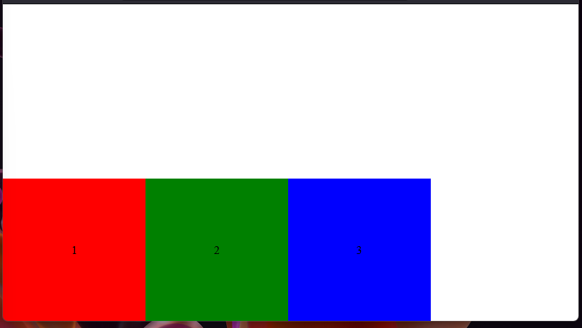
      #parent {
        display: flex;
        height: 100vh;
        align-items: end;
      }
      #parent {
        height: 100vh;
        display: flex;
        flex-wrap: wrap;
        align-content: space-evenly;
      }
      #parent {
        height: 100vh;
        display: flex;
        flex-wrap: wrap;
        align-content: space-around;
      }
      #parent {
        height: 100vh;
        display: flex;
        flex-wrap: wrap;
        align-content: space-between;
      }
      #parent {
        height: 100vh;
        display: flex;
        flex-wrap: wrap;
        align-content: flex-start;
      }
      #parent {
        height: 100vh;
        display: flex;
        flex-wrap: wrap;
        align-content: flex-end;
      }
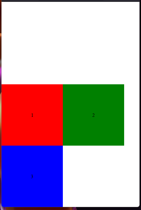
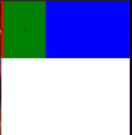
      #parent {
        height: 100vh;
        display: flex;
      }
      #parent > div {
        width: 200px;
        height: 200px;
        text-align: center;
        line-height: 200px;
      }
      #parent > div:nth-child(1) {
        background-color: red;
        order: 3;
      }
      #parent > div:nth-child(2) {
        background-color: green;
        order: 1;
      }
      #parent > div:nth-child(3) {
        background-color: blue;
        order: 2;
      }
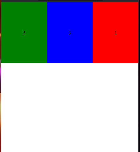
      #parent {
        display: flex;
      }
      #parent > div {
        text-align: center;
        line-height: 200px;
      }
      #parent > div:nth-child(1) {
        background-color: red;
        flex-grow: 3;
      }
      #parent > div:nth-child(2) {
        background-color: green;
        flex-grow: 1;
      }
      #parent > div:nth-child(3) {
        background-color: blue;
        flex-grow: 2;
      }
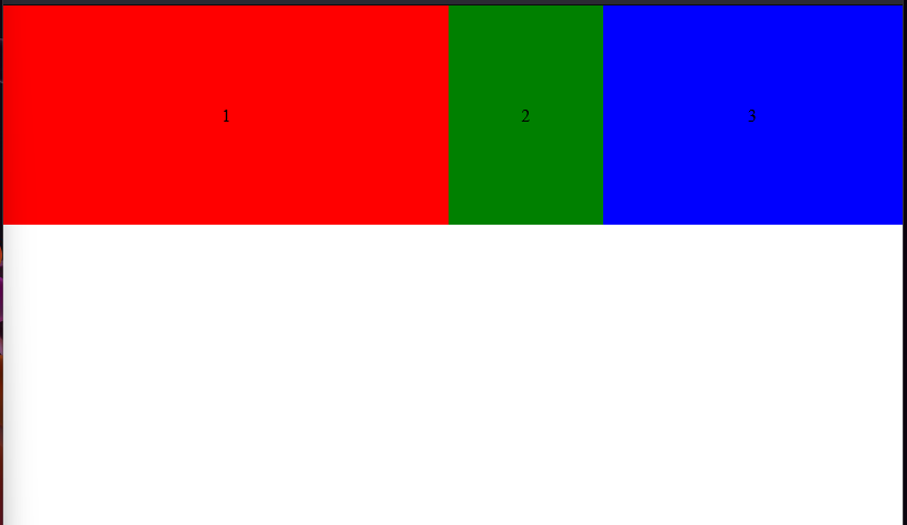
      #parent {
        display: flex;
      }
      #parent > div {
        text-align: center;
        line-height: 200px;
        flex-basis: 200px;
      }
      #parent > div:nth-child(1) {
        background-color: red;
        flex-shrink: 0;
      }
      #parent > div:nth-child(2) {
        background-color: green;
        flex-shrink: 1;
      }
      #parent > div:nth-child(3) {
        background-color: blue;
        flex-shrink: 2;
      }
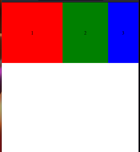
      #parent {
        display: flex;
      }
      #parent > div {
        text-align: center;
        line-height: 200px;
      }
      #parent > div:nth-child(1) {
        background-color: red;
        flex: 0;
      }
      #parent > div:nth-child(2) {
        background-color: green;
        flex: 1;
      }
      #parent > div:nth-child(3) {
        background-color: blue;
        flex: 2;
      }
2. flex 로 holy grail을 완성 하시오.
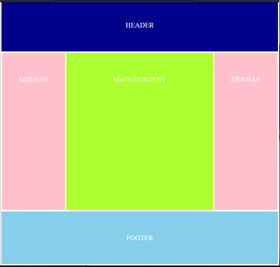
<!DOCTYPE html>
<html lang="en">
  <head>
    <meta charset="UTF-8" />
    <meta name="viewport" content="width=device-width, initial-scale=1.0" />
    <title>Holy Grail</title>
    <style>
      * {
        margin: 0;
        padding: 0;
        border: 0;
      }
      div {
        border: 2px solid white;
        color: white;
        line-height: 20vh;
        font-size: 1.5rem;
      }
      #wrap {
        display: flex;
        flex-direction: column;
        text-align: center;
      }
      #header {
        background-color: darkblue;
        height: 20vh;
      }
      #section {
        display: flex;
        flex-direction: row;
        height: 60vh;
      }
      #sidenav {
        width: 30%;
        background-color: pink;
      }
      #main_content {
        width: 70%;
        background-color: greenyellow;
      }
      #sidebar {
        width: 30%;
        background-color: pink;
      }
      #footer {
        height: 20vh;
        background-color: skyblue;
      }
      @media screen and (max-width: 520px) {
        #section {
          flex-direction: column;
        }
        #sidenav {
          width: 100%;
        }
        #main_content {
          width: 100%;
        }
        #sidebar {
          width: 100%;
        }
      }
    </style>
  </head>
  <body>
    <div id="wrap">
      <div id="header">HEADER</div>
      <div id="section">
        <div id="sidenav">SIDENAV</div>
        <div id="main_content">MAIN CONTENT</div>
        <div id="sidebar">SIDEBAR</div>
      </div>
      <div id="footer">FOOTER</div>
    </div>
  </body>
</html>
3. 커피숍 프로젝트를 완성하시오.

Brave but clumsy