질문 내용
- 미디어 쿼리에 대하여 설명하시오.
- 반응형 웹디자인에 대하여 설명하시오.
- 아래의 가변 요소에 대하여 설명하시오.
- %
- em 과 rem 의 차이
- 이미지를 반응형으로 만드는법
- 커피숍 프로젝트를 완성하시오.
개인 작성
- 미디어 쿼리
- 접속하는 장치(미디어)에 따라 특정한 CSS 스타일을 사용하도록 하는 것
- 미디어 크기에 따라 배경 화면 설정
- 미디어 쿼리의 형식
@media screen and (min-width:200px) and (max-width:360px) {

}
예시 - 뷰포트 너비에 따른 배경화면 전환 설정
       body{
            background: url(imgs3/bg0.jpg) no-repeat fixed;
            background-size: cover;
        }

        @media screen and (max-width:1024px) {
            body{
            background: url(imgs3/bg1.jpg) no-repeat fixed;
            background-size: cover;
            }
        }

        @media screen and (max-width:768px) {
            body{
            background: url(imgs3/bg2.jpg) no-repeat fixed;
            background-size: cover;
            }
        }

        @media screen and (max-width:320px) {
            body{
            background: url(imgs3/bg3.jpg) no-repeat fixed;
            background-size: cover;
            }
        }
해당 구문은
~320 : bg3.jpg
320 초과 768 이하 : bg2.jpg
768 초과 1024 이하 : bg1.jpg
1024 초과 : bg0.jpg
라는 의미이다.
- 반응형 웹 디자인 유래
- PC 규격을 기준으로 하던 시대에서, 모바일 시대가 도래.
-> 모바일 기기들의 규격은 다양하다. 출시 때마다 별도로 사이트를 제작하는 건 비효율적이다.
-> 웹 사이트의 내용을 그대로 유지하면서 다양한 화면 크기에 맞게 웹 사이트를 표시하는 방법이 필요
반응형 웹 디자인
- 화면 크기에 반응해 화면 요소를 자동으로 바꿔서 사이트를 구현하는 것
장점
- 모든 스마트 기기에서 접속 가능
- 가로 모드에 맞춘 레이아웃 변경 가능
- 사이트 유지, 관리 용이
단점
- 웹 기술 자체가 최신 웹 표준인 CSS3의 일부이다.
-> 최신 모던 웹 브라우저에서만 지원
이전 버전 웹 브라우저에서 진행하려면 일일히 직접 구현해야 할 것이다..
- % : 뷰포트 크기의 너비나 높이를 기준으로 하여, 해당 수치의 일정 비율만큼 설정하고자 할 때 사용
- em : 부모 요소가 중첩될 경우 글자 크기가 계속 달라짐
- rem : root em - 처음부터 기본 크기를 지정하고 그걸 기준으로 글자 크기 지정
뷰포트(viewport)
- 실제 내용이 표시되는 영역- 가변 이미지로 만드는 방법 1
- CSS를 이용 : 부모 요소만큼 커지거나 작아지도록 지정 가능
	max-width:100%;
        height:auto;
-> 이미지 너비 최대치는 이미지 자체 너비 길이까지로 제한하고,
height:auto는 이미지가 작아질 때, 원본 이미지의 비율을 유지하면서 줄어들도록 하는 구문
- 가변 이미지로 만드는 방법 2
- picture 태그 : 시멘틱 태그 중 하나. 해당 태그 사용 시 source 태그와 조합하여 사용함.
    <picture>
        <source srcset="imgs2/shop-large.jpg" media="(min-width:1024px)">
        <source srcset="imgs2/shop-medium.jpg" media="(min-width:768px)">
        <source srcset="imgs2/shop-small.jpg" media="(min-width:320px)">
        <img src="imgs2/shop.jpg" alt="" style="width: 100%;">
    </picture>
media : 기기를 의미.
브라우저를 접속한 기기의 해상도에 따라 보여주는 이미지가 다르다.
shop-large.jpg는 1024 이상인 경우,
shop-medium.jpg는 768~1024 사이일 때,
shop-small.jpg는 320~768 일 때 해당 이미지를 보여준다.
2024-03-07 : 반응형 웹 작업 미진행.
이미지만 보고 진행하는 clone coding이다.
연습 파일이다.
폰트 디자인 미설정 파일.
index_practice.html
<!DOCTYPE html>
<html lang="ko">
<head>
<meta charset="utf-8">
<meta name="viewport" content="width=device-width, initial-scale=1">
<title>cafe page</title>
<style>
*{
margin: 0;
padding: 0;
box-sizing: border-box;
}
body{
text-align: center;
}
#container{
width: 1002px;
margin: 5% auto;
border: 1px solid #8f8e8e;
}
.header{
width: 1000px;
}
.header .menu-bar{
background-color: brown;
height: 50px;
}
.header .menu-bar li{
line-height: 50px;
list-style: none;
display: inline-block;
margin: 0 20px 0 20px;
}
.header .menu-bar li a,.header .menu-bar li a:visited{
text-decoration: none;
color: white;
}
.header .menu-bar li a:hover{
color: orange;
}
.header-image{
width: 1000px;
background-image: url(../images/header.jpg);
background-size: cover;
height: 550px;
}
.content{
width: 1000px;
}
.content .post{
width: 1000px;
border: 1px dotted #cccccc;
padding: 30px;
height: 450px;
text-align: left;
position: relative;
}
.post:nth-child(2){
background-color: antiquewhite;
}
.post h1{
height: 50px;
}
.post img{
width: 400px;
height: auto;
padding: 30px;
position: absolute;
left: 50px;
}
.post .text{
width: 440px;
height: 200px;
padding: 30px;
position: absolute;
top: 100px;
left: 500px;
font-weight: bold;
}
.post:nth-child(3) img{
left: 500px;
border-radius: 50%;
overflow: hidden;
}
.post:nth-child(3) .text{
top:80px;
left:50px;
line-height: 2em;
}
.text p{
font-size: 1.2em;
}
.text .small-text{
font-size: 0.9em;
font-style: italic;
}
.footer{
width: 1000px;
height: 100px;
line-height: 100px;
font-size: 2em;
background-color: brown;
color:aqua;
}
</style>
</head>
<body>
<div id="container">
<div class="header">
<ul class="menu-bar">
<li><a href="#intro">카페 소개</a></li>
<li><a href="#map">오시는 길</a></li>
<li><a href="#choice">이 달의 추천</a></li>
</ul>
<div class="header-image"></div>
</div>
<div class="content">
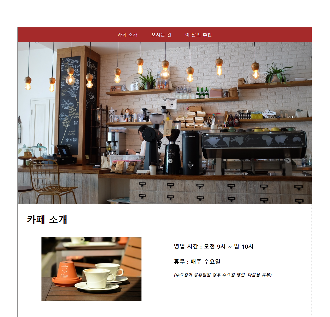
<div id="intro" class="post">
<h1>카페 소개</h1>
<img src="../images/coffee.jpg" alt="">
<div class="text">
<p>영업 시간 : 오전 9시 ~ 밤 10시
<br><br>
휴무 : 매주 수요일</p>
<br>
<p class="small-text">(수요일이 공휴일일 경우 수요일 영업, 다음날 휴무)</p>
</div>
</div>
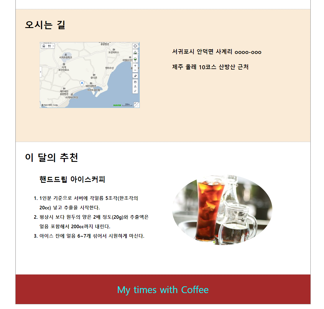
<div id="map" class="post">
<h1>오시는 길</h1>
<img src="../images/map.jpg" alt="사계 포구에서 서쪽 방향으로 000미터 진행">
<div class="text">
<p> 서귀포시 안덕면 사계리 oooo-ooo<br><br>
제주 올레 10코스 산방산 근처</p>
</div>
</div>
<div id="choice" class="post">
<h1>이 달의 추천</h1>
<img src="../images/ice.jpg" alt="">
<div class="text">
<h2>핸드드립 아이스커피</h2>
<br>
<ol>
<li>1인분 기준으로 서버에 각얼름 5조각(한조각의 20cc) 넣고 추출을 시작한다.</li>
<li>평상시 보다 원두의 양은 2배 정도(20g)와 추출액은 얼음 포함해서 200cc까지 내린다.</li>
<li>아이스 잔에 얼음 6~7개 섞어서 시원하게 마신다.</li>
</ol>
</div>
</div>
</div>
<div class="footer">My times with Coffee</div>
</div>
</body>
</html>
두리둥둥