개발일지 1일차
1. 학습내용
- 박스 모델(box model)
모든 HTML 요소는 박스 모양으로 구성된다. HTML 요소는 margin, border, padding,content로 구분된다.
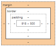
content : 텍스트나 이미지가 들어있는 박스의 실질적인 내용 부분
padding : content와 border 사이의 간격
border : content와 padding 주변을 감싸는 테두리
margin : border와 이웃하는 요소 사이의 간격
index.html
<div class="box-model">Hello World</div>
style.css
.box-model {
	/*내가 만든 공간의 크기를 유지한 상태에서 padding으로 위치를 변경할 경우*/
	box-sizing: border-box;
	width: 200px;
	height: 200px;
	background-color: yellow;
	border: solid 10px red;
	/*top right bottom left 순*/
	/*코드가 길어질 수록 브라우저의 속도 느려진다.*/
	/*margin: 100px 0 0 100px;*/
	padding: 100px 0 0 100px;
	/*
	margin-left: 100px;
	margin-top: 100px;
	margin-right:;
	margin-bottom:;
	padding-left: 100px;
	padding-top: 100px;
	padding-right: ;
	padding-bottom: ;
	*/
}
- 결과
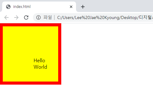
-
마진병합현상(Margin Collapsing)
margin이란 요소의 네 방향 바깥 여백 영역을 설정하는 css 속성이다. 이 때 마진 병합은 인접하는 block요소의 상하단의 margin이 병합되는 현상을 말한다. margin의 크기는 병합되는 마진 중 큰 값을 가진 마진의 값으로 병합된다.
margin 병합현상은 2가지로 나뉜다.-
형제지간의 병합현상
index.html
<div class="margin-one"></div>
<div class="margin-two"></div>
style.css
.margin-one {
    width: 100%;
    height: 100px;
    background-color: yellow;
    margin-bottom: 100px;
}
.margin-two {
    width: 100%;
    height: 100px;
    background-color: blue;
    margin-top: 150px;
}
-결과
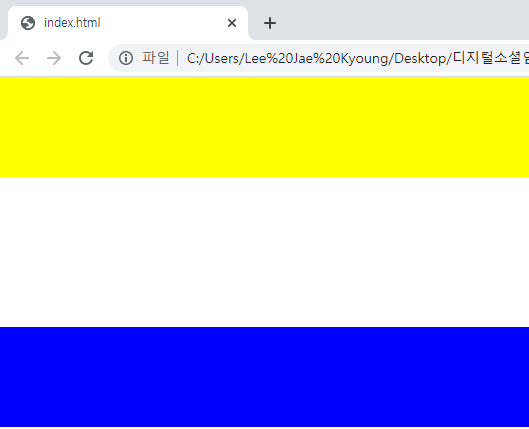
-
부모자식간의 병합현상
index.html
<div class="margin-parent">
    <div class="margin-child"></div>
</div>
style.css
.margin-parent {
    width: 300px;
    height: 300px;
    background-color: yellow;
}
.margin-child {
    width: 150px;
    height: 150px;
    background-color: blue;
    margin-top: 100px;
}
-결과
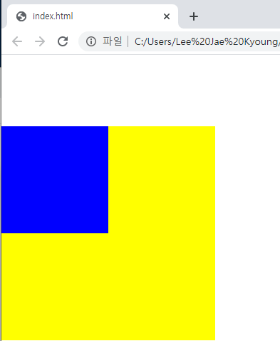
-
-
Display
display 속성은 요소를 어떻게 보여줄지를 결정합니다.
주로 4가지 속성값이 쓰이는데, 태그마다 기본값이 다릅니다.none : 보이지 않음
block : 블록 박스
inline : 인라인 박스
inline-block : block과 inline의 중간 형태inline 속성값은 상하배치작업을 할 수 없고, 공간을 만들지 못한다.
반대로 block 속성값은 상하배치작업이 가능하고, 공간을 만든다.
inline-block속성값은 두 위에 두 속성을 포함한다.index.html
<h1>Block</h1>
<h1>Block</h1>
<h1>Block</h1>
<span>Inline</span>
<span>Inline</span>
<span>Inline</span>
style.css
h1 {
    display: inline-block;
    width: 100px;
    height: 100px;
    background-color: yellow;
    margin-top: 100px;
}
span {
    display: block;
    width: 100px;
    height: 100px;
    background-color: pink;
    margin-top: 100px;
}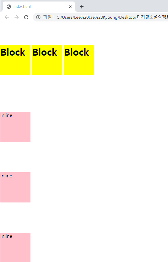
-
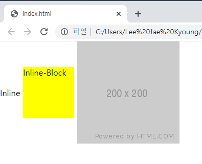
Vertical Align
CSS에서 inline와 inline-block를 수직 정렬할 때 사용한다.
속성값
top : 부모요소의 상단으로 맞춤
middle : 부모요소의 중앙으로 맞춤
bottom : 부모요소의 하단으로 맞춤
index.html
<span class="inline">Inline</span>
<span class="inline-block">Inline-Block</span>
<img src="https://via.placeholder.com/200">
style.css
.inline-block {
	display: inline-block;
	width: 100px;
	height: 100px;
	background-color: yellow;
}
/* img 태크는 inline-block요소를 가지고 있기 때문에 사용가능*/
.inline, .inline-block, img {
	vertical-align: middle;
}
-
결과
-
Position
태그들의 위치를 결정하는 CSS요소이다. 그리고 position을 사용할 경우 주의할 점으로는
- margin-top 사용시 부모자식지간의 발생하는 마진병합현상이 일어나는지
- top, right, bottom, left 속성을 사용할 수 있는지
- 자식의 높이 값이 부모에게 영향을 주는지
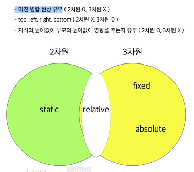
static : position의 default값이며 부모자식간의 마진병합현상이 발생한다. top,right,bottom,left를 사용할 수 없다.
fixed : 마진병합현상이 발생하지 않는다. top,right,bottom,left를 사용할 수 있다.(단 좌표기준점이 브라우저 기준) 부모가 높이값을 가지고 있지 않을 때 자식의 높이값이 부모의 높이값의 영향을 주지않는다.
relative : 부모자식지간의 마진병합현상이 발생. top,right,bottom,left를 사용할 수 있다.(단 최초있었는 위치를 기준으로 좌표가 형성된다.) 부모가 높이값을 가지고 있지 않을 때 자식의 높이값이 부모의 높이값의 영향을 준다.
absolute : 마진병합현상이 발생하지 않는다. top,right,bottom,left를 사용할 수 있다.(단 좌표기준점이 브라우저 기준) 부모가 높이값을 가지고 있지 않을 때 자식의 높이값이 부모의 높이값의 영향을 주지않는다.
static
index.html
<div class="static-parent">
	<div class="static-child"></div>
</div>
style.css
.static-parent {
	width: 300px;
	height: 300px;
	background-color: yellow;
}
.static-child {
	position: static;
	width: 150px;
	height: 150px;
	background-color: blue;
	/*margin-top: 100px;*/
	/*top: 100px;*/
}
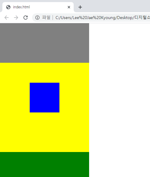
fixed
index.html
<div class="box1"></div>
	<div class="fixed-parent">
		<div class="fixed-child">
    </div>
</div>
<div class="box2"></div>
style.css
.fixed-parent {
	width: 300px;
	height: 300px;
	background-color: yellow;
}
.fixed-child {
	position: fixed;
	width: 100px;
	height: 100px;
	background-color: blue;
	margin-top: 100px;
	/*margin-top: 100px;*/
	/*top: 100px;*/
}
.box2 {
	width: 300px;
	height: 2000px;
	background-color: green;
}
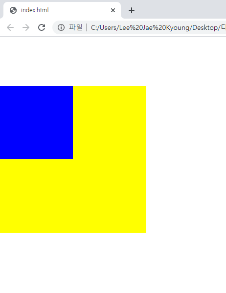
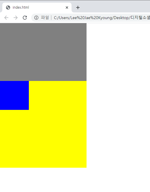
relative
index.html
<div class="box1"></div>
	<div class="relative-parent">
		<div class="relative-child">
    </div>
</div>
style.css
.box1 {
	width: 300px;
	height: 200px;
	background-color: gray;
}
.relative-parent {
	width: 300px;
	height: 300px;
	background-color: yellow;
}
.relative-child {
	position: relative;
	width: 100px;
	height: 100px;
	background-color: blue;
	/*margin-top: 100px;*/
	/*top: 100px;*/
}
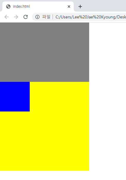
absolute
index.html
<div class="box1"></div>
	<div class="absolute-parent">
		<div class="absolute-child">
    </div>
</div>
style.css
.box1 {
	width: 300px;
	height: 200px;
	background-color: gray;
}
.absolute-parent {
	position: static;
	width: 300px;
	height: 300px;
	background-color: yellow;
}
.absolute-child {
	position: absolute;
	width: 100px;
	height: 100px;
	background-color: blue;
}
2. 학습한 내용 중 어려웠던 점 또는 해결못한 것들
- 용어자체의 이해가 잘 되지 않아서 margin과 padding의 구분이 쉽지 않았다.
- position의 차원과 각 속성값에 대한 이해가 어려웠다.
3. 해결방법 작성
margin과 padding의 구분된 이미지를 통해 이해할 수 있었다.
position의 이해는 강의를 반복학습하여 익숙해질 때까지 반복하여 해결 중이다.
4. 학습 소감
공간에 대한 이해가 가장 중요해보이고, 반복학습을 통해 용어와 속성값을 외워야 할 것 같다.