1. 학습내용
- Transform
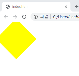
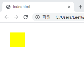
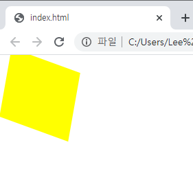
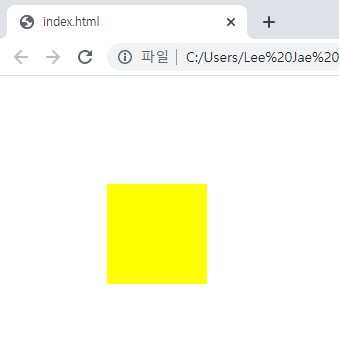
CSS transform 속성으로 요소에 회전, 크기 조절, 기울이기, 이동 효과를 부여할 수 있습니다. transform은 CSS 시각적 서식 모델의 좌표 공간을 변경합니다.>rotate() : 2차원적인 회전효과 scale(x,y) : 내가 선택한 영역의 크기를 비율로 키운다 skew(x,y) : 3차원적인 회전효과 translate(x,y) : 내가 선택한 영역의 오브젝트 위치를 변경할 때 사용
index.html
<div class="transform"></div>style.css
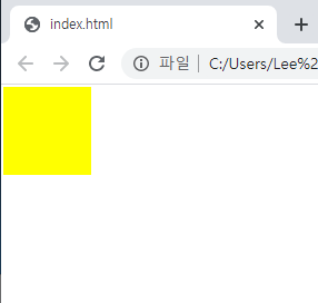
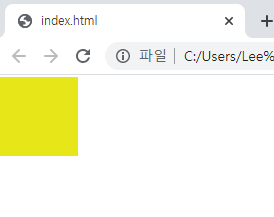
.transform {
	/*width: 100px;*/
	/*height: 100px;*/
	/*background-color: yellow;*/
	/*transform: rotate(45deg);*/
	/*transform: scale(0.5, 0.5);*/
	/*transform: skew(-10deg, 20deg);*/
	/*transform: translate(100px, 100px);*/
	/*margin-left: 100px;*/
	/*margin-top: 200px;*/
}
rotate
scale
skew
translate
-
Transition
CSS 트랜지션은 CSS 속성을 변경할 때 애니메이션 속도를 조절하는 방법을 제공합니다.>transition-property : 바꾸려는 속성 transition-duration : 애니메이션에 걸리는 시간 transition-timing-function : 애니메이션이 움직이는 성격을 설정 transition-delay : 딜레이 시간 설정index.html
<div class="transition"></div>style.css
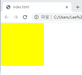
.transition {
	width: 300px;
	height: 300px;
	background-color: yellow;
	/*
	transition-property: width;
	transition-duration: 2s;
	transition-timing-function: linear;
	transition-delay: 1s;
	*/
	transition: width 2s linear, height 2s linear;
}
.transition:hover {
	width: 600px;
	height: 600px;
}
터치 전
터치 후
-
Animation
CSS3 애니메이션은 엘리먼트에 적용되는 CSS 스타일을 다른 CSS 스타일로 부드럽게 전환시켜 줍니다. 애니메이션은 애니메이션을 나타내는 CSS 스타일과 애니메이션의 중간 상태를 나타내는 키프레임들로 이루어집니다.>animation-name: 애니메이션 이름 animation-duration: 애니메이션 전환 기간 animation-timing-function: 특정시점에서 가속 또는 감속을 정하는 속성 animation-delay: 애니메이션 전환 딜레이 animation-iteration-count: 애니메이션 반복 횟수 설정 animation-direction: 애니메이션 방향
@keyframe을 통해 Animation과 연동해야한다.
index.html
<div class="animation"></div>style.css
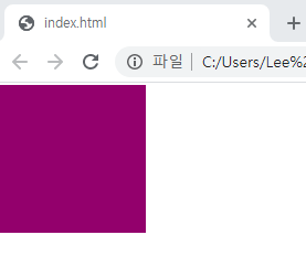
.animation {
    width: 300px;
    height: 300px;
    background-color: yellow;
    animation-name: changeWidth;
    animation-duration: 3s;
    animation-timing-function: linear;
    animation-delay: 1s;
    animation-iteration-count: infinite;
    animation-direction: alternate;
}
/* animation과 연동 */
/* from to */
/* 숫자%로도 가능 */
/* 포물선과 같은 경우 stylie(사이트)를 이용하면 간편하다. */
@keyframes changeWidth {
    0% {
        width: 300px;
        height: 300px;
        background-color: yellow;
    }
    50% {
        background-color: blue;
    }
    100% {
        width: 600px;
        height: 600px;
        background-color: red;
    }
}
before
after
무한으로 크기와 색이 점점 부드럽게 전환되면서 변해진다.
- Animation 연습
index.html
<div class="spin-lion"></div>style.css
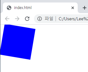
.spin-lion {
	width: 150px;
	height: 150px;
	background-color: blue;
	/*
	animation-name: spinLion;
	animation-duration: 1.5s;
	animation-timing-function: linear;
	animation-iteration-count: infinite;
	animation-direction: alternate;
	*/
	-webkit-animation: spinLion 1.5s linear infinite alternate 1s;
	animation: spinLion 1.5s linear infinite alternate 1s;
}
@keyframes spinLion {
	from {
		transform: rotate(-10deg);
	}
	to {
		transform: rotate(10deg);
	}
}
네모가 좌우측으로 스핀
2. 학습한 내용 중 어려웠던 점 또는 해결못한 것들
transform, transition 의 용어 정리가 어려웠고, 지금도 이 2가지가 헷갈린다.
animation같은 경우는 @keyframes을 통해서 연동 후 연동한 애니메이션의 이름과 딜레이시간, 애니메이션 반복횟수, 애니메이션 방향등 다양한 속성과 값들이 존재해 숙지하는데 조금 시간이 걸릴 것 같다.
3. 해결방법 작성
블로그 작성으로 실습해 본 내용들을 반복학습하고 암기하는 중이다.
4. 학습 소감
용어 정리가 필수 인 것 같고, 용어와 속성값을 암기해야 할 필요성을 느끼는 중이다.

I'm Closer