UI/UX 디자이너 님과 회의 중 일부 페이지 시안이 수정되어 셀렉트 박스도 기본 스타일이 아닌 직접 디자인을 해야하는 시안으로 변경되어 직접 커스텀 아니면 내부 option 디자인을 건드릴 수가 없기에 셀렉트 박스를 커스텀 하기로했다.
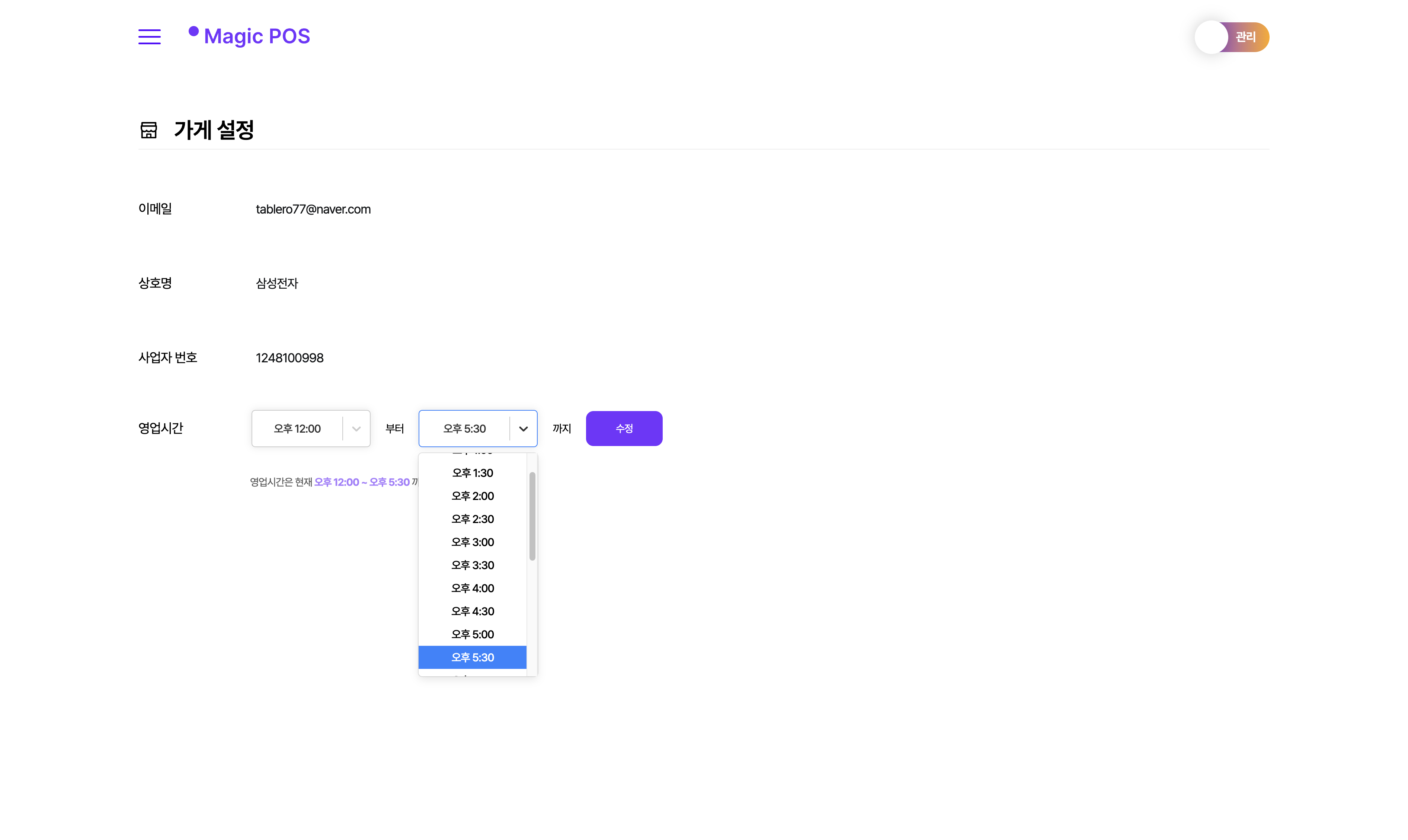
POS 관리자 페이지를 제작하다 보니 영업 시간을 설정하는 셀렉트이다.
→ 오픈부터 마감까지
설치
npm install react-select
yarn add react-select
Select
시간 포맷
// 시간 포맷 변환
export const convertTimeFormat = (time: string) => {
  const [hour, minute] = time.split(':');
  const hourNumber = Number(hour);
  const prefix = hourNumber >= 12 ? '오후' : '오전';
  const convertedHour = hourNumber > 12 ? hourNumber - 12 : hourNumber === 0 ? 12 : hourNumber;

  return {
    originalTime: time,
    convertedTime: `${prefix} ${convertedHour}:${minute}`,
  };
};
// 셀렉트 옵션 생성
export const createTimeOptions = (timeArray: string[]) =>
timeArray.map(t => ({
  value: t,
  label: convertTimeFormat(t).convertedTime,
}));

// 셀렉트 옵션 - 24시간을 30분 단위로 배열 생성
export const timeOption = Array.from(
  { length: TIME_SIZE },
  (_, i) => `${String(Math.floor(i / 2)).padStart(2, '0')}:${String((i % 2) * 30).padStart(2, '0')}:00`,
);
가장 먼저 select option에 들어가게될 시간을 오전 00:00 으로 변환하는 유틸 함수를 먼저 만들었다.
24시간제 기준으로 00:00 또는 00:00:00 으로 보여지게 되면 사용자에게 친화적으로 다가가지 않다는 판단하에 포맷팅을 진행했다.
구현
const StoreSelectBox = (props: StoreSelectBoxProps) => {
  const { times, item, setTimes } = props;
  const updateTimeState = (name: string, value: string) => setTimes(prevTimes => ({ ...prevTimes, [name]: value }));
  const timeOptions = createTimeOptions(timeOption);

  return (
    <Select
      styles={customStyles}
      name={item.name}
      id={item.name}
      onChange={option => updateTimeState(item.name, option?.value ?? '')}
      value={timeOptions.find(option => option.value === times[item.name])}
      options={timeOptions.filter(option => (item.name === 'endTime' ? option.value > times.startTime : true))}
      placeholder={item.defaultValue}
    />
  );
};
그리고 react-select에서 기본적으로 제공하는 options 에 시간을 포맷팅한 값들은 객체 형태로 넣어줬다.
{ value: string, label: string } 이런 형태로 들어가게 되고 내가 출력한 tiemOptions 변수에는 { value: 00:30:00, label: 오전 12:00 } 으로 들어가게 된다.
onChange 옵션도 기본적으로 제공되어서 콜백함수로 상태 변경을 진행
// item
{ id: 1, name: 'startTime', defaultValue: '오픈', label: '부터' },
{ id: 2, name: 'endTime', defaultValue: '마감', label: '까지' },
그리고 오픈 시간 셀렉트와 마감 셀렉트 2개를 구현해야 해서 props로 받아온 item 즉, 2개의 객체를 기준으로 필터를 걸어줬다.
const customStyles: StylesConfig<OptionType, false> = {
  control: provided => ({
    ...provided,
    width: '16rem',
    height: '5rem',
    ... 등등,
  }),
  menu: provided => ({
    ...provided,
    width: '16rem',
    fontWeight: '500',
    ... 등등,
  }),
};
가장 원했던 커스텀도 할 수 있어서 인라인 스타일에 맞게끔 작업해주면 된다.
control은 선택된 아이템을 보여주는 영역이고 menu는 옵션들이 보여지는 드롭다운 메뉴를 나타낸다.
provided는 현재 선택된 영역(?) control, menu 이라고 이해하면 된다.
다음엔 직접 컴포넌트 코딩 보단 다른 영역으로 분리하는 방법을 고안해 봐야겠다.
컴포넌트 사용
// item은 오픈, 마감을 구분하기 위한 객체
// times는 오픈, 마감 시간 상태
// setTimes는 오픈, 마감 시간 상태 변경
<StoreSelectBox item={item} times={times} setTimes={setTimes} />
실제로는 item 배열 길이 만큼 순회해서 아래와 같이 나타났다.