What is Flexbox?
Flexbox is a set of CSS properties for building 1-dimensional layouts in webpages. The main purpose of flexbox is that empty spaces inside a container element can be automatically divided by its child elements. Unlike floats, using flexbox can easily align contents to one another inside a single parent container either vertically or horizontally. Flexbox helps developers to quickly solve common problems such as vertical or horizontal centering. Additionally, flexbox allows to write fewer and cleaner HTML and CSS code than that of float.
Flexbox Application
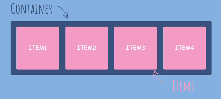
For the most part, using flexbox is fairly straightforward. All we need to do is to create a parent container which is known as the flex-container and add the display property to flex. This will set all the child elements inside the flex-container to align themselves side-by-side and these elements will be known as flex-items.
// write this code on the parent container to apply flexbox
display: flex
Aligning and Spacing
Fundamentally, flexbox properties are very useful because we can easily align or created spaces between flexbox items.
For aligning items, we use the align-items property for vertical alignment and justify-content property for horizontal alignment. We can also apply alignment for individual items within the flex-container using the same properties mentioned.
For creating spaces between items, we use the gap property to create clean spacing. This gets rid of unnecessary margins around items and creates equal spacing between them. Without the gap property, we would need to manually create spaces using the standard margin property which could take an enormous amount of time.
// aligning items(vertical)
align-items: flex-start;
align-items: flex-end;
align-items: center;
align-items: stretch;
// aligning items(horizontal) justify-content: left; justify-content: right; justify-content: stretch; justify-content: space-between;// spacing items gap: 30px;
Flex Properties
flex-grow: specifies how much a chosen item will grow relative to the rest of the flexible items inside the same container.
flex-shrink: specifies how the chosen item will shrink relative to the rest of the flexible items inside the same container.
flex-basis: specifies the initial length of a flexible item.
// standard flex properties
flex-grow: 0;
flex-shrink: 1;
flex-basis: auto;
// shortcut to writing flex properties flex: 0 1 auto;
List of Useful Flexbox Properties
Flex-Container
// To create space between items, without using margin
gap: <length>;
// To align items along main axis (horizontally, by default) justify-content: <flex-start | flex-end | center | space-between | space-around | space-evenly>;// To align items along cross axis (vertically, by default) align-items: <stretch | flex-start | flex-end | center | baseline>;// To define which is the main axis flex-direction: <row | row-reverse | column | column-reverse>;// To allow items to wrap into a new line if they are too large flex-wrap: <nowrap | wrap | wrap-reverse>;// Only applies when there are multiple lines (flex-wrap: wrap) align-content: <stretch | flex-start | flex-end | center | space-between | space-around>;
Flex-Items
// To overwrite align-items for individual flex items
align-self: <auto | stretch | flex-start | flex-end | center | baseline>;
// To allow an elment to grow (0 means no, 1+ means yes) flex-grow: 0 | <integer>;// To allow an element to shrink (0 mean no, 1+ means yes) flex-shrink: 1 | <integer>;// To define an item's width, instead of the width property flex-basis: auto | <length>;// Recommended shorthand for flex-grow, -shrink, -basis flex: 0 1 auto | <int> <int> <len>;// Controls order of items. -1 makes item first, 1 makes it last order: 0 | <integer>;