When we want to build a good looking website, it is VERY VERY important to structurally build the entire web application layout. This is an important stage where we need to focus on the look and feel of the web application. Just a simple decision of putting a component in the right location within a web page can make all the difference to how the users would interact with the web application.
For the following exercise, I have attempted to create a simple web application that resembles an email account. Although it is not real, I wanted to practice building component layouts in a structured manner.
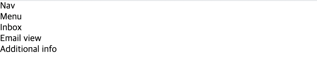
As always, I started out by creating all the necessary containers that would be needed in a typical email account. For this particular exercise, I will need a navigation bar, a menu bar, a section, a section for viewing the actual email content, and a side bar for viewing additional information.
As for the css, I set the margin and padding to be 0 while setting the box-sizing property to border-box. Again, this property gets rid of any extra pixels that are automatically set.
    // html
    <nav>Nav</nav>
    <menu>Menu</menu>
    <section>Inbox</section>
    <main>Email view</main>
    <aside>Additional info</aside>
// css * { margin: 0; padding: 0; box-sizing: border-box; }
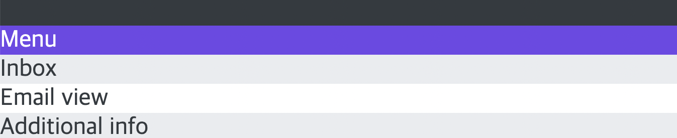
After creating all the containers, I gave some quick design with texts and colors to adjust how they will look when the exercise is complete.
      // css
      body {
        font-family: sans-serif;
        color: #343a40;
        font-size: 24px;
      }
      nav {
        background-color: #343a40;
      }
      menu {
        background-color: #7048e8;
        color: #fff;
      }
      section {
        background-color: #e9ecef;
      }
      aside {
        background-color: #e9ecef;
      }
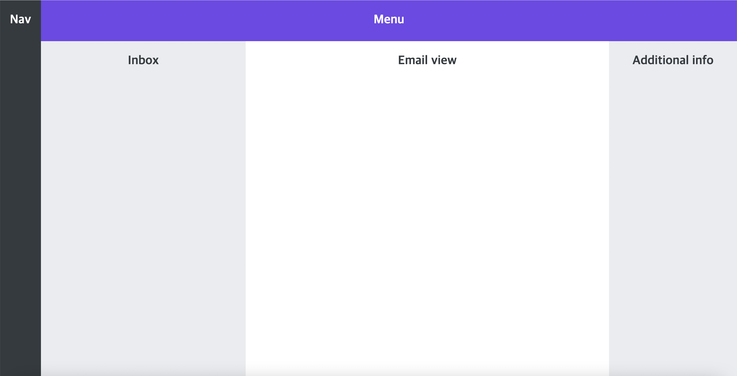
Now it is time to structure the containers to their appropriate sizes and location. Since I was planning on building an email account page, using css grid was the best solution. Setting the display property to grid, I was able to align rows and columns freely. Using both grid-template-columns and grid-template-rows, I extended the height and width of the containers to their appropriate sizes according to the size. Using the fr unit, the screen will automatically adjust to any required size no matter which device is used.
Additionally, using the grid-column and grid-row property, I was able to quickly extend the nav and the menu bar to fill the left and top part of the screen. The other containers were then automatically filled in the remaining spaces.
      // css
      body {
        font-family: sans-serif;
        color: #343a40;
        font-size: 24px;
        height: 100vh;
        text-align: center;
        font-weight: bold;
        display: grid;
        grid-template-columns: 80px 400px 1fr 250px;
        grid-template-rows: 80px 1fr;
      }
      nav,
      menu,
      section,
      main,
      aside {
        padding-top: 24px;
      }
      nav {
        background-color: #343a40;
        color: white;
        grid-row: 1 / -1;
      }
      menu {
        background-color: #7048e8;
        color: #fff;
        grid-column: 2 / -1;
      }
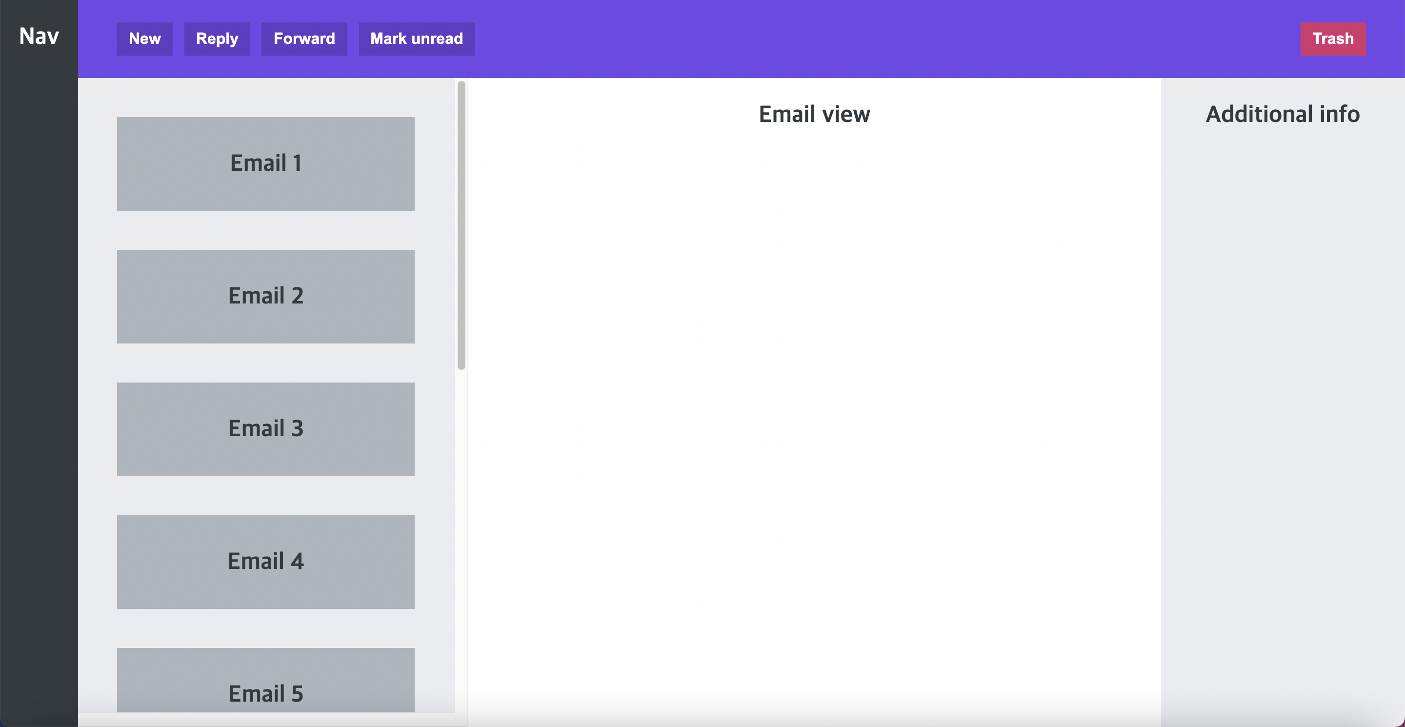
Finally, I moved on to adding smaller components inside the five large components.
I started with the menu bar on the top where I added some features that one would typically see in an email account such as creating a new email, replying an email, or forwarding an email. They were created as interactive buttons. Then, I gave them some quick design effects with colors, font sizes, and position change. I set the menu element to flex so that I can align all the buttons vertically to the center and move the last button to the very end.
Additionally, I gave a list of div elements inside the section component where one can view a list of emails that has been received. Similarly, I applied flexbox to this list. However, this time I changed the flex-direction to start from top to bottom in a column. I also used an interesting property known as overflow where I set it as scroll in order to scroll the list of emails that are contained within the section. Lastly, I finished this exercise with some last minute sizing and positioning.
This exercise was actually pretty fun and gave me a lot of learning experience on the importance of structuring a web application layout. So pat on my back for that! 😀
    // html
    <menu>
      <button>New</button>
      <button>Reply</button>
      <button>Forward</button>
      <button>Mark unread</button>
      <button>Trash</button>
    </menu>
    <section>
      <div class="email">Email 1</div>
      <div class="email">Email 2</div>
      <div class="email">Email 3</div>
      <div class="email">Email 4</div>
      <div class="email">Email 5</div>
      <div class="email">Email 6</div>
      <div class="email">Email 7</div>
      <div class="email">Email 8</div>
      <div class="email">Email 9</div>
      <div class="email">Email 10</div>
    </section>
// css menu { background-color: #7048e8; grid-column: 2 / -1; display: flex; align-items: center; gap: 12px; padding: 0 40px; } button { display: inline-block; font-size: 16px; font-weight: bold; background-color: #5f3dc4; border: none; cursor: pointer; color: #fff; padding: 8px 12px; } button:last-child { background-color: #d6336c; margin-left: auto; } section { background-color: #e9ecef; padding: 40px; overflow: scroll; display: flex; gap: 40px; flex-direction: column; } .email { background-color: #adb5bd; height: 96px; flex-shrink: 0; display: flex; align-items: center; justify-content: center; }

Great breakdown of building a web application layout! If you're progressing to the next step, understanding the underlying architecture is key. Check out this resource (https://www.cleveroad.com/blog/web-application-architecture/) for insightful details on web application architecture.