Using Good Icons
Although icons are one of the supporting features of a website, they are one of the first things the users look at when they look through any website. As such using a good icon is just as much important as using good texts or images.
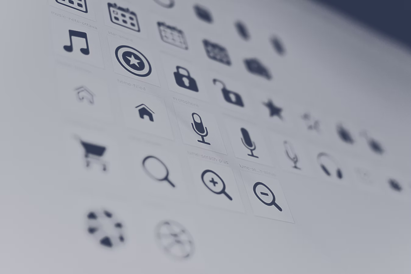
Thankfully, we do not need to create new icons to use in our website. All the icons that we can use are stored in icon packs that can be found on the internet for free. We just need to make sure that the icons we choose matches our websites personality. When choosing an icon pack, it is recommended to use only one instead of a mix of different icon packs. Using too much icon packs in a website may cause confusion for actual users.
Instead of using bitmap image formats (.jpg and .png), we need to use either SVG icons or icon fonts. This is because bitmap image formats do not scale and will look very blurry on the actual website. On the other hamd, SVG images are vector-based which means they can scale indefinitely on any platform.
Again, we always need to choose icons based on website personality. To do this easily, we can compare our icon with our typography. For example, if the text has a roundness feeling, we can choose icons that express this roundness. If the weight of the text is light, we may choose icons with light colored features.
When to Use Icons
-
To provide visual assistance to text.
-
For product feature blocks.
-
To associate with actions while labeling them at the same time.
-
As bullet points
Using Icons Well
-
Keep icons neutral by using the same color as the text. On the other hand, use different colors for more attention.
-
Don't confuse your user with icons. Icons need to make sense and fit the text or action.
-
Don't make icons larger than what they were designed for. If needed, enclose them in a shape.
Useful Tools
- Heroicons https://heroicons.com/ --> SVG Icons