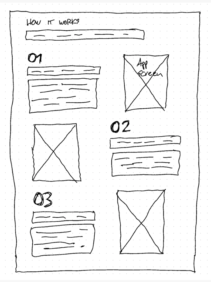
The how-it-works section is a component that is built in order to guide users step-by-step on how to use the service provided on the website.
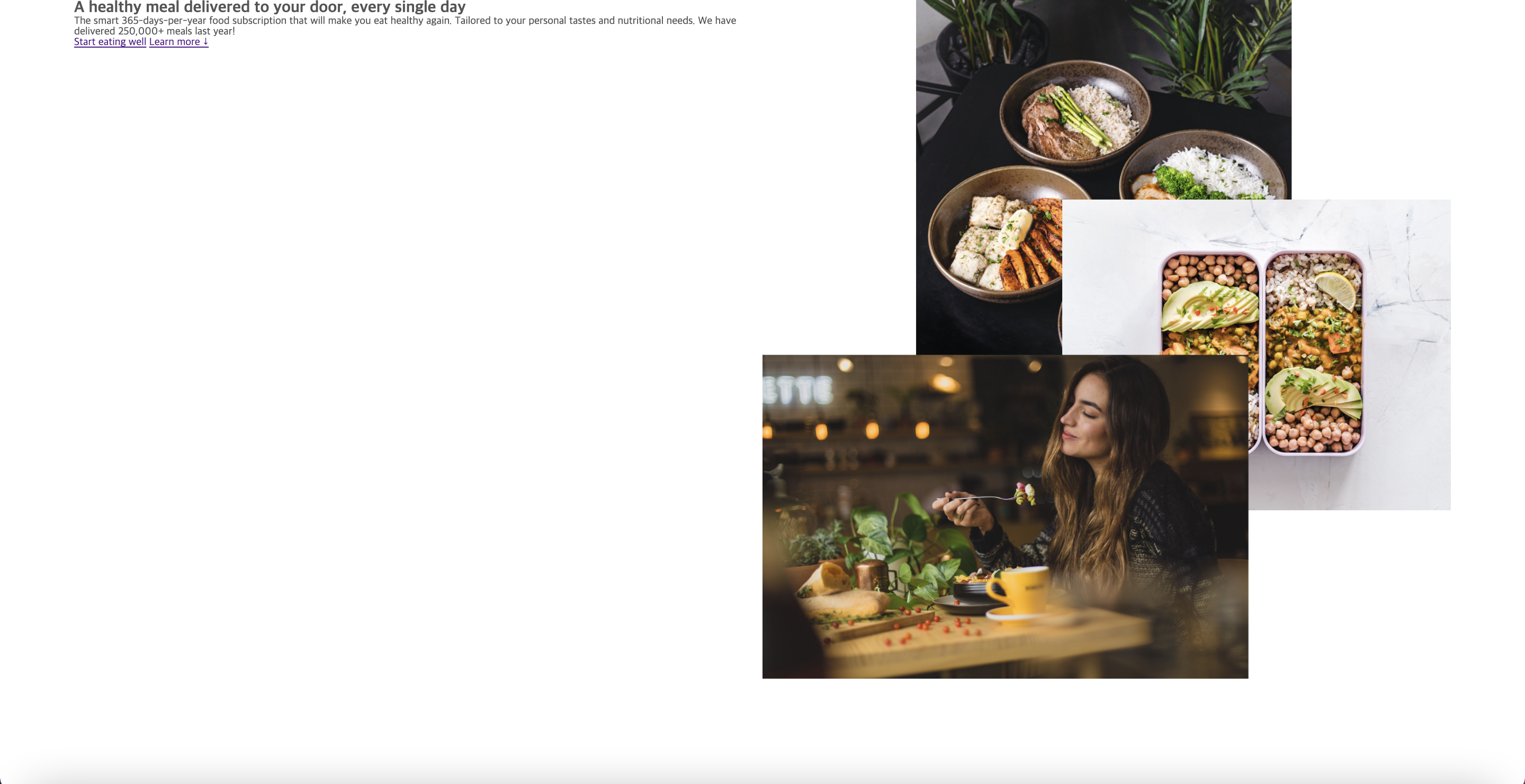
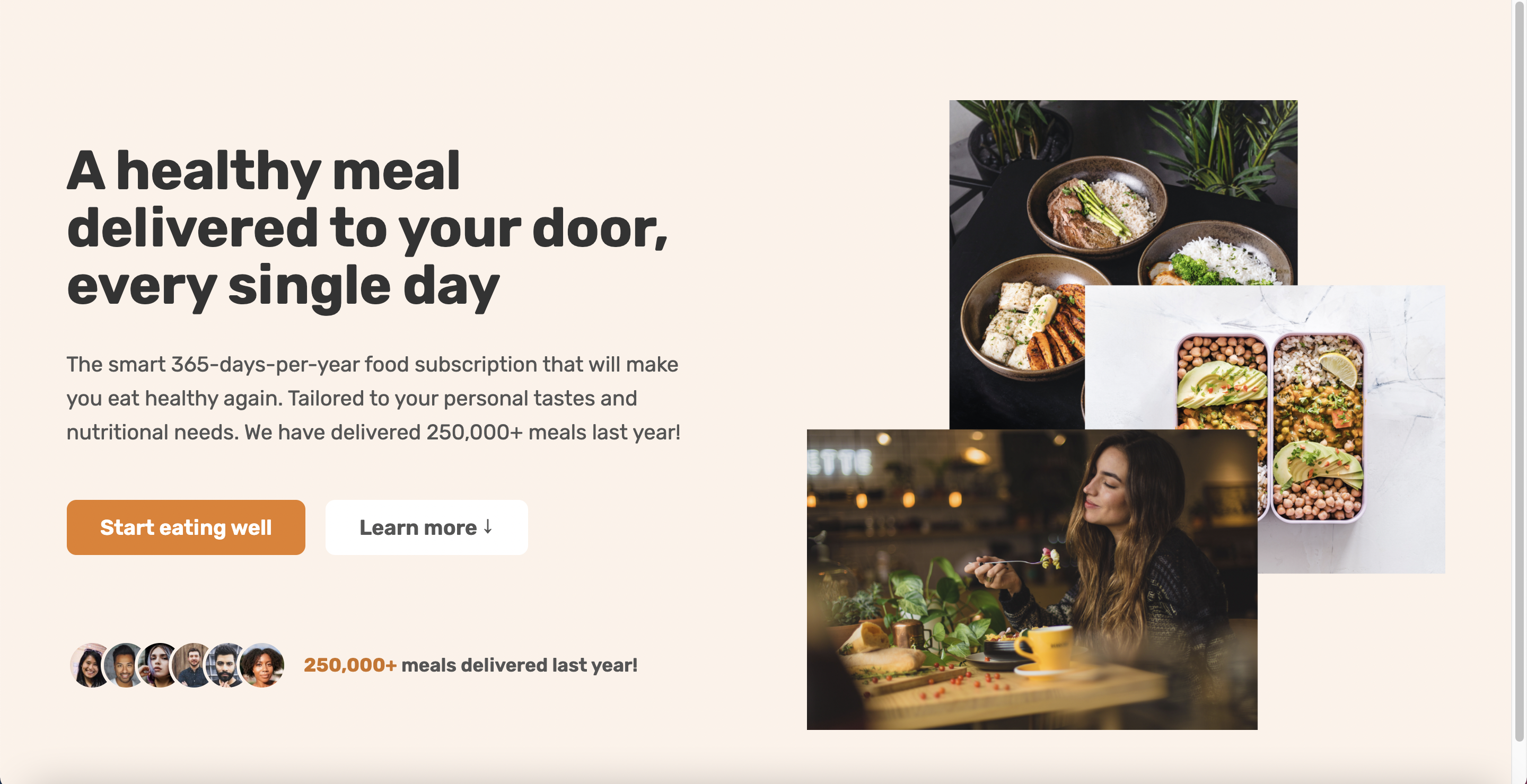
I began by first building the hero section of the website. A hero section is very important because it is the first thing that users will see when they enter any website. It can be said that the hero section is the main component.
I start by inputing starter codes for both the html and css pages. From here, I continue building up all the components that will eventually come together to create a single website.
Within the body element, I created a section element where I was able to build all the components needed for a hero section. Specifically, I created two div elements where one was for texts while the other one was for images. Additionally, I added some buttons on the text element in forms of links that guides users to register for the service or look for additional information.
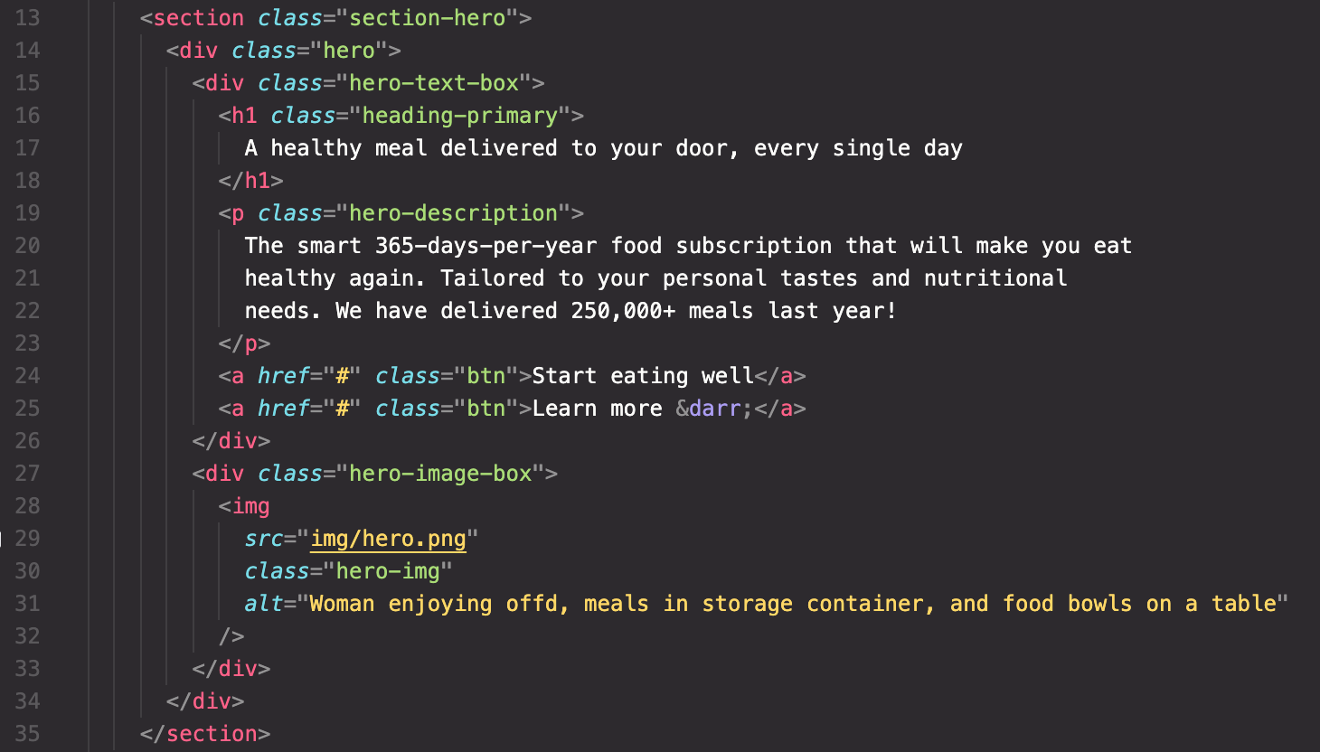
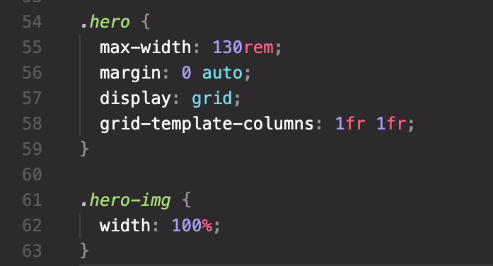
For the text and image elements, I divide them equally on both sides using css grid. This was easily done since all I had to do was use the grid-template-columns property and set both sides to 1fr. I also used the max-width property to set the maximum width of an element. This prevents other elements from becoming larger than the value specified by max-width. I have previously set the size of 1px to equal 10rem and so it was easier to use rem rather than pixel for sizing elements.
Up to this point, this is what I got for my website:
Now it's time to stylize and modify contents using css. First and foremost, I gave a background-color to the entire hero section to make it less boring.
For the layout, I added a gap on the hero section to give some more space between the texts and the images. I also used the align-items property and set it to center in order the vertically align both elements.
// New additions .section-hero { background-color: #fdf2e9; }.hero { gap: 9.6rem; align-items: center; }
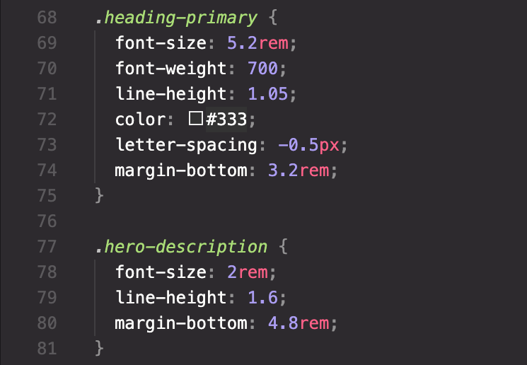
Since the size of the main header and the description were too small, I changed their font-size and font-weight I increaed the font-size and gave a bolder font-weight to the header to make it stand out more. On the other hand, I increased the font-size of the description just enough to grab attention right after the header. I also changed the color of the text to be slightly lighter to give it a bit more calm feeling. Additionally, I gave some spacing between letters on the header, while widening the margin on the bottom for both elements.
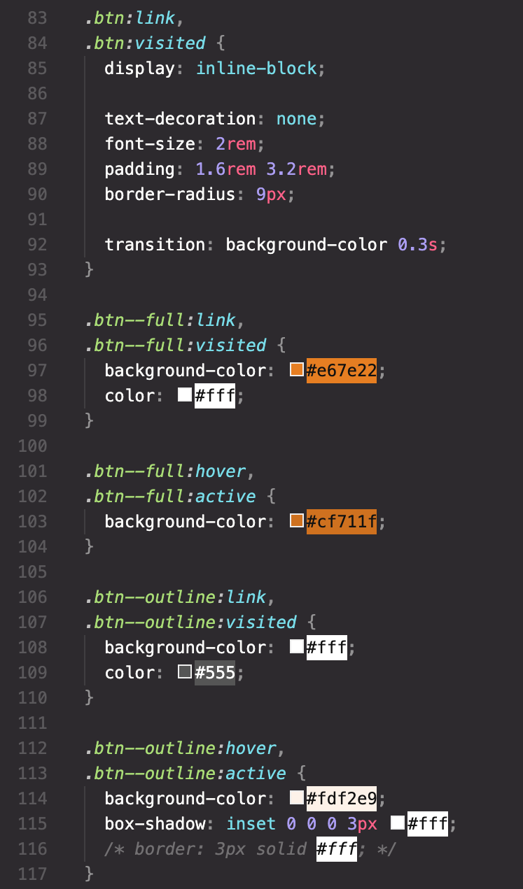
After stylizing the two text elements, it was time to move onto buttons. In order to show some decent effects for the buttons, I applied link selectors. Using all the selectors (link, visited, hover, active), I was able to give effects within various situation (e.g. the effects displayed when the cursor points to the button).
Especially for the color effects used for the buttons, I was able to give a stylish effect using the transition property where I was able to control the speed in which a color blends into the button. This felt as a very useful technique that could be used in a variety of situation.
After stylizing and sizing all the elements, this was how it turned out:
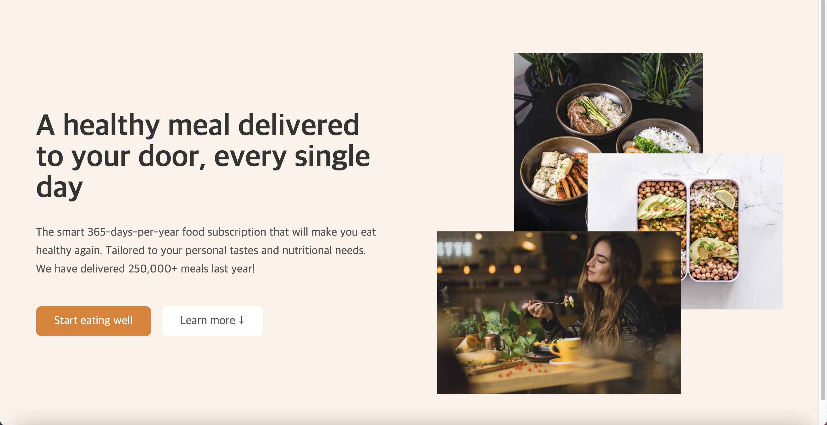
To finish building the hero section, I added some customer photos which represent a fictional data of the number of users using this website.
Using the images already given for this exercise, I created a new div element container along with another two new div elements inside the container. The first div element contained images of customers while the other dive elemnt had an advertisement text for the website. The images were stored stored by accessing their files.
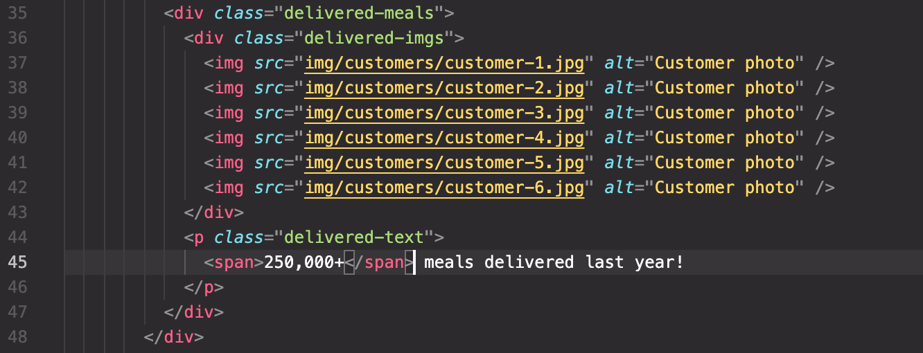
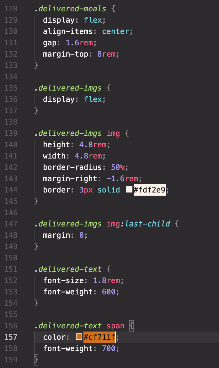
With all the contents in place, I used css to give them layout and design. For their layout, I used flexbox to form a horizontal line structure. Additionally, I gave the images a round border while giving some space between the images and the text (including space between images).
This gave me the following result:
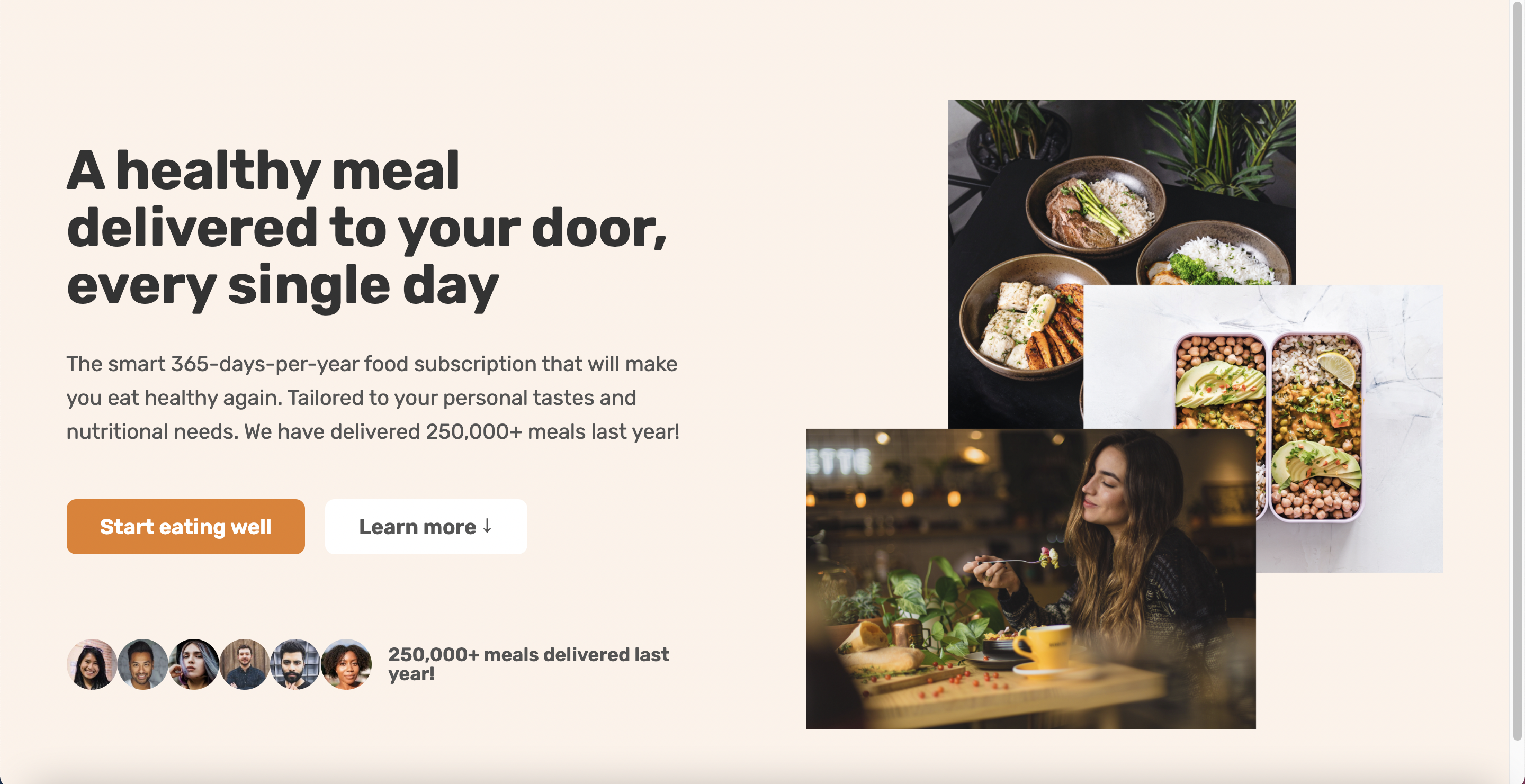
While the hero section was technically complete. I gave a few more design effects in order to make it look more professional.
By giving some negative values for the margin on the right side of each image, I was able to bring the images more closer together. Additionally, I gave some borders on each image along with a white color to make it look natural.
.delivered-imgs img {
  margin-right: 50%;
}
One problem with this method was that even the last image created a margin which was unnecessary. As such, I created a new last-child link class which helped me omit only the margin for the last image.
Lastly, I gave a color to the text that represented the average number of people using this website through the help of a website called 'coolers' which helped me find matching colors.
.delivered-imgs img:last-child {
  margin: 0;
}
Resources
Tint & Shade Generator --> https://maketintsandshades.com/
Google Fonts --> https://fonts.google.com/
Coolors --> https://coolors.co/
Thanks to your sharing about this section and merge fruit which is truly awesome.