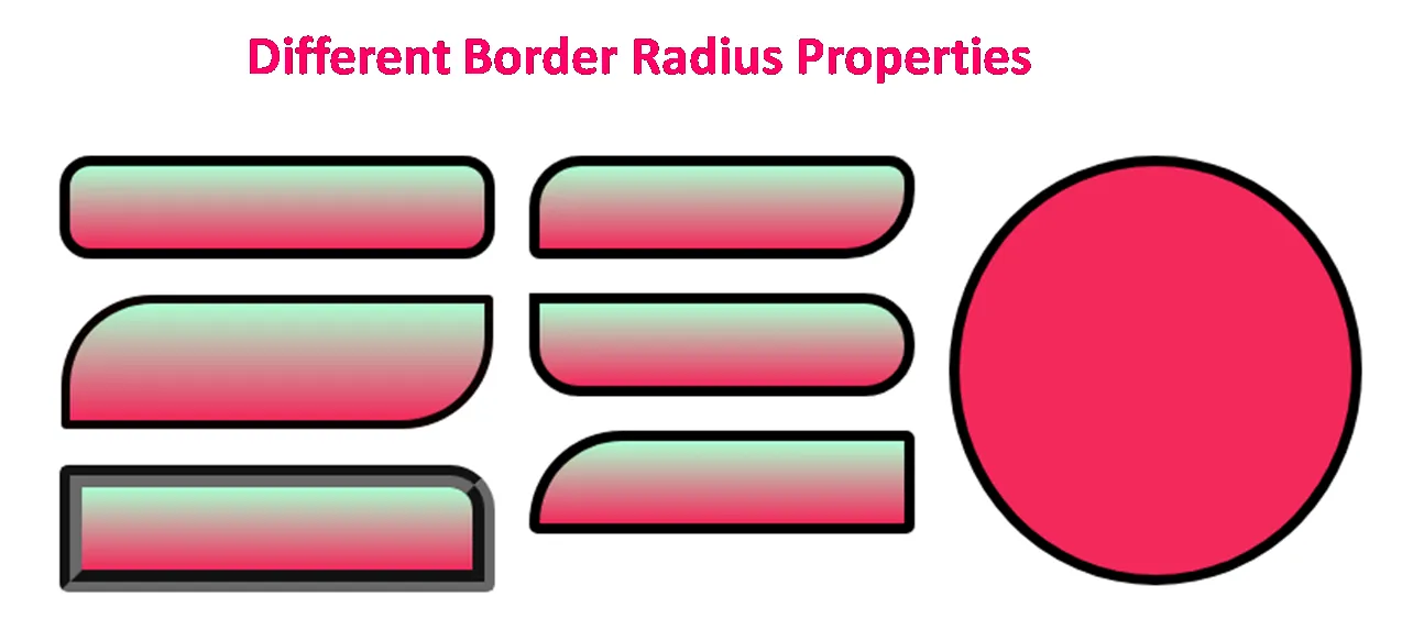
Using Border-radius
Though creating border-radius in various contents may look insignificant, this process is actually very important for the website to look unique. By giving border-radius, we are able to choose the overall mood of our website. For instance, if we do not give any border-radius, the personality of our website would convey a very serious or elegant atmosphere. On the other hand, if we apply border-radius to various elements, our website could convey a very playful and fun atmosphere. Looking at the actual websites where border-radius is applied and comparing it with ones that have no border-radius can give us a more clear picture.
We may use border-radius to also match the typeface of the text. For instance, if typeface we are using is 'round text', we can give border-radius to elments to display round shapes. If the typeface is squared, then we can give less border-radius but just enough for the elements to look playful.
Border-radius can be applied in most elements including buttons, images, around icons, and even entire sections.
// applying border-radius using css
Border-radius: <size>;

I like designing borders for my gaming website called gorilla tag . It is easy to do that. Thanks for your instruction