
1. seaborn 개요
- seaborn은 matplotlib과 함께 실행된다
1) seaborn 설치
- !conda install -y seaborn
2) seaborn import
## 임포트 등 세팅

import matplotlib.pyplot as plt
import seaborn as sns
from matplotlib import rc

plt.rcParams["axes.unicode_minus"] = False  # 마이너스 기호 사용
rc("font", family="Malgun Gothic")  # 한글 폰트 사용
get_ipython().run_line_magic("matplotlib", "inline") # seaborn은 matplotlib과 함께 실행된다
2. 예제 np.linspace()
1) np.linspace(0, 14, 100)
# 예제, 0부터 14 사이의 100개의 값 생성
x = np.linspace(0, 14, 100)
x

>>
array([ 0.        ,  0.14141414,  0.28282828,  0.42424242,  0.56565657,
        0.70707071,  0.84848485,  0.98989899,  1.13131313,  1.27272727,
        1.41414141,  1.55555556,  1.6969697 ,  1.83838384,  1.97979798,
        2.12121212,  2.26262626,  2.4040404 ,  2.54545455,  2.68686869,
        2.82828283,  2.96969697,  3.11111111,  3.25252525,  3.39393939,
        3.53535354,  3.67676768,  3.81818182,  3.95959596,  4.1010101 ,
        4.24242424,  4.38383838,  4.52525253,  4.66666667,  4.80808081,
        4.94949495,  5.09090909,  5.23232323,  5.37373737,  5.51515152,
        5.65656566,  5.7979798 ,  5.93939394,  6.08080808,  6.22222222,
        6.36363636,  6.50505051,  6.64646465,  6.78787879,  6.92929293,
        7.07070707,  7.21212121,  7.35353535,  7.49494949,  7.63636364,
        7.77777778,  7.91919192,  8.06060606,  8.2020202 ,  8.34343434,
        8.48484848,  8.62626263,  8.76767677,  8.90909091,  9.05050505,
        9.19191919,  9.33333333,  9.47474747,  9.61616162,  9.75757576,
        9.8989899 , 10.04040404, 10.18181818, 10.32323232, 10.46464646,
       10.60606061, 10.74747475, 10.88888889, 11.03030303, 11.17171717,
       11.31313131, 11.45454545, 11.5959596 , 11.73737374, 11.87878788,
       12.02020202, 12.16161616, 12.3030303 , 12.44444444, 12.58585859,
       12.72727273, 12.86868687, 13.01010101, 13.15151515, 13.29292929,
       13.43434343, 13.57575758, 13.71717172, 13.85858586, 14.        ])
# 4개의 실선 데이터 생성
x = np.linspace(0, 14, 100)
y1 = np.sin(x)
y2 = 2 * np.sin(x + 0.5)
y3 = 3 * np.sin(x + 1.0)
y4 = 4 * np.sin(x + 1.5)
2) plot() 그래프
plt.figure(figsize=(10, 6))
plt.plot(x, y1, x, y2, x, y3, x, y4)
plt.show()

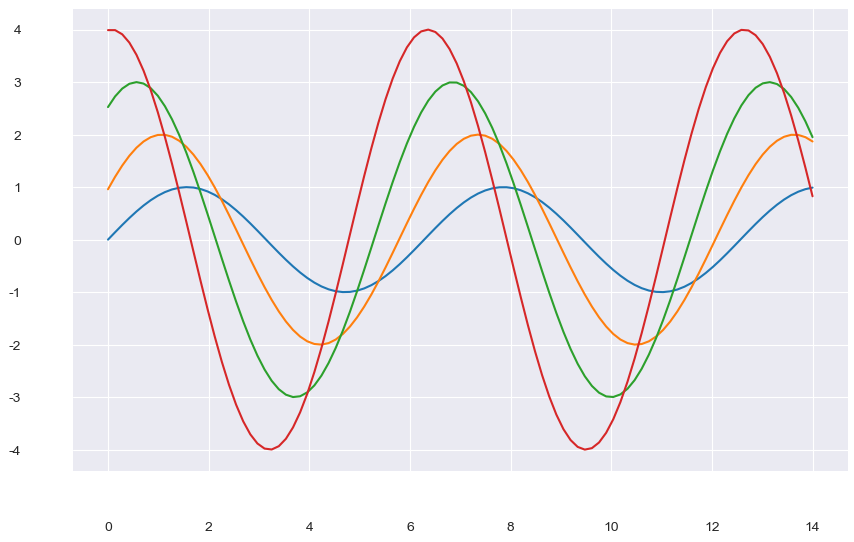
(1) despine 옵션
- despine 옵션 : x축, y축과 그래프 사이의 간격을 벌린다
# despine 옵션 : x축, y축과 그래프 사이의 간격을 벌린다
plt.figure(figsize=(10, 6))
plt.plot(x, y1, x, y2, x, y3, x, y4)
sns.despine(offset=30)
plt.show()
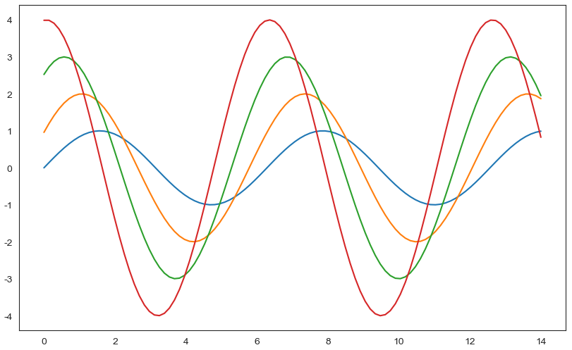
(2) set_style() 옵션
- 5가지 종류가 있다 : white, dark, whitegrid, darkgrid, ticks
# set_style()
# 5가지 종류가 있다 : white, dark, whitegrid, darkgrid, ticks

sns.set_style("white")
plt.figure(figsize=(10, 6))
plt.plot(x, y1, x, y2, x, y3, x, y4) # 쌍으로 넣어주면 4개의 실선 데이터가 생성된다.
plt.show()
# set_style()
# 5가지 종류가 있다 : white, dark, whitegrid, darkgrid, ticks

sns.set_style("dark")
plt.figure(figsize=(10, 6))
plt.plot(x, y1, x, y2, x, y3, x, y4)
plt.show()

# set_style()
# 5가지 종류가 있다 : white, dark, whitegrid, darkgrid, ticks

sns.set_style("whitegrid")
plt.figure(figsize=(10, 6))
plt.plot(x, y1, x, y2, x, y3, x, y4)
plt.show()

# set_style()
# 5가지 종류가 있다 : white, dark, whitegrid, darkgrid, ticks

sns.set_style("darkgrid")
plt.figure(figsize=(10, 6))
plt.plot(x, y1, x, y2, x, y3, x, y4)
plt.show()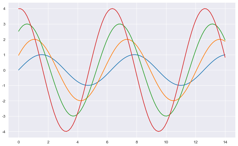
3. 예제 tips data
tips = sns.load_dataset("tips")
tips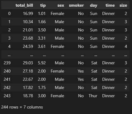
# total_bill, tip은 float 데이터, sex, smoker, day, time은 category 데이터임을 알아두자.
tips.info()

>>
<class 'pandas.core.frame.DataFrame'>
RangeIndex: 244 entries, 0 to 243
Data columns (total 7 columns):
 #   Column      Non-Null Count  Dtype
---  ------      --------------  -----
 0   total_bill  244 non-null    float64
 1   tip         244 non-null    float64
 2   sex         244 non-null    category
 3   smoker      244 non-null    category
 4   day         244 non-null    category
 5   time        244 non-null    category
 6   size        244 non-null    int64
dtypes: category(4), float64(2), int64(1)
memory usage: 7.4 KB
1) boxplot() 그래프
# tips 데이터, total_bill 컬럼
plt.figure(figsize=(8,6))
sns.boxplot(x=tips["total_bill"]) # 방법 1
# sns.boxplot(x="total_bill", data=tips) # 방법 2
# sns.boxplot( data=tips, x="total_bill") # 방법 3
plt.show()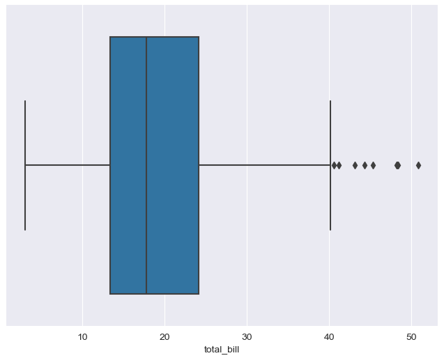
# x축, y축 지정
# 요일에 따른 total bill boxplot
plt.figure(figsize=(8,6))
sns.boxplot(x=tips["day"], y = tips["total_bill"]) # 방법 1
# sns.boxplot(x="day", y ="total_bill", data=tips) # 방법 2
# sns.boxplot(data=tips, y ="total_bill", x="day") # 방법 3
plt.show()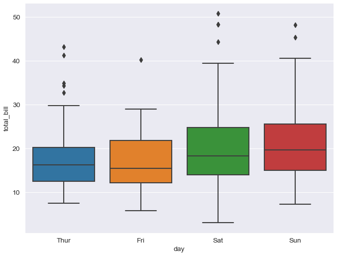
(1) hue, palette 옵션
- hue 옵션 : 카테고리 데이터 표현 옵션
- palette 옵션 : 색깔 옵션 (Set 1 ~ 3)
# hue 옵션 : 카테고리 데이터 표현 옵션
# palette 옵션 : 색깔 옵션 (Set 1 ~ 3)
plt.figure(figsize=(8,6))
sns.boxplot(x="day", y = "total_bill", data=tips, hue="smoker", palette="Set2")
plt.show()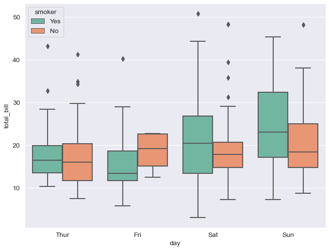
3) swarmplot
plt.figure(figsize=(8,6))
sns.swarmplot(x="day", y = "total_bill", data=tips)
plt.show()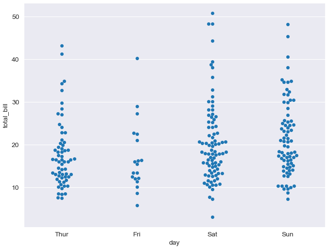
(1) color 옵션
- color 옵션 : 0-1 사이 검은색부터 흰색 사이 값을 조절(0: 검정, 1: 흰색)
# color 옵션 : 0-1 사이 검은색부터 흰색 사이 값을 조절(0: 검정, 1: 흰색)
plt.figure(figsize=(8,6))
sns.swarmplot(x="day", y = "total_bill", data=tips, color="0.5")
plt.show()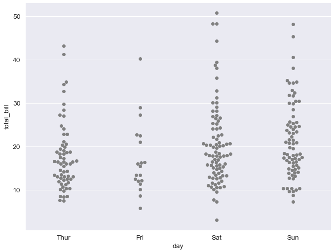
4) boxplot + swarmplot
plt.figure(figsize=(8,6))
sns.boxplot(x="day", y = "total_bill", data=tips)
sns.swarmplot(x="day", y = "total_bill", data=tips, color="0.25")
plt.show()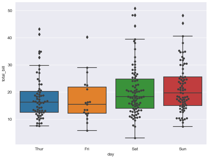
5) lmplot
(1) height 옵션
- height 옵션 : 그래프 크기(figsize 와 같다)
# lmplot : total_bill과 tip 사이 관계 파악
# height 옵션 : 그래프 크기(figsize 와 같다)
sns.set_style("darkgrid")
sns.lmplot(x="total_bill", y = "tip", data=tips, height=7)
plt.show()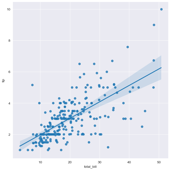
sns.lmplot(x="total_bill", y = "tip", hue="smoker", data=tips, height=7)
plt.show()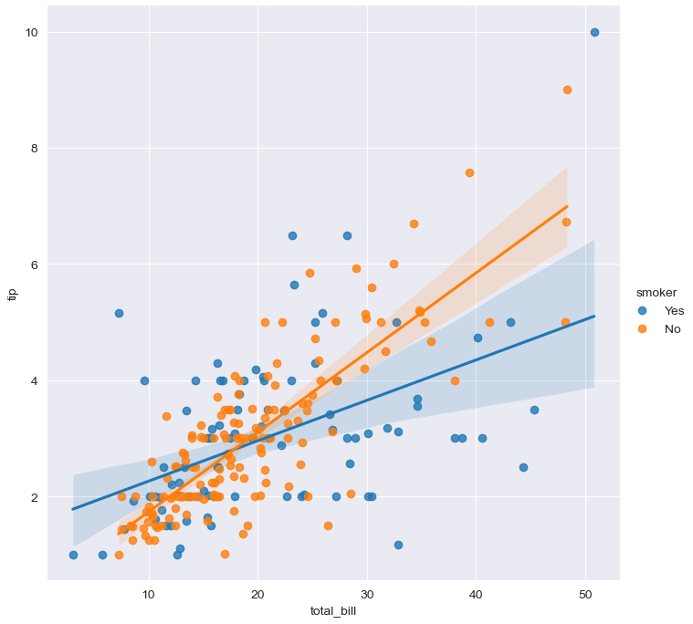
4. 예제 flights data
flights = sns.load_dataset("flights")
flights.head()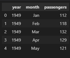
flights.info()

>>
<class 'pandas.core.frame.DataFrame'>
RangeIndex: 144 entries, 0 to 143
Data columns (total 3 columns):
 #   Column      Non-Null Count  Dtype
---  ------      --------------  -----
 0   year        144 non-null    int64
 1   month       144 non-null    category
 2   passengers  144 non-null    int64
dtypes: category(1), int64(2)
memory usage: 2.9 KB
(1) pivot 옵션
- pivot(index='month', columns='year', values='passengers')
flights = flights.pivot(index='month', columns='year', values='passengers')
flights.head()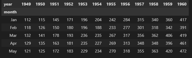
(2) annot, fmt, cmap 옵션
- annot 옵션: True(데이터 값 표시), False(데이터 값 미표시)
- fmt 옵션 : d(정수형 표현), f(실수형 표현)
- cmap 옵션 : 색상명
# annot 옵션: True(데이터 값 표시), False(데이터 값 미표시)
# fmt 옵션 : d(정수형 표현), f(실수형 표현)
# cmap 옵션 : 색상명

plt.figure(figsize=(10, 8))
sns.heatmap(data=flights, annot=True, fmt="d")
plt.show()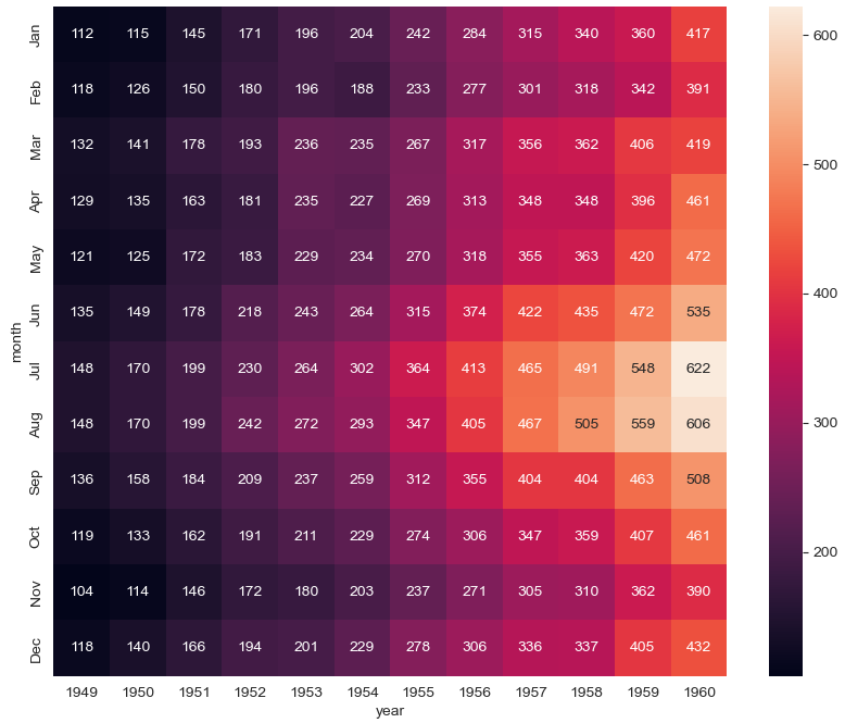
# annot 옵션: True(데이터 값 표시), False(데이터 값 미표시)
# fmt 옵션 : d(정수형 표현), f(실수형 표현)
# cmap 옵션 : 색상명

plt.figure(figsize=(10, 8))
sns.heatmap(data=flights, annot=True, fmt="d", cmap="YlGnBu")
plt.show()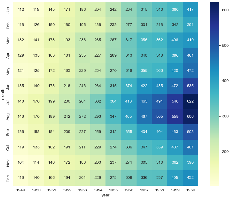
5. 예제 iris data
sns.set(style="ticks")
iris = sns.load_dataset("iris")
iris.head()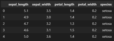
iris.info()
>>
<class 'pandas.core.frame.DataFrame'>
RangeIndex: 150 entries, 0 to 149
Data columns (total 5 columns):
# Column Non-Null Count Dtype
--- ------ -------------- -----
0 sepal_length 150 non-null float64
1 sepal_width 150 non-null float64
2 petal_length 150 non-null float64
3 petal_width 150 non-null float64
4 species 150 non-null object
dtypes: float64(4), object(1)
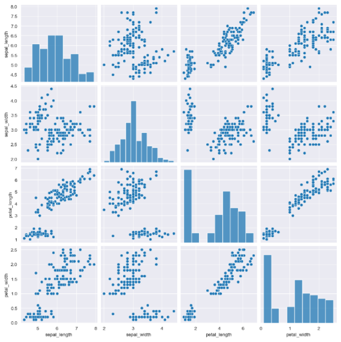
memory usage: 6.0+ KB1) pairplot
- pairplot : 값 전체 데이터에 대해서 모든 경우의 수를 그래프로 나타내준다.
- pairplot : 다수의 컬럼을 비교한다.
sns.pairplot(iris)
plt.show()
(내가 원하는 그래프가 안나와서 아래 그래프는 구글링함)
(1) ticks 옵션
- ticks : x축, y축 모양이 변했다.
# ticks : x축, y축 모양이 변했다.
sns.set_style("ticks")
sns.pairplot(iris)
plt.show()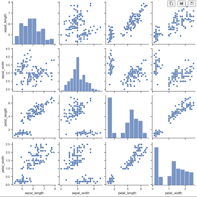
(2) hue 옵션(with pairplot)
- 원하는 데이터만 pairplot으로 나타내기
- hue option을 주기 전엔 한 가지 색상으로 표현되어 어떤 데이터를 나타내는지 알 수 없었는데 hue option을 주고 나선 한 눈에 데이터를 잘 알아볼 수 있다.
# iris의 species는 3가지 종류의 데이터가 있음을 알 수 있다.
iris["species"].unique()

>> array(['setosa', 'versicolor', 'virginica'], dtype=object)sns.pairplot(iris, hue="species")
plt.show()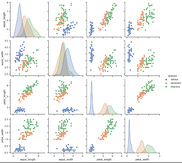
(3) 원하는 컬럼만 pairplot
sns.pairplot(iris,
             x_vars=["sepal_width", "sepal_length"],
             y_vars=["petal_width", "petal_length"])
plt.show()
sns.pairplot(iris,
             x_vars=["sepal_width", "sepal_length"],
             y_vars=["petal_width", "petal_length"],
             hue="species")
plt.show()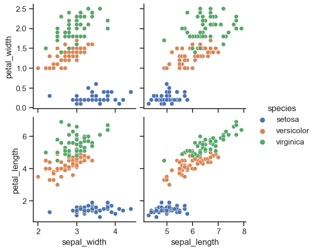
6. 예제 anscombe data
anscombe = sns.load_dataset("anscombe")
anscombe.head()
anscombe['dataset'].unique()

>>
array(['I', 'II', 'III', 'IV'], dtype=object)
(1) ci 옵션
- ci 옵션 : 신뢰구간 선택
# ci 옵션 : 신뢰구간 선택
sns.set_style("darkgrid")
sns.lmplot(x="x", y="y", data=anscombe.query("dataset == 'I'"), ci=None, height=7)
plt.show()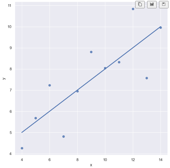
(2) scatter_kws 옵션
- scatter_kws 옵션 : 원 크기
# ci 옵션 : 신뢰구간 선택
# scatter_kws 옵션 : 원 크기

sns.set_style("darkgrid")
sns.lmplot(x="x",
           y="y",
           data=anscombe.query("dataset == 'I'"),
           ci=None,
           scatter_kws={"s":200},
           height=7)
plt.show()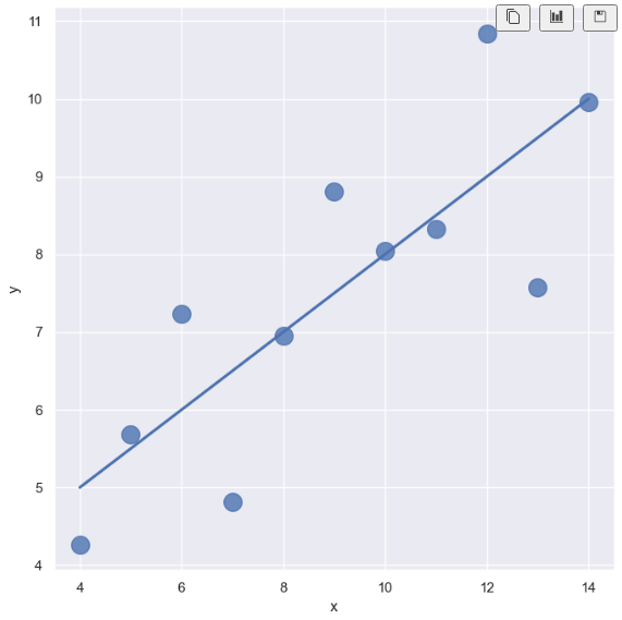
(3) order 옵션
- order 옵션 : curve
# ci 옵션 : 신뢰구간 선택
# scatter_kws 옵션 : 원 크기
# order 옵션 : curve

sns.set_style("darkgrid")
sns.lmplot(x="x",
           y="y",
           data=anscombe.query("dataset == 'II'"),
           order = 1,
           ci=None,
           scatter_kws={"s":10},
           height=7)
plt.show()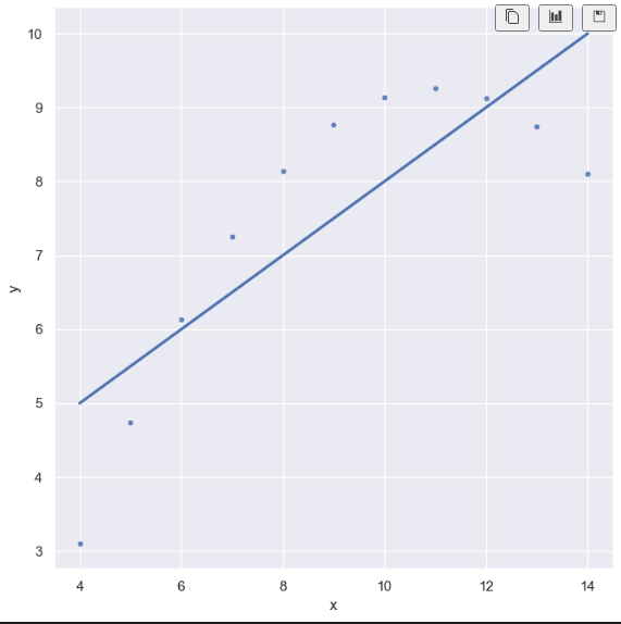
# ci 옵션 : 신뢰구간 선택
# scatter_kws 옵션 : 원 크기
# order 옵션 : curve

sns.set_style("darkgrid")
sns.lmplot(x="x",
           y="y",
           data=anscombe.query("dataset == 'II'"),
           order = 2,
           ci=None,
           scatter_kws={"s":200},
           height=7)
plt.show()
(4) robust 옵션 : outlier
- outlier(이상치, 특이치) 옵션 : 혼자 동떨어져있는 데이터 다루는 방법
- robust True : outlier 고려 안함
- robust False : outlier 고려함
# outlier
sns.set_style("darkgrid")
sns.lmplot(
    x="x",
    y="y",
    data=anscombe.query("dataset == 'III'"),
    ci=None,
    height=7,
    scatter_kws={"s": 80}) #ci: 신뢰구간 선택
plt.show()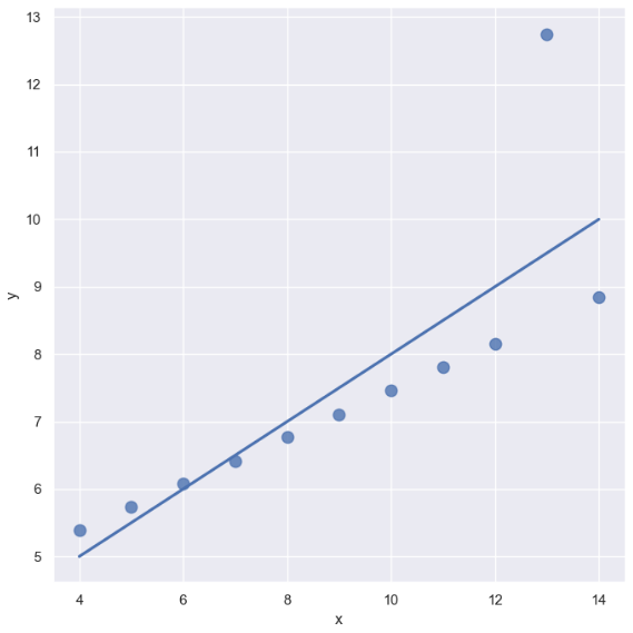
# outlier(이상치, 특이치) 옵션 : 혼자 동떨어져있는 데이터 다루는 방법
# robust True : outlier 고려 안함
# robust False : outlier 고려함
sns.set_style("darkgrid")
sns.lmplot(
    x="x",
    y="y",
    data=anscombe.query("dataset == 'III'"),
    robust=True,
    ci=None,
    height=7,
    scatter_kws={"s": 80}) #ci: 신뢰구간 선택
plt.show()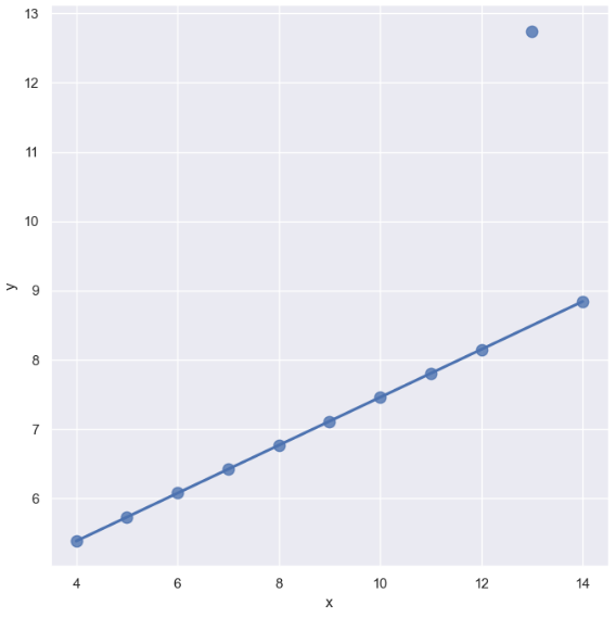
7. 서울시 범죄현황 데이터 시각화
시각화 패키지 불러오기
import matplotlib.pyplot as plt
import seaborn as sns
from matplotlib import rc

plt.rcParams["axes.unicode_minus"] = False
rc("font", family="Malgun Gothic")
get_ipython().run_line_magic("matplotlib", "inline")
- 최종 데이터
crime_anal_norm.head()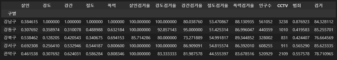
pairplot() 그래프
- 상관관계
pairplot-kind 옵션
kind 1. scatter
- 아무것도 넣지않으면 디폴트 값으로 scatter 이다.
# kind="reg" : 회귀선 넣기
sns.pairplot(data=crime_anal_norm,
             vars=["살인", "강도", "폭력"],
             size=3)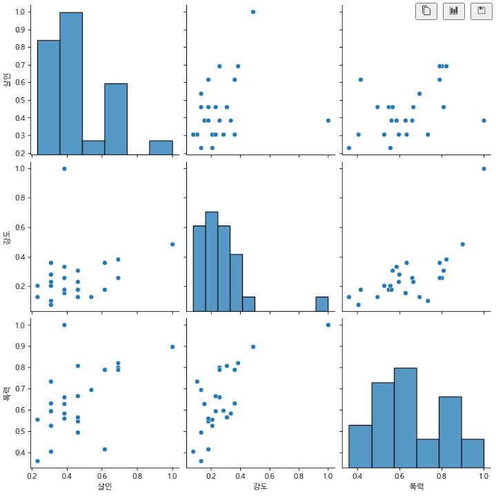
kind 2. reg(회귀선)
# kind="reg" : 회귀선 넣기
sns.pairplot(data=crime_anal_norm,
             vars=["살인", "강도", "폭력"],
             kind="reg",
             size=3)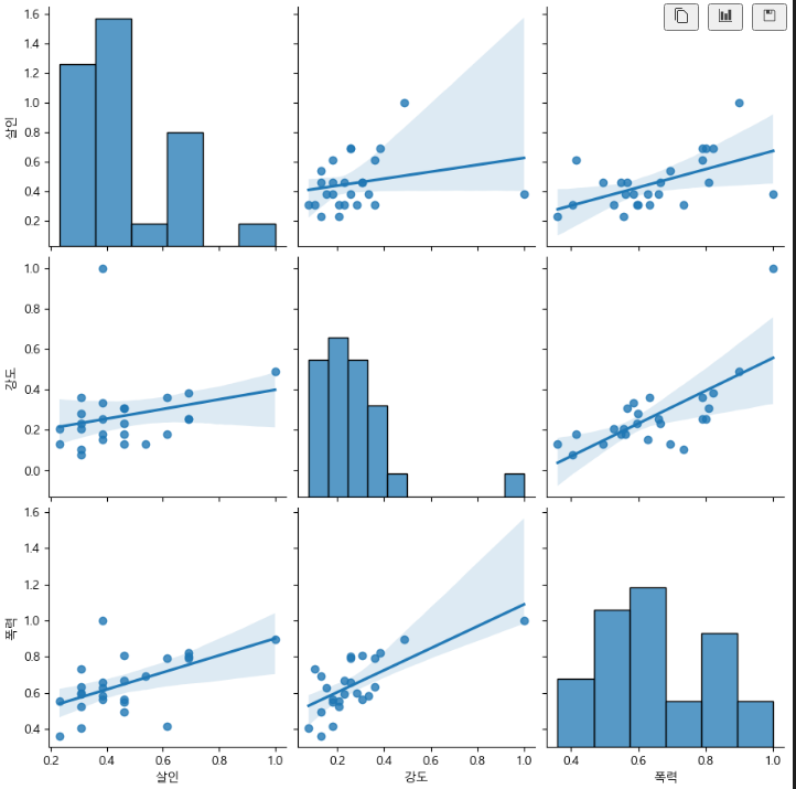
kind 3. kde
def draw():
    sns.pairplot(crime_anal_norm,
                 x_vars=["인구수", "CCTV"],
                 y_vars=["살인", "강도"],
                 kind="reg",
                 size=4
                )
    plt.show()
draw()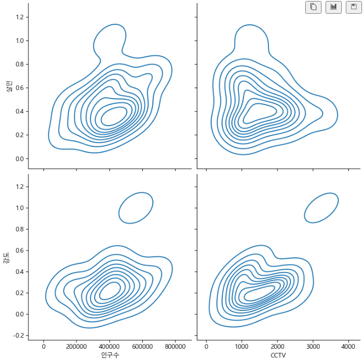
kind 4. hist
def draw():
    sns.pairplot(crime_anal_norm,
                 x_vars=["인구수", "CCTV"],
                 y_vars=["살인검거율", "폭력검거율"],
                 kind="reg",
                 size=4
                )
    plt.show()
draw()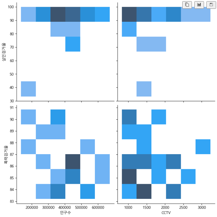
def draw():
    sns.pairplot(crime_anal_norm,
                 x_vars=["인구수", "CCTV"],
                 y_vars=["절도검거율", "강도검거율"],
                 kind="reg",
                 size=4
                )
    plt.show()
draw()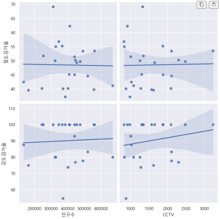
heatmap() 그래프
- df를 '검거' 컬럼을 기준으로 정렬
linewidths 옵션
- 히트맵 간격인 듯
- 디폴트값은 0
- linewidths=0.5 인 경우
def drawheat():
    target_col = ["강간검거율",
                  "강도검거율",
                  "살인검거율",
                  "절도검거율",
                  "폭력검거율",
                  "검거"]

    crime_anal_norm_sort = crime_anal_norm.sort_values(by="검거", ascending=False)

    plt.figure(figsize=(10, 10))
    sns.heatmap(data=crime_anal_norm_sort[target_col],
                annot=True,
                fmt="f",
                linewidths=0.5,
                cmap="RdPu"
               )
    plt.title("범죄 검거 비율(정규화된 검거의 합으로 정렬")
    plt.show()
drawheat()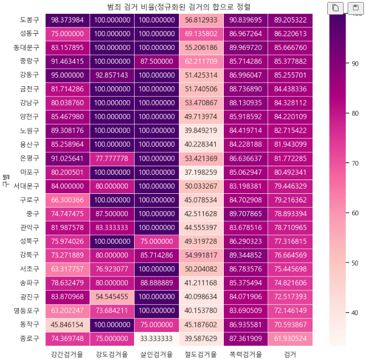
- linewidths=7 인 경우 (간격이 벌어져있다)
def drawheat():
    target_col = ["강간검거율",
                  "강도검거율",
                  "살인검거율",
                  "절도검거율",
                  "폭력검거율",
                  "검거"]

    crime_anal_norm_sort = crime_anal_norm.sort_values(by="검거", ascending=False)

    plt.figure(figsize=(10, 10))
    sns.heatmap(data=crime_anal_norm_sort[target_col],
                annot=True,
                fmt="f",
                linewidths=7,
                cmap="RdPu"
               )
    plt.title("범죄 검거 비율(정규화된 검거의 합으로 정렬")
    plt.show()
drawheat()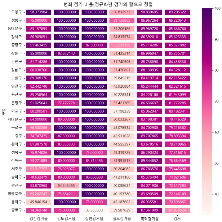
위 글은 제로베이스 데이터 취업 스쿨의 강의자료를 참고하여 작성되었습니다.

허재