기업협업 프로그램으로 참여하고 있는 프로젝트에 table 요소가 많이 사용되었다.
최대한 편하게 재사용할 수 있도록 직관적인 코드를 작성하고자 했는데, 테이블에 포함되어야 될 내용이 많다보니thead, td, tr 등이 복잡하게 난무하게 되었다.
(물론 내가 실력이 부족해서..지저분하게 구현될 확률이 높다..)
아무튼, 보기 좋은 코드를 작성하고 싶은 마음에 보다 깔끔하게 테이블을 구현할 방법을 찾아보았고 react-table이라는 라이브러리를 사용하여 구현을 많이 하기에 나도 사용해보았다🤗(귀가 얇은 편..)
react-table을 사용한 이유
bootstrap을 통해 편하게 테이블을 구현할 수 있었음에도 react-table을 사용한 이유는 크게 두가지가 있었다.
-
bootstrap을 사용하는 경우 스타일링으로 사용하고자 한styled-components를 포기해야 했다.
bootstrap이Sass기반으로 움직이다 보니, 여태styled-components로 구현한 내용을 다Sass로 변경해야 했는데, 몇페이지 되지 않는 테이블을 위해 전체 스타일링을 변경해야되는 것이 비효율적인 것으로 판단되어bootstrap을 포기했다. -
react-table를 사용한 경우가 코드가 더 깔끔했다.
bootstrap을 사용하는 경우에도thead,th,td,tr이 빠짐없이 사용되기에 셀의 양이 증가할수록 코드가 복잡해지는건 매한가지였다.
허나,react-table의 경우 mapping을 활용하기에 최적화되어 있어, 코드가 더 편하게 눈에 들어왔다.
// Bootstrap 사용 예
<table class="table">
  <thead>
    <tr>
      <th scope="col">#</th>
      <th scope="col">First</th>
      <th scope="col">Last</th>
      <th scope="col">Handle</th>
    </tr>
  </thead>
  <tbody>
    <tr>
      <th scope="row">1</th>
      <td>Mark</td>
      <td>Otto</td>
      <td>@mdo</td>
    </tr>
    <tr>
      <th scope="row">2</th>
      <td>Jacob</td>
      <td>Thornton</td>
      <td>@fat</td>
    </tr>
    <tr>
      <th scope="row">3</th>
      <td>Larry</td>
      <td>the Bird</td>
      <td>@twitter</td>
    </tr>
  </tbody>
</table>
// react-table 사용 예
<TableSheet {...getTableProps()}>
<TableHead>
{headerGroups.map(header => (
<Header {...header.getHeaderGroupProps()}>
{header.headers.map(col => (
<Th {...col.getHeaderProps()}>{col.render('Header')} />
))}
</Header>
))}
</TableHead>
<tbody {...getTableBodyProps()}>
{rows.map(row => {
prepareRow(row);
return (
<tr {...row.getRowProps()}>
{row.cells.map(cell => (
<Td {...cell.getCellProps()}>{cell.render('Cell')} />
))}
</tr>
);
})}
</tbody>
</TableSheet>위의 코드를 보면 알겠지만, react-table 쪽이 tr, td 를 보다 간단명료하게 사용할 수 있다..!
시작하기
우선 react-table 설치로 시작한다
// npm
 npm install react-table --save

// yarn
yarn add react-table
테이블 데이터 설정하기
react-table을 사용하여 테이블을 제작하려면, 우선 테이블에 입력할 data를 알맞게 정리해놓아야 한다.
data에는 각 세로 열의 header 데이터를 담은 columns와, header와 연결되어 전체 셀 데이터를 담은 data가 담겨져있어야 한다.
즉,
| header | header |
|---|---|
| data | data |
| data | data |
이런 식으로 각 데이터가 출력될 예정이다
모든 데이터는 처음에 한번만 render되어야 하기에 데이터 호출 시 useMemo를 사용한다
column 입력
column은 배열 형태로 입력되어야 한다.
배열 안에는 각 column을 구성할 항목들이 object형태로 들어가있어야 한다.
Header에는 테이블에 출력될 header 이름을, accessor에는 data object와 연결할 key name을 기재한다.
const columnData = [
      {
        accessor: 'email',
        Header: 'Email',
      },
      {
        accessor: 'walletID',
        Header: 'Wallet ID',
      },
      {
        accessor: 'coin_list',
        Header: 'Wallet Balance',
      },
      {
        accessor: 'created_at',
        Header: 'Created At',
      },
      {
        accessor: 'edited_at',
        Header: 'Edited At',
      },
]

const columns = useMemo(() => columnData, []);
data 입력
data도 동일하게 배열 내 객체 형태로 입력되어야 된다.
columns의 accessor와 key name이 일치한지 주의하여 입력한다.
const data = useMemo(() => [{
    "email": "이메일이에용",
    "walletID": "아이디에용",
    "created_at": "2021-08-03 01:14:47",
    "edited_at": "2021-08-03 01:15:49",
    "coin_list": ["TRV", "BTC", "BCH", "ETH"]
}], [])
객체 내 object 형태로만 넘겨주면 되기에, 네트워크로 받아온 데이터를 바로 넘길 수 있다.
const [info, setInfo] = useState();

const getTamWallet = () => {
  data.getTamWallet().then(item => setInfo(item));
};

const data = useMemo(() => info, [info])
table 구성하기
columns와 data가 준비되었다면 아래와같이 table을 출력한다.
table을 출력하기위해선 기본적으로 아래 5가지가 필요하다.
- getTableProps() -
react-table로 table을 만들고 싶은 경우 선언되어야 한다.
이 메서드를 통해 필요한 property, method를 활용할 수 있다. - getTableBodyProps() -
react-table로 table body를 만들어야되는 경우 선언되어야 한다. - headerGroups - header 부분에 들어갈 데이터를 담고 있다.
- rows - 전달한 data를 받는 곳
- prepareRow() - 각각의 data들을 한 줄씩 묶음으로 가공한다.
import React from 'react';
import { useTable } from 'react-table';
import styled from 'styled-components';

// useTable에다가 작성한 columns와 data를 전달한 후 아래 4개의 props를 받아온다
const Table = ({ columns, data }) => {
  const { getTableProps, getTableBodyProps, headerGroups, rows, prepareRow } =
    useTable({ columns, data });

  return (
    <TableSheet {...getTableProps()}>
      <TableHead>
        {headerGroups.map(header => (
          // getHeaderGroupProps를 통해 header 배열을 호출한다
          <Header {...header.getHeaderGroupProps()}>
            {header.headers.map(col => (
              // getHeaderProps는 각 셀 순서에 맞게 header를 호출한다
              <Th {...col.getHeaderProps()}>{col.render('Header')}</Th>
            ))}
          </Header>
        ))}
      </TableHead>
      <tbody {...getTableBodyProps()}>
        {rows.map(row => {
          prepareRow(row);
          return (
            // getRowProps는 각 row data를 호출해낸다
            <tr {...row.getRowProps()}>
              {row.cells.map(cell => (
                // getCellProps는 각 cell data를 호출해낸다
                <Td {...cell.getCellProps()}>{cell.render('Cell')}</Td>
              ))}
            </tr>
          );
        })}
      </tbody>
    </TableSheet>
  );
};
결과물
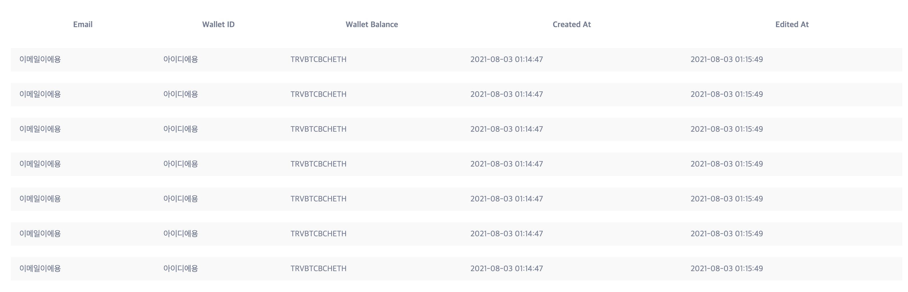
간단하게 표를 만들어냈다.
그런데 Wallet Balance 부분에 각 항목들이 다닥다닥 붙어서 출력되어 시각적으로 잘 들어오지 않는다.
이런 경우를 위해 react-table에서는 custom styling을 지원한다.
한번 이를 활용하여 위의 테이블을 보다 가시적으로 만들어보자!
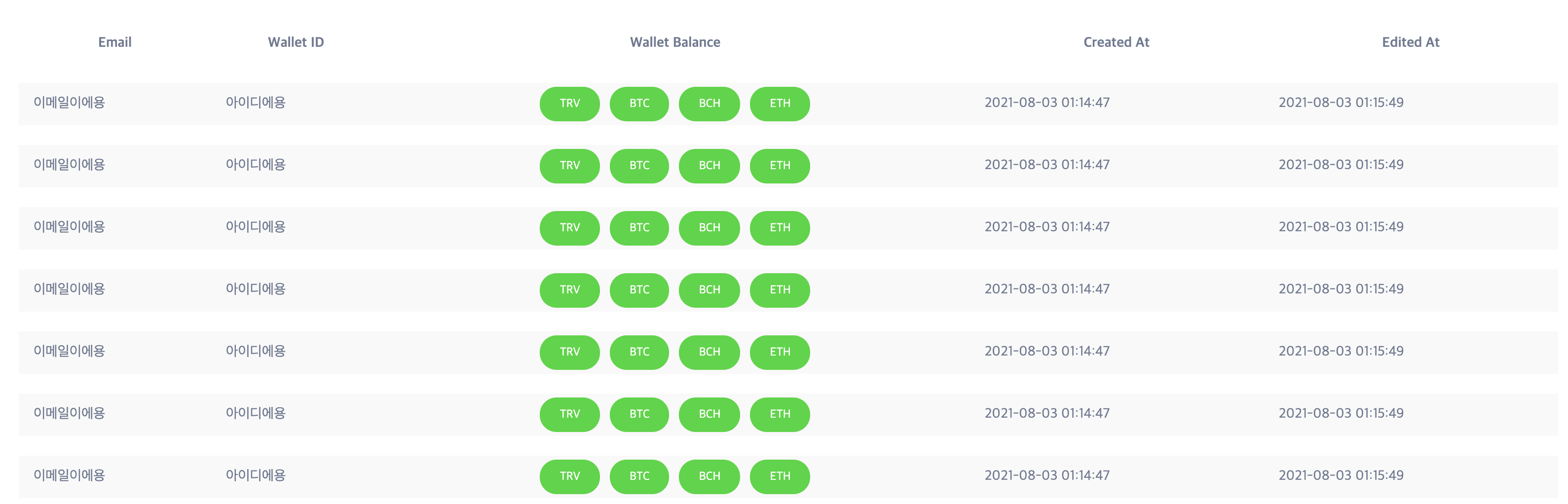
응용 - custom styling 적용하기
cell의 디자인을 변경시켜야하기 때문에 columns data에 cell 항목을 추가하여 스타일링을 진행한다.
const columnData = [
      {
        accessor: 'email',
        Header: 'Email',
      },
      {
        accessor: 'walletID',
        Header: 'Wallet ID',
      },
      {
        accessor: 'coin_list',
        Header: 'Wallet Balance',
        Cell: ({ cell: { value } }) => <Balance values={value} />,
      },
      {
        accessor: 'created_at',
        Header: 'Created At',
      },
      {
        accessor: 'edited_at',
        Header: 'Edited At',
}]react-table의 스타일링은 custom hook을 활용하여 작업해을 해야하기에, cell의 값들만 별도로 추출하여 Balance component로 보내준다.
cell을 갖고 작업하는 경우({ value }) => String(value) 형태를 기본으로 잡고 활용해야한다.
const Tags = styled.span`
  background-color: #00d82c;
  color: #fff;
  font-size: 1.2rem;
  margin: 0 0.5rem;
  padding: 1rem 2rem;
  border-radius: 3rem;
`;

const Balance = ({ values }) => {
  return (
    <div style={{ textAlign: 'center' }}>
      {values.map((coin, idx) => {
        return <Tags key={idx}>{coin}</Tags>;
      })}
    </div>
  );
};
이렇게 cell 값들을 별도로 추출해내어, 위와 같이 스타일링 작업을 진행해주면 아래와 같이 이쁘게 cell styling이 적용된 것을 확인할 수 있다🤗
참고자료