
📌 개요
이전 글에서는 Jetpack Compose 애니메이션의 기초를 배웠습니다. 값의 부드러운 변화(animateFloatAsState, animateColorAsState), 레이아웃 애니메이션(animateContentSize), 그리고 UI 전환 효과(AnimatedVisibility, AnimatedContent)를 통해 기본적인 애니메이션을 구현해봤죠.
하지만 실제 앱을 개발할 때는 더 복잡한 상황들을 마주하게 됩니다. 리스트에서 아이템을 추가하고 삭제할 때 다른 아이템들이 자연스럽게 재배치되어야 하고, 여러 애니메이션이 동시에 실행될 때 서로 간섭하지 않아야 하며, 성능도 고려해야 합니다.
이번 2부에서는 앱 개발에서 만날 수 있는 고급 애니메이션 기법들을 다뤄보겠습니다. 특히 리스트 애니메이션, 복합 애니메이션, 성능 최적화에 중점을 두고, 실제 프로젝트에서 활용해볼 수 있는 패턴들을 소개하겠습니다.
1. 리스트 애니메이션 마스터하기
리스트 애니메이션은 많은 앱에서 볼 수 있지만 구현이 까다로운 부분입니다. 단순히 아이템을 추가/제거하는 것이 아니라, 다른 아이템들이 자연스럽게 위치를 이동하면서도 각 아이템의 고유성을 유지해야 합니다.
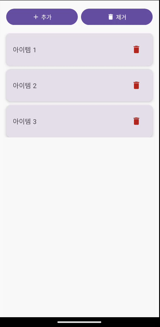
1-1. 코드예시
data class ListItem(
    val id: Int,
    val text: String
)

@Composable
fun AnimatedListExample() {
    var items by remember {
        mutableStateOf(
            listOf(
                ListItem(1, "아이템 1"),
                ListItem(2, "아이템 2"),
                ListItem(3, "아이템 3")
            )
        )
    }
    var nextItemId by remember { mutableIntStateOf(4) }

    Column(
        modifier = Modifier
            .fillMaxSize()
            .padding(16.dp)
    ) {
        // 컨트롤 버튼들
        Row(
            modifier = Modifier.fillMaxWidth(),
            horizontalArrangement = Arrangement.spacedBy(8.dp)
        ) {
            Button(
                onClick = {
                    items = items + ListItem(nextItemId, "아이템 $nextItemId")
                    nextItemId++
                },
                modifier = Modifier.weight(1f)
            ) {
                Icon(
                    imageVector = Icons.Default.Add,
                    contentDescription = null,
                    modifier = Modifier.size(18.dp)
                )
                Spacer(modifier = Modifier.width(4.dp))
                Text("추가")
            }
            Button(
                onClick = {
                    if (items.isNotEmpty()) {
                        items = items.dropLast(1)
                    }
                },
                modifier = Modifier.weight(1f)
            ) {
                Icon(
                    imageVector = Icons.Default.Delete,
                    contentDescription = null,
                    modifier = Modifier.size(18.dp)
                )
                Spacer(modifier = Modifier.width(4.dp))
                Text("제거")
            }
        }

        Spacer(modifier = Modifier.height(16.dp))

        // 애니메이션 리스트
        LazyColumn(
            verticalArrangement = Arrangement.spacedBy(8.dp)
        ) {
            items(
                items = items,
                key = { it.id }
            ) { item ->
                AnimatedVisibility(
                    visible = true,
                    enter = slideInVertically(
                        initialOffsetY = { -it },
                        animationSpec = tween(500)
                    ) + fadeIn(tween(500)) + expandVertically(tween(500)),
                    exit = slideOutVertically(
                        targetOffsetY = { it },
                        animationSpec = tween(500)
                    ) + fadeOut(tween(500)) + shrinkVertically(tween(500)),
                    modifier = Modifier
                        .animateItem( // 위치 변경 애니메이션
                            fadeInSpec = tween(500),
                            fadeOutSpec = tween(500),
                            placementSpec = tween(500)
                        )
                        .fillMaxWidth()
                ) {
                    ListItemCard(
                        item = item,
                        onDelete = {
                            items = items.filter { it.id != item.id }
                        }
                    )
                }
            }
        }
    }
}

@Composable
fun ListItemCard(
    item: ListItem,
    onDelete: () -> Unit
) {
    Card(
        modifier = Modifier.fillMaxWidth(),
        elevation = CardDefaults.cardElevation(defaultElevation = 4.dp)
    ) {
        Row(
            modifier = Modifier
                .fillMaxWidth()
                .padding(16.dp),
            horizontalArrangement = Arrangement.SpaceBetween,
            verticalAlignment = Alignment.CenterVertically
        ) {
            Text(
                text = item.text,
                style = MaterialTheme.typography.bodyLarge,
                modifier = Modifier.weight(1f)
            )
            IconButton(onClick = onDelete) {
                Icon(
                    imageVector = Icons.Default.Delete,
                    contentDescription = "삭제",
                    tint = MaterialTheme.colorScheme.error
                )
            }
        }
    }
}

@Preview(showBackground = true)
@Composable
fun AnimatedListExamplePreview() {
    AnimatedListExample()
}
1-2. 리스트 애니메이션의 핵심 포인트
key파라미터: 각 아이템의 고유성을 보장하여 올바른 애니메이션 적용animateItem(): 위치 변경을 자동으로 애니메이션 (이전animateItemPlacement()의 최신 대체)- 애니메이션 조합:
slideIn/Out + fade + expand/shrink로 자연스러운 효과 - 일관된 타이밍: 모든 애니메이션을 같은 duration으로 동기화
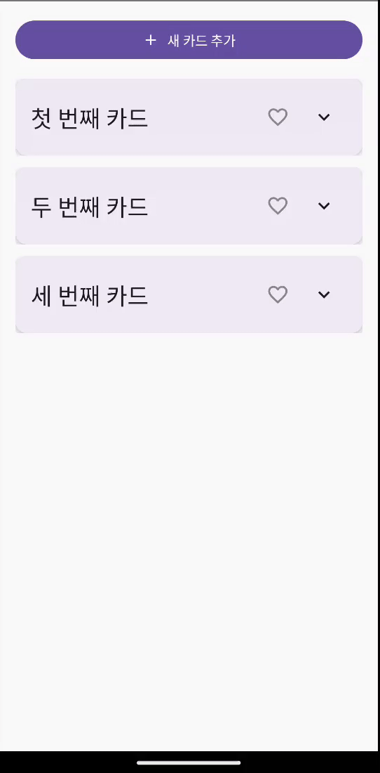
2. 종합 실습: 인터랙티브 카드 컬렉션
이제 1편에서 배운 기본 애니메이션들과 리스트 애니메이션을 조합해서 앱에서 사용할 수 있는 복합적인 UI를 만들어보겠습니다.
2-1. 코드 예시
data class CardItem(
    val id: Int,
    val title: String,
    val description: String,
    val isFavorite: Boolean = false
)

@Composable
fun InteractiveCardCollection() {
    var cards by remember {
        mutableStateOf(
            listOf(
                CardItem(1, "첫 번째 카드", "이것은 첫 번째 카드의 상세 설명입니다. 카드를 클릭하면 이 내용을 볼 수 있어요."),
                CardItem(2, "두 번째 카드", "두 번째 카드의 내용입니다. 즐겨찾기 기능도 사용해보세요!"),
                CardItem(3, "세 번째 카드", "마지막 카드입니다. 삭제 버튼을 눌러 애니메이션을 확인해보세요.")
            )
        )
    }
    var nextCardId by remember { mutableIntStateOf(4) }

    Column(
        modifier = Modifier
            .fillMaxSize()
            .padding(16.dp)
    ) {
        // 카드 추가 버튼
        Button(
            onClick = {
                cards = cards + CardItem(
                    id = nextCardId,
                    title = "새로운 카드 $nextCardId",
                    description = "이것은 새로 추가된 카드입니다."
                )
                nextCardId++
            },
            modifier = Modifier.fillMaxWidth()
        ) {
            Icon(
                imageVector = Icons.Default.Add,
                contentDescription = null,
                modifier = Modifier.size(18.dp)
            )
            Spacer(modifier = Modifier.width(8.dp))
            Text("새 카드 추가")
        }

        Spacer(modifier = Modifier.height(16.dp))

        LazyColumn(
            verticalArrangement = Arrangement.spacedBy(12.dp)
        ) {
            items(
                items = cards,
                key = { it.id }
            ) { card ->
                InteractiveCard(
                    card = card,
                    onFavoriteToggle = { cardId ->
                        cards = cards.map {
                            if (it.id == cardId) it.copy(isFavorite = !it.isFavorite)
                            else it
                        }
                    },
                    onDelete = { cardId ->
                        cards = cards.filter { it.id != cardId }
                    },
                    modifier = Modifier.animateItem(
                        fadeInSpec = spring(
                            dampingRatio = Spring.DampingRatioMediumBouncy,
                            stiffness = Spring.StiffnessMedium
                        ),
                        fadeOutSpec = spring(
                            dampingRatio = Spring.DampingRatioMediumBouncy,
                            stiffness = Spring.StiffnessMedium
                        ),
                        placementSpec = spring(
                            dampingRatio = Spring.DampingRatioMediumBouncy,
                            stiffness = Spring.StiffnessMedium
                        )
                    )
                )
            }
        }
    }
}

@Composable
fun InteractiveCard(
    card: CardItem,
    onFavoriteToggle: (Int) -> Unit,
    onDelete: (Int) -> Unit,
    modifier: Modifier = Modifier
) {
    var isExpanded by remember { mutableStateOf(false) }

    val cardElevation by animateDpAsState(
        targetValue = if (isExpanded) 12.dp else 4.dp,
        animationSpec = spring(
            dampingRatio = Spring.DampingRatioNoBouncy,
            stiffness = Spring.StiffnessMedium
        ),
        label = "cardElevation"
    )

    val favoriteColor by animateColorAsState(
        targetValue = if (card.isFavorite) Color.Red else Color.Gray,
        animationSpec = tween(300),
        label = "favoriteColor"
    )

    Card(
        modifier = modifier
            .fillMaxWidth()
            .animateContentSize(
                animationSpec = spring(
                    dampingRatio = Spring.DampingRatioNoBouncy,
                    stiffness = Spring.StiffnessMedium
                )
            )
            .clickable { isExpanded = !isExpanded },
        elevation = CardDefaults.cardElevation(defaultElevation = cardElevation),
        colors = CardDefaults.cardColors(
            containerColor = if (isExpanded)
                MaterialTheme.colorScheme.primaryContainer
            else
                MaterialTheme.colorScheme.surface
        )
    ) {
        Column(
            modifier = Modifier.padding(16.dp)
        ) {
            // 헤더
            Row(
                modifier = Modifier.fillMaxWidth(),
                horizontalArrangement = Arrangement.SpaceBetween,
                verticalAlignment = Alignment.CenterVertically
            ) {
                Text(
                    text = card.title,
                    style = MaterialTheme.typography.headlineSmall,
                    modifier = Modifier.weight(1f)
                )

                Row {
                    // 즐겨찾기 버튼
                    IconButton(onClick = { onFavoriteToggle(card.id) }) {
                        Icon(
                            imageVector = if (card.isFavorite)
                                Icons.Filled.Favorite
                            else
                                Icons.Default.FavoriteBorder,
                            contentDescription = "즐겨찾기",
                            tint = favoriteColor
                        )
                    }

                    // 펼치기/접기 버튼
                    IconButton(onClick = { isExpanded = !isExpanded }) {
                        Icon(
                            imageVector = if (isExpanded)
                                Icons.Default.KeyboardArrowUp
                            else
                                Icons.Default.KeyboardArrowDown,
                            contentDescription = "펼치기/접기"
                        )
                    }
                }
            }

            // 펼쳐지는 내용
            AnimatedVisibility(
                visible = isExpanded,
                enter = slideInVertically(
                    initialOffsetY = { -it / 3 },
                    animationSpec = spring(
                        dampingRatio = Spring.DampingRatioNoBouncy,
                        stiffness = Spring.StiffnessMedium
                    )
                ) + fadeIn(
                    spring(
                        dampingRatio = Spring.DampingRatioNoBouncy,
                        stiffness = Spring.StiffnessMedium
                    )
                ) + expandVertically(
                    animationSpec = spring(
                        dampingRatio = Spring.DampingRatioNoBouncy,
                        stiffness = Spring.StiffnessMedium
                    )
                ),
                exit = slideOutVertically(
                    targetOffsetY = { -it / 3 },
                    animationSpec = spring(
                        dampingRatio = Spring.DampingRatioNoBouncy,
                        stiffness = Spring.StiffnessMedium
                    )
                ) + fadeOut(
                    spring(
                        dampingRatio = Spring.DampingRatioNoBouncy,
                        stiffness = Spring.StiffnessMedium
                    )
                ) + shrinkVertically(
                    animationSpec = spring(
                        dampingRatio = Spring.DampingRatioNoBouncy,
                        stiffness = Spring.StiffnessMedium
                    )
                )
            ) {
                Column {
                    Spacer(modifier = Modifier.height(8.dp))
                    Text(
                        text = card.description,
                        style = MaterialTheme.typography.bodyMedium
                    )
                    Spacer(modifier = Modifier.height(16.dp))

                    // 액션 버튼들
                    Row(
                        modifier = Modifier.fillMaxWidth(),
                        horizontalArrangement = Arrangement.spacedBy(8.dp)
                    ) {
                        Button(
                            onClick = { /* 편집 액션 */ },
                            modifier = Modifier.weight(1f)
                        ) {
                            Icon(
                                imageVector = Icons.Default.Edit,
                                contentDescription = null,
                                modifier = Modifier.size(16.dp)
                            )
                            Spacer(modifier = Modifier.width(4.dp))
                            Text("편집")
                        }
                        Button(
                            onClick = { onDelete(card.id) },
                            colors = ButtonDefaults.buttonColors(
                                containerColor = MaterialTheme.colorScheme.error
                            ),
                            modifier = Modifier.weight(1f)
                        ) {
                            Icon(
                                imageVector = Icons.Default.Delete,
                                contentDescription = null,
                                modifier = Modifier.size(16.dp)
                            )
                            Spacer(modifier = Modifier.width(4.dp))
                            Text("삭제")
                        }
                    }
                }
            }
        }
    }
}

@Preview(showBackground = true)
@Composable
fun AnimatedListExamplePreview() {
    AnimatedListExample()
}
2-2. 복합 애니메이션에서 주의할 점
- 애니메이션 스펙 통일: 모든 관련 애니메이션의
stiffness와dampingRatio를 같게 설정 - 성능 고려: 너무 많은 애니메이션이 동시에 실행되지 않도록 주의
- 사용자 의도 존중: 사용자가 빠르게 여러 작업을 할 때 애니메이션이 방해되지 않도록
3. 다양한 애니메이션 패턴 살펴보기
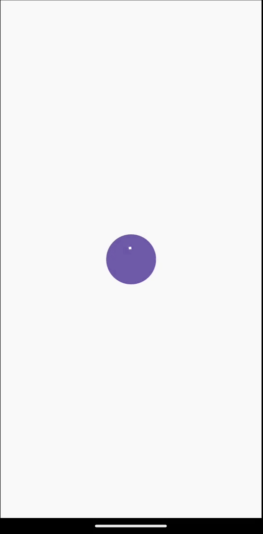
3-1. 무한 반복 로딩 애니메이션
앱에서 볼 수 있는 로딩 인디케이터를 만들어보겠습니다.
@Composable
fun PulsingLoadingIndicator() {
val infiniteTransition = rememberInfiniteTransition(label = "pulsingAnimation")
val scale by infiniteTransition.animateFloat(
initialValue = 0.7f,
targetValue = 1.3f,
animationSpec = infiniteRepeatable(
animation = tween(1200, easing = EaseInOutCubic),
repeatMode = RepeatMode.Reverse
),
label = "scale"
)
val alpha by infiniteTransition.animateFloat(
initialValue = 0.3f,
targetValue = 1f,
animationSpec = infiniteRepeatable(
animation = tween(1200, easing = EaseInOutCubic),
repeatMode = RepeatMode.Reverse
),
label = "alpha"
)
Box(
contentAlignment = Alignment.Center,
modifier = Modifier
.size(100.dp)
.scale(scale)
.alpha(alpha)
) {
Box(
modifier = Modifier
.size(60.dp)
.background(
MaterialTheme.colorScheme.primary,
CircleShape
)
) {
Box(
contentAlignment = Alignment.Center,
modifier = Modifier.fillMaxSize()
) {
CircularProgressIndicator(
modifier = Modifier.size(30.dp),
color = MaterialTheme.colorScheme.onPrimary,
strokeWidth = 3.dp
)
}
}
}
}
@Preview(showBackground = true)
@Composable
fun PulsingLoadingIndicatorPreview() {
MaterialTheme {
Box(
modifier = Modifier.fillMaxSize(),
contentAlignment = Alignment.Center
) {
PulsingLoadingIndicator()
}
}
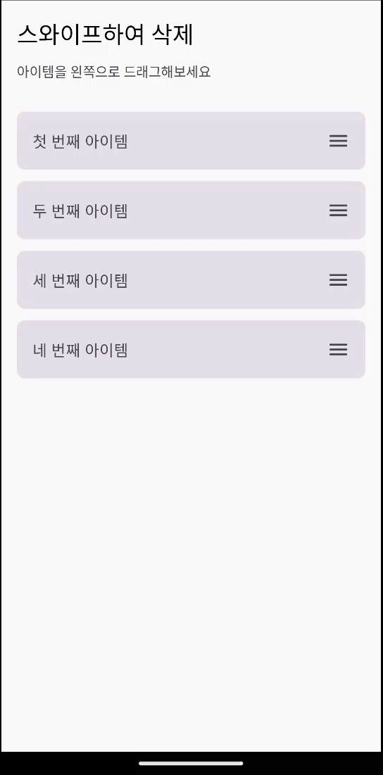
}3-2. 스와이프 딜리트 (Swipe to Delete)
모바일 앱에서 종 종 볼 수 있는 스와이프로 삭제하는 패턴입니다.
@Composable
fun SwipeToDeleteItem(
    text: String,
    onDelete: () -> Unit,
    modifier: Modifier = Modifier
) {
    var offsetX by remember(text) { mutableFloatStateOf(0f) }
    val deleteThreshold = 80f

    val animatedOffsetX by animateFloatAsState(
        targetValue = offsetX,
        animationSpec = tween(200),
        label = "offsetX",
        finishedListener = { finalValue ->
            if (finalValue <= -300f) {
                onDelete()
            }
        }
    )

    Box(
        modifier = modifier
            .fillMaxWidth()
            .height(60.dp)
            .clip(RoundedCornerShape(8.dp))
    ) {
        Box(
            modifier = Modifier
                .fillMaxSize()
                .background(MaterialTheme.colorScheme.errorContainer),
            contentAlignment = Alignment.CenterEnd
        ) {
            Icon(
                imageVector = Icons.Default.Delete,
                contentDescription = "삭제",
                tint = MaterialTheme.colorScheme.onErrorContainer,
                modifier = Modifier.padding(end = 16.dp)
            )
        }

        Card(
            modifier = Modifier
                .fillMaxSize()
                .offset { IntOffset(animatedOffsetX.roundToInt(), 0) }
                .pointerInput(text) {
                    detectHorizontalDragGestures(
                        onDragEnd = {
                            if (offsetX < -deleteThreshold) {
                                offsetX = -300f
                            } else {
                                offsetX = 0f
                            }
                        }
                    ) { _, dragAmount ->
                        offsetX = offsetX + dragAmount
                        if (offsetX > 0f) offsetX = 0f
                    }
                }
        ) {
            Row(
                modifier = Modifier
                    .fillMaxSize()
                    .padding(16.dp),
                verticalAlignment = Alignment.CenterVertically
            ) {
                Text(
                    text = text,
                    style = MaterialTheme.typography.bodyLarge,
                    modifier = Modifier.weight(1f)
                )
                Icon(
                    imageVector = Icons.Default.Menu,
                    contentDescription = "드래그",
                    tint = MaterialTheme.colorScheme.onSurfaceVariant
                )
            }
        }
    }
}

@Composable
fun SwipeToDeleteDemo() {
    var items by remember {
        mutableStateOf(
            listOf(
                "첫 번째 아이템",
                "두 번째 아이템",
                "세 번째 아이템",
                "네 번째 아이템"
            )
        )
    }

    Column(
        modifier = Modifier
            .fillMaxSize()
            .padding(16.dp),
        verticalArrangement = Arrangement.spacedBy(12.dp)
    ) {
        Text(
            text = "스와이프하여 삭제",
            style = MaterialTheme.typography.headlineSmall
        )

        Text(
            text = "아이템을 왼쪽으로 드래그해보세요",
            style = MaterialTheme.typography.bodyMedium,
            color = MaterialTheme.colorScheme.onSurfaceVariant
        )

        Spacer(modifier = Modifier.height(8.dp))

        items.forEach { item ->
            SwipeToDeleteItem(
                text = item,
                onDelete = {
                    items = items - item
                }
            )
        }

        if (items.isEmpty()) {
            Column(
                horizontalAlignment = Alignment.CenterHorizontally,
                modifier = Modifier.fillMaxWidth().padding(32.dp)
            ) {
                Text(
                    text = "모든 아이템이 삭제되었습니다!",
                    style = MaterialTheme.typography.bodyLarge
                )

                Spacer(modifier = Modifier.height(16.dp))

                Button(
                    onClick = {
                        items = listOf(
                            "새로운 첫 번째 아이템",
                            "새로운 두 번째 아이템",
                            "새로운 세 번째 아이템",
                            "새로운 네 번째 아이템"
                        )
                    }
                ) {
                    Text("다시 생성")
                }
            }
        }
    }
}

@Preview(showBackground = true)
@Composable
fun SwipeToDeleteDemoPreview() {
    MaterialTheme {
        SwipeToDeleteDemo()
    }
}
3-3. 플로팅 액션 버튼 확장
FAB를 누르면 여러 옵션이 부채꼴로 펼쳐지는 패턴입니다.
@Composable
fun ExpandableFAB() {
    var isExpanded by remember { mutableStateOf(false) }

    val fabRotation by animateFloatAsState(
        targetValue = if (isExpanded) 45f else 0f,
        animationSpec = spring(
            dampingRatio = Spring.DampingRatioMediumBouncy,
            stiffness = Spring.StiffnessMedium
        ),
        label = "fabRotation"
    )

    Box(
        modifier = Modifier.fillMaxSize(),
        contentAlignment = Alignment.BottomEnd
    ) {
        Column(
            horizontalAlignment = Alignment.End,
            modifier = Modifier.padding(16.dp)
        ) {
            AnimatedVisibility(
                visible = isExpanded,
                enter = slideInVertically(
                    initialOffsetY = { it },
                    animationSpec = spring(stiffness = Spring.StiffnessMedium)
                ) + fadeIn(spring()),
                exit = slideOutVertically(
                    targetOffsetY = { it },
                    animationSpec = spring(stiffness = Spring.StiffnessMedium)
                ) + fadeOut(spring())
            ) {
                Column(
                    horizontalAlignment = Alignment.End,
                    verticalArrangement = Arrangement.spacedBy(12.dp),
                    modifier = Modifier.padding(bottom = 16.dp)
                ) {
                    listOf(
                        Icons.Default.Edit to "편집",
                        Icons.Default.Share to "공유",
                        Icons.Default.Favorite to "즐겨찾기"
                    ).forEachIndexed { index, (icon, label) ->
                        Row(
                            verticalAlignment = Alignment.CenterVertically,
                            horizontalArrangement = Arrangement.spacedBy(8.dp)
                        ) {
                            Card(
                                colors = CardDefaults.cardColors(
                                    containerColor = MaterialTheme.colorScheme.surface,
                                    contentColor = MaterialTheme.colorScheme.onSurface
                                ),
                                elevation = CardDefaults.cardElevation(defaultElevation = 4.dp)
                            ) {
                                Text(
                                    text = label,
                                    modifier = Modifier.padding(horizontal = 12.dp, vertical = 6.dp),
                                    style = MaterialTheme.typography.labelMedium
                                )
                            }

                            FloatingActionButton(
                                onClick = {
                                    isExpanded = false
                                },
                                modifier = Modifier.size(40.dp),
                                containerColor = MaterialTheme.colorScheme.secondary
                            ) {
                                Icon(
                                    imageVector = icon,
                                    contentDescription = label,
                                    modifier = Modifier.size(20.dp)
                                )
                            }
                        }
                    }
                }
            }

            FloatingActionButton(
                onClick = { isExpanded = !isExpanded },
                modifier = Modifier.rotate(fabRotation)
            ) {
                Icon(
                    imageVector = Icons.Default.Add,
                    contentDescription = "메뉴"
                )
            }
        }
    }
}

@Preview(showBackground = true)
@Composable
fun ExpandableFABPreview() {
    ExpandableFAB()
}
4. 성능 최적화와 베스트 프랙티스
애니메이션은 UI를 생동감 있게 만들지만, 무분별하게 사용하면 성능 저하나 사용자 경험 저해로 이어질 수 있습니다. 따라서 적절한 AnimationSpec 선택, 불필요한 애니메이션 최소화, 메모리 효율, 애니메이션 충돌 방지까지 고려해야 합니다.
4-1. 적절한 AnimationSpec 선택하기
애니메이션의 목적에 따라 다른 AnimationSpec을 사용해야 합니다.
// 빠른 피드백이 필요한 경우 (버튼 터치 등)
animationSpec = tween(durationMillis = 100, easing = EaseOut)

// 자연스러운 움직임이 필요한 경우 (크기/위치 변화)
animationSpec = spring(
    dampingRatio = Spring.DampingRatioMediumBouncy,
    stiffness = Spring.StiffnessMedium
)

// 정확한 타이밍 연출이 필요한 경우
animationSpec = keyframes {
    durationMillis = 1000
    0.5f at 200 with EaseInOut // 200ms에 50% 도달
    0.8f at 800 with EaseOut   // 800ms에 80% 도달
}
4-2. 불필요한 애니메이션 줄이기
모든 상태 변화에 애니메이션을 적용할 필요는 없습니다. 의미 있는 상태 변화에만 집중해야 성능과 사용자 경험을 모두 잡을 수 있습니다.
// ❌ 자주 변하는 값에 애니메이션 적용 (성능 저하)
val animatedValue by animateFloatAsState(frequentlyChangingValue)

// ✅ 의미 있는 상태 변화에만 애니메이션 적용
val animatedValue by animateFloatAsState(
    targetValue = if (isImportantStateChanged) newValue else currentValue
)

// ✅ 필요할 때만 애니메이션 활성화
val animationSpec = if (shouldAnimate) {
    spring(dampingRatio = Spring.DampingRatioMediumBouncy)
} else {
    snap() // 즉시 변경
}
4-3. 메모리 효율적으로 다루기
애니메이션 객체를 매번 새로 생성하면 불필요한 리소스 낭비가 발생합니다. remember를 활용해 transition을 캐싱하고, 여러 애니메이션을 하나의 transition에서 관리하는 것이 좋습니다.
@Composable
fun EfficientAnimation() {
    // ✅ remember로 transition 캐싱
    val infiniteTransition = rememberInfiniteTransition(label = "efficientAnimation")

    // ✅ 여러 값을 동시에 애니메이션
    val progress by infiniteTransition.animateFloat(
        initialValue = 0f,
        targetValue = 1f,
        animationSpec = infiniteRepeatable(
            animation = tween(2000),
            repeatMode = RepeatMode.Reverse
        ),
        label = "progress"
    )

    val scale = 1f + (progress * 0.2f)
    val alpha = 0.7f + (progress * 0.3f)

    Box(
        modifier = Modifier
            .scale(scale)
            .alpha(alpha)
    ) {
        // 콘텐츠
    }
}
4-4. 애니메이션 충돌 방지하기
여러 상태가 동시에 변할 때 애니메이션이 충돌하면 어색한 움직임이 발생합니다. 이럴 때는 여러 상태를 하나의 애니메이션 값으로 통합해 관리하는 것이 좋습니다.
@Composable
fun ConflictFreeAnimation() {
    var isPressed by remember { mutableStateOf(false) }
    var isHovered by remember { mutableStateOf(false) }

    // 여러 상태를 하나의 targetScale 값으로 통합
    val targetScale = when {
        isPressed -> 0.95f
        isHovered -> 1.05f
        else -> 1f
    }

    val animatedScale by animateFloatAsState(
        targetValue = targetScale,
        animationSpec = spring(
            dampingRatio = Spring.DampingRatioMediumBouncy,
            stiffness = Spring.StiffnessHigh
        ),
        label = "buttonScale"
    )

    Button(
        onClick = { /* 액션 */ },
        modifier = Modifier
            .scale(animatedScale)
            .pointerInput(Unit) {
                detectTapGestures(
                    onPress = {
                        isPressed = true
                        tryAwaitRelease()
                        isPressed = false
                    }
                )
            }
            .hoverable(interactionSource = remember { MutableInteractionSource() })
    ) {
        Text("애니메이션 버튼")
    }
}
정리
이번 글에서는 Jetpack Compose 애니메이션의 실전 활용을 다뤘습니다.
- 리스트 애니메이션: 아이템 추가/삭제 및 재배치 시 자연스러운 전환
- 복합 애니메이션: 카드 펼치기, 즐겨찾기, 삭제 기능을 조합한 인터랙티브 UI
- 다양한 패턴: 로딩 인디케이터, 스와이프 삭제, 확장형 FAB
- 성능 최적화: AnimationSpec 선택, 불필요한 애니메이션 최소화, 충돌 방지 방법
이번 내용을 통해 애니메이션을 실제 앱 화면에 적용하는 다양한 방법을 살펴볼 수 있었습니다.
🎯 다음 글 예고: 상태를 적용한 화면 만들기
지금까지는 UI 자체에 집중해왔다면, 다음 글부터는 UI와 상태(State)의 연결을 살펴보겠습니다. Compose는 선언형 UI이기 때문에 상태 관리가 핵심이며, 이를 제대로 이해해야 앱을 안정적으로 만들 수 있습니다.
다음 글에서는 아래와 같은 내용을 다룰 예정입니다.
remember,mutableStateOf를 활용한 기본 상태 관리derivedStateOf와 같은 파생 상태 계산ViewModel과StateFlow를 이용한 화면 상태 구성- 로그인/회원가입 같은 ****화면에 상태를 적용하는 방법
정적인 UI를 넘어, 상태 기반으로 살아 움직이는 Compose 화면을 만들어보는 여정을 함께하겠습니다. 🚀