
📌 개요
이전 글에서는 MaterialTheme을 활용해 앱의 디자인 시스템을 구축하고, 색상, 글꼴, 모양 등을 통해 일관된 스타일을 적용하는 방법을 배웠습니다.
이제 앱이 시각적으로 완성되었다면, 사용자 경험을 한 단계 더 끌어올릴 차례입니다. 아무리 예쁜 디자인이라도 화면 전환이 갑작스럽거나, 버튼을 눌렀을 때 반응이 뚝뚝 끊어진다면 사용자는 어색함을 느끼게 됩니다.
이번 글에서는 Jetpack Compose의 강력한 애니메이션 시스템을 활용해 자연스럽고 부드러운 UI를 만드는 방법을 배워보겠습니다. 단순히 화려한 효과를 넣는 것이 아니라, 사용자의 행동에 반응하고 앱의 흐름을 부드럽게 연결하는 의미 있는 애니메이션을 구현해보겠습니다.
1. 기본 애니메이션: 값의 부드러운 변화
가장 기본적인 애니메이션은 숫자, 색상, 크기 등의 값이 변할 때 갑작스럽게 바뀌지 않고 부드럽게 전환되도록 만드는 것입니다.
1-1. animateFloatAsState - 숫자 값 애니메이션
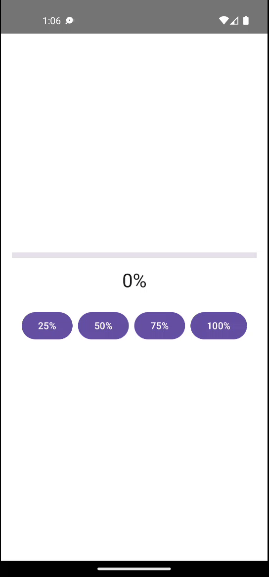
버튼을 누를 때마다 진행 상태가 부드럽게 변하는 예제를 만들어보겠습니다.
@Composable
fun ProgressAnimation() {
    var progress by remember { mutableFloatStateOf(0f) }
    val animatedProgress by animateFloatAsState(
        targetValue = progress,
        animationSpec = tween(durationMillis = 1000)
    )

    Column(
        modifier = Modifier
            .fillMaxSize()
            .padding(16.dp),
        horizontalAlignment = Alignment.CenterHorizontally,
        verticalArrangement = Arrangement.Center
    ) {
        LinearProgressIndicator(
            progress = { animatedProgress },
            modifier = Modifier
		                    .fillMaxWidth()
		                    .height(8.dp),
            color = ProgressIndicatorDefaults.linearColor,
            trackColor = ProgressIndicatorDefaults.linearTrackColor,
        )

        Spacer(modifier = Modifier.height(16.dp))

        Text(
            text = "${(animatedProgress * 100).toInt()}%",
            style = MaterialTheme.typography.headlineMedium
        )

        Spacer(modifier = Modifier.height(24.dp))

        Row(horizontalArrangement = Arrangement.spacedBy(8.dp)) {
            Button(onClick = { progress = 0.25f }) { Text("25%") }
            Button(onClick = { progress = 0.5f }) { Text("50%") }
            Button(onClick = { progress = 0.75f }) { Text("75%") }
            Button(onClick = { progress = 1f }) { Text("100%") }
        }
    }
}
📌 학습 포인트
animateFloatAsState는 Float 값의 변화를 자동으로 애니메이션으로 처리합니다.targetValue가 바뀔 때마다 현재값에서 목표값까지 부드럽게 전환됩니다.animationSpec으로 애니메이션의 속도를 조절할 수 있습니다.
1-2. animateColorAsState - 색상 애니메이션
버튼의 배경색이 상태에 따라 부드럽게 변하는 토글 버튼을 만들어보겠습니다.
@Composable
fun ColorToggleButton() {
var isSelected by rememberSaveable { mutableStateOf(false) }
val backgroundColor by animateColorAsState(
targetValue = if (isSelected) MaterialTheme.colorScheme.primary
else MaterialTheme.colorScheme.surface,
animationSpec = tween(durationMillis = 300),
)
val contentColor by animateColorAsState(
targetValue = if (isSelected) MaterialTheme.colorScheme.onPrimary
else MaterialTheme.colorScheme.onSurface,
animationSpec = tween(durationMillis = 300),
)
Card(
modifier = Modifier
.fillMaxWidth()
.padding(16.dp)
.toggleable(
value = isSelected,
onValueChange = { isSelected = it },
role = Role.Switch,
),
colors = CardDefaults.cardColors(containerColor = backgroundColor),
) {
Row(
modifier = Modifier
.fillMaxWidth()
.padding(16.dp),
horizontalArrangement = Arrangement.SpaceBetween,
verticalAlignment = Alignment.CenterVertically,
) {
Text(
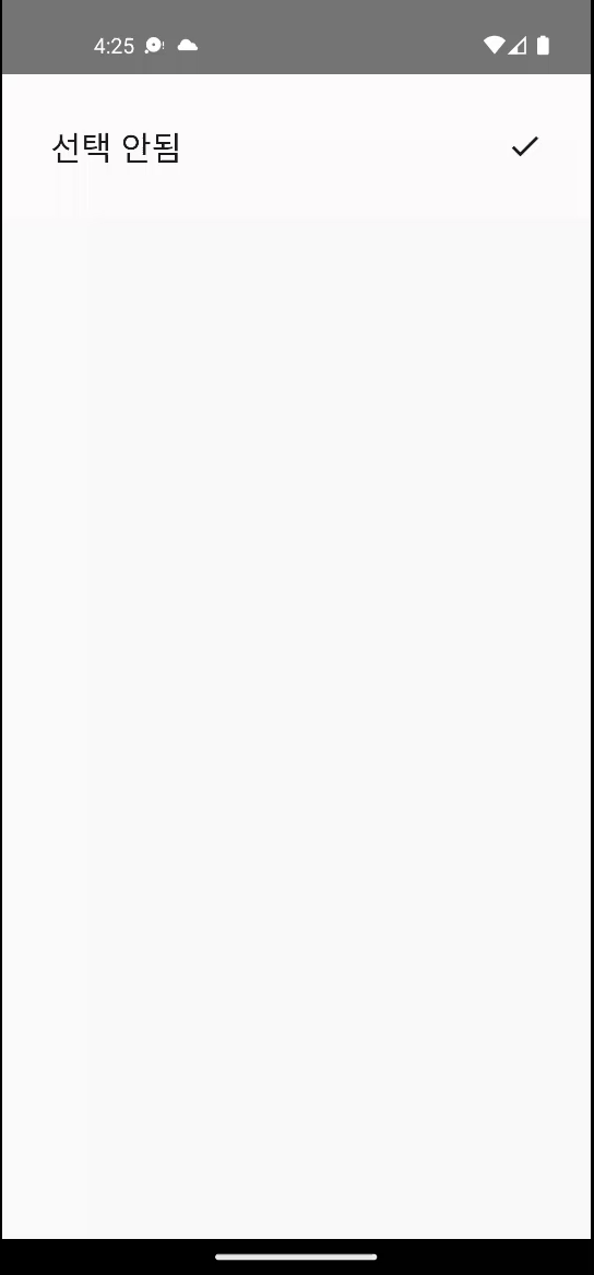
text = if (isSelected) "선택됨" else "선택 안됨",
fontSize = MaterialTheme.typography.titleLarge.fontSize,
color = contentColor,
style = MaterialTheme.typography.bodyLarge,
)
Icon(
imageVector = if (isSelected) Icons.Default.Check else Icons.Default.Check,
contentDescription = if (isSelected) "선택됨" else "선택 안됨",
tint = contentColor,
)
}
}
}📌 활용 팁
- 배경색과 텍스트 색상을 함께 애니메이션하면 더 완성도 높은 효과를 만들 수 있습니다.
MaterialTheme의 색상을 사용하면 다크 모드에서도 자연스럽게 동작합니다.
2. 크기와 위치 애니메이션
2-1. animateContentSize - 동적 크기 변화
콘텐츠의 양이 바뀔 때 컨테이너의 크기가 부드럽게 조절되는 효과를 만들어보겠습니다.
@Composable
fun ExpandableCard() {
var isExpanded by rememberSaveable { mutableStateOf(false) }
val rotation by animateFloatAsState(
targetValue = if (isExpanded) 180f else 0f,
animationSpec = spring(
dampingRatio = Spring.DampingRatioMediumBouncy,
stiffness = Spring.StiffnessLow,
),
)
val bodyText = remember {
"""
여기에는 카드의 상세 내용이 들어갑니다.
사용자가 펼치기 버튼을 누르면 이 텍스트가 부드럽게 나타나고,
다시 누르면 부드럽게 사라집니다.
expand/shrink에 clip=false를 주어 클리핑 없이 자연스럽게 접고 펼칩니다.
""".trimIndent()
}
Card(
modifier = Modifier
.fillMaxWidth()
.padding(16.dp),
) {
Column(modifier = Modifier.padding(16.dp)) {
Row(
modifier = Modifier.fillMaxWidth(),
horizontalArrangement = Arrangement.SpaceBetween,
verticalAlignment = Alignment.CenterVertically,
) {
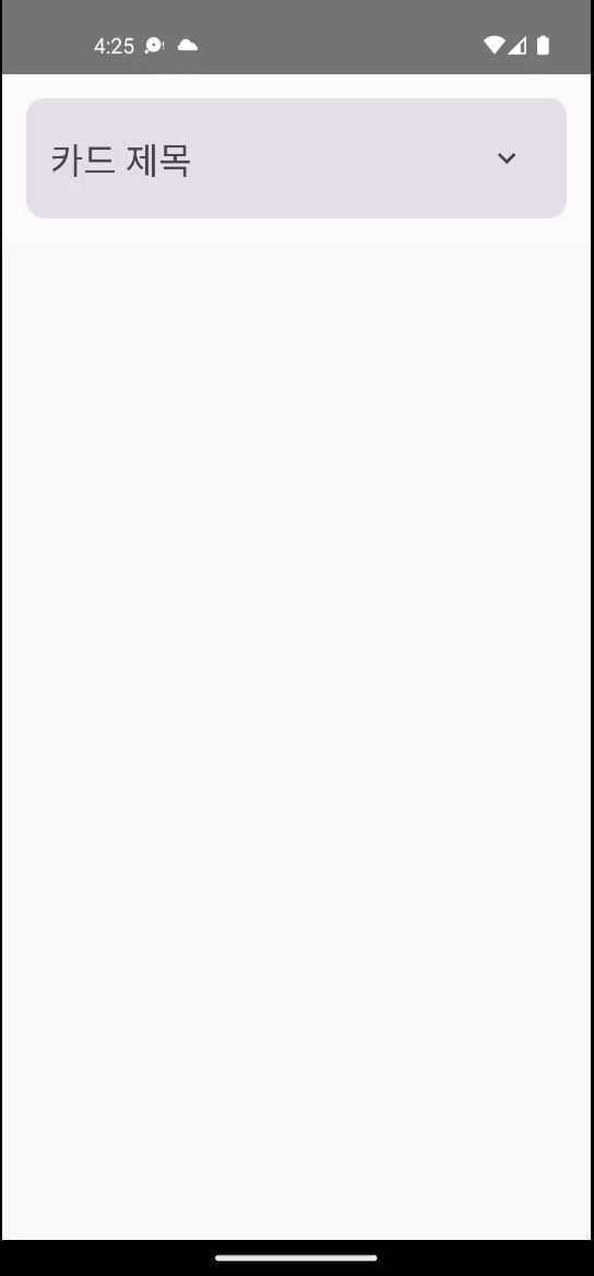
Text(
text = "카드 제목",
style = MaterialTheme.typography.headlineSmall,
)
IconButton(onClick = { isExpanded = !isExpanded }) {
Icon(
imageVector = Icons.Filled.KeyboardArrowDown,
contentDescription = if (isExpanded) "접기" else "펼치기",
modifier = Modifier.rotate(rotation),
)
}
}
AnimatedVisibility(
visible = isExpanded,
enter = fadeIn() +
expandVertically(
animationSpec = spring(
dampingRatio = Spring.DampingRatioMediumBouncy,
stiffness = Spring.StiffnessLow,
),
clip = false,
),
exit = fadeOut() +
shrinkVertically(
animationSpec = spring(
dampingRatio = Spring.DampingRatioNoBouncy,
stiffness = Spring.StiffnessMediumLow,
),
clip = false,
),
) {
Column(
modifier = Modifier
.fillMaxWidth()
.padding(top = 8.dp),
) {
Text(
text = bodyText,
style = MaterialTheme.typography.bodyMedium,
)
}
}
}
}
}📌 spring() 애니메이션의 장점
- 확장/축소 시에 자연스러운 움직임을 제공합니다.
dampingRatio로 탄성 정도를,stiffness로 애니메이션 속도를 조절할 수 있습니다.
2-2. Modifier.offset으로 위치 애니메이션
아이템이 움직이는 효과를 만들어보겠습니다.
@Composable
fun SlidingElement() {
var isAtStart by remember { mutableStateOf(true) }
val offsetX by animateDpAsState(
targetValue = if (isAtStart) 0.dp else 200.dp,
animationSpec = spring(dampingRatio = Spring.DampingRatioMediumBouncy),
)
Column(
modifier = Modifier
.fillMaxSize()
.padding(16.dp),
) {
Box(
modifier = Modifier
.fillMaxWidth()
.height(100.dp),
) {
Card(
modifier = Modifier
.size(80.dp)
.offset(x = offsetX),
colors = CardDefaults.cardColors(
containerColor = MaterialTheme.colorScheme.primary,
),
) {
Box(
contentAlignment = Alignment.Center,
modifier = Modifier.fillMaxSize(),
) {
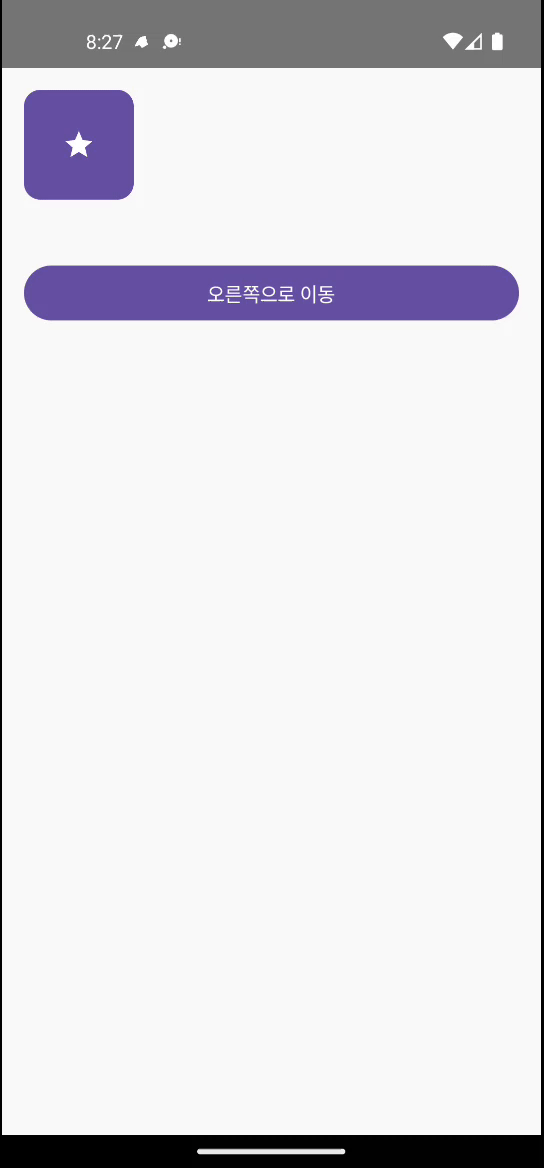
Icon(
imageVector = Icons.Default.Star,
contentDescription = null,
tint = MaterialTheme.colorScheme.onPrimary,
)
}
}
}
Spacer(modifier = Modifier.height(24.dp))
Button(
onClick = { isAtStart = !isAtStart },
modifier = Modifier.fillMaxWidth(),
) {
Text(if (isAtStart) "오른쪽으로 이동" else "원래 위치로")
}
}
}3. 콘텐츠 전환 애니메이션
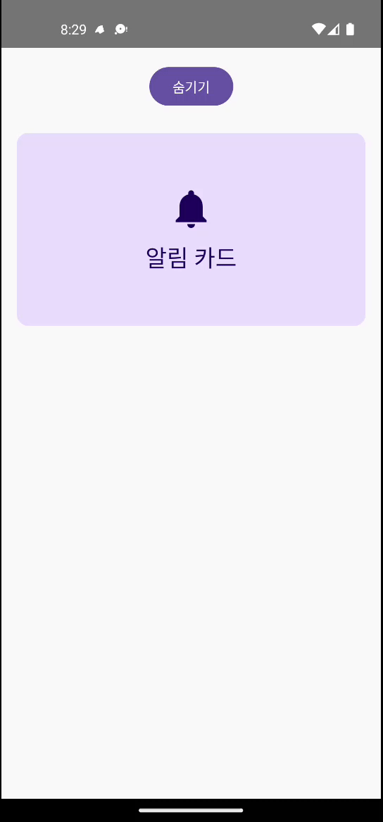
3-1. AnimatedVisibility - 요소의 나타남/사라짐
UI 요소가 나타나거나 사라질 때 부드러운 전환 효과를 만들어보겠습니다.
@Composable
fun AnimatedVisibilityExample() {
    var isVisible by remember { mutableStateOf(true) }

    Column(
        modifier = Modifier
            .fillMaxSize()
            .padding(16.dp),
        horizontalAlignment = Alignment.CenterHorizontally
    ) {
        Button(onClick = { isVisible = !isVisible }) {
            Text(if (isVisible) "숨기기" else "보이기")
        }

        Spacer(modifier = Modifier.height(24.dp))

        AnimatedVisibility(
            visible = isVisible,
            enter = slideInVertically(
                initialOffsetY = { -it },
                animationSpec = tween(durationMillis = 500)
            ) + fadeIn(tween(500)),
            exit = slideOutVertically(
                targetOffsetY = { -it },
                animationSpec = tween(durationMillis = 500)
            ) + fadeOut(tween(500))
        ) {
            Card(
                modifier = Modifier
                    .fillMaxWidth()
                    .height(200.dp),
                colors = CardDefaults.cardColors(
                    containerColor = MaterialTheme.colorScheme.primaryContainer
                )
            ) {
                Box(
                    contentAlignment = Alignment.Center,
                    modifier = Modifier.fillMaxSize()
                ) {
                    Column(horizontalAlignment = Alignment.CenterHorizontally) {
                        Icon(
                            imageVector = Icons.Default.Notifications,
                            contentDescription = null,
                            modifier = Modifier.size(48.dp),
                            tint = MaterialTheme.colorScheme.onPrimaryContainer
                        )
                        Spacer(modifier = Modifier.height(8.dp))
                        Text(
                            text = "알림 카드",
                            style = MaterialTheme.typography.headlineSmall,
                            color = MaterialTheme.colorScheme.onPrimaryContainer
                        )
                    }
                }
            }
        }
    }
}
📌 AnimatedVisibility의 강력함
enter와exit애니메이션을 조합할 수 있습니다.slideIn/Out,fadeIn/Out,scaleIn/Out등 다양한 전환 효과를 제공합니다.
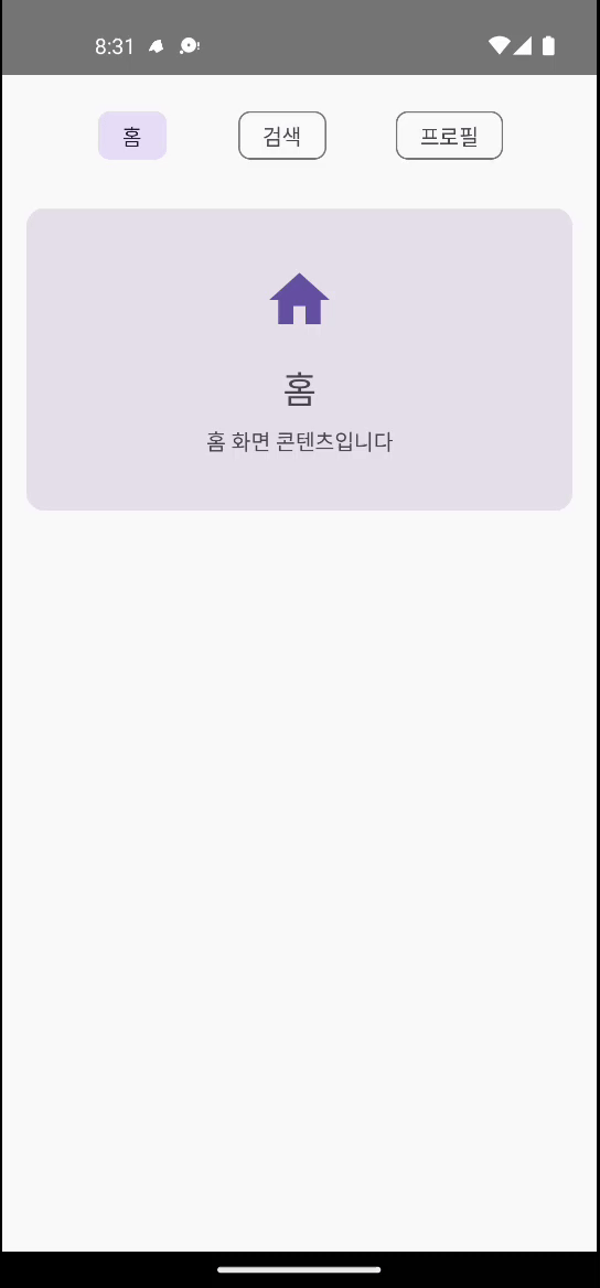
3-2. AnimatedContent - 콘텐츠 교체 애니메이션
텍스트나 아이콘이 바뀔 때 자연스러운 전환 효과를 만들어보겠습니다.
@Composable
fun TabSwitcher() {
    var selectedTab by remember { mutableStateOf(0) }
    val tabs = listOf("홈", "검색", "프로필")

    Column(
        modifier = Modifier
            .fillMaxSize()
            .padding(16.dp)
    ) {
        // 탭 버튼들
        Row(
            modifier = Modifier.fillMaxWidth(),
            horizontalArrangement = Arrangement.SpaceEvenly
        ) {
            tabs.forEachIndexed { index, title ->
                FilterChip(
                    onClick = { selectedTab = index },
                    label = { Text(title) },
                    selected = selectedTab == index
                )
            }
        }

        Spacer(modifier = Modifier.height(24.dp))

        // 애니메이션되는 콘텐츠
        AnimatedContent(
            targetState = selectedTab,
            transitionSpec = {
                slideInHorizontally(
                    initialOffsetX = { it },
                    animationSpec = tween(300)
                ) with slideOutHorizontally(
                    targetOffsetX = { -it },
                    animationSpec = tween(300)
                )
            }
        ) { tabIndex ->
            when (tabIndex) {
                0 -> TabContent("홈", "홈 화면 콘텐츠입니다", Icons.Default.Home)
                1 -> TabContent("검색", "검색 화면 콘텐츠입니다", Icons.Default.Search)
                2 -> TabContent("프로필", "프로필 화면 콘텐츠입니다", Icons.Default.Person)
            }
        }
    }
}

@Composable
fun TabContent(title: String, description: String, icon: ImageVector) {
    Card(
        modifier = Modifier
            .fillMaxWidth()
            .height(200.dp)
    ) {
        Column(
            modifier = Modifier
                .fillMaxSize()
                .padding(24.dp),
            horizontalAlignment = Alignment.CenterHorizontally,
            verticalArrangement = Arrangement.Center
        ) {
            Icon(
                imageVector = icon,
                contentDescription = null,
                modifier = Modifier.size(48.dp),
                tint = MaterialTheme.colorScheme.primary
            )
            Spacer(modifier = Modifier.height(16.dp))
            Text(
                text = title,
                style = MaterialTheme.typography.headlineSmall
            )
            Spacer(modifier = Modifier.height(8.dp))
            Text(
                text = description,
                style = MaterialTheme.typography.bodyMedium,
                textAlign = TextAlign.Center
            )
        }
    }
}
애니메이션 사용 시 주의사항
❌ 피해야 할 패턴들
- 과도한 애니메이션: 모든 요소에 애니메이션을 적용하면 오히려 산만해집니다.
- 너무 긴 애니메이션: 300ms 이상의 애니메이션은 사용자를 기다리게 만듭니다.
- 일관성 없는 애니메이션: 같은 기능은 같은 애니메이션을 사용해야 합니다.
✅ 권장되는 사용법
- 의미 있는 애니메이션: 사용자의 행동에 대한 피드백이나 상태 변화를 명확히 전달
- 적절한 타이밍: 150-300ms 범위의 빠르고 부드러운 애니메이션
- 접근성 고려: 시스템 애니메이션 설정을 존중하는 구현
정리
이번 글에서는 Jetpack Compose 애니메이션의 기초 중에서도 다음 세 가지 핵심 주제를 다뤘습니다.
- 기본 애니메이션:
animateFloatAsState,animateColorAsState를 통한 값의 부드러운 변화 - 크기 및 위치 애니메이션:
animateContentSize,Modifier.offset과animateDpAsState를 활용한 레이아웃 애니메이션 - 콘텐츠 전환 애니메이션:
AnimatedVisibility와AnimatedContent를 이용한 자연스러운 UI 전환 효과 구현
🎯 다음 글 예고: 애니메이션으로 부드러운 UI 경험 만들기 - 2부
이번 글에서는 위 세 가지 주제만 집중적으로 다루었기에, 리스트 애니메이션, 종합 실습, 성능 최적화, 실무 패턴, 주의사항 등의 내용까지는 다루지 못했습니다. 따라서, 다음 글에서는 아래와 같은 내용들을 이어서 다룰 예정입니다.
- 리스트 아이템의 추가/제거 및 재배치 애니메이션 구현
- 다양한 애니메이션 API를 조합한 종합 실습 사례(예: 인터랙티브 카드 컬렉션)
- 성능 최적화 팁과 접근성 고려 방안
- 실제 앱에 적용할 수 있는 실무 중심 애니메이션 패턴 (로딩 인디케이터, 스와이프 삭제 등)
다음 글에서는 더 실전적인 기술들을 함께 살펴보며 더 자연스럽고 직관적인 UI 경험을 함께 만들어볼 예정입니다. 다음 글도 기대해 주세요! 🚀