Tensorflow 2.0 첫 번째 신경망 훈련하기
6,000개의 패션 data를 학습하여 옷의 종류를 분류하는 신경망 모델을 훈련.
Tensorflow의 고수준 API keras를 사용한다.
import tensorflow as tf    # tensorflow import
from tensorflow import keras    # keras import

import numpy as np    # numpy: 데이터구조, 수치계산 등을 효율적으로 수행하게 하는 라이브러리
import matplotlib.pyplot as plt    # matplotlib: data를 차트나 plot으로 그려주는 라이브러리

print(tf.__version__)
>> 2.3.0
패션 MNIST 데이터셋 import하기
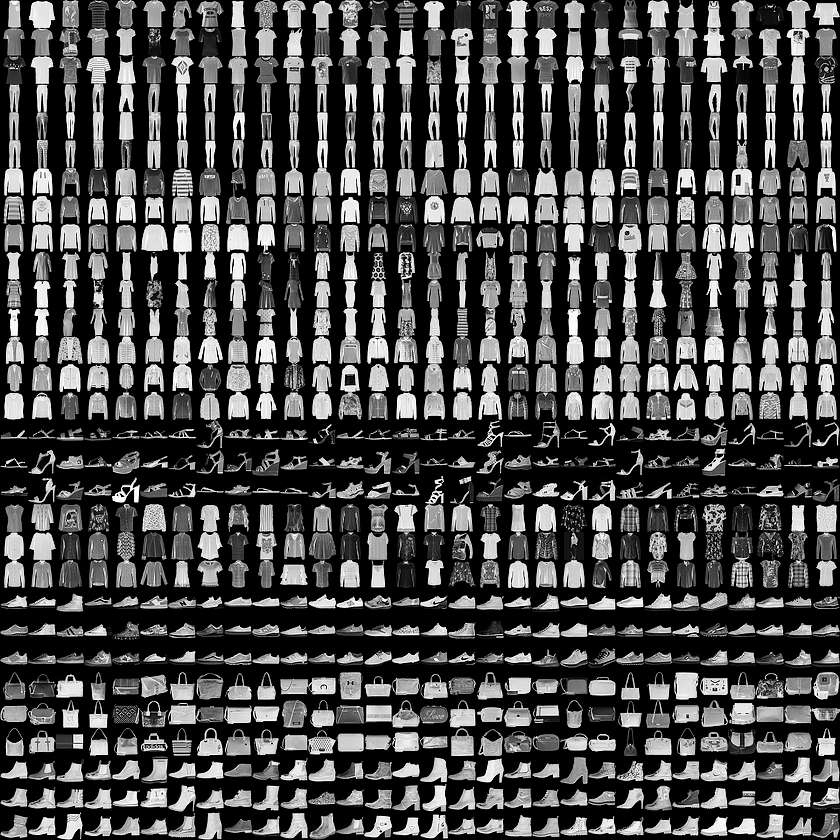
mnist는 간단한 컴퓨터 비전 데이터 세트이다. Yann LeCun의 웹사이트에서 제공하며, 편의를 위해 데이터를 자동으로 설치하는 코드가 포함되어있다.
fashion_mnist는 70,000개의 흑백 이미지가 10개의 category로 구성되어있다.
70,000개 중 60,000개는 학습에 사용되고, 나머지 10,000개는 평가에 사용한다.
아래는 해당 data의 예시이다.
각종 변수를 선언한다.
fashion_mnist = keras.datasets.fashion_mnist    # 이미 keras에 포함되어있는 dataset을 변수로 저장

(train_images, train_labels), (test_images, test_labels) = fashion_mnist.load_data()
 # 모델 학습에 사용              # 모델 테스트에 사용
load_data() 함수를 호출하면 네 개의 numpy 배열이 반환된다.
각 이미지: 28x28크기, 0 <= 픽셀값(float) <= 255, 0 <= lable(int) <= 9
| 레이블 | 클래스 |
|---|---|
| 0 | T-shirt/top |
| 1 | Trouser |
| 2 | Pullover |
| 3 | Dress |
| 4 | Coat |
| 5 | Sandal |
| 6 | Shirt |
| 7 | Sneaker |
| 8 | Bag |
| 9 | Ankle boot |
실제 data에는 클래스의 이름이 입력되어있지 않다.
따라서 별도의 변수를 만들어 저장해야한다.
class_names = ['T-shirt/top', 'Trouser', 'Pullover', 'Dress', 'Coat',
               'Sandal', 'Shirt', 'Sneaker', 'Bag', 'Ankle boot']
데이터 탐색
train_images.shape
>> (60000, 28, 28) # (data의 갯수, 세로픽셀, 가로픽셀)train_images에는 numpy data가 들어있다
train_labels
>> array([9, 0, 0, ..., 3, 0, 5], dtype=unit8)trin_labes에는 모든 각 data의 레이블이 배열 형식으로 들어있다.
len(train_labels
>> 60000
60000개의 data가 잘 들어있음을 알 수 있다.
마찬가지로 test set에 대한 것도 실행시켜보면 아래와 같다.
tset_images.shape
>> (10000, 28, 28)

len(test_labels)
>> 10000
데이터 전처리
훈련 전에 데이터를 전처리 해야한다.
# matplotlib 사용
plt.figure()    # defalt figure 생성
plt.imshow(train_images[0])    # train_images의 0번째 항목을 이미지화하여 2D로 보여준다.
plt.colorbar()    # data값을 시각화하는 color bar를 보여준다.
plt.grid(False)    # True를 하면 이미지에 격자무늬가 그려진다.
plt.show()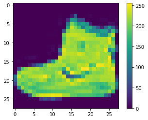
신경망 모델은 0~1값을 가지므로, 조정한다.
train_images = train_images / 255.0    # /=는 사용할 수 없다.
test_images = test_images / 255.0
데이터 포멧이 올바른지 확인하기 위해 훈련세트에서 25개의 이미지와 클래스 이름을 출력해보자.
plt.figure(figsize=(10, 10))    # 10(inch) x 10(inch) 크기의 figure 생성
for i in range(25):
    plt.subplot(5, 5, i+1)    # subplot(nrows, ncols, index, **kwargs) != subplots()
                              # *args: (int, int, index), defalt: (1, 1, 1)
                              # 현재 생성된 figure에 subplot을 생성한다.
    plt.xticks([])    # x축 방향 포인트(tick) 없음.
    plt.yticks([])    # y축 방향 포인트(tick) 없음.
    plt.grid(False)    # 격자선 없음
    plt.imshow(train_images[i], camp=plt.cm.binary)    # image data 입력
    plt.xlabel(class_names[train_labels[i]])    # x축에 lable 추가
plt.show()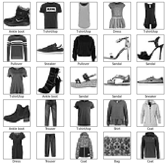
모델 구성
모델 층을 구성한 뒤, 신경망 모델을 컴파일한다.
층 설정
model = keras.layers.Sequential([    # Sequential 모델은 레이어를 선형으로 연결하여 구성한다.
    keras.layers.Flatten(input_shape=(28, 28)),    # 2차원 배열(28x28)을 1차원배열(784)로 변환
    keras.layers.Dense(128, activation='relu'),    # 첫 번째 층. 128개의 노드를 가짐.
    keras.layers.Dense(10m activation='softmax')    # 두 번째 층. 10개의 노드를 가짐.
])
입력되는 2차원 이미지 포멧을 1차원으로 변환시킨다.
이후 2개의 Dense 층을 만들어 놓는다.
모델 컴파일
모델을 훈련하기 전에 몇 가지 설정을 해준다.
- 손실 함수(Loss function): 훈련 하는 동안 모델의 오차를 측정한다. 손실함수가 최소가 되는 방향으로 학습한다.
- 옵티마이저(Optimizer): 데이터와 손실 함수를 바탕으로 모델의 업데이트 방법을 결정한다.
- 지표(Metrics): 훈련 단계와 테스트 단계를 모니터링하기 위해 사용한다.
model.compile(optimizer='adam',    # Adam(Adaptive Moment Estimation). Optimizer의 일종.
    loss='sparse_categorical_crossentropy',    # Loss finction의 일종.
    metrics=['accuracy'])    # accuracy: 맞춘 data / 전체 data
모델 훈련
신경망 모델 훈련 방법은 다음과 같다.
1. 훈련 데이터를 모델에 주입한다.
2. 모델이 이미지와 레이블을 매핑하는 방법을 배운다.
3. 테스트 세트에 대한 모델의 예측을 만든다.
다음 메서드를 입력하여 훈련 데이터를 학습한다.
model.fit(train_images, train_labels, epochs=5)    # model.fit(x, y, batch_size=1, epochs=1)
# x: 입력data, y: 결과data, batch_size: 한 번 학습에 사용하는 data 갯수, epochs: data반복 횟수
>> Epoch 1/5
>> 1875/1875 [==============================] - 3s 2ms/step - loss: 0.4968 - >> accuracy: 0.8238
>> Epoch 2/5
>> 1875/1875 [==============================] - 3s 2ms/step - loss: 0.3744 - >> accuracy: 0.8639
>> Epoch 3/5
>> 1875/1875 [==============================] - 3s 2ms/step - loss: 0.3354 - >> accuracy: 0.8775
>> Epoch 4/5
>> 1875/1875 [==============================] - 3s 2ms/step - loss: 0.3099 - >> accuracy: 0.8868
>> Epoch 5/5
>> 1875/1875 [==============================] - 3s 2ms/step - loss: 0.2930 - >> accuracy: 0.8924
>> <tensorflow.python.keras.callbacks.History at 0x7fdc42704fd0>
5회 학습이 진행되면서 loss와 accuracy를 출력한다. 이 모델은 약 89%의 정확도를 달성했다.
정확도 평가
test set에서 모델의 성능을 비교해보자.
test_loss, test_acc = model.evaluate(test_images, test_labels, verbose=2)
# model.evaluate(x, y, verbose)
# x: 입력data, y: 결과data, verbose: (0=silent, 1=verbose, 2=one log line per epoch)
>> 313/313 - 0s - loss: 0.3600 - accuracy: 0.8751
>> 테스트 정확도: 0.8751000165939331
test set의 정확도가 training때보다 조금 낮다. 이렇게 머신러닝 모델이 훈련때보다 새로운 데이터에서 성능이 낮아지는 현상을 과대적합(overfitting)이라고 한다.
예측 만들기
훈련된 모델을 이용해서 이미지에 대한 예측을 만들 수 있다.
predictions = models.predict(test_images)첫번째 예측을 확인해보자
predictions[0]
>> array([1.4300117e-07, 6.1975776e-08, 4.8528854e-08, 6.3456537e-07,
         6.5483448e-08, 2.0896263e-02, 2.8552611e-07, 1.7379050e-01,
         3.0357189e-05, 8.0528170e-01], dtype=float32)
이 예측은 10개의 숫자 배열이고, 각 요소는 해당 품목에 상응하는 모델의 신뢰도를 나타낸다.
np.argmax(predictions[0])
>> 9
가장 높은 신뢰도를 가진 레이블은 9번 (앵클부츠)이다. 실제 test label을 확인하면,
test_labels[0]
>> 9
정답이 맞았다.
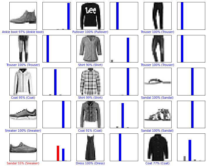
10개 클래스에 대한 모든 예측들을 그래프로 표현해보자
# i번째 이미지에 대한 예측을 나타내는 plot
def plot_image(i, predictions_array, true_label, img):
    predictions_array, true_label, img = predictions_array[i], true_label[i], img[i]
    plt.grid(False)
    plt.xticks([])
    plt.yticks([])

    # 이미지 보여주기
    plt.imshow(img, cmap=plt.cm.binary)

    predicted_label = np.argmax(predictions_array)    # 가장 확률이 높은 레이블
    if predicted_label == true_label:    # 정답이면 라벨 색 'blue'
        color = 'blue'
    else:                                # 오답이면 라벨 색 'red'
        color = 'red'

    plt.xlabel("{} {:2.0f}% ({})".format(class_names[predicted_label],
                                100*np.max(predictions_array),
                                class_names[true_label]),
                                color=color)

# 막대그래프로 확률 표현
def plot_value_array(i, predictions_array, true_label):
    predictions_array, true_label = predictions_array[i], true_label[i]
    plt.grid(False)
    plt.xticks([])
    plt.yticks([])
    # 모든 막대그래프를 회색으로 그린다.
    thisplot = plt.bar(range(10), predictions_array, color="#777777")
    plt.ylim([0, 1])
    predicted_label = np.argmax(predictions_array)    # 정답이라고 생각하는 라벨

    thisplot[predicted_label].set_color('red')    # 일단 빨갛게 칠하고
    thisplot[true_label].set_color('blue')    # 정답에 파랗게 칠함.
    #=> 맞추면 파란색만 나오고, 틀리면 선택한 label은 빨갛게 나온다.
0번째 원소의 이미지, 예측, 신뢰도 점수 배열을 확인한다.
i = 0
plt.figure(figsize=6.3))
plt.subplot(1, 2, 1)
plot_image(i, predictions, test_labels, test_images)
plt.subplot(1, 2, 2)
plot_value_array(i, predictions, test_labels)
plt.show()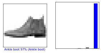
반면, 12번째 이미지는 틀렸다.
i = 12
plt.figure(figsize=(6,3))
plt.subplot(1,2,1)
plot_image(i, predictions, test_labels, test_images)
plt.subplot(1,2,2)
plot_value_array(i, predictions,  test_labels)
plt.show()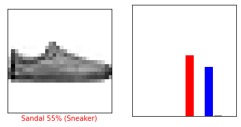
15개의 이미지를 한번에 보자
num_rows = 5
num_cols = 3
num_images = num_rows*num_cols
plt.figure(figsize=(2*2*num_cols, 2*num_rows))
for i in range(num_images):
  plt.subplot(num_rows, 2*num_cols, 2*i+1)
  plot_image(i, predictions, test_labels, test_images)
  plt.subplot(num_rows, 2*num_cols, 2*i+2)
  plot_value_array(i, predictions, test_labels)
plt.show()