개요
<!-- box에 hover시 box-shadow를 주는 경우 -->
.box {
	transform: box-shadow 1s ease-in,
				opacity 1s ease-in;
	&:hover {
 	box-shadow: 0 0 2px 4px lightgray;
    }
}

<!-- box의 pseudo element에 미리 shadow를 주고 opacity로 조절 -->
.box::after {
	content: '';
	position: absolute;
	inset : 0;
	box-shadow: 0 0 2px 4px lightgray;
	opacity: 0;
}
.box:hover::after {
	opacity: 1;
}- 위의 2가지의 box-shadow를 주는 방식은 시각적으로 아무런 차이가 없지만 performance 이슈가 존재한다.
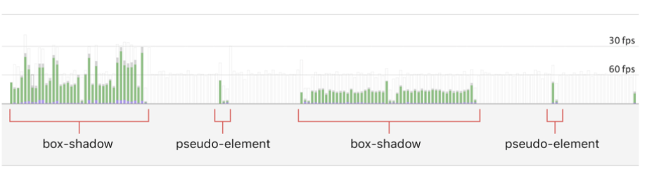
| performance type | box-shadow | pseudo-element |
|---|---|---|
| rendering | 32ms | 20ms |
| painting | 18ms | 2ms |
- opacity로 animation을 통제하는 경우가 box-shadow를 직접 주는 경우 보다 조금 더 효율이 좋음
- opacity로 조절하는 경우 페이지가 re-paint될 필요가 없기 때문에 조금 더 빠르다
- 비슷한 property로는 transform이 존재
- 이 2가지 속성은 페이지를 re-paint하지 않고 animate가 가능!! 이는 마치 함수가 1가지 기능만을 하도록 만드는 것처럼 box-shadow만을 담당하는 새로운 layer를 만들어 주는 것과 유사하다
웹의 최적화는 Javascript나 React의 re-render을 최소화 하는 방식으로만 생각했던 나에게는 css로도 웹의 최적화에 영향을 줄 수 있었다는 것에 신선한 충격이었다.
참고 자료
Stop animating box-shadows the wrong way!
https://tobiasahlin.com/blog/how-to-animate-box-shadow/

while( life ) { learn more; }