
기존 프로젝트에서는 API 요청을 통해 데이터를 불러오는 등 비동기 작업을 수행할 때, 사용자에게 로딩 상태를 알리기 위해 아래와 같은 간단한 로딩 컴포넌트를 사용했다.
react-icons에서 적당한 아이콘을 하나 가져와 css의 spin animation을 넣어주고, Loading... 이라는 문구를 띄워 추가 데이터를 불러오는 중이라는 것을 보여주는 방식이었다.
그런데, 위의 로딩 컴포넌트는 어딘가 부족하다는 생각이 들었다. 일단 내 기준에서 보기에 별로 안예뻤다. (뭐든 예쁜게 최고다!) 그래서 나는 이 컴포넌트를 Skeleton UI로 변경해보기로 했다.
Skeleton UI
스켈레톤 UI는 뭘까 ? 스켈레톤 컴포넌트는 데이터를 가져오는 등 비동기 처리 과정에서 콘텐츠를 보여주는 컴포넌트를 말한다. 사용자가 우리의 서비스를 이용하는 동안 콘텐츠의 로딩을 기다리면서 하얀 백지 화면만 보게 된다면, 지루함을 느낄것이고, 로딩하는데 상당 시간이 소요될 경우 '페이지가 멈췄나?' 라는 생각을 가질 수 있을것이다. 이를 방지하기 위해 스켈레톤 컴포넌트를 보여줌으로써 사용자에게 서비스가 원활히 작동중임을 알리고, 이탈을 방지하는 효과를 얻을 수 있다.
그럼, 한 번 만들어보자.
UI 만들기
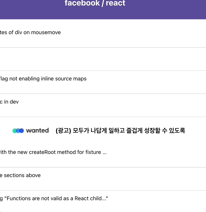
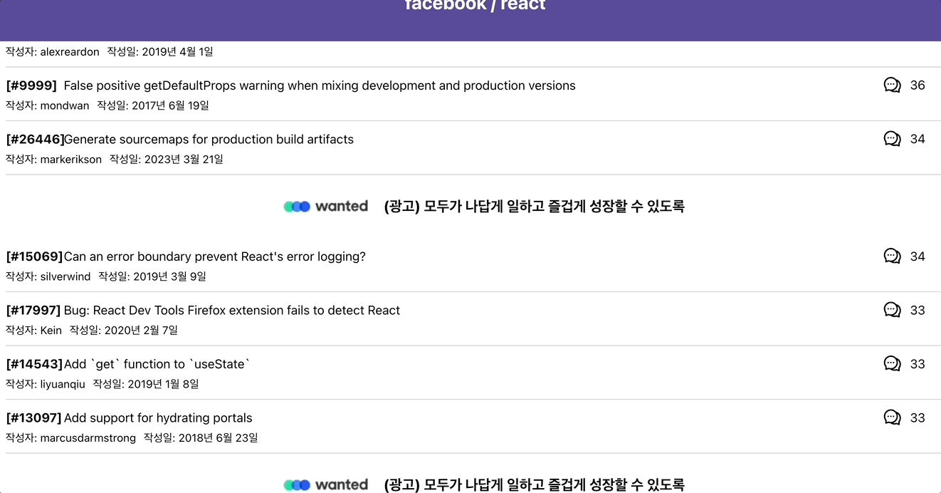
우선, 내가 스켈레톤 컴포넌트를 보여주고자 하는 페이지는 아래와 같은 형태를 가지고 있다.
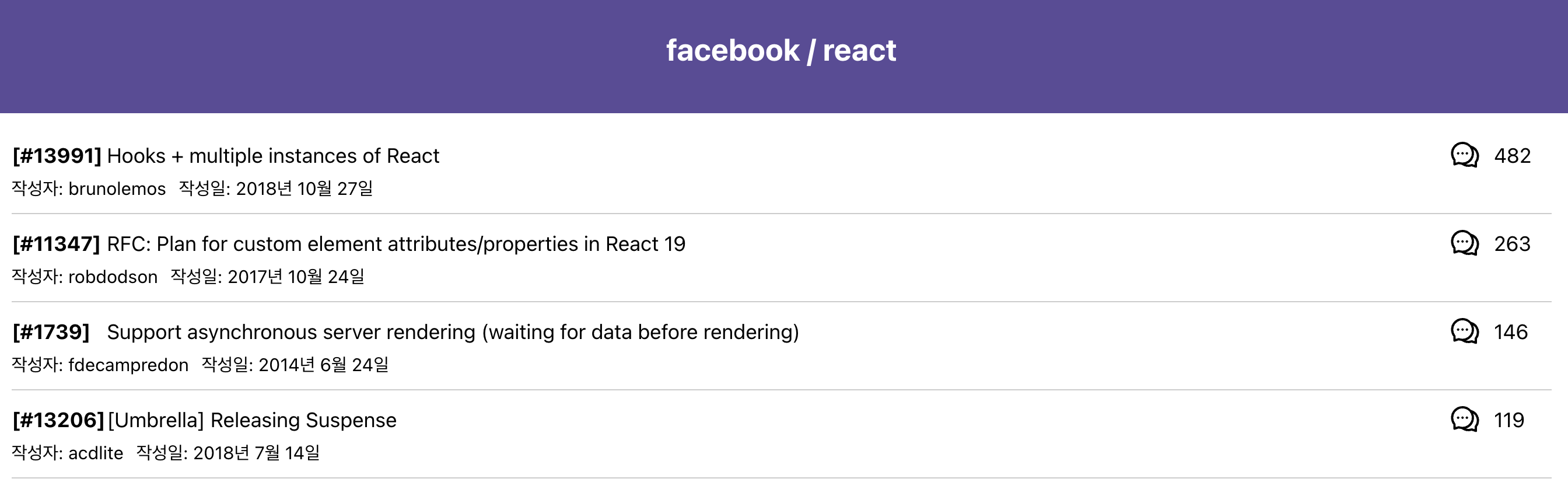
위 페이지에서 Header 부분은 고정적으로 보여질 것이기 때문에 따로 스켈레톤 컴포넌트를 필요로 하지 않는다. 무한스크롤을 통해 아래 이슈 데이터 부분을 불러올 때, 해당 부분을 스켈레톤 컴포넌트로 보여줘야한다. 그렇기에 스켈레톤 컴포넌트의 UI는 이슈 데이터 컴포넌트와 비슷한 형태를 가질것이다.
기존 데이터 컴포넌트 코드
기존의 이슈 데이터 컴포넌트는 아래와 같은 코드 구조를 가지고 있다. 이를 바탕으로 스켈레톤 컴포넌트를 만들어보자.
// IssueItem.tsx
import styled from 'styled-components';
import { colors } from '../../constants/colors';
// 이 외 import 구문 생략
type IssueItemProps = {
issue: Endpoints['GET /repos/{owner}/{repo}/issues']['response']['data'][number];
};
const IssueItem = ({ issue }: IssueItemProps) => {
return (
<Link to={`/issue/${issue.number}`} style={{ textDecoration: 'none', color: 'inherit' }}>
<IssueLayout>
<IssueHeaderContainer>
<IssueTitleContainer>
<span>[#{issue.number}]</span>
<span> {issue.title}</span>
</IssueTitleContainer>
<RightContent>
<AiOutlineComment size={25}></AiOutlineComment>
<span>{issue.comments}</span>
</RightContent>
</IssueHeaderContainer>
<IssueDetailsContainer>
<span>작성자: {issue.user?.login}</span>
<span>작성일: {convertDateToKorean(issue.created_at)}</span>
</IssueDetailsContainer>
</IssueLayout>
</Link>
);
};
export default IssueItem;
const IssueLayout = styled.div`
padding: 10px 0;
border-bottom: 1px solid #ccc;
width: 100%;
&:hover {
background-color: ${colors.hover};
}
`;
const IssueHeaderContainer = styled.div`
display: flex;
justify-content: space-between;
align-items: center;
width: 100%;
`;
const IssueTitleContainer = styled.div`
display: flex;
align-items: center;
gap: 20px;
flex: 1;
max-width: calc(100% - 100px);
& > span:first-child {
font-weight: bold;
width: 50px;
text-align: right;
}
& > span:nth-child(2) {
flex: 1;
overflow: hidden;
text-overflow: ellipsis;
white-space: nowrap;
max-width: calc(100% - 70px);
}
`;
const IssueDetailsContainer = styled.div`
font-size: 14px;
margin-top: 5px;
display: flex;
gap: 10px;
`;
const RightContent = styled.div`
display: flex;
gap: 10px;
width: 80px;
& > span:last-child {
margin-top: 3px;
}
`;
스켈레톤 컴포넌트 구조 잡기
스켈레톤 컴포넌트의 UI는 일반적으로 흰색 배경에, 로딩이 진행중인 듯 한 CSS 애니메이션을 적용하여 보여준다. 우선 컴포넌트의 UI 구조를 이슈 데이터 컴포넌트에 맞게 잡아주도록 하자.
import styled from 'styled-components';
import { colors } from '../../../constants/colors';

const SkeletonItem: React.FC = () => {
  return (
    <SkeletonLayout>
      <SkeletonHeaderContainer>
        <SkeletonTitleContainer>
          <SkeletonSpan width="50px"></SkeletonSpan>
          <SkeletonSpan width="100%"></SkeletonSpan>
        </SkeletonTitleContainer>
        <RightSkeletonContent>
          <SkeletonSpan width="70px"></SkeletonSpan>
        </RightSkeletonContent>
      </SkeletonHeaderContainer>
      <SkeletonDetailsContainer>
        <SkeletonSpan width="70px"></SkeletonSpan>
        <SkeletonSpan width="100px"></SkeletonSpan>
      </SkeletonDetailsContainer>
    </SkeletonLayout>
  );
};

export default SkeletonItem;

const SkeletonLayout = styled.div`
  padding: 10px 0;
  border-bottom: 1px solid #ccc;
  width: 100%;
`;

const SkeletonHeaderContainer = styled.div`
  display: flex;
  justify-content: space-between;
  align-items: center;
  width: 100%;
`;

const SkeletonTitleContainer = styled.div`
  display: flex;
  align-items: center;
  gap: 20px;
  flex: 1;
  max-width: calc(100% - 100px);
`;

const SkeletonDetailsContainer = styled.div`
  margin-top: 5px;
  display: flex;
  gap: 10px;
`;

const RightSkeletonContent = styled.div`
  display: flex;
  gap: 10px;
  width: 80px;
`;

const SkeletonSpan = styled.span<{ width: string }>`
  display: block;
  height: 1em;
  background: ${colors.gray};
  background-size: 200% 100%;
  width: ${props => props.width};
  border-radius: 4px;
`;
이런식으로 최대한 기존 컴포넌트와 유사하게 구조를 잡아주었다. 이슈 데이터의 번호, 제목, 댓글 수, 작성자와 작성일 부분에 background를 넣어줌으로써 흰색 배경에 회색 box들을 채워넣었다.
이제 로딩 애니메이션을 만들어보자.
로딩 애니메이션 적용하기
기존 코드에서 로딩 애니메이션을 만들기 위해, keyframes를 이용하여 애니메이션을 만들고, 이를 SkeletonSpan 컴포넌트에 적용하는 방식으로 구현했다.
import styled, { keyframes } from 'styled-components'; // styled-components의 keyframes import

// 로딩 애니메이션 생성
const loadingAnimation = keyframes`
  0% {
    background-position: -200% 0;
  }
  100% {
    background-position: 200% 0;
  }
`;

// 애니메이션 적용
const SkeletonSpan = styled.span<{ width: string }>`
  display: block;
  height: 1em;
  background: linear-gradient(90deg, ${colors.gray}, #f5f5f5, ${colors.gray});
  background-size: 200% 100%;
  animation: ${loadingAnimation} 1.5s infinite;
  width: ${props => props.width};
  border-radius: 4px;
`;
background 왼쪽에서 오른쪽으로 그라데이션 효과를 주고, animation 속성에 infinite를 주어 로딩이 진행되는 듯한 효과를 적용했다. 최종 코드는 아래와 같다.
import styled, { keyframes } from 'styled-components';
import { colors } from '../../../constants/colors';

const SkeletonItem: React.FC = () => {
  return (
    <SkeletonLayout>
      <SkeletonHeaderContainer>
        <SkeletonTitleContainer>
          <SkeletonSpan width="50px"></SkeletonSpan>
          <SkeletonSpan width="100%"></SkeletonSpan>
        </SkeletonTitleContainer>
        <RightSkeletonContent>
          <SkeletonSpan width="70px"></SkeletonSpan>
        </RightSkeletonContent>
      </SkeletonHeaderContainer>
      <SkeletonDetailsContainer>
        <SkeletonSpan width="70px"></SkeletonSpan>
        <SkeletonSpan width="100px"></SkeletonSpan>
      </SkeletonDetailsContainer>
    </SkeletonLayout>
  );
};

export default SkeletonItem;

const loadingAnimation = keyframes`
  0% {
    background-position: -200% 0;
  }
  100% {
    background-position: 200% 0;
  }
`;

const SkeletonLayout = styled.div`
  padding: 10px 0;
  border-bottom: 1px solid #ccc;
  width: 100%;
`;

const SkeletonHeaderContainer = styled.div`
  display: flex;
  justify-content: space-between;
  align-items: center;
  width: 100%;
`;

const SkeletonTitleContainer = styled.div`
  display: flex;
  align-items: center;
  gap: 20px;
  flex: 1;
  max-width: calc(100% - 100px);
`;

const SkeletonDetailsContainer = styled.div`
  margin-top: 5px;
  display: flex;
  gap: 10px;
`;

const RightSkeletonContent = styled.div`
  display: flex;
  gap: 10px;
  width: 80px;
`;

const SkeletonSpan = styled.span<{ width: string }>`
  display: block;
  height: 1em;
  background: linear-gradient(90deg, ${colors.gray}, #f5f5f5, ${colors.gray});
  background-size: 200% 100%;
  animation: ${loadingAnimation} 1.5s infinite;
  width: ${props => props.width};
  border-radius: 4px;
`;
프로젝트에 적용하기
이제 만들어진 스켈레톤 컴포넌트를 프로젝트의 기존 로딩 컴포넌트 대신 적용해보자.
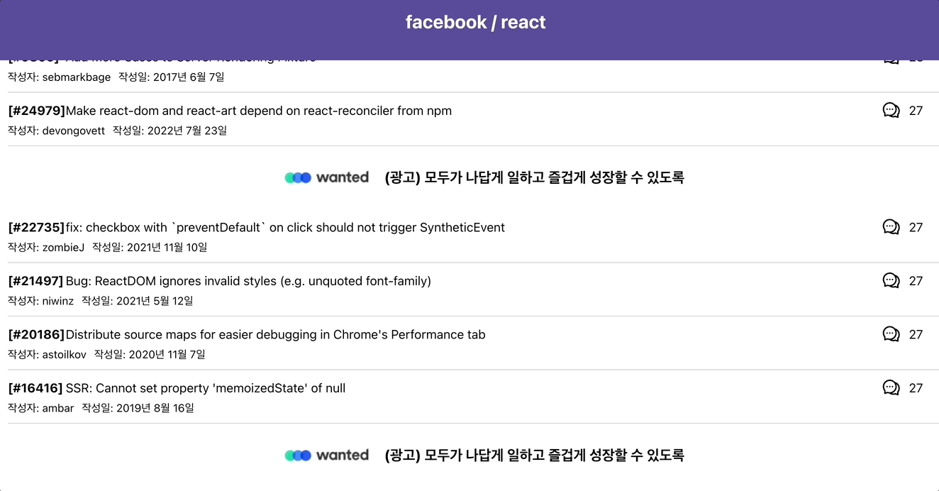
성공 ! 이지만 뭔가 허전하다. 지금은 스켈레톤 컴포넌트가 띡 하고 하나만 렌더링 되는데, 이를 데이터에 맞게 수를 늘려보자. 내가 구현한 프로젝트의 경우 총 4개의 이슈 컴포넌트와 1개의 광고 컴포넌트가 한 묶음으로 되어있다. 스켈레톤 컴포넌트를 이에 맞춰 5개씩 렌더링 되도록 하고싶었다.
기존의 컴포넌트를 'SkeletonItem' 으로 칭하고, 이를 5개씩 렌더링 하는 'SkeletonComponent' 파일을 작성했다.
// SkeletonComponent.tsx

import SkeletonItem from './SkeletonItem';

const SkeletonComponent: React.FC = () => {
  return (
    <div>
      {Array.from({ length: NUMBER_OF_SKELETONS }).map((_, index) => (
        <SkeletonItem key={index} />
      ))}
    </div>
  );
};

export default SkeletonComponent;

const NUMBER_OF_SKELETONS = 5;
Array.from 메서드를 이용하여 스켈레톤 아이템 컴포넌트가 5개 들어있는 배열을 만들어주고, 이를 렌더링 하는 방식을 사용했다.
최종 결과물
이제 스켈레톤 컴포넌트가 내가 원하던대로 5개씩 렌더링된다 !
포스팅을 마치며
내가 참고한 블로그에서는 이렇게 말한다. '스켈레톤 UI를 채택하는 것이 항상 최고의 해결책은 아니다. 중요한 것은 사이트에서 어떤 UI 컴포넌트가 좋게 보이는지 아는 것이다. 때로는 로딩 바로도 충분하지만 더 많은 것이 필요할 수도 있다.' 라고. 사용자들이 보기엔 기존의 Loading... 문구가 더 깔끔하고 직관적일 수 있다. 하지만 이번에 직접 스켈레톤 컴포넌트를 만들고, 프로젝트에 적용해봄으로써 사용자에게 데이터 로딩 상태에서 더 나은 UI/UX를 제공할 수 있는 방법을 배울 수 있었다. 이제 나에게도 한 가지의 선택지가 더 생긴것이다.
참고