🌳 학습내용 ) 반응형 웹
사용하는 이유
장점
1) 모든 기기에서 접속가능
2) 가로모드에 맞춰 레이아웃 변경가능
3)사이트 유지 관리 용이
4) 최신 웹표준에 따름
단점
1) 사이트 디자인이 단순해진다
2) 하위 버전 브라우저와 호환성 문제가 있을 수 있음 -> 미디어쿼리는 css3기술이다
Media Queries
미디어 쿼리를 확인할수있는 사이트다.
손쉽게 반응형 웹페이지를 만들수있는 방법중 하나는 CSS프레임 워크를 활요하는 방법이있다.
대표적인 CSS프레임 워크는 부트스트랩5이다.
  < Viewport: 스마트 폰에서 실제 내용이 표시되는 영역
      width: 뷰포트너비
      initial-scale : 초기 확대/축소 값(1~10) ex) 1: 확대없이 원래 크기로
      user-scalble : 유저가 확대 축소 가능여부 >
  <meta name="viewport" content="width=device-width,
@mdia-query
작은화면 -> 큰화면 --> min-width를 사용하여 활용
스타일 적용할때에는 *는 잘 사용하지않는다.
*를 사용하게 된다면 전체적으로 적용이 되기때문에 현업에서는 잘 사용되지 않는다.
속도차원에서 패널티가 있기 때문이다.
html, body{
	margin:0;
    padding:0;
}
@media (max-width:768px){
	.meia-menu{
    flxe-direction: column;
    align-items: flex-start;
    widht:170px;
    }
🌴 Card-layout
card{
	position:relative;(부모 테크를 지정하여 자식의 absolte를 사용하면 부모기준으로 배치가된다.)
    width:300px;
    height:500px;
    }

.words{
	poasition:absolute;
    left: 10px;
    top: 300px;

}
@media screen and (min-width:768px){
#container{
width:570px;
/*margin:50px auto;*/
}
.card{
position:relatvie;
widhth:550px;
height:250px;
}
.words{
position:absolute;
left: 310px;
top: 50px;
width:200px
}
@media screen and (min-width:1720px){
#container{
width: 1710px;
}
.card{
position:relatvie;
margin:10px;
float:left;
width:550px;
height:250px;
}
}
HTMl
`
<html lang="en">
<head>
<meta charset="UTF-8">
<meta http-equiv="X-UA-Compatible" content="IE=edge">
<meta name="viewport" content="width=device-width, initial-scale=1.0">
<title>Document</title>
<link rel="stylesheet" href="./css/style.css">
</head>
<body>
<div id="container">
<div class="card">
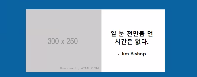
<img src="http://via.placeholder.com/300x250">
<div class="words">
<h2>일 분 전만큼 먼 시간은 없다. </h2>
<h3>- Jim Bishop</h3>
</div>
</div>
<div class="card">
<img src="https://via.placeholder.com/300x250">
<div class="words">
<h2>웃음은 마음의 조깅이다 </h2>
<h3>- Norman Cousins</h3>
</div>
</div>
<div class="card">
<img src="https://via.placeholder.com/300x250">
<div class="words">
<h2>일 분 전만큼 먼 시간은 없다. </h2>
<h3>- Jim Bishop</h3>
</div>
</div>
</div>
</body>
</html>css
@charset "utf-8";

html, body{
    margin:0;
    padding:0;
    /* width: 컨텐츠, 마진, 패딩 합쳐서 결정
    card에서는  border 1px 포함되기 때문에 border까지 모두 너비로 계산하도록 설정 */
    box-sizing:border-box;
}
body{
    background-color: #0964a0;
}
/* 기본 배치 : 세로 정렬  */
#container{
    width: 320px;
    margin: 50px auto;
}
.card {
    position:relative; /*부모 쪽 position:relative 지정하면 자식쪽에서 absolute 배치 시
                        기준이 되는 위치가 변경(브라우저 -> 부모 위치 ) */
    width:300px;
    height:500px;
    margin: 20px 10px;
    border:1px solid #ccc;
    background-color: #fff;
}
.words{
    position:absolute;
    left: 10px;
    top: 300px;
    padding: 10px;
    text-align: center;
}
/* 중복된 부분은 작성하지 않는다!! */
@media screen and (min-width:768px) and (max-width:1719px){
    #container{
        width:570px;
        margin:50px auto;
    }
    .card{
        position:relative;
        width:550px;
        height:250px;
    }
    .words{
        position:absolute;
        left:310px;
        top:50px;
        width:200px;
    }
}

@media screen and (min-width:1720px){
    #container{
        width: 1716px;  /*1710 -> 1716*/
    }
    /* card의 크기: width(550) + margin(20) + border(2) =  1716*/
    .card{
        position:relative;
        float:left;
        margin:10px;
        width:550px;
        height:250px;
    }
    .words{
        position:absolute;
        left:310px;
        top:50px;
        width:200px;
    }
}
🌳 어려운 내용
@media screen and (min-width:1720px){
   #container{
       width: 1716px;
   }
🌳 해결방법
@media screen and (min-width:1720px){
   #container{
       width: 1716px;  /*1710 -> 1716*/
   }
width값의 넓이를 변경해하여 문제를 해결하였다.
🌳 학습소감
아직 많이 부족하지만 열심히 해야겠다.
비전공자의 프론트앤드 도전기