
🍎학습내용 주제
반응형 웹 만들기

@media 활용하기

   768px 보다 작을때 header가 2단으로 바뀌도록 처리
html
<!DOCTYPE html>
<html lang="ko">
<head>
    <meta charset="UTF-8">
    <meta http-equiv="X-UA-Compatible" content="IE=edge">
    <meta name="viewport" content="width=device-width, initial-scale=1.0">
    <link rel="stylesheet" href="./css/style.css">
    <title>Document</title>
</head>
<body>
    <header class="intro">
        <h1></h1>
        <nav>
            <ul>
                <li>1</li>
                <li>2</li>
                <li>3</li>
            </ul>
        </nav>
    </header>
    <section class="main">
        <p>Lorem, ipsum dolor sit amet consectetur adipisicing elit. </p>

    </section>
</body>
</html>
CSS code
@charset "utf-8";
body, h1, p{
margin:0;
padding:0;
}
p {font-size: 48px;}
/* position: static fixed */
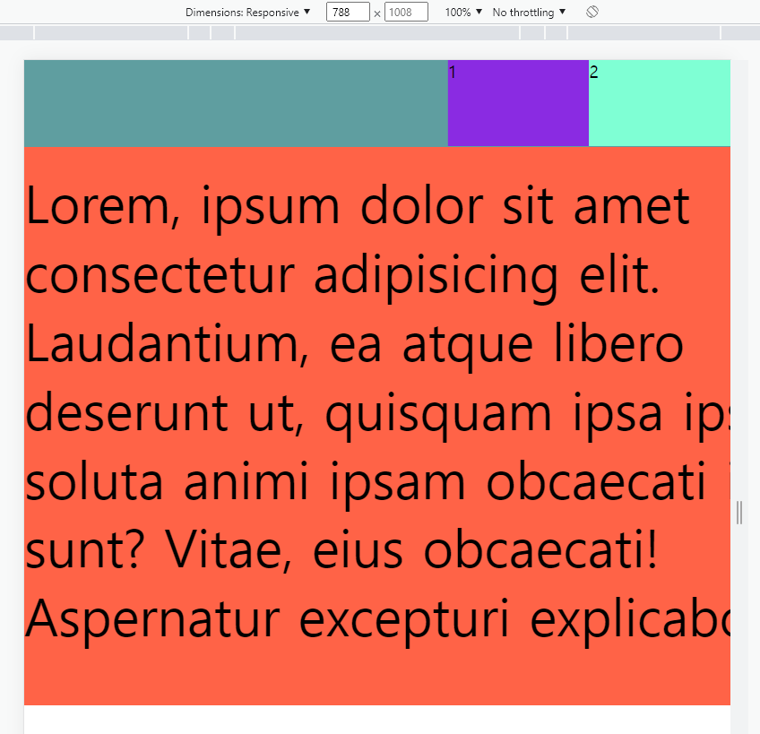
.intro{
width:100%;
height: 80px;
display:flex;
position:fixed;
/* border:1px solid red; */
}
.intro h1{
width:50%;
height: 100%;
background-color: cadetblue;
}
.intro nav{
width:50%;
height:100%;
/* background-color: yellowgreen; */
}
.intro nav ul{
list-style: none;
display: flex;
margin:0;
padding:0;
}
.intro nav ul li{
width: 33.3333%;
height: 80px;
/* border:1px solid red; */
}
.intro nav ul li:first-child{
background-color: blueviolet;
}
.intro nav ul li:nth-child(2){
background-color: aquamarine;
}
.intro nav ul li:last-child{
background-color: royalblue;
}
.main{
width:100%;
height:500px;
background-color: tomato;
padding-top:100px;
}
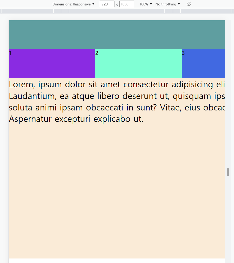
/* 768px 보다 작을 때 header가 2단으로 바뀌도록 처리 */
@media (max-width:768px){
.intro{
height:160px;
flex-direction: column;
position:static;
}
.intro h1,
.intro nav{
width:100%;
}
.main{
padding-top:0;
background-color: antiquewhite;
}
p {font-size: 24px;}
}
@media 커리 적용후 메뉴바
gird 사용법
display:grid; /*grid, gird-inline */
grid-template-columns: repeat(2, 200px);
grid-template-rows: minmax(220px auto);
grid-gap: 10px 10px;
justify-content: center;
gird 또한 flex와 같이 gird-inline이있다.
block 과 inline-block의 관계로 생각하면된다.
gird-tmeplate-rows; = 행의 배치
gird-tmeplate-columns; 열의 배치
fr 은 fraction의 줄임말이다.
1fr 1fr 1fr은 균등하게 1:1:1의 비율로 3개의 만들겠다는것이다.
repeat는 반복하여 자동으로 값을 처리하는 함수이다.
grid-template-columns: repeat(2, 200px); 2번 200px 200px 반복하는것이다
🙊 어려웠던 점 or 해결못한 것
grid의 사용법이 익숙하지 않아서 힘들었다.
🐣 해결방법 작성
수업 이 끝난후 그리드에 대하여 추가 공부를 진행하였다.🌝 학습 소감
기초부터 탄탄히 잡으면서 학습을 해나가야할것 같다고 생각이들었다.
비전공자의 프론트앤드 도전기