위젯 소개
구글에서 플러터를 소개할 때, 'Everything is a Widget' '모든 것이 위젯이다' 라고 소개를 한다.
플러터에서 화면에 보여지는 UI와 관련된 모든 요소는 위젯으로 구성되어 있다.
위젯은 현재 주어진 상태(데이터) 를 기반으로 어떤 UI를 구현할지를 정의한다.
위젯의 상태가 변경되면 변경 사항에 알맞게 변경된 UI를 화면에 다시 그려준다.
자식을 하나만 갖는 위젯
child 매개변수를 입력받아서 하나의 자식만 갖는다.
Container
자식을 담는 컨테이너 역할을 한다.
배경색, 너비와 높이, 테두리 등의 디자인을 지정할 수 있다.
GestureDetector
플러터에서 제공하는 제스처 기능을 자식 위젯에서 인식하는 위젯이다.
탭이나 드래그 그리고 더블클릭 같은 제스처 기능이 자식 위젯에 인식됐을 때 함수를 실행할 수 있다.
SizedBox
높이와 너비를 지정하는 위젯이다.
Container 와는 다르게 디자인 요소를 적용할 수 없고 const 생성자로 선언할 수 있어서 퍼포먼스 측면에서 더 효율적이다.
다수의 자식을 갖는 위젯
children 매개변수를 입력받으며 리스트로 여러 위젯을 입력할 수 있다.
Column
children 매개변수에 입력된 모든 위젯들을 세로로 배치한다.
Row
children 매개변수에 입력된 모든 위젯들을 가로로 배치한다.
ListView
리스트를 구현할 때 사용된다.
입력된 위젯이 화면을 벗어나게 되면 스크롤이 가능해진다.
child / children 차이점
child
단 하나의 위젯만 입력 가능
예시에서는 Text 위젯 하나만 렌더링 한다.
import 'package:flutter/material.dart';
void main() {
runApp(MyApp());
}
class MyApp extends StatelessWidget {
// 생성자
const MyApp({Key? key}) : super(key: key);
@override
Widget build(BuildContext context) {
return MaterialApp(
home: Scaffold(
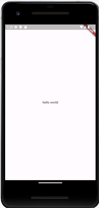
body: Center(
child: Text("hello world"),
),
),
);
}
}
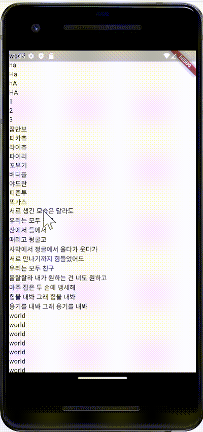
children
여러 위젯을 리스트에 입력할 수 있다.
리스트에 입력된 순서대로 화면에 그려진다.
ListView 위젯을 활용하니 스크롤이 된다.
import 'package:flutter/material.dart';
void main() {
runApp(MyApp());
}
class MyApp extends StatelessWidget {
// 생성자
const MyApp({Key? key}) : super(key: key);
@override
Widget build(BuildContext context) {
return MaterialApp(
home: Scaffold(
body: SizedBox(
width: double.infinity,
child: ListView(
children: [
Text('hello'),
Text('world'),
Text('ha'),
Text('Ha'),
Text('hA'),
Text('HA'),
Text('1'),
Text('2'),
Text('3'),
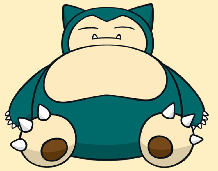
Text('잠만보'),
Text('피카츄'),
Text('라이츄'),
Text('파이리'),
Text('꼬부기'),
Text('버터풀'),
Text('야도란'),
Text('피죤투'),
Text('또가스'),
Text('서로 생긴 모습은 달라도'),
Text('우리는 모두 친구'),
Text('산에서 들에서'),
Text('때리고 뒹굴고'),
Text('사막에서 정글에서 울다가 웃다가'),
Text('서로 만나기까지 힘들었어도'),
Text('우리는 모두 친구'),
Text('울랄랄라 내가 원하는 건 너도 원하고'),
Text('마주 잡은 두 손에 맹세해'),
Text('힘을 내봐 그래 힘을 내봐'),
Text('용기를 내봐 그래 용기를 내봐'),
Text('world'),
Text('world'),
Text('world'),
Text('world'),
Text('world'),
Text('world'),
Text('world'),
Text('world'),
Text('world'),
],
),
),
),
);
}
}
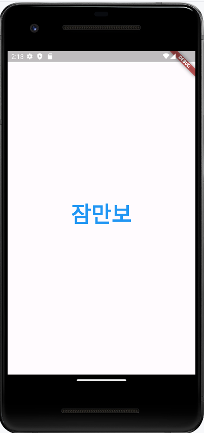
텍스트 위젯
화면에 글자를 보여주려면 글자를 렌더링할 수 있는 위젯을 사용해야 한다.
대표적으로Text위젯이 있다.
text 위젯은
글자를 적고 스타일링 하는 위젯이다.
첫번째 포지셔널 파라미터에 원하는 문자열을 작성하고,
style 이라는 네임드 파라미터를 사용해 스타일링을 정한다.
import 'package:flutter/material.dart';

void main() {
  runApp(MyApp());
}

class MyApp extends StatelessWidget {
  // 생성자
  const MyApp({Key? key}) : super(key: key);

  @override
  Widget build(BuildContext context) {
    return MaterialApp(
      home: Scaffold(
        body: Center(
          child: Text(
            '잠만보',
            style: TextStyle(
            fontSize: 48,
            fontWeight: FontWeight.w700,
            color: Colors.blue,
          ),
          ),
        )
      ),
    );
  }
}
제스처 관련 위젯
제스처란
사용자가 키보드로 글자를 입력하는 행위 외의 모든 입력을 제스처라고 한다.
화면을 탭하거나, 길게 누르거나...
GestureDetector 위젯은 모든 제스처를 매개변수로 제공해준다.
제스처 관련 위젯은 하위 위젯에 탭이나 드래그처럼 특정 제스처가 입력됐을 때 인식하고, 콜백 함수를 실행한다.
Button 위젯
TextButton
텍스트만 있는 버튼이다.
콜백함수로 print함수를 실행해서 버튼을 누르면 '클릭함?' 문구가 뜨게 했다.
import 'package:flutter/material.dart';

void main() {
  runApp(MyApp());
}

class MyApp extends StatelessWidget {
  // 생성자
  const MyApp({Key? key}) : super(key: key);

  @override
  Widget build(BuildContext context) {
    return MaterialApp(
      home: Scaffold(
          body: Center(
              child: TextButton(
        onPressed: () => {print('클릭함?')},
        style: TextButton.styleFrom(
          foregroundColor: Colors.red,
        ),

        //버튼에 넣을 텍스트 위젯
        child: Text(
          '텍스트 버튼임',
          style: TextStyle(
            fontSize: 48,
            fontWeight: FontWeight.w700,
          ),
        ),
      ))),
    );
  }
}
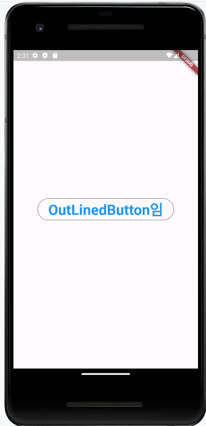
OutLinedButton
테두리가 있는 버튼이다.
import 'package:flutter/material.dart';

void main() {
  runApp(MyApp());
}

class MyApp extends StatelessWidget {
  // 생성자
  const MyApp({Key? key}) : super(key: key);

  @override
  Widget build(BuildContext context) {
    return MaterialApp(
      home: Scaffold(
          body: Center(
              child: OutlinedButton(
                // 클릭 시 실행할 함수
                onPressed: () =>{print('클릭함?')},
                // 버튼 스타일
                style: OutlinedButton.styleFrom(
                  foregroundColor: Colors.blue,
                ),
                // 버튼에 들어갈 위젯
                child: Text('OutLinedButton임',
                style: TextStyle(
                  fontSize: 32,
                  fontWeight: FontWeight.w700,
                ),),
              )
          )
      ),
    );
  }
}
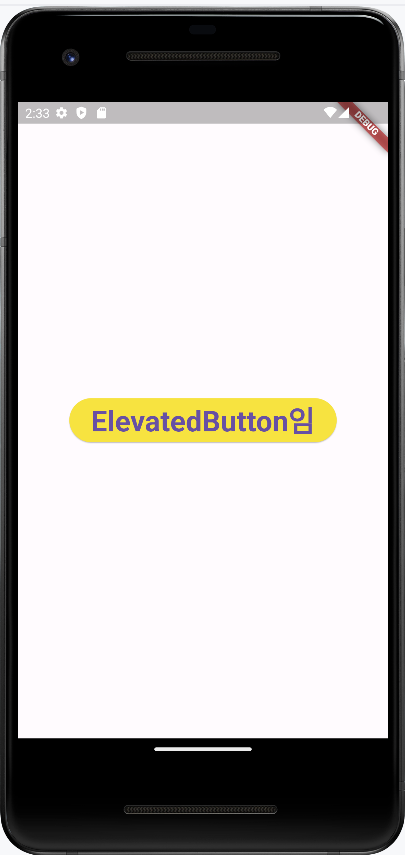
ElevatedButton
입체적으로 튀어나온 느낌의 배경이 들어간 버튼이다.
import 'package:flutter/material.dart';

void main() {
  runApp(MyApp());
}

class MyApp extends StatelessWidget {
  // 생성자
  const MyApp({Key? key}) : super(key: key);

  @override
  Widget build(BuildContext context) {
    return MaterialApp(
      home: Scaffold(
          body: Center(
              child: ElevatedButton(
        // 클릭 시 실행할 콜백
        onPressed: () => {},
        // 버튼 스타일링
        style: ElevatedButton.styleFrom(
          backgroundColor: Colors.yellow,
        ),
        // 버튼에 들어갈 위젯
        child: Text(
          'ElevatedButton임',
          style: TextStyle(
            fontSize: 32,
            fontWeight: FontWeight.w700,
          ),
        ),
      ))),
    );
  }
}
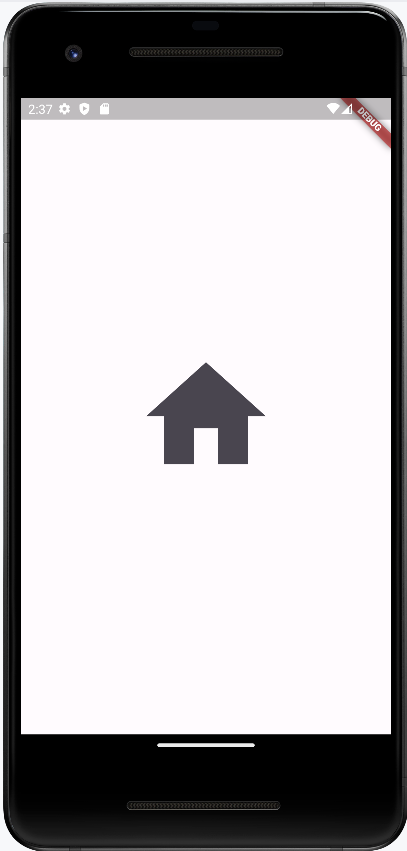
IconButton
아이콘을 버튼으로 생성하는 위젯이다.
icon 매개변수에 보여주고 싶은 아이콘을 넣을 수 있다.
아이콘은 글리프(glyph) 기반의 아이콘을 사용할 수 있으며 Icons 클래스를 통해 플러터에서 제공하는 기본 아이콘들을 사용할 수 있다.
import 'package:flutter/material.dart';

void main() {
  runApp(MyApp());
}

class MyApp extends StatelessWidget {
  // 생성자
  const MyApp({Key? key}) : super(key: key);

  @override
  Widget build(BuildContext context) {
    return MaterialApp(
      home: Scaffold(
          body: Center(
              child: IconButton(
        onPressed: () => {},
        icon: Icon(
          Icons.home,
          size: 160,
        ),
      ))),
    );
  }
}
집모양 아이콘이 잘 나온다
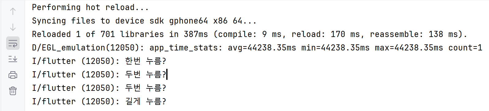
GestureDetector
손가락으로 하는 여러가지 입력을 인지하는 위젯
한번 눌렀을 때,
두번 눌렀을 때,
길게 눌렀을 때,
각각 상황에 맞는 콜백을 호출해서 print 하는 것을 볼 수 있다.
import 'package:flutter/material.dart';

void main() {
  runApp(MyApp());
}

class MyApp extends StatelessWidget {
  // 생성자
  const MyApp({Key? key}) : super(key: key);

  @override
  Widget build(BuildContext context) {
    return MaterialApp(
      home: Scaffold(
          body: Center(
              child: GestureDetector(
        // 한번 탭했을 때, 실행할 함수
        onTap: () => {print('한번 누름?')},
        // 두번 탭했을 때, 실행할 함수
        onDoubleTap: () => {print('두번 누름?')},
        // 길게 눌렀을 때,
        onLongPress: () => {print('길게 누름?')},
        // 제스처를 적용할 위젯
        child: Container(
          decoration: BoxDecoration(
            color: Colors.blue,
          ),
          width: 100,
          height: 100,
        ),
      ))),
    );
  }
}
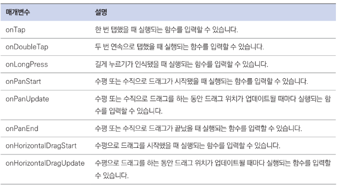
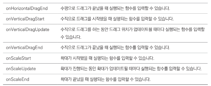
GestureDetector 위젯에서 제공하는 제스처 매개변수들
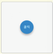
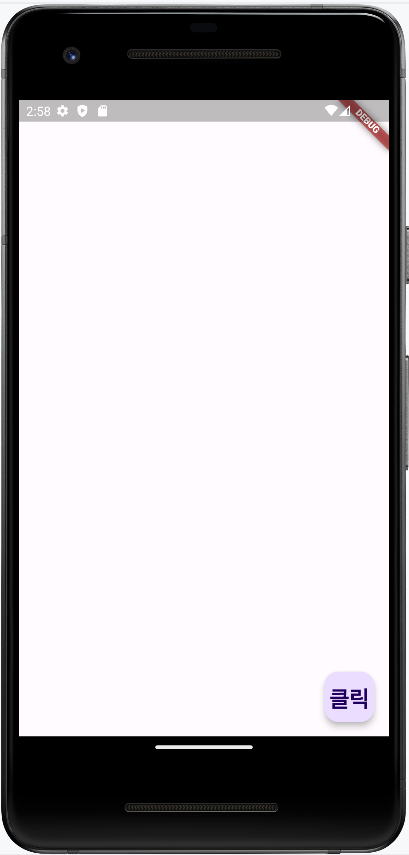
FloatingActonButton
안드 앱 사용하다 보면 화면 아래에 동그란 플로팅 버튼을 볼 수 있다. 그거 말하는거임
import 'package:flutter/material.dart';

void main() {
  runApp(MyApp());
}

class MyApp extends StatelessWidget {
  // 생성자
  const MyApp({Key? key}) : super(key: key);

  @override
  Widget build(BuildContext context) {
    return MaterialApp(
      home: Scaffold(
        floatingActionButton: FloatingActionButton(
          // 클릭했을 떄 실행할 함수
          onPressed: () => {print('누름?')},
          child: Text(
            '클릭',
            style: TextStyle(
              fontSize: 24,
              fontWeight: FontWeight.w700,
            ),
          ),
        ),
        body: Container(),
      ),
    );
  }
}
디자인 관련 위젯
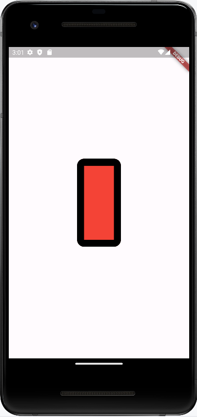
Container
import 'package:flutter/material.dart';

void main() {
  runApp(MyApp());
}

class MyApp extends StatelessWidget {
  // 생성자
  const MyApp({Key? key}) : super(key: key);

  @override
  Widget build(BuildContext context) {
    return MaterialApp(
      home: Scaffold(
          body: Center(
        child: Container(
          // 스타일 작용
          decoration: BoxDecoration(
            // 배경색 적용
            color: Colors.red,
            // 테두리 적용
            border: Border.all(
              // 테두리 굵기
              width: 16.0,
              // 테두리 색상
              color: Colors.black,
            ),
            // 모서리 둥글게 만들기
            borderRadius: BorderRadius.circular(
              16.0,
            ),
          ),
          // 높이
          height: 200.0,
          // 너비
          width: 100.0,
        ),
      )),
    );
  }
}
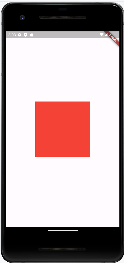
SizedBox
일정 크기의 공간을 공백으로 두고 싶을 때 사용한다.
Container도 공백을 만들 수 있지만 SizedBox 는 const생성자를 사용했을때, 퍼포먼스에서 이점을 얻을 수 있다.
import 'package:flutter/material.dart';

void main() {
  runApp(MyApp());
}

class MyApp extends StatelessWidget {
  // 생성자
  const MyApp({Key? key}) : super(key: key);

  @override
  Widget build(BuildContext context) {
    return MaterialApp(
      home: Scaffold(
          body: Center(
              child: SizedBox(
        // 높이 지정
        height: 200.0,

        // 너비 지정
        width: 200.0,

        // SizedBox는 색상이 없으므로 크기를 확인하는
        // 용도로 Container 추가
        child: Container(
          color: Colors.red,
        ),
      ))),
    );
  }
}
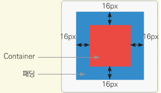
Padding
child 위젯에 여백을 제공할 때 사용한다.
Padding 위젯을 사용하면 Padding 위젯의 상위 위젯과 하위 위젯 사이의 여백을 둘 수 있다.
import 'package:flutter/material.dart';

void main() {
  runApp(MyApp());
}

class MyApp extends StatelessWidget {
  // 생성자
  const MyApp({Key? key}) : super(key: key);

  @override
  Widget build(BuildContext context) {
    return MaterialApp(
      home: Scaffold(
          body: Center(
              child: Container(
        color: Colors.blue,
        child: Padding(
          // 상하, 좌우로 모두 16픽셀만큼 패딩 적용
          padding: EdgeInsets.all(
            16.0,
          ),
          child: Container(
            color: Colors.red,
            width: 50.0,
            height: 50.0,
          ),
        ),
      ))),
    );
  }
}
상위 위젯인 파란 Container,
하위 위젯인 빨간 Container
사이에 padding 16px 이 들어가 있다
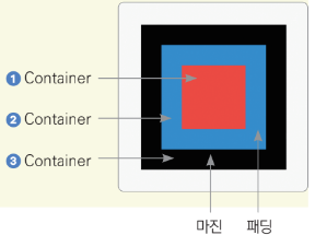
Margin
위젯의 바깥에 간격을 추가해 준다.
플러터에서는 잘 쓰이지 않는다.
Margin 은 따로 위젯이 존재하지 않고 Container 위젯에 추가할 수 있다.
import 'package:flutter/material.dart';

void main() {
  runApp(MyApp());
}

class MyApp extends StatelessWidget {
  // 생성자
  const MyApp({Key? key}) : super(key: key);

  @override
  Widget build(BuildContext context) {
    return MaterialApp(
      home: Scaffold(
          body: Center(
              child: Container(
                  color: Colors.blue,
                  child: // ③ 최상위 검정 컨테이너 (margin이 적용되는 대상)
                      Container(
                    color: Colors.black,

                    // ② 중간 파란 컨테이너
                    child: Container(
                      color: Colors.blue,

                      // 마진 적용 위치
                      margin: EdgeInsets.all(16.0),

                      // 패딩 적용
                      child: Padding(
                        padding: EdgeInsets.all(16.0),

                        // ① 패딩이 적용된 빨간 컨테이너
                        child: Container(
                          color: Colors.red,
                          width: 50,
                          height: 50,
                        ),
                      ),
                    ),
                  )))),
    );
  }
}
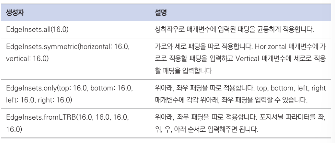
EdgeInsets 클래스 생성자 정리
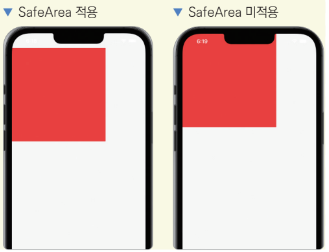
SafeArea
플러터는 가용되는 화면을 모두 사용하기 때문에 노치가 있는 핸드폰에서 노치에 위젯들이 가릴 수 있다.
SafeArea 위젯을 사용하면 따로 기기별로 예외 처리를 하지 않고도 안전한(Safe) 화면에서만 위젯을 그릴 수 있다.
import 'package:flutter/material.dart';

void main() {
  runApp(MyApp());
}

class MyApp extends StatelessWidget {
  // 생성자
  const MyApp({Key? key}) : super(key: key);

  @override
  Widget build(BuildContext context) {
    return MaterialApp(
      home: Scaffold(
          body: Center(
        child: SafeArea(
          // 원하는 부위만 따로 적용할 수도 있습니다.
          // true는 적용 false는 미적용
          top: true,
          bottom: true,
          left: true,
          right: true,
          child: Container(
            color: Colors.red,
            height: 300.0,
            width: 300.0,
          ),
        ),
      )),
    );
  }
}
배치 관련 위젯
너무 많으니까 그림으로 보자
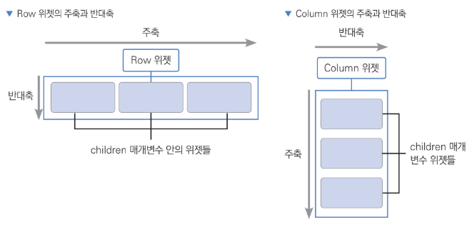
Row
Row는 말 그대로 가로로 위젯을 배치하는 데 사용된다.
하나의 child 위젯을 입력받는 위젯들과 다르게 여러 개의 child 위젯을 입력받을 수 있는 children 매개변수를 노출한다.
Row와 Column에는 주축main axis과 반대축cross axis이라는 개념이 존재하는데 Row는 가로가 주축, 세로가 반대축이 되고 Column의 경우 반대가 된다.
주축과 반대축을 어떻게 조합하냐에 따라 Row와 Column 위젯을 이용해서 다양하게 배치할 수 있다.
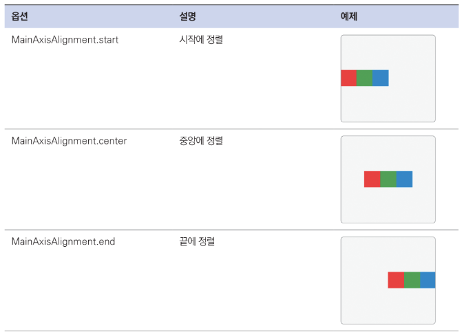
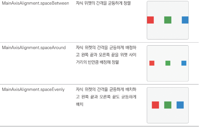
MainAxisAllignment
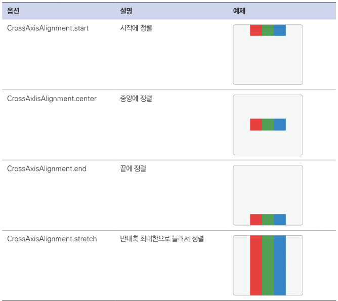
CrossAxisAlignment
Column
Row를 그냥 세로로 보면 됨
Flexible
Flexible 위젯은 Row나 Column에서 사용하는 위젯이다.
Flexible 위젯을 Column과 Row에서 사용하면 Flexible에 제공된 child가 크기를 최소한으로 차지하게 할 수 있다.
추가적으로flex 매개변수를 이용해 각 Flexible 위젯이 얼만큼의 비율로 공간을 차지할지 지정할 수도 있다.
Expanded
Expanded 위젯은 Flexible 위젯을 상속하는 위젯이다.
Column과 Row에서 Expanded를 사용하면 위젯이 남아 있는 공간을 최대한으로 차지합니다.
Flexible 위젯은 fit 매개변수에 FlexFit.tight 또는 FlexFit.loose를 입력할 수 있다.
FlexFit.loose는 자식 위젯이 필요한 만큼의 공간만 차지합니다.FlexFit.tight는 자식 위젯이 차지하는 공간과 관계없이 남은 공간을 모두 차지합니다.
Expanded 위젯은 Flexible 위젯의 fit 매개변수에
FlexFit.tight를 기본으로 제공해준 위젯이다. 따라서 Flexible 위젯과 다르게 남는 공간을 최대한으로 차지하게 된다.
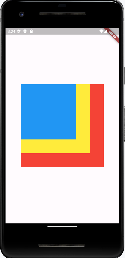
Stack
위젯을 겹치는 기능을 제공
import 'package:flutter/material.dart';

void main() {
  runApp(MyApp());
}

class MyApp extends StatelessWidget {
  // 생성자
  const MyApp({Key? key}) : super(key: key);

  @override
  Widget build(BuildContext context) {
    return MaterialApp(
      home: Scaffold(
          body: Center(
        child: Stack(
          children: [
            // 빨간색 Container
            Container(
              height: 300.0,
              width: 300.0,
              color: Colors.red,
            ),

            // 노란색 Container
            Container(
              height: 250.0,
              width: 250.0,
              color: Colors.yellow,
            ),

            // 파란색 Container
            Container(
              height: 200.0,
              width: 200.0,
              color: Colors.blue,
            ),
          ],
        ),
      )),
    );
  }
}