버블 차트 그리기
데이터셋
df_goal_point.head()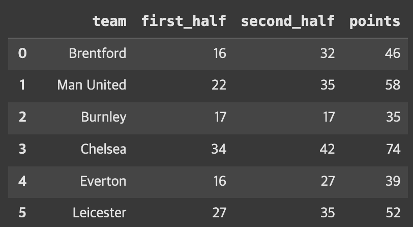
산점도에 size 파라미터를 추가하여 버블 차트 그리기
- sns.scatterplot(x = x, y = y, size = '사이즈를 결정할 컬럼')
sns.scatterplot(x = 'first_half',
                y = 'second_half',
                hue = 'team',
                size = 'points',
                alpha = 0.8,
                data = df_goal_point)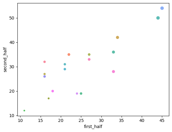
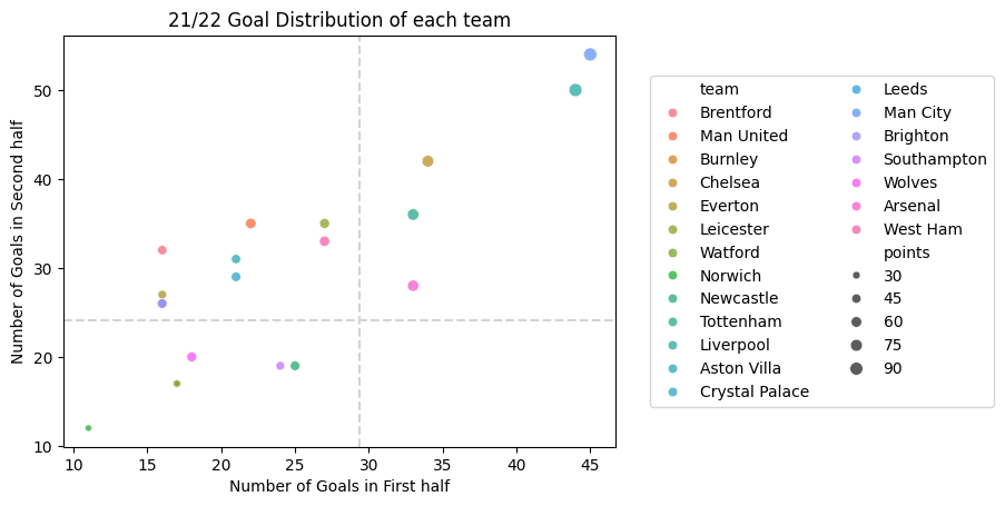
산점도에 수직선, 수평선 추가하기
- 수평선
plt.axhline(값, color = 색싱, linestyle = '--', linewidth = 1.5)- 수직선
plt.axvline(값, color = 색상, linestyle = '--', linewidth = 1.5)예시
sns.scatterplot(x = 'first_half',
                y = 'second_half',
                hue = 'team',
                size = 'points',
                alpha = 0.8,
                data = df_goal_point)
plt.xlabel('Number of Goals in First half')
plt.ylabel('Number of Goals in Second half')
plt.title('21/22 Goal Distribution of each team')
plt.axhline(df_goal_point['first_half'].mean(), color = 'lightgray', linestyle = '--', linewidth = 1.5)
plt.axvline(df_goal_point['second_half'].mean(), color = 'lightgray', linestyle = '--', linewidth = 1.5)
plt.legend(loc = 'center right', bbox_to_anchor=(1.7, 0.5), ncol = 2)
plt.show()- 결과:

To Dare is To Do