분포 Distribution
- 정의: 데이터가 특정 값 중심으로 흩어진 형태를 나타내는 통계적 개념. 경험적인 데이터의 형태
- 분류: 이산확률분포와 연속확률분포
- 장점
- 데이터의 요약(중앙값, 평균, 분산) 등에 대한 수식 표현 가능
- 모집단을 추정하는 가설의 기반
- 각 분포는 특정 확률 함수를 가지며, 이를 통해 예측 가능
- 분포로 형태 현상을 모델링할 수 있음 (*모델링: 현실 세계를 추상화, 단순화, 명확화하는 방법)

베르누이 분포 Bernoulli Distribution
-
확률 변수가 취할 수 있는 경우가 2가지인 경우
-
예) 동전 던지기, 클릭 등
- 확률: 0과 1 사이의 값이며, 모든 경우에 대한 확률의 합은 1
- 확률 변수: 변수가 가질 수 있는 경우의 수를 표현하는 방법
-
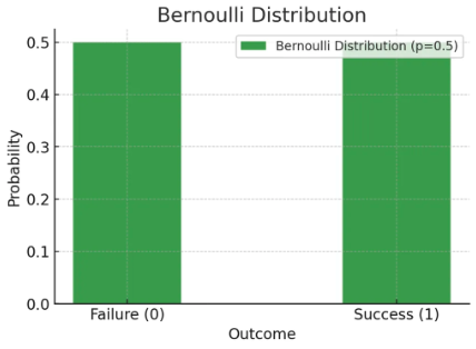
한 유저가 어떤 버튼을 클릭하는 경우가 1, 클릭하지 않는 경우가 0으로 동등하다고 하면 아래와 같이 표현

-
일반화 수식
-
시각화 코드
import matplotlib.pyplot as plt

# 베르누이 분포 모수 정의
p_bernoulli = 0.5  # 확률

# 클릭(=성공) 1, 클릭안함(=실패) 0 으로 정의
x_bernoulli = [0, 1]

# 각 확률 계산
y_bernoulli = [1 - p_bernoulli, p_bernoulli]

# 베르누이 분포 시각화
plt.figure(figsize=(6, 4))
plt.bar(x_bernoulli, y_bernoulli,
		color='green', alpha=0.7, width=0.4,
        label=f'Bernoulli Distribution (p={p_bernoulli})')
plt.xticks([0, 1], ['Failure (0)', 'Success (1)'])
plt.xlabel('Outcome')
plt.ylabel('Probability')
plt.title('Bernoulli Distribution')
plt.legend()
plt.grid(axis='y', linestyle='--', alpha=0.7)
plt.show()
이항 분포 Binomial Distribution
- 연속된 n번의 독립적 시행에서 각 시행이 확률 p를 가질 때의 이산 확률 분포
- 베르누이 분포의 N번 확장 버전.
-
이항분포 표현식
-
이항분포 수식
-
버튼을 클릭하는 확률이 1/2일 때, 3명의 유저 중 2명이 클릭할 확률은
- n = 3, k = 2, p = 1/2
-
시각화 코드
import numpy as np
import matplotlib.pyplot as plt
from scipy.stats import binom

# 이항분포 모수 정의
n_users = 3  # 유저의 수
p_click = 1 / 2  # 클릭 확률

# 클릭 수 생성
x_clicks = np.arange(0, n_users + 1) # [0, 1, 2, 3]

# 클릭 0 부터 3(모두 클릭)에 대한 확률을 생성
y_clicks = binom.pmf(x_clicks, n_users, p_click) # [0.125, 0.375, 0.375, 0.125]

# 시각화
plt.figure(figsize=(8, 5))
plt.bar(x_clicks, y_clicks, color='orange', alpha=0.7, label=f'Binomial Distribution (n={n_users}, p={p_click:.2f})')
plt.xlabel('Number of Users Clicking')
plt.ylabel('Probability')
plt.title('Binomial Distribution of Clicks')
plt.xticks(x_clicks)
plt.legend()
plt.grid(axis='y', linestyle='--', alpha=0.7)
plt.show()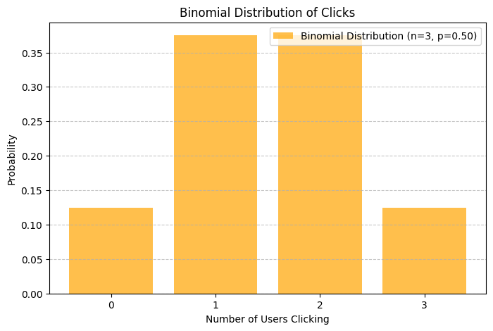
만약 N이 매우 커지게 된다면?
-
자연스럽게 정규분포와 모양이 비슷해진다.
-
일반적으로 이면서 인 경우 정규분포를 따른다고 "경험적"으로 알려져있다.

-
수식
-
시각화 코드
import numpy as np
import matplotlib.pyplot as plt
from scipy.stats import binom

# 이항분포 정의
n_large = 100  # 100명이 시행
p_large = 1 / 2  # 클릭 확률 0.5

#데이터 생성
x_large = np.arange(0, n_large + 1)

# 100명의 시행횟수 수행
y_large = binom.pmf(x_large, n_large, p_large)

# Normal approximation (mean and standard deviation)
mean = n_large * p_large
std = np.sqrt(n_large * p_large * (1 - p_large))
normal_approx = (1 / (std * np.sqrt(2 * np.pi))) * np.exp(-0.5 * ((x_large - mean) / std) ** 2)

# 이항분포와 정규분포 시각화
plt.figure(figsize=(10, 6))
plt.bar(x_large, y_large, color='blue', alpha=0.5, label='Binomial Distribution')
plt.plot(x_large, normal_approx, color='red', lw=2, label='Normal Approximation')
plt.xlabel('Number of Users Clicking')
plt.ylabel('Probability')
plt.title(f'Binomial Distribution (n={n_large}, p={p_large:.2f}) vs Normal Approximation')
plt.legend()
plt.grid(axis='y', linestyle='--', alpha=0.7)
plt.show()
균등 분포 Uniform Distribution
- 모든 X에 대해서 확률이 동일함.
- 연속확률분포 중 하나.
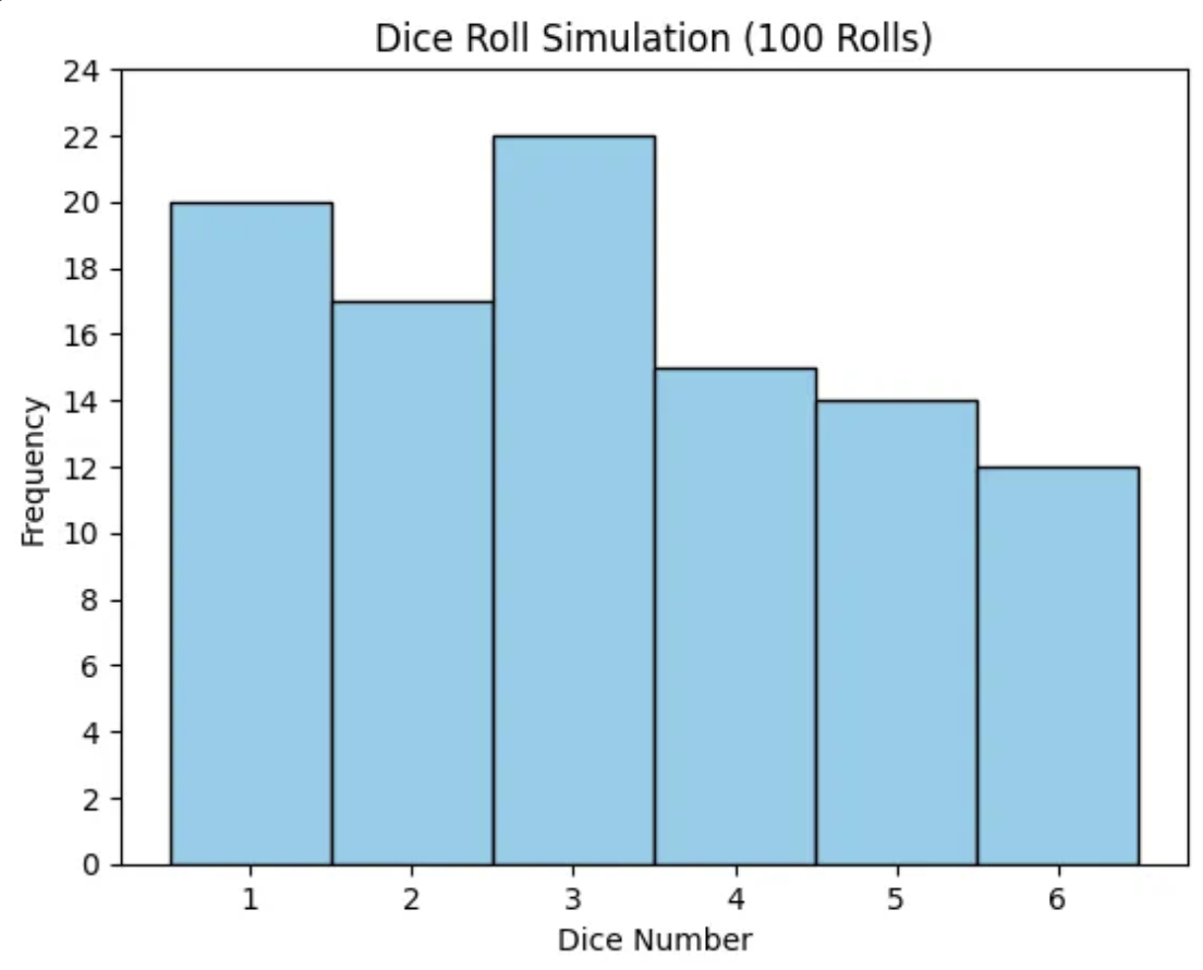
- 이론적으로 '주사위 굴리기'는 균등 분포의 유사한 사례 But 이산확률이기에 정확하지는 X
정규 분포 Normal Distribution
- 평균을 기준으로 좌우 대칭이며, 종 모양으로 봉우리가 1개인 연속하는 확률 분포.
- 장점: 평균과 표준 편차를 알고 있다면, 특정 값이 전체 데이터의 몇 %에 포함되는지 알 수 있다.
- 정규분포 표현식
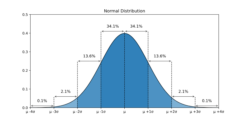
- : 전체 데이터의 68%
- : 전체 데이터의 95%
- : 전체 데이터의 99.7%
왜도 Skewness
- 확률의 비대칭 정도를 나타내는 측도
- 긴꼬리 분포라고도 함.
- 주로 right skewness가 자주 발생한다.

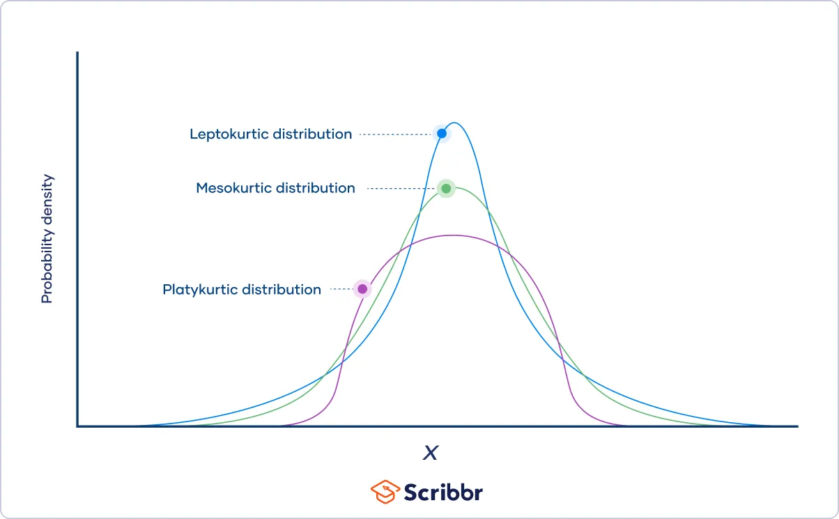
첨도 Kurtosis
- 종모양의 뾰족한 정도를 나타내는 측도
- 첨도가 정규분포보다 낮으면 뭉툭한 모양으로 이상치가 적음
- 첨도가 정규분포보다 높으면 꼬리(tail)가 길고 이상치가 많
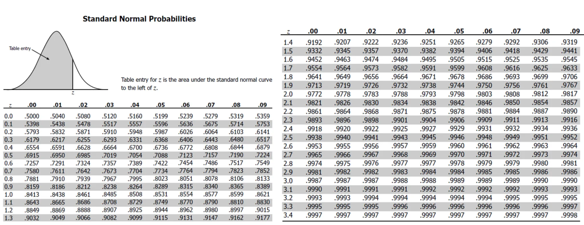
표준정규분포 Standard Normal Distribution
- 평균이 0이고, 표준편차가 1인 정규분포
- 정규화 Normalization: 어떤 대상을 규칙이나 기준에 맞는 상태로 만드는 방법
- 추론통계에서는 "모든 데이터에서 평균을 빼고 표준편차로 나누는 방법"
- 또한 모든 Z 값에 대해 이미 계산해놓은 표가 존재 -> 표준정규분포표
- "누적된 확률값" 제공

To Dare is To Do