
3강 - 다양한 분석 방법
위치 추정
# 데이터 분석에서 자주 사용되는 라이브러리
import pandas as pd
# 다양한 계산을 빠르게 수행하게 돕는 라이브러리
import numpy as np
# 시각화 라이브러리
import matplotlib.pyplot as plt
# 시각화 라이브러리2
import seaborn as sns
data = [85, 90, 78, 92, 88, 76, 95, 89, 84, 91]
mean = np.mean(data)
median = np.median(data)
print(f"평균: {mean}, 중앙값: {median}")평균: 86.8, 중앙값: 88.5
변이 추정
variance = np.var(data)
std_dev = np.std(data)
data_range = np.max(data) - np.min(data)

print(f"분산: {variance}, 표준편차: {std_dev}, 범위: {data_range}")
분산: 33.36, 표준편차: 5.775811631277461, 범위: 19
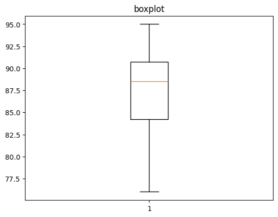
데이터 분포
plt.hist(data, bins=5)
plt.title('histogram')
plt.show()

plt.boxplot(data)
plt.title('boxplot')
plt.show()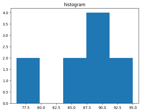
이진 데이터와 범주형 데이터
satisfaction = ['satisfaction', 'satisfaction', 'dissatisfaction',
'satisfaction', 'dissatisfaction', 'satisfaction', 'satisfaction',
'dissatisfaction', 'satisfaction', 'dissatisfaction']
satisfaction_counts = pd.Series(satisfaction).value_counts()

satisfaction_counts.plot(kind='bar')
plt.title('satisfaction distribution')
plt.show()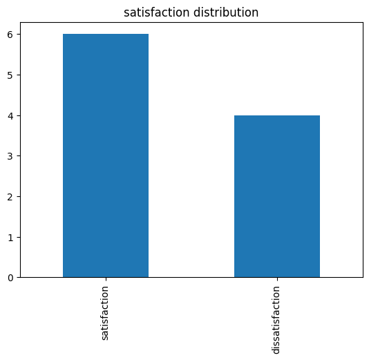
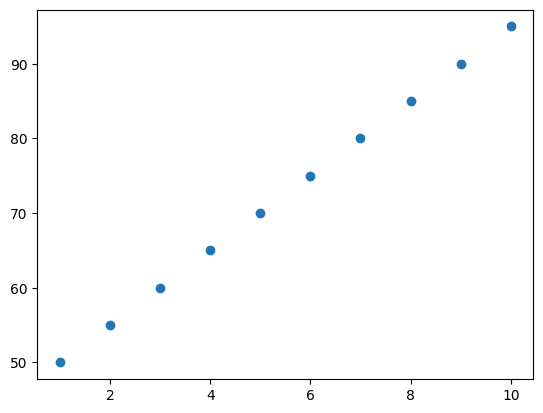
상관관계 분석
study_hours = [10, 9, 8, 7, 6, 5, 4, 3, 2, 1]
exam_scores = [95, 90, 85, 80, 75, 70, 65, 60, 55, 50]
correlation = np.corrcoef(study_hours, exam_scores)[0, 1]

print(f"공부 시간과 시험 점수 간의 상관계수: {correlation}")

plt.scatter(study_hours, exam_scores)
plt.show()
공부 시간과 시험 점수 간의 상관계수: 1.0
np.corrcoef(data1, data2)
correlation1 = np.corrcoef(study_hours, exam_scores)
correlation1
# 결과:
array([[1., 1.],
[1., 1.]])위처럼 상관계수 행렬이 반환됨. 따라서 [0, 1], 즉, 0행 1열로 인덱싱을 하여 상관계수 (1.)만 도출.
두 개 이상의 변수 탐색
data = {'TV': [230.1, 44.5, 17.2, 151.5, 180.8],
        'Radio': [37.8, 39.3, 45.9, 41.3, 10.8],
        'Newspaper': [69.2, 45.1, 69.3, 58.5, 58.4],
        'Sales': [22.1, 10.4, 9.3, 18.5, 12.9]}
df = pd.DataFrame(data)

sns.pairplot(df)
# 대각선은 히스토그램
plt.show()
# heatmap까지 그린다면
sns.heatmap(df.corr())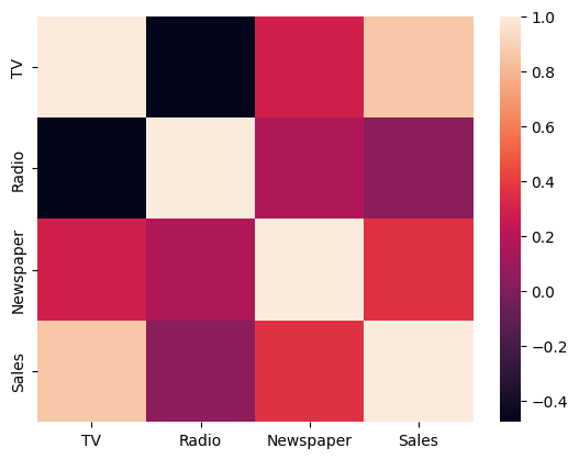
sns.pairplot(df)
- 데이터 프레임의 모든 컬럼 사이의 산점도를 나타냄.
- 대각선에는 해당 컬럼의 히스토그램.

To Dare is To Do