📍 Flex
display : flex ;display 속성 중 하나- 항목 무리를 행과 열 형태로 배치할 때 사용
- 가로 : main axis
세로 : cross axis
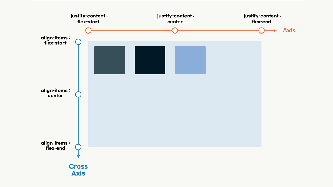
1. justify-content
- 메인축인 행방향으로의 정렬
justify-content: start;⭐
justify-content: center;
justify-content: end;
justify-content: flex-start;⭐
justify-content: flex-end;
justify-content: space-between; ⭐
justify-content: space-around; ⭐
(1) start vs. flex-start
- 만약
flex-direction : row-reverse;와 같이 역방향을 주었을 때,
flex-start는 이를 인식하고, 역방향이 되지만
일반start를 주면 역방향을 준 것을 인식하지 못한다
(2) space-between vs. space-around
-
between은 맨 첫번째 요소와 맨 마지막 요소를 양 끝에 딱 붙이고, 가운데 요소들을 일정 간격으로 정렬시켜줌 (양 끝에 붙여준다는 게 포인트라고 생각)
-
around는 맨 첫번째 요소와 맨 마지막 요소를 양 끝에 딱 붙여주지는 않지만, 양 끝 간격은 서로 동일함
2. align-items
- cross-axis인 열방향으로의 정렬
align-items: stretch; ⭐
align-items: center;
align-items: start;
align-items: end;
(1) stretch
- flex 아이템의 높이가 flex container의 높이만큼 변한다. 열방향으로 정렬하는 align-items 이니까 높이라는 것
3. align-content
align-items와 동일하게 사용되며, 단지 cross-axis 축의 아이템들이 여러개일 때 사용
4. align-self
- 만약 부모에게
align-items: flex-start;라는 효과를 주었다고 했을 때, 이를 무시하고 원하는 다른 위치에 배치가 가능하다. 자식인 본인은align-self: center;라면, center에 배치됨
5. flex-direciton
- 열방향, 행방향 위치시키기 위함 ( reverse로 역방향도 가능 )
flex-direction: column;
flex-direction: column-reverse;
flex-direciton: row;
flex-direciton: row-reverse;
6. flex-wrap
- 자식요소를 감싸주는 역할
- 밖으로 튀어나온 애들이 안으로 쏙! 들어간다
flex-wrap: wrap;
flex-wrap: nowrap;
flex-wrap: wrap-reverse;
7. flex-flow
flex-direction과flex-wrap이 합쳐졌다고 생각하면 됨
flex-flow: row wrap;
flex-flow: row-reverse nowrap;
flex-flow: column wrap-reverse;
flex-flow: column wrap;
8. 실습
(1) 초록색 미니박스를 파란박스의 중앙오른쪽에 위치시키기
- 간단한 실습이라 다들 엄청 빨리빨리 끝냈는데 나는 자꾸 안돼서 쩔쩔맸던 실습. 알고보니
justify-content:flex-end;를 item클래스에다가 주고있었던 것😅
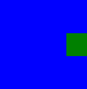
.container  {
            display: flex; ⭐
            width: 200px;
            height: 200px;
            background: blue;
            justify-content: flex-end; ⭐
            align-items: center;
            }
.item      {
            display: flex; ⭐
            width: 50px;
            height: 50px;
            background: green;
            }
(2) flexbox froggy
- flex 연습하기 좋다고 추천받아 곧장 24단계까지 완료 ! 아니나 다를까 이걸로 연습하고 나니 flex에 재미도 붙이고 개념도 점점 이해가 갔다.
- 완전히 flex가 익혀질 때까지 처음부터 다시 해봐야겠다.
- https://flexboxfroggy.com
.png)
.png)
📍 느낀점
- 개구리를 연못에 배치시키는 'Flexbox Froggy'로 연습하니
flex가 이해도 잘되고 좋았다. 완전히 익혀질 때까지 해야겠다. 재미있어서 쉬는시간에 하기 좋다! - 이제부터는 완전히 이해한 내용에 대해서만 TIL을 작성하려고 한다. 개념 1개라도 정확히 내가 익히는 과정이 필요하다고 생각한다. 의미없는 정보의 나열은 그만! 못다한 부분은 기록해두었다가 차근차근 업로드해 나가야지-!
- 6시 기상해서 운동하고 9 to 9 으로 수업 끝내고 다시 복습하며 벨로그 기록까지.. 체력적으로 힘든 하루다. 하루에 1시간 이상 운동해서 체력 기르자!
📍 향후계획
flex-basis,flex-grow,flex-shrink도 복습 후 추가하기- 오늘 배운
grid는 실습한 내용과 함께 내일까지 업로드할 것

FE Developer