
1. 히스토그램
- 평균 50, 표준편차 10인 정규분포에서 100개의 난수 생성
- 생성된 데이터를 데이터프레임으로 만들기
- 생성된 데이터의 기술통계량 (평균, 중간값, 표준편차) 계산
- 데이터를 20개 구간으로 나누어 히스토그램 그리기
# 난수생성
data = np.random.normal(loc=50, scale=10, size=100)
# 데이터프레임생성
one = pd.DataFrame(data, columns=['data'])
# 기술통계량
print(f"평균 : {one.mean()}, 표준편차 : {one.std()}, 중간값 : {one.median()}")
# 히스토그램
plt.hist(one, bins=20)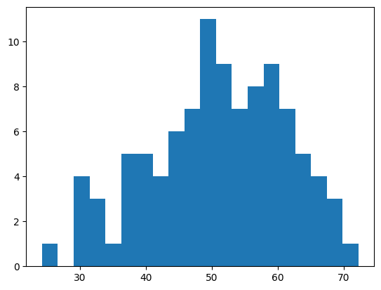
2. 시간에 따른 데이터 분석
- 날짜 : 2024-01-01~2024-12-31까지 일별 데이터 생성
- 매출 : 100부터 1000까지의 랜덤 정수 데이터 생성
- 월 : 월의 데이터를 기준으로 연도 데이터 생성
# datetime의 속성정보 month를 활용
dt.month- 월별 매출 데이터 바차트로 그리기
# 날짜
dates = pd.date_range('2024-01-01', '2024-12-31', freq='D')

# 매출
sales = np.random.randint(100, 1000, len(dates))

# 데이터 프레임
two = pd.DataFrame({'date' : dates, 'sales' : sales})
# two.info()

# 월 정보
two['month'] = two['date'].dt.month
# two.head()

# 월별 매출 데이터
monthly_sales = two.groupby('month')['sales'].sum()

# 바차트
# plt.bar(monthly_sales.index, monthly_sales)
monthly_sales.plot(kind='bar')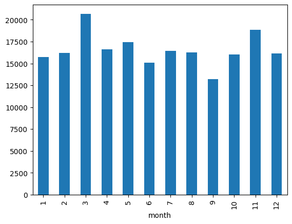
3. 상관분석
- 아래의 난수데이터로 데이터셋 만들기
'A': np.random.normal(loc=50, scale=10, size=100),
'B': np.random.normal(loc=60, scale=5, size=100),
'C': np.random.normal(loc=70, scale=8, size=100),
'D': np.random.normal(loc=80, scale=12, size=100)- 상관계수 매트릭스 만들기
- 매트릭스를 기준으로 히트맵 그리기
# 데이터프레임
three = pd.DataFrame({
    'A': np.random.normal(loc=50, scale=10, size=100),
    'B': np.random.normal(loc=60, scale=5, size=100),
    'C': np.random.normal(loc=70, scale=8, size=100),
    'D': np.random.normal(loc=80, scale=12, size=100)
})
# three = pd.DataFrame(data)
# three.info()

# 상관계수 매트릭스
corr_matrix = three.corr()
# corr_matrix

# 히트맵
sns.heatmap(corr_matrix, annot=True, fmt='.2f')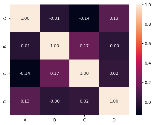
4. 시계열 데이터 분석
- 날짜(dates) : '2020-01-01'부터 '2024-12-31'까지 월초를 기준으로 날짜 데이터 생성
- 기온 : 아래의 계산식을 활용하여 기온 데이터 생성
10 + 5 * np.sin(np.linspace(0, 4 * np.pi, len(dates))) + np.random.normal(loc=0, scale=2, size=len(dates))- 날짜 데이터를 기준으로 연도 컬럼 생성
# datetime의 속성정보 year를 활용
dt.year- 연도별 기온의 평균 계산
- 연도별 기온에 대한 라인그래프 그리기
# 시간데이터 생성
dates = pd.date_range('2020-01-01', '2024-12-31', freq='MS')

# 기온데이터 생성
temp = 10 + 5 * np.sin(np.linspace(0, 4 * np.pi, len(dates))) + np.random.normal(loc=0, scale=2, size=len(dates))

# 데이터프레임
four = pd.DataFrame({'days' : dates, 'temp' : temp})

# 연도별 평균기온
four['year'] = four['days'].dt.year
annual_temp = four.groupby('year')['temp'].mean()

# 라인그래프
annual_temp.plot()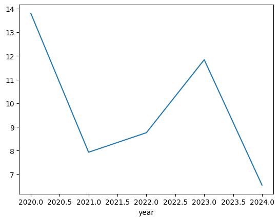

hyeeun-techlog