
1. Matplotlib
- Python과 Numpy에서 plotting을 위해 사용되며 주로 2D도표를 위한 패키지
- 2002년 존 헌터에 의해 시작된 MATLAB의 시각화 기능과 유사한 인터페이스를 지원하고자 시작된 프로젝트
- matplotlib는 객체 지향적인 방식으로 시각화하며, 서브모듈 pyplot을 이용하여 간단하게 시각화 가능용
(1) 선그래프(line graph)
plt.plot(x, y)- x : x축의 값(데이터의 인덱스)
- y : y축의 값(데이터의 요소값)
# x^2의 그래프
x = np.arange(10)
y = x**2
plt.plot(x, y)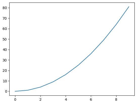
- 스타일 지정
# X^2 그래프를 빨간원으로 그리기
plt.plot(x,y,'ro')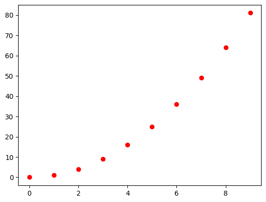
- 그래프의 크기
plt.figure(figsize=(3,3))
x = np.arange(10)
plt.plot(x)
- 여러 그래프 겹쳐 그리기
# 2x, x^2, x^3의 그래프 그리기
x = np.arange(10)
plt.plot(x, 2*x,'r', x, x**2, 'b', x, x**3, 'g')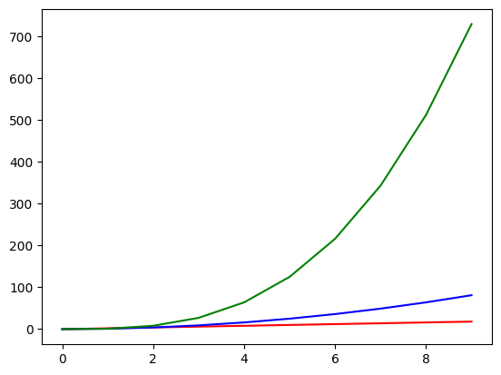
# y1은 검은색 실선, y2는 파란색 점선, y3는 마젠타색 point선
x = np.linspace(1,10, 5)
y1 = x
y2 = x + np.random.randn(5)
y3 = x - np.random.randn(5)
# plt.plot(x,y1,'k', x,y2,'b--', x, y3,'m.')
plt.plot(x,y1,'k')
plt.plot(x,y2,'b--')
plt.plot(x, y3,'m.')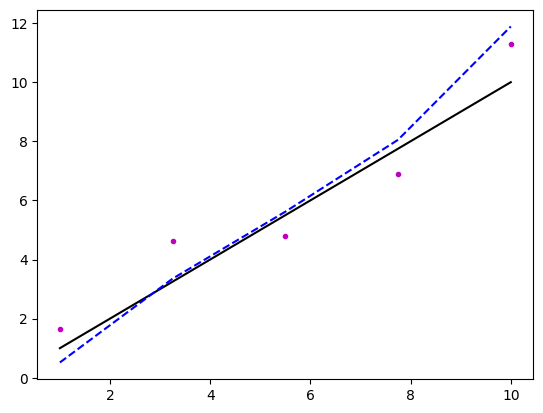
- 축레이블, 차트 제목 설정
# x축레이블을 'money', y축레이블을 'time', 제목을 'time for money'로 지정
x = np.arange(10)
plt.plot(x, 2*x, 'b-', x, x**2, 'r--', x, x**3, 'go')
plt.xlabel("money")
plt.ylabel("time")
plt.title("time for money")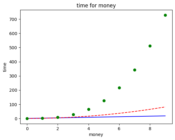
- 범례(legend)
#y1은 first, y2는 second로 label 지정, 범례위치는 best
x = np.arange(10)
y1 = x**2
y2 = x*5 + 3
plt.plot(x, y1, 'r',label="first")
plt.plot(x, y2, 'b', label="second")
plt.legend()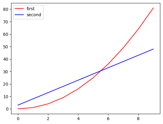
-
loc: 범례 위치 지정- upper left, upper center, upper right, center left, center, center right, lower left, lower center, lower right, best, right
-
Annotation (주석)
# x=4인 값에 대하여 here를 표시하기((2,20)), 선그래프의 수식 텍스트 입력(위치는 (7,70))
x = np.arange(10)
y = x**2
plt.plot(x,y)
plt.annotate('here', xy=(4,4**2), xytext=(2,20), arrowprops={'color':'green'})
plt.text(7,70,'$y=x^2$')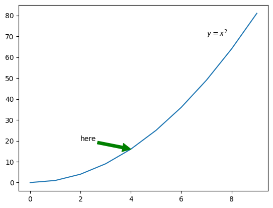
- Subplot
여러 plot을 나누어 표시
# subplot(1 : x**2, 2:x**5, 3:np.sin(x), 4:np.cos(x))
x = np.arange(10)
plt.subplot(2,2,1)
plt.plot(x, x**2)
plt.subplot(2,2,2)
plt.plot(x, x**5)
plt.subplot(2,2,3)
plt.plot(x,np.sin(x))
plt.subplot(2,2,4)
plt.plot(x,np.cos(x))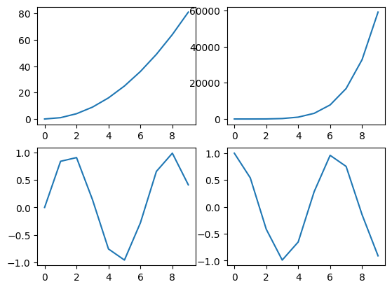
(2) 산점도
# x와 y에 대한 산점도
x = np.arange(50)
y = x + np.random.randn(50)*10
scale = np.random.randint(1,100, 50)
category = np.random.randint(0,5,50)
plt.scatter(x,y, scale, category, alpha=0.7)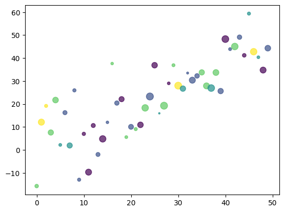
# y1은 파란색 라인그래프, y2는 검은색 산점도로 그리기
x = np.arange(100)
y1 = x*3
y2 = x*3 + np.random.randn(100)*50
plt.plot(x,y1,'b')
plt.scatter(x, y2, s=10, c='k')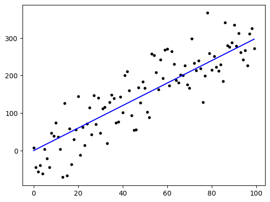
(3) Bar 그래프
# x, values에 대한 bar 차트 (수직과 수평 바그래프를 서브그래프로)
x = list('ABCD')
values = [50, 30, 70, 100]
plt.subplot(1,2,1)
plt.bar(x,values)
plt.subplot(1,2,2)
plt.barh(x,values)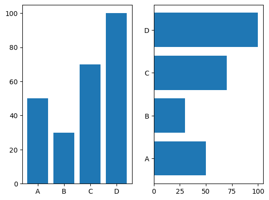
(4) 히스토그램
# x에 대해 30개 구간으로 나누어 -3~3까지 히스토그램
x = np.random.randn(1000)
plt.hist(x, bins=30, range=(-3,3))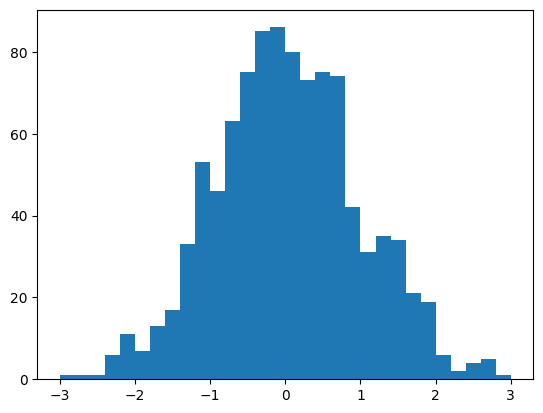
(5) Box 그래프
# x에 대한 박스형 그래프
x = np.random.randn(100)
np.append(x, [15, 99])
plt.boxplot(x)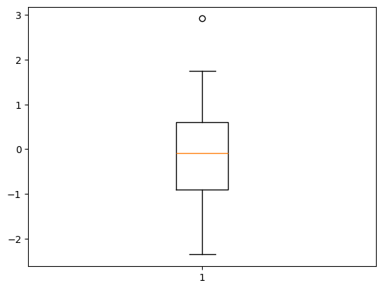
(6) 파이그래프
# x를 labels에 따라 파이그래프(12시부터 시작해서 시계방향으로)
x = [7,6,3,2,2]
labels =list('ABCDE')
plt.pie(x, labels=labels, autopct='%.2f%%', startangle=90, counterclock=False)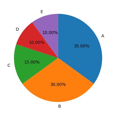
2. Pandas
(1) 라인그래프
# dataframe에 대한 라인그래프
df = pd.DataFrame(np.random.randn(100,3),
                  index=pd.date_range('20200101', periods=100),
                  columns=list('ABC')).cumsum()
df.plot()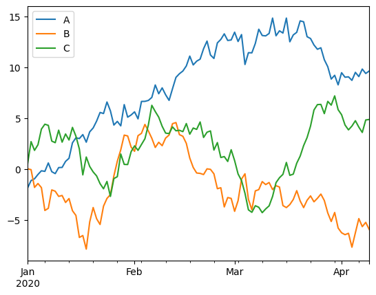
(2) kde 그래프
df = pd.DataFrame({
    'A': np.random.randn(1000),
    'B': np.random.randn(1000) * 2
})
df.plot.kde()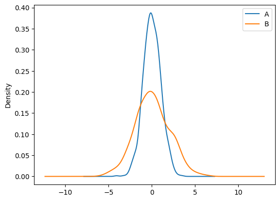
(3) Area 그래프
x = np.arange(0, 10, 0.1)
y = np.sin(x)
df = pd.DataFrame({'x':x, 'y':abs(y)})

df.plot.area(x='x', y='y')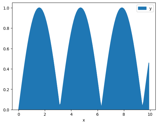
3. Seaborn
(1) 라인 그래프
# dark 테마 활용
sns.set_style('dark')
plt.figure(figsize=(10,6))
plt.plot(x,y1, x,y2, x,y3, x,y4)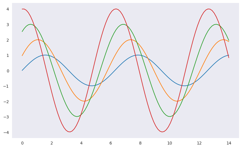
(2) sns 데이터 셋 활용 - boxplot
# tips 데이터를 활용한 실습
tips = sns.load_dataset("tips")
tips.head()
# 특정 카테고리에 대한 값의 분포는 x, y를 지정하여 확인 가능
plt.figure(figsize=(8,5))
sns.boxplot(x='day', y='total_bill', data=tips)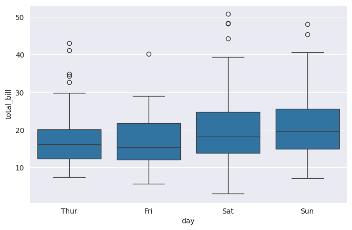
# hue 옵션 : 카데고리별 데이터 시각화 가능 (smoker여부에 따라 다르게)
# palette 옵션 : 색상 지정 가능
plt.figure(figsize=(8,5))
sns.boxplot(x='day', y='total_bill', hue='smoker', data=tips)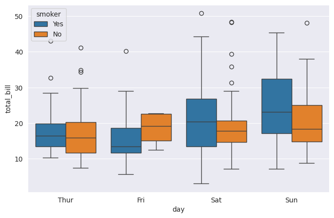
# palette 옵션 : 색상 지정 가능 (Set3)
plt.figure(figsize=(8,5))
sns.boxplot(x='day', y='total_bill', hue='smoker', data=tips, palette='Set3')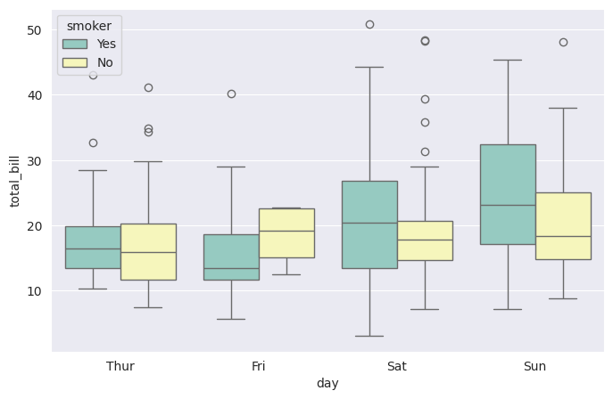
(3) sns 데이터 셋 활용 - swarmplot
# day별 total_bill에 대한 swarmplot
sns.set_style('whitegrid')
plt.figure(figsize=(8,5))
sns.swarmplot(x='day', y='total_bill', data=tips)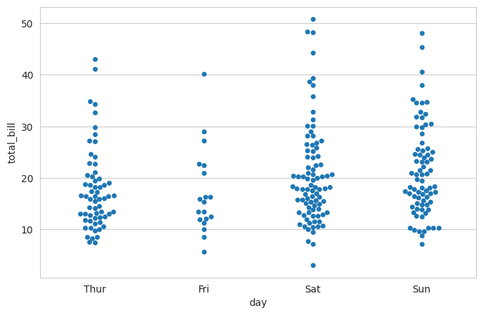
# boxplot과 겹쳐서 사용 가능
plt.figure(figsize=(8,5))
sns.boxplot(x='day', y='total_bill', data=tips)
sns.swarmplot(x='day', y='total_bill', data=tips)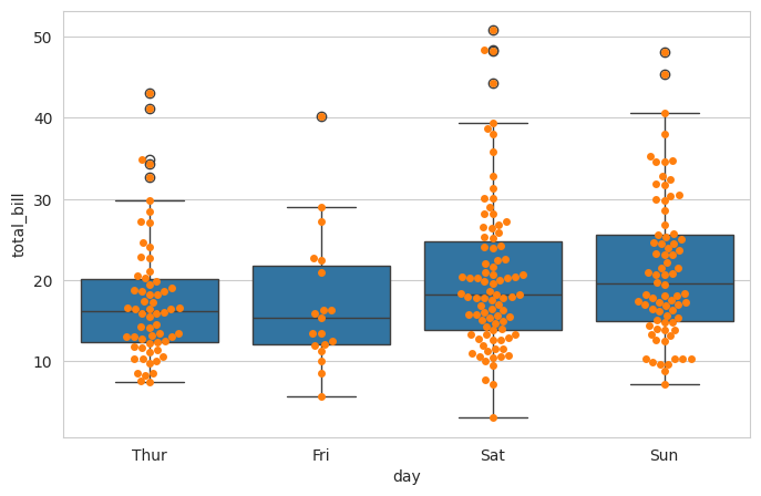
(4) sns 데이터 셋 활용 - lmplot
# total_bill과 tip에 대한 회귀 그래프
sns.set_style('darkgrid')
sns.lmplot(x='total_bill', y='tip', data=tips)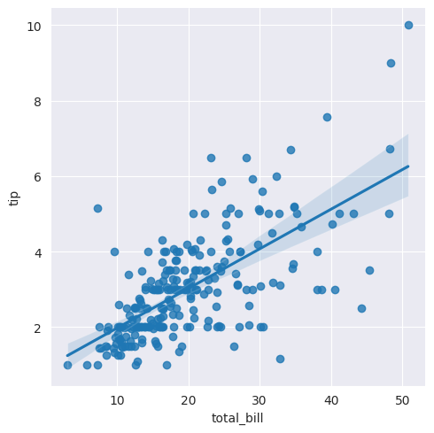
# hue 옵션 : 카데고리별 적용가능 (smoker여부에 따른 회귀그래프)
sns.lmplot(x='total_bill', y='tip', data=tips, hue='smoker')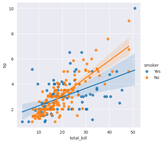
# palette 옵션 : 색상적용가능 (Set1사용)
sns.lmplot(x='total_bill', y='tip', data=tips, hue='smoker', palette='Set1')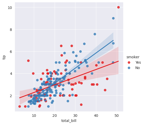
(5) sns 데이터 셋 활용 - heatmap
# 샘플데이터셋(filghts) 불러오기
flights= sns.load_dataset('flights')
flights.head()
# annot옵션을 통해 그래프상에 값 출력
# fmt 옵션을 통해 데이터의 형식을 지정 (d:정수, f:실수)
sns.heatmap(flights, annot=True, fmt='d')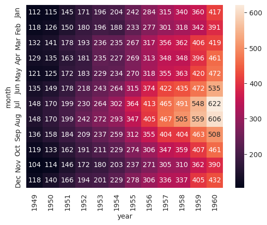
(6) sns 데이터 셋 활용 - pairplot
# iris(붓꽃) 데이터 로드
iris = sns.load_dataset('iris')
iris.head()
# pairplot
sns.set(style='ticks')
sns.pairplot(iris)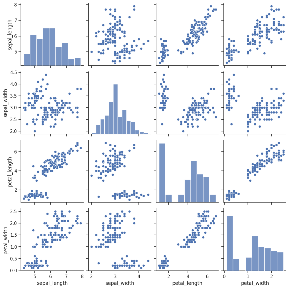
# hue 옵션을 통해 카데고리별 변수의 관계와 분포 확인 가능 (species별)
sns.pairplot(iris, hue='species')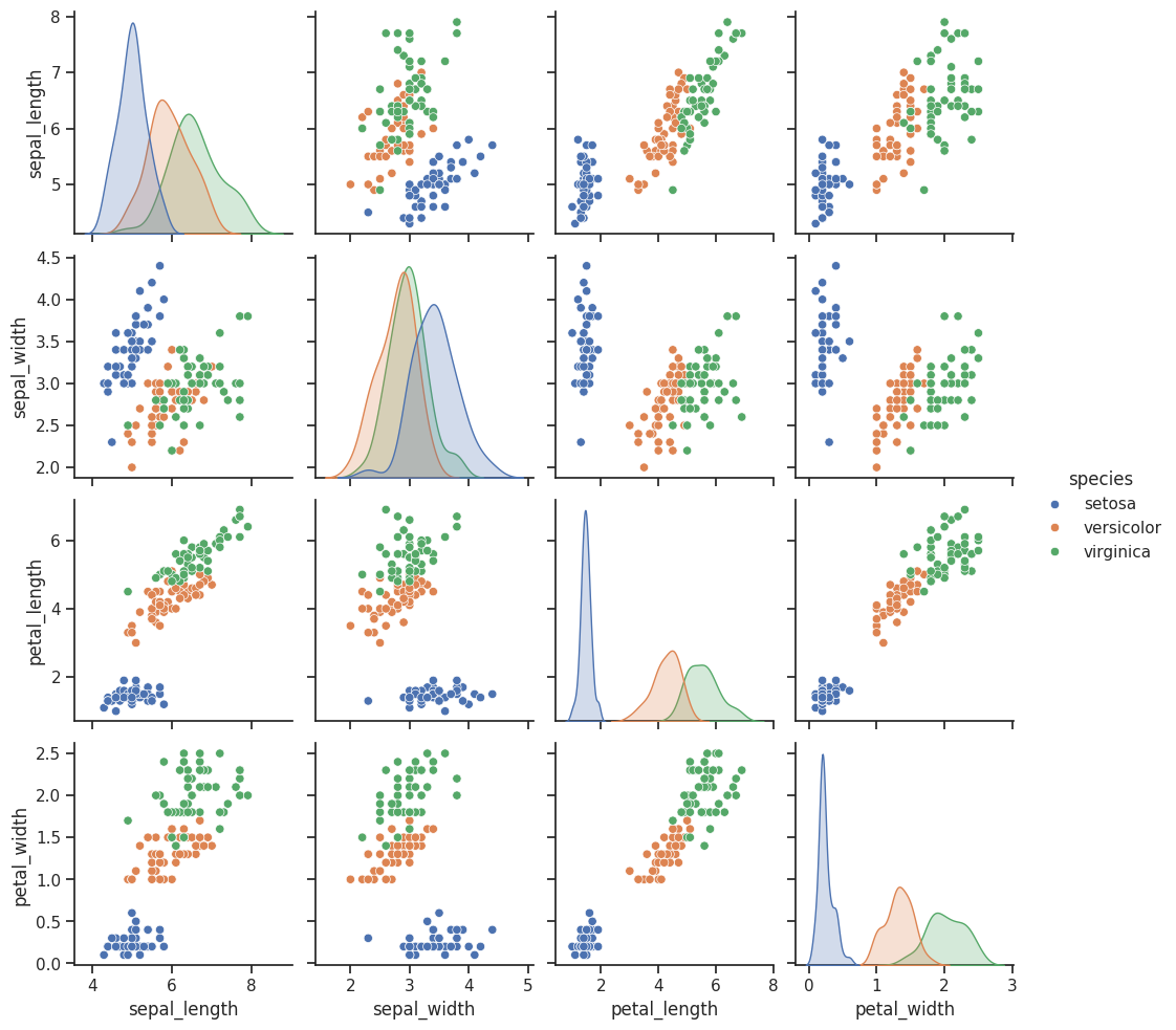
# vars 옵션을 통해 특정 변수만 지정 가능 (['sepal_length', 'sepal_width'])
sns.pairplot(iris, vars=['sepal_length', 'sepal_width'])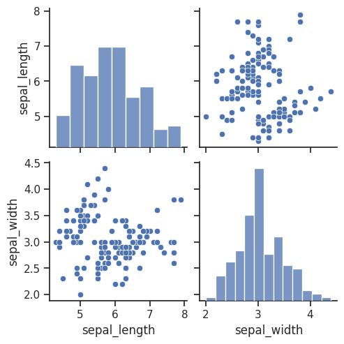
# x_vars, y_vars 옵션을 통해 축별 변수를 지정할 수 있음 (x:sepal 길이와 너비, y:petal 길이와 너비)
sns.pairplot(iris, x_vars=['sepal_length', 'sepal_width'], y_vars=['petal_length', 'petal_width'], hue='species')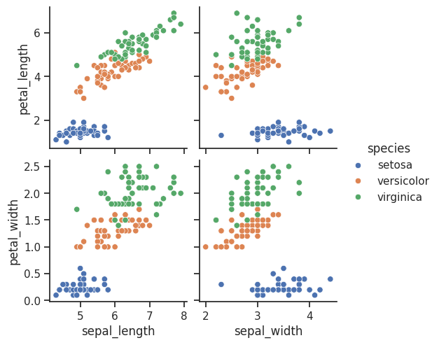
4. 시각화 요약
5. 타이타닉 데이터 실습
# 성별(sex)에 따른 생존율을 파이차트로 그리기
survived_rate = titanic.groupby('sex')['survived'].mean()
print(survived_rate)
plt.pie(survived_rate, labels=survived_rate.index, autopct='%.2f%%', startangle=90, counterclock=False)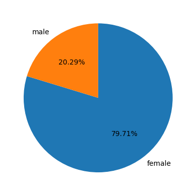
# 객실등급별(pclass) 생존자수를 바차트로 그리기
classes = titanic.groupby('class')['survived'].sum()
plt.bar(classes.index, classes.values)
# plt.xticks(ticks=[1,2,3], labels=['First', 'Second', 'Third'])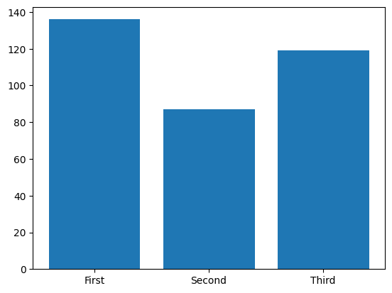
# 생존(survived)에 대한 변수간 상관분석 시각화(pairplot 사용)
sns.pairplot(titanic, hue='survived')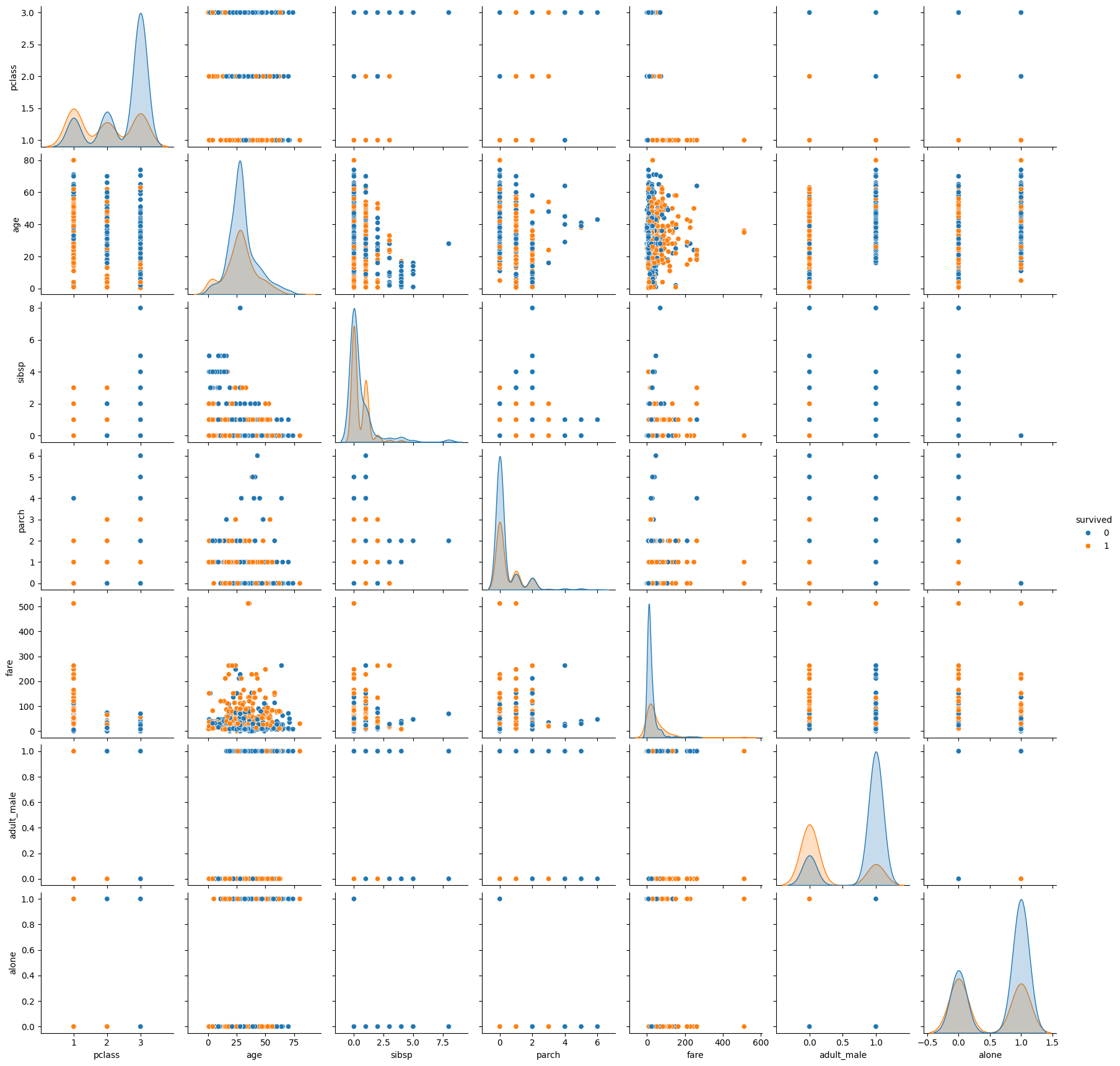
## 아래의 변수에 대하여 변수간의 상관계수를 히트맵으로 시각화
# 변수 : ['survived', 'sex', 'age_group', 'family', 'pclass', 'fare']
cols = ['survived', 'sex', 'age_group', 'family', 'pclass', 'fare']
corr_titanic = titanic[cols].corr()
corr_titanic

sns.heatmap(corr_titanic, annot=True, fmt='.2f')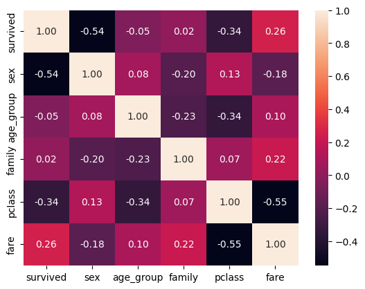
6. 와인 데이터 실습
# 와인 유형에 따른 품질 등급 히스토그램 그리기
wine_type = wine.groupby('type')['quality']
wine_type.plot.hist(alpha=0.5)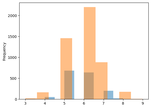
# 와인 속성과 품질(quality)간의 상관계수 히트맵 그리기
corr_wine = wine.iloc[:,:-1].corr()
corr_wine

sns.heatmap(corr_wine, annot=True, fmt='.1f')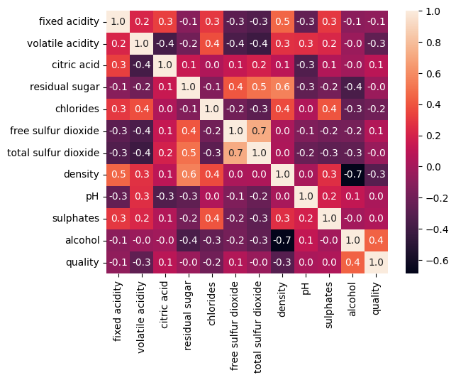
# 와인품질에 대해 가장 높은 상관계수를 가지는 속성에 대하여 회귀그래프(lmplot) 그리기
high_rel = corr_wine_abs['quality'].sort_values(ascending=False).index[1]
# high_rel = abs(corr_wine['quality'])
high_rel

sns.lmplot(x=high_rel, y='quality', data=wine, hue='type')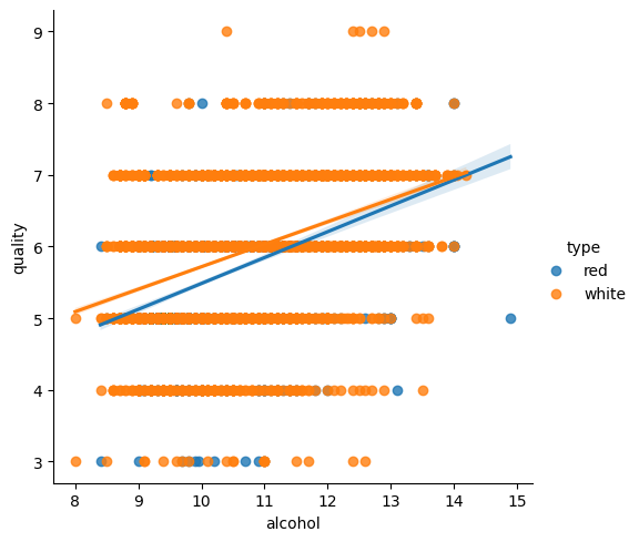

hyeeun-techlog