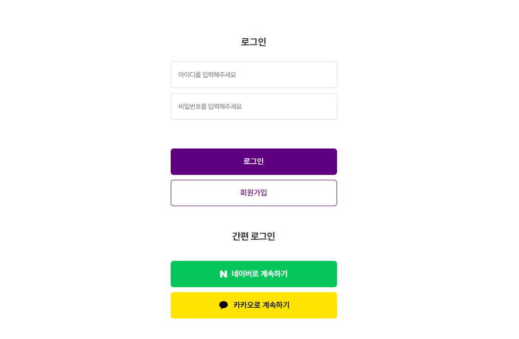
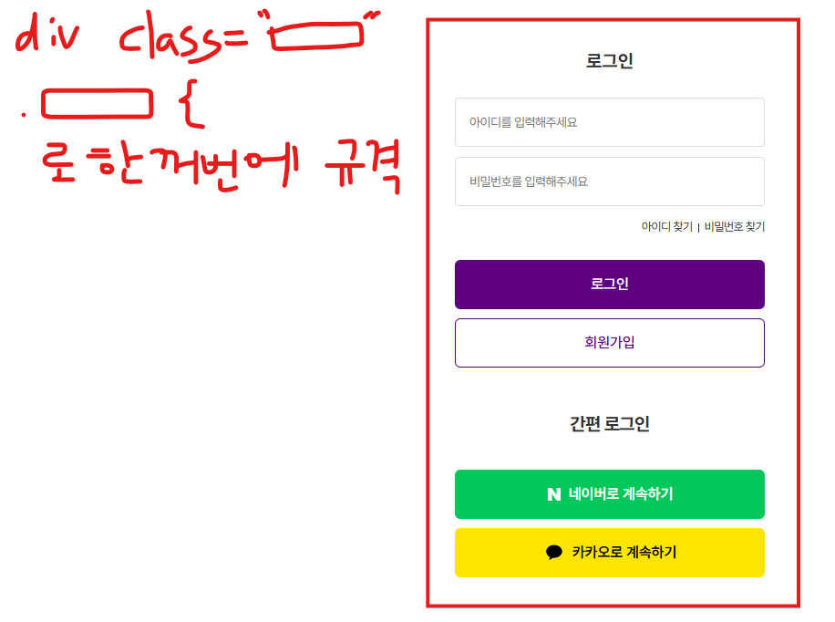
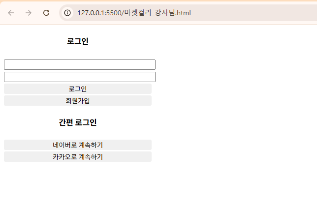
마켓컬리 로그인 페이지를 최대한 유사하게 만들고 디자인해봅니다.
시도
디자인부터 하면 망한다고 합니다.
전반적으로 구도 잡아줍니다.
<!-- 마켓컬리 -->
<!DOCTYPE html>
<html lang="en">
<head>
<meta charset="UTF-8">
<meta name="viewport" content="width=device-width, initial-scale=1.0">
<title>Document</title>
<style>
body{
text-align: center;
}
.login{
background-color: purple;
color:white;
border:none;
width: 300px;
height: 40px;
border-radius: 5px;
}
.join{
background-color: white;
color:purple;
border-color: purple;
width: 300px;
height: 40px;
border-radius: 5px;
}
.naver{
background-color:limegreen;
color:white;
border:none;
width: 300px;
height: 40px;
border-radius: 5px;
}
.kakao {
background-color: yellow;
border:none;
width: 300px;
height: 40px;
border-radius: 5px;
}
</style>
</head>
<body>
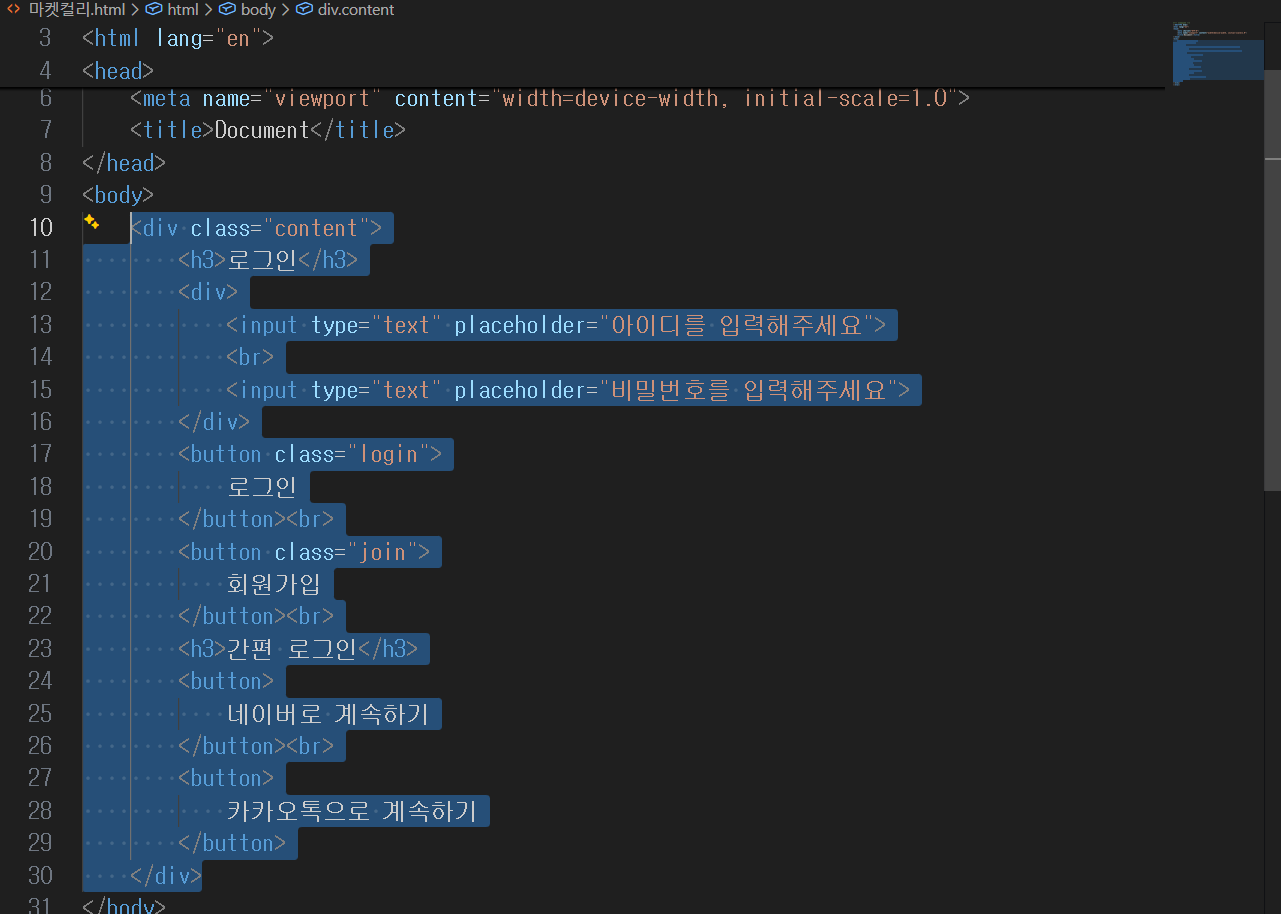
<div class="content">
<h3>로그인</h3>
<div class="input">
<input type="text" placeholder="아이디를 입력해주세요">
<br>
<input type="text" placeholder="비밀번호를 입력해주세요">
</div><br><br>
<button class="login">
로그인
</button><br><br>
<button class="join">
회원가입
</button><br><br>
<h3>간편 로그인</h3>
<button class="naver">
네이버로 계속하기
</button><br><br>
<button class="kakao">
카카오톡으로 계속하기
</button>
</div>
</body>
</html>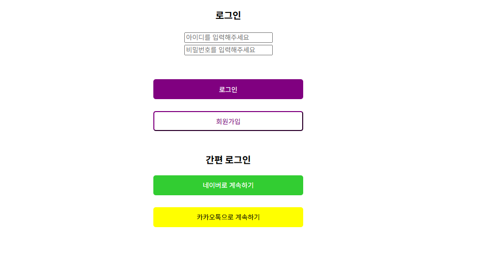
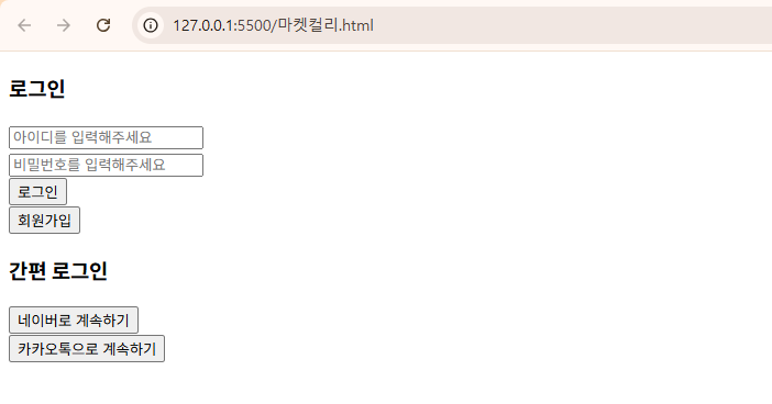
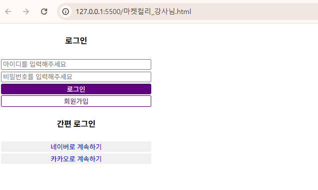
왜자꾸 저기 회원가입 버튼 border 컬러가 구리게 나오는지 모르겠다.
답변
강사님 수업을 들으며 코드 줍줍
<!-- 파일명: CSS로그인.html -->
<!DOCTYPE html>
<html lang="en">
<head>
    <meta charset="UTF-8">
    <meta name="viewport" content="width=device-width, initial-scale=1.0">
    <title>Document</title>

    <style>
        /* 내가 지정한 크기대로 HTML 너비 고정해서
        주기! */
        *{
            box-sizing: border-box;
        }
        a{
            text-decoration: none;
        }

        /* HTML는 기본적으로 여백이 들어가있는
        태그들이 많다. */
        .login-group{
            width: 300px;

            text-align: center;
        }
        .login-group input{
            width:100%;

        }
        .login-group button{
            width: 100%;
            outline: none;
            border: none;
            /* background-color: #5f0080; */
            border-radius: 3px;
        }
        #login-btn{
            background-color: #5f0080;
            color:white;
        }
        #signup-btn{
            background-color: white;

            border: 1px solid #5f0080;
            color:#5f0080;
        }

    </style>
</head>
<body>
    <div class="login-group">
        <h4>로그인</h4>
        <input type="text" placeholder="아이디를 입력해주세요">
        <input type="text" placeholder="비밀번호를 입력해주세요">
        <button id="login-btn">로그인</button>
        <button id="signup-btn">회원가입</button>

        <h4>간편 로그인</h4>

        <button>
            <a href="https://nid.naver.com/nidlogin.login?mode=form&url=https://www.naver.com/">네이버로 계속하기</a>
        </button>
        <button>
            <a href="https://accounts.kakao.com/login/?continue=https%3A%2F%2Faccounts.kakao.com%2Fweblogin%2Faccount#login">카카오로 계속하기</a>
        </button>
    </div>
</body>
</html>
참고로 class와 id는 거의 같다. 여러개 묶을거면 class고 1개면 id
사실 실무에서는 그냥 class로 다 쓴다.<button id="login-btn">로그인</button> 와 <button class="login-btn">로그인</button> 는 동일하다. 어떤거 써도 상관 없다.
풀이
<!-- 파일명: CSS로그인.html -->
<!DOCTYPE html>
<html lang="en">
<head>
<meta charset="UTF-8">
<meta name="viewport" content="width=device-width, initial-scale=1.0">
<title>Document</title>
<style>
.login-group{
width: 300px;
text-align: center;
}
</style>
</head>
<body>
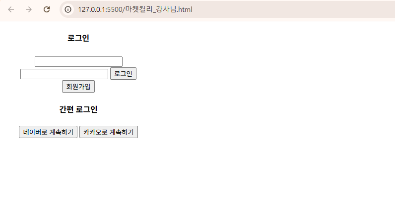
<div class="login-group">
<h4>로그인</h4>
<input type="text">
<input type="text">
<button>로그인</button>
<button>회원가입</button>
<h4>간편 로그인</h4>
<button>
네이버로 계속하기
</button>
<button>
카카오로 계속하기
</button>
</div>
</body>
</html>
style 태그에
    .login-group input{
        width:100%;
    }
추가
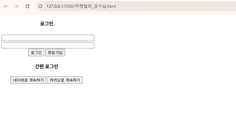
style 태그에
    .login-group button{
        width: 100%;
        outline: none;
        border: none;
        border-radius: 3px;
    }
추가

데이터기반 스토리텔링을 통해 인사이트를 얻습니다.