레이아웃 시스템
개요
- Flexbox 를 사용합니다.
- 웹에서와 거의 같은 방식입니다.
- 99.8% 의 경우 높이와 너비에 기반해서 레이아웃을 만들지 않습니다.
- 당연하게도 모바일 환경에서는 반응형으로 디자인 해야합니다.
용법
display:flex지정해줄 필요 없습니다.flexDirection기본값은column- Flex Size 를 사용합니다.
- stlye 객체의
flex키 활용 - 형제 컨테이너들과의 비율을
flex에서 지정해줍니다. - 부모 컨테이너에
flex값이 지정되어 있지 않으면 적용되지 않습니다.
- stlye 객체의
예시
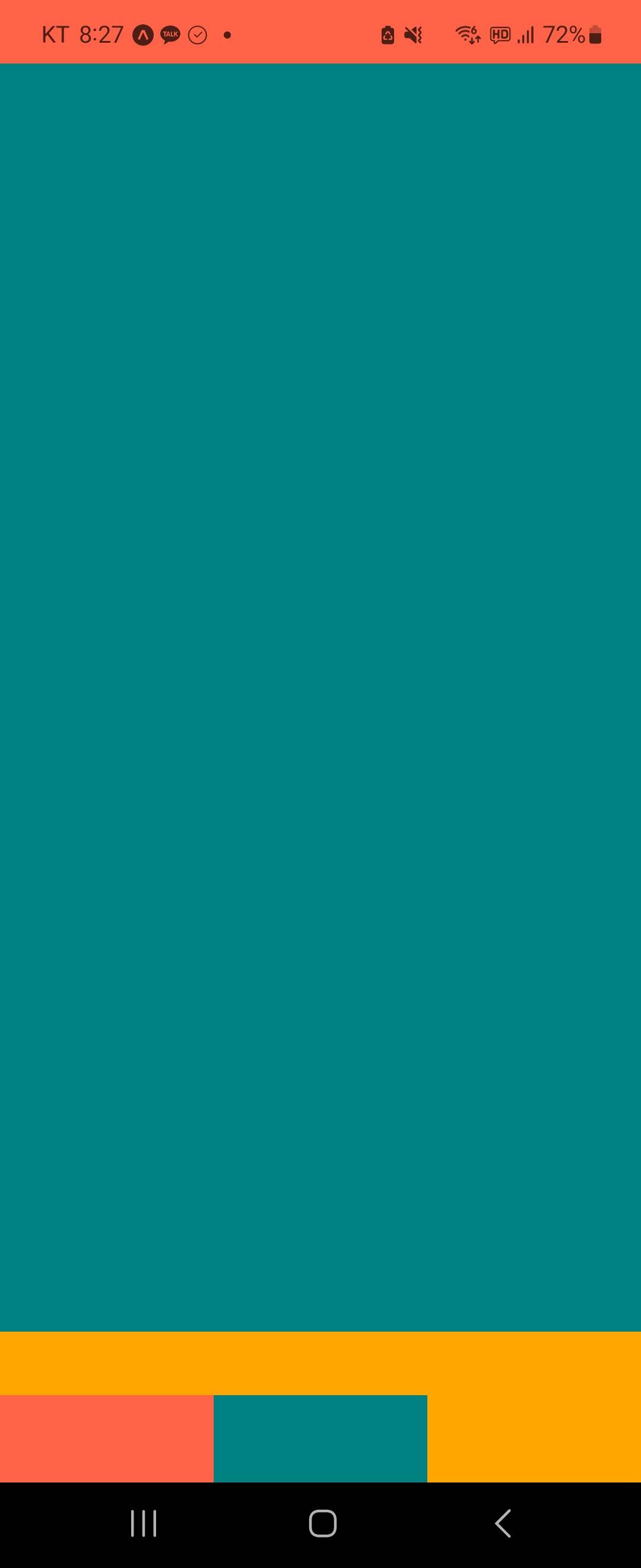
- 텍스트 X
import { View } from "react-native";

export default function App() {
  return (
    <>
      <View style={{ flex: 16 }}>
        <View style={{ flex: 0.1, backgroundColor: "tomato" }}></View>
        <View style={{ flex: 2, backgroundColor: "teal" }}></View>
        <View style={{ flex: 0.1, backgroundColor: "orange" }}></View>
      </View>
      <View style={{ flex: 1, flexDirection: "row" }}>
        <View style={{ flex: 1, backgroundColor: "tomato" }}></View>
        <View style={{ flex: 1, backgroundColor: "teal" }}></View>
        <View style={{ flex: 1, backgroundColor: "orange" }}></View>
      </View>
    </>
  );
}
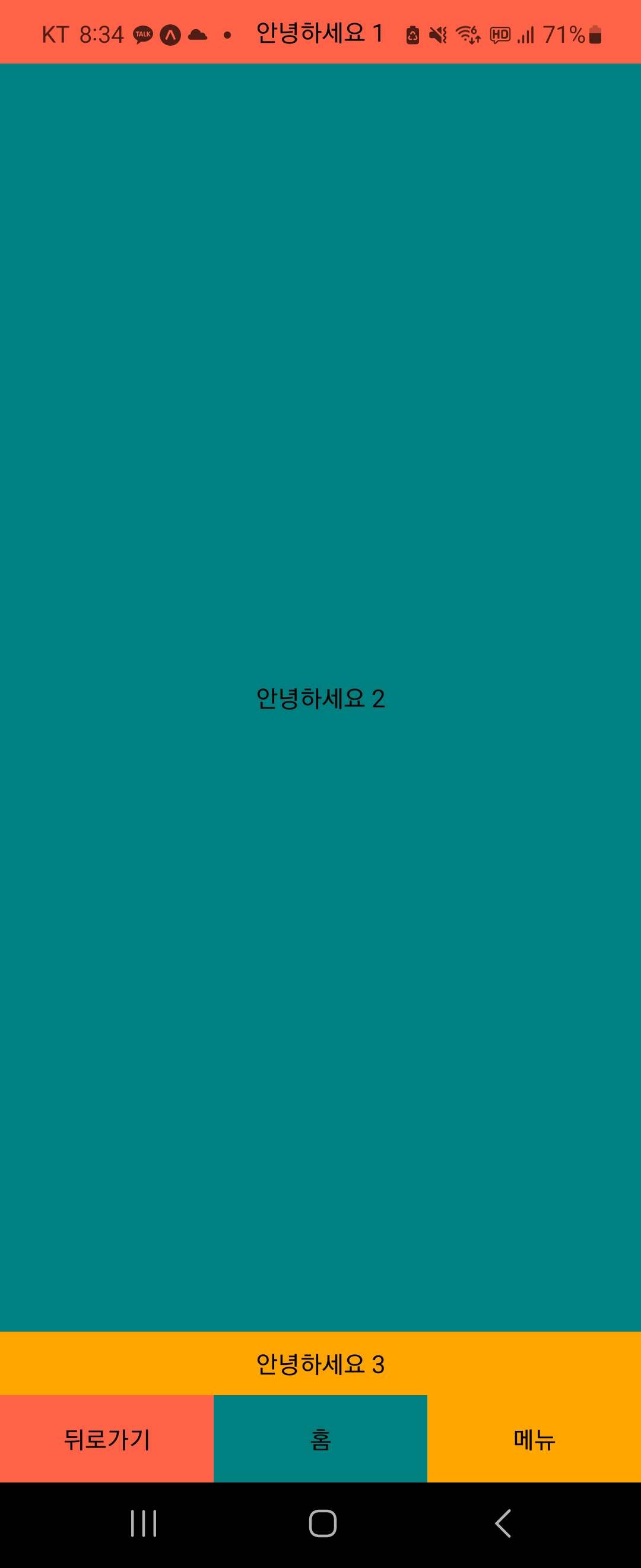
- 텍스트 O
import { View, Text, StyleSheet } from "react-native";

export default function App() {
  return (
    <>
      <View style={{ flex: 16 }}>
        <View
          style={{
            flex: 0.1,
            backgroundColor: "tomato",
            justifyContent: "center",
            alignItems: "center",
          }}
        >
          <Text>안녕하세요 1</Text>
        </View>
        <View
          style={{
            flex: 2,
            backgroundColor: "teal",
            justifyContent: "center",
            alignItems: "center",
          }}
        >
          <Text>안녕하세요 2</Text>
        </View>
        <View
          style={{
            flex: 0.1,
            backgroundColor: "orange",
            justifyContent: "center",
            alignItems: "center",
          }}
        >
          <Text>안녕하세요 3</Text>
        </View>
      </View>
      <View style={{ flex: 1, flexDirection: "row" }}>
        <View
          style={{
            flex: 1,
            backgroundColor: "tomato",
            justifyContent: "center",
            alignItems: "center",
          }}
        >
          <Text>뒤로가기</Text>
        </View>
        <View
          style={{
            flex: 1,
            backgroundColor: "teal",
            justifyContent: "center",
            alignItems: "center",
          }}
        >
          <Text>홈</Text>
        </View>
        <View
          style={{
            flex: 1,
            backgroundColor: "orange",
            justifyContent: "center",
            alignItems: "center",
          }}
        >
          <Text>메뉴</Text>
        </View>
      </View>
    </>
  );
}
Aim for the TOP, Developer