컴포넌트들 개요
1. <TouchableOpacity>
- <View> 가 터치에 적절하게 반응하도록 하는 컴포넌트
- 터치하면 래핑된 <View> 의 opacity 가 감소하여 흐리게 표시됩니다.
2. <TouchableHighlight>
- <View> 가 터치에 적절하게 반응하도록 하는 컴포넌트
- 터치하면 래핑된 <View> 의 background 를 표시합니다. (속성 필수)
3. <TouchalbeWithoutFeedback>
- <View> 가 터치에 반응하지 않지만 이벤트를 리스닝하는 컴포넌트
- 터치하면 시각적인 피드백없이 이벤트만 핸들링 합니다.
4. <Pressable>
- <Pressable> 은 위의 Touchables 의 기술들이 응집되어 있는 컴포넌트
- 터치, 프레스 시에 지정한 속성에 따라 시각적 피드백과 이벤트 핸들링을 제공합니다.
- 가장 신규 컴포넌트이고 위의 Touchables 가 Pressable 로 대체될 수 있습니다.
| <TouchableOpacity> | <TouchableHighlight> | <TouchableWithoutFeedback> | <Pressable> | |
|---|---|---|---|---|
| 시각적 피드백 | O | O | X | 커스텀 |
| 이벤트핸들링 | O | O | O | O |
5. <TextInput>
- RN 에서 텍스트를 입력받는 유일한 방법인 컴포넌트
- 제공되는 속성과 이벤트 리스너를 통해 사용할수 있습니다.
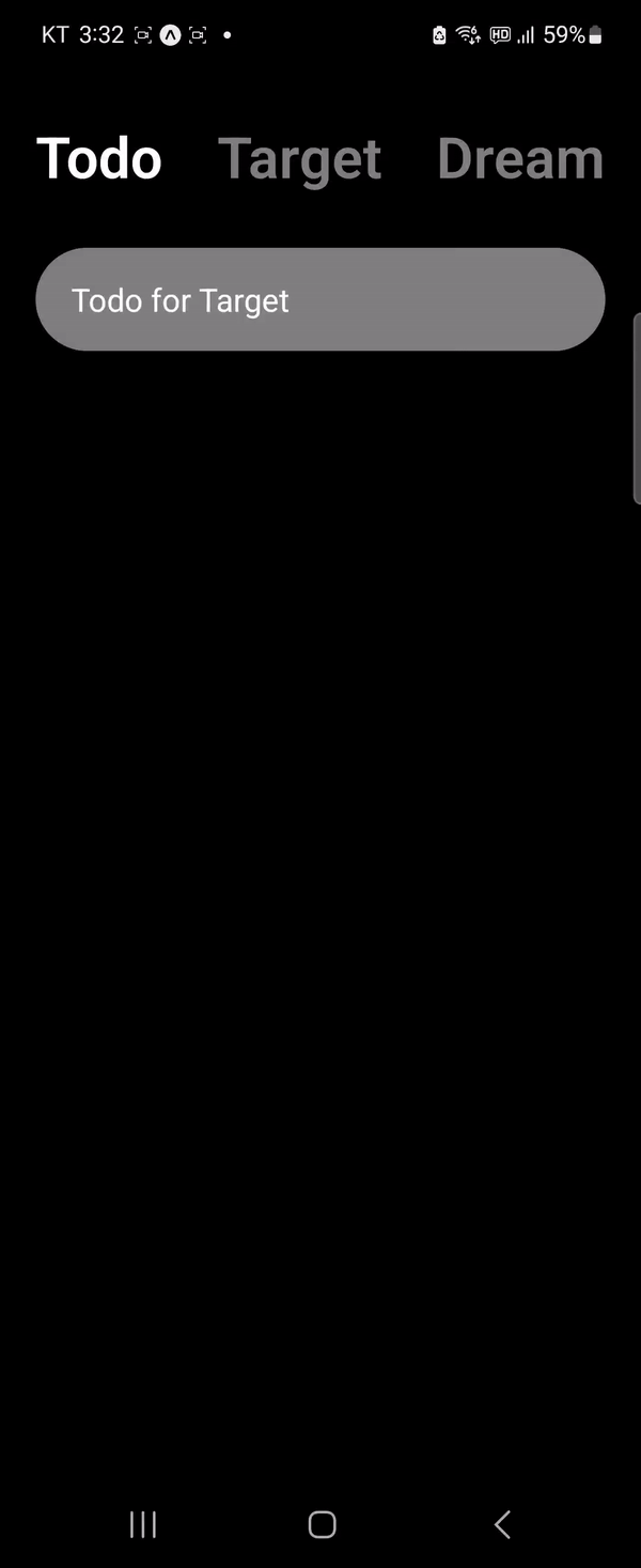
데모 영상
코드
import { StatusBar } from "expo-status-bar";
import React, { useState } from "react";
import {
  StyleSheet,
  Text,
  View,
  TouchableOpacity,
  TextInput,
} from "react-native";

export default function App() {
  const [category, setCategory] = useState({
    todo: true,
    target: false,
    dream: false,
  });
  const [text, setText] = useState("");

  const todo = () => {
    setCategory({ todo: true, target: false, dream: false });
  };
  const target = () => {
    setCategory({ todo: false, target: true, dream: false });
  };
  const dream = () => {
    setCategory({ todo: false, target: false, dream: true });
  };

  const onChangeText = (text: string) => {
    setText(text);
  };

  return (
    <View style={styles.container}>
      <StatusBar style="light" />
      <View style={styles.header}>
        <TouchableOpacity onPress={todo}>
          <Text
            style={{
              ...styles.btnText,
              color: category.todo ? "white" : "gray",
            }}
          >
            Todo
          </Text>
        </TouchableOpacity>
        <TouchableOpacity onPress={target}>
          <Text
            style={{
              ...styles.btnText,
              color: category.target ? "white" : "gray",
            }}
          >
            Target
          </Text>
        </TouchableOpacity>
        <TouchableOpacity onPress={dream}>
          <Text
            style={{
              ...styles.btnText,
              color: category.dream ? "white" : "gray",
            }}
          >
            Dream
          </Text>
        </TouchableOpacity>
      </View>
      <View>
        <TextInput
          style={styles.input}
          placeholder={
            category.todo
              ? "Todo for Target"
              : category.target
              ? "Target for Dream"
              : "Dream for Life"
          }
          placeholderTextColor="white"
          onChangeText={onChangeText}
          value={text}
        />
      </View>
    </View>
  );
}

const styles = StyleSheet.create({
  container: {
    flex: 1,
    backgroundColor: "black",
    paddingHorizontal: 20,
  },
  header: {
    flexDirection: "row",
    justifyContent: "space-between",
    marginTop: 66,
  },
  btnText: { fontSize: 32, fontWeight: "600" },
  input: {
    backgroundColor: "gray",
    color: "white",
    paddingVertical: 15,
    paddingHorizontal: 20,
    borderRadius: 30,
    marginTop: 30,
    fontSize: 18,
  },
});
Aim for the TOP, Developer