1.이론
CSS flex
자신의 컨테이너가 차지하는 공간에 맞추기 위해 크기를 키우거나 줄이는 방법을 설정하는 속성
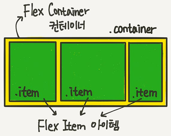
- 크게 아이템과 컨테이너로 나눠진다.
- 부모 요소인 div.container를 Flex Container라 한다.
- 자식 요소인 div.item을 Flex Item이라 한다.
- Flex의 속성들은, 컨테이너에 적용하는 속성과 아이템에 적용하는 속성으로 나뉘어 진다.
아이템에 적용되는 속성
아이템에 적용되는 속성은 크게 세가지로 다음과 같다.
- flex-grow
- 할당 가능한 공간의 정도 (flex아이템이 부모 컨테이너의 여분의 공간을 얼마나 가져갈 것인지 결정한다.)
- 기본 값은 0이며, 이는 아이템이 추가 공간을 가져가지 않게 된다.
- 만약 모든 아이템들이 'flex-grow: 1;'을 가지면, 모든 아이템들은 동일한 공간을 추가로 가져가 부모 컨테이너를 채우게 된다.
- 형제 아이템들이 모두 동일한 flex-grow 값 = 동일한 공간
- 현제 아이템들이 다른 flex-grow 값 = 다른 공간
- flex-shrink
- 아이템의 크기가 container보다 클 때 사용
- 설정된 값에 따라 크기가 얼마나 축소될 것인지 결정한다.
- 기본값은 1이며, 이는 공간이 부족할 때 모든 아이템이 동일하게 줄어든다.
- 특정 아이템의 'flex-shrink'값을 더 높게 설정하면, 그 아이템은 다른 아이템들보다 더 많이 줄어든다.
- flex-shrink: 0 = 줄어들지 않겠다!
- flex-basis
- 아이템의 초기 크기 (기본 크기를 설정)
- flex-basis는 아이템이 공간을 추가로 가져가거나 줄어들기 전의 원래 크기를 말한다.
- 이속성의 값은 일반적으로 길이 단위(예: px, em, %, etc.) 또는 auto가 될 수 있다.
- auto 값은 아이템의 width 또는 height 속성값에 따라 결정된다.
- 'auto가 아니라, flex-basis'와 'width(direction: column이면 height)'중 flex-basis가 우선
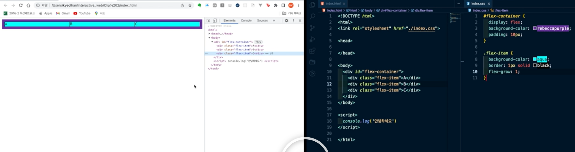
실습
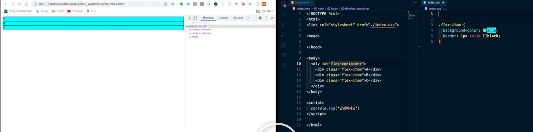
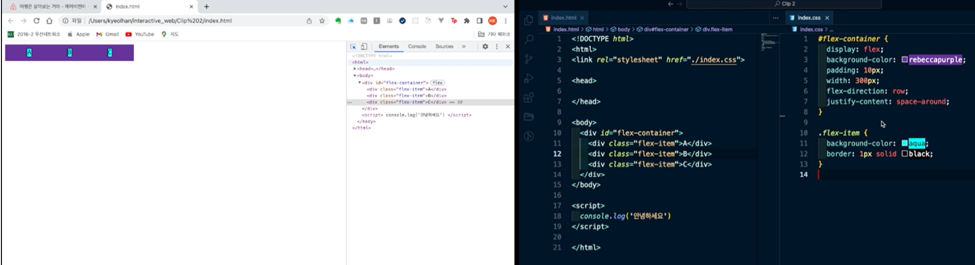
△ 위에서와 같이, 기본으로는 이렇게 정렬이 되지만
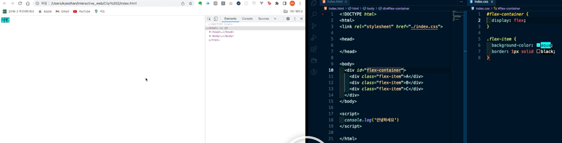
△ flex-container에서 display를 flex로 바꾸면, 배치가 좌우 정렬이 된다.
display: flex;를 선언하면, 해당 요소는 flex 컨테이너가 되고 그의 자식 요소들은 flex 아이템이 된다. 기본적으로 flex 아이템들은 행(row) 방향으로 배치된다. 이는 flex-direction 속성의 기본 값이 row이기 때문이다. flex-direction: row;는 주축(main axis)을 왼쪽에서 오른쪽으로 설정하며, 이는 브라우저의 텍스트 방향성과 일치한다. 따라서, display: flex;를 선언하고 다른 설정을 추가로 하지 않으면, 자식 요소들은 좌우(왼쪽에서 오른쪽으로) 정렬되게 된다. 만약 아이템들을 위에서 아래로 배치하고 싶다면, flex-direction 속성을 column으로 변경할 수 있다. 이 경우, 주축이 위에서 아래로 설정되어 아이템들이 수직으로 배치된다.
justify-content, align-items, align-content 등의 다른 flex 속성들을 사용하면, 아이템들의 정렬을 더 세밀하게 조정할 수 있다. 이 속성들을 통해 아이템들을 컨테이너의 중앙에 배치하거나, 서로 사이에 공간을 두거나, 교차 축(cross axis)에 따라 정렬하는 등의 작업을 할 수 있다.
padding은 내용(context)와 영역(border)사이에 여백을 지정한다.
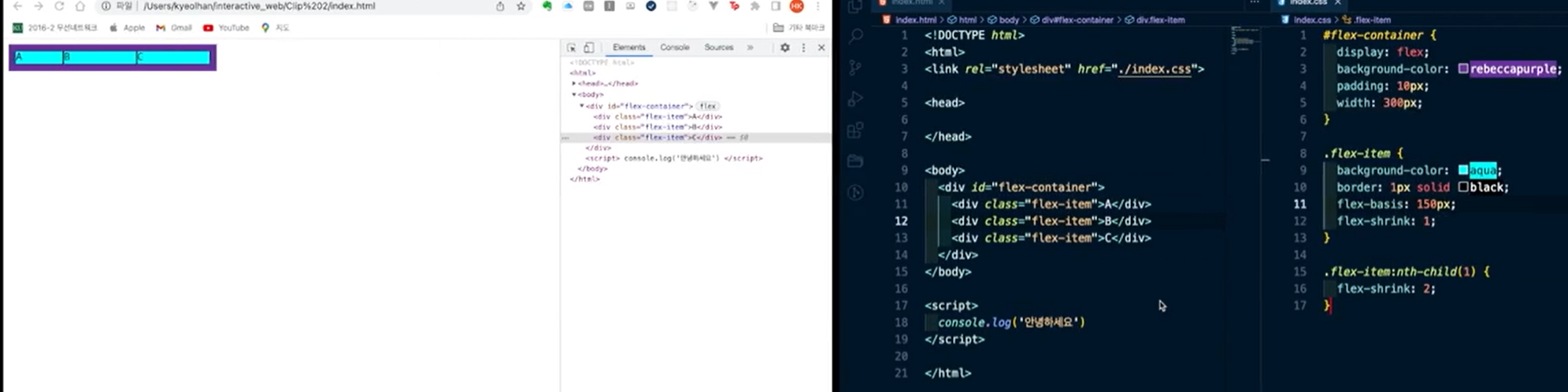
flex-grow가 1이므로, 모든 아이템들은 동일한 크기를 부모로부터 할당받게 되어 위와 같이 A,B,C가 동일한게 나눠진다.
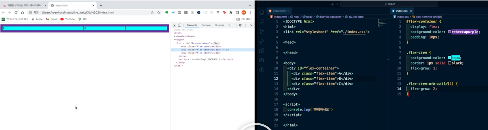
.flex-item:nth-child(1) {
	flex-grow: 2;
} /*첫 번째 자식이 2만큼의 공간을 할당받는다.*/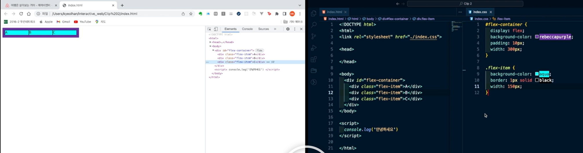
△ 컨테이너의 폭이 300px인데, 아이템의 폭이 150px을 할당받아, 컨테이너의 크기를 넘어버린 경우, shrink의 값이 기본적으로 1이 되므로, 모든 아이템들의 크기가 동일하게 줄어들어 할당받는다.
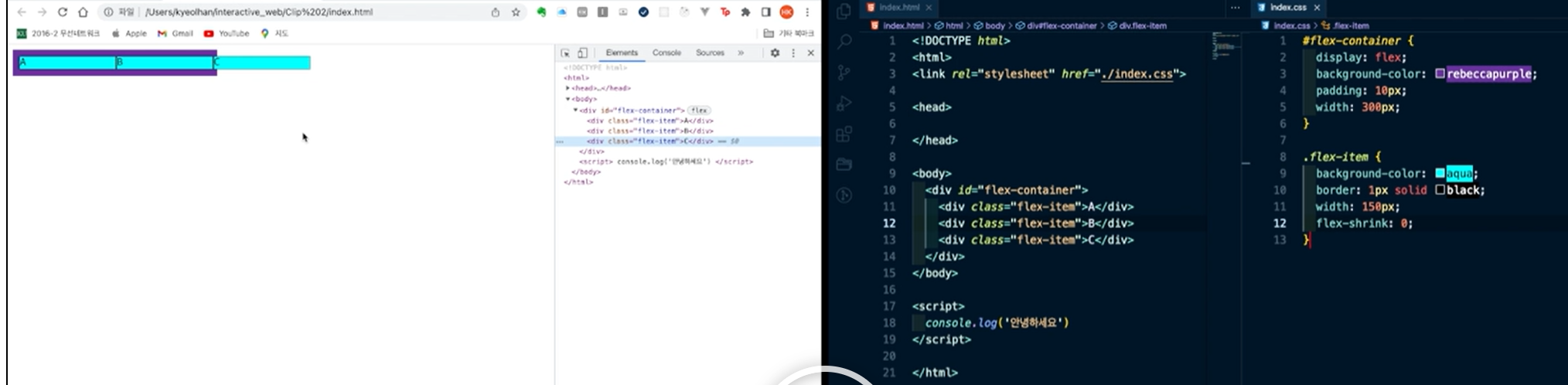
△ flex-shrink가 0이므로, 줄어들지 않으므로, 아이템의 크기가 컨테이너를 넘어서 할당된다.
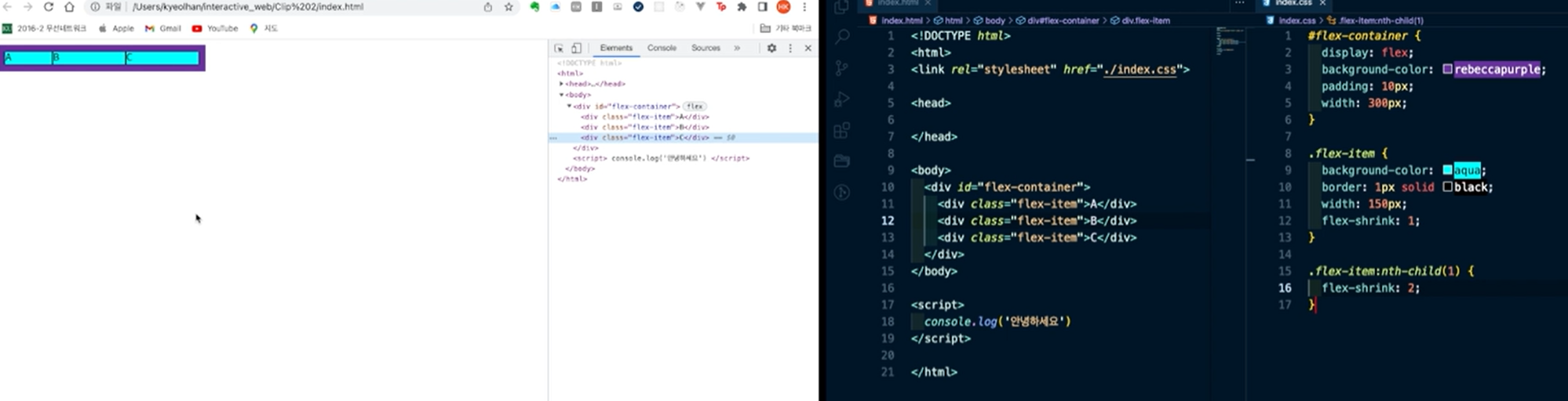
△ 자식 요소중 첫 번째 자식의 flex-shrink가 2이므로, 기본적으로 1인 다른 요소들보다 2배 더 줄어든다.
△ flex-basis가 150px로 지정되었다. 하지만 기본 flex-shrink가 존재하므로, container를 넘지 못했다.
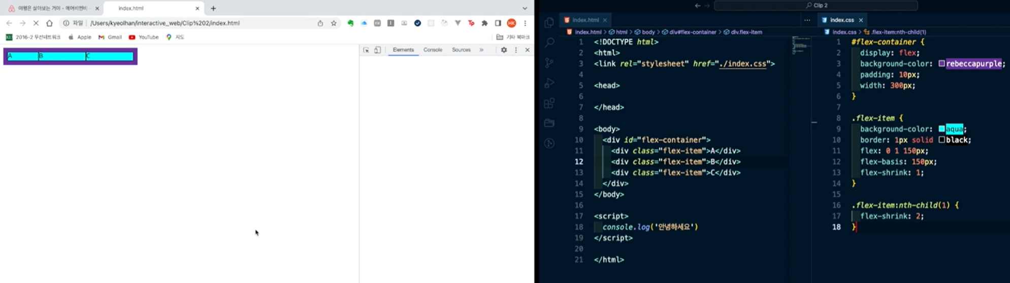
△ 축약형으로 다음과 같이 flex:0 1 150px; 로 입력이 가능하다.
(grow, shrink, basis 순서)
display: flex;
.container {
	display: flex;
	/* display: inline-flex; */
}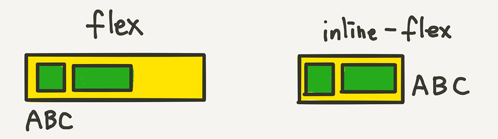
- display: flex
- 이 속성은, 부모 요소는 블록 수준 요소처럼 동작한다.
- 부모 요소는 화면 전체 너비를 차지하고, 위 아래로 새로운 줄을 생성한다. 이렇게 되면, 부모 요소 위,아래에 다른 요소가 올 수 없게 된다.
- 'display: flex;'가 선언된 요소는 주로 레이아웃의 큰 구조를 잡거나, 아이템들을 행 또는 열로 나열할 때 사용된다.
- display: inline-flex
- 부모 요소는 인라인 수준 요소처럼 동작하게 된다.
- 부모 요소가 자신의 내용만큼의 너비를 차지하고, 동일한 줄에 다른 요소와 함께 배치될 수 있음을 의미한다.
- 'display: inline-flex;'가 선언된 요소는 텍스트 내에 있는 아이템들을 조정하거나, 작은 구성 요소 내에서 아이템들을 배치할 때 주로 사용된다.
컨테이너에 적용되는 속성
- 방향 flex-direction
- row
- column
- row-reverse
- column-reverse
- 정렬 justify-content, align-items
- flex-start
- flex-end
- center
- space-between: 아이템간의 간격을 일정하게 맞추는 정렬
- space-around: 아이템간의 간격을 일정케 하면서, 가장자리 아이템과 컨테이너 사이의 간격을 아이템사이의 간격의 절반으로 유지시키는 정렬
실습
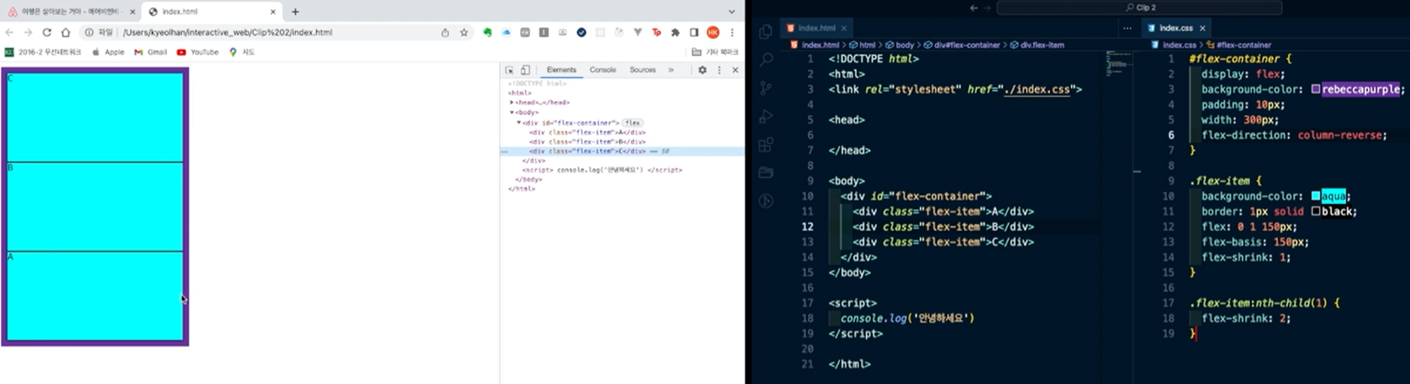
△ width는 300px이 되었고, flex-direction: column-reverse로 인해, 각 아이템들의 높이가 150픽셀로 역순 세로 정렬이 된 것을 볼 수 있다.
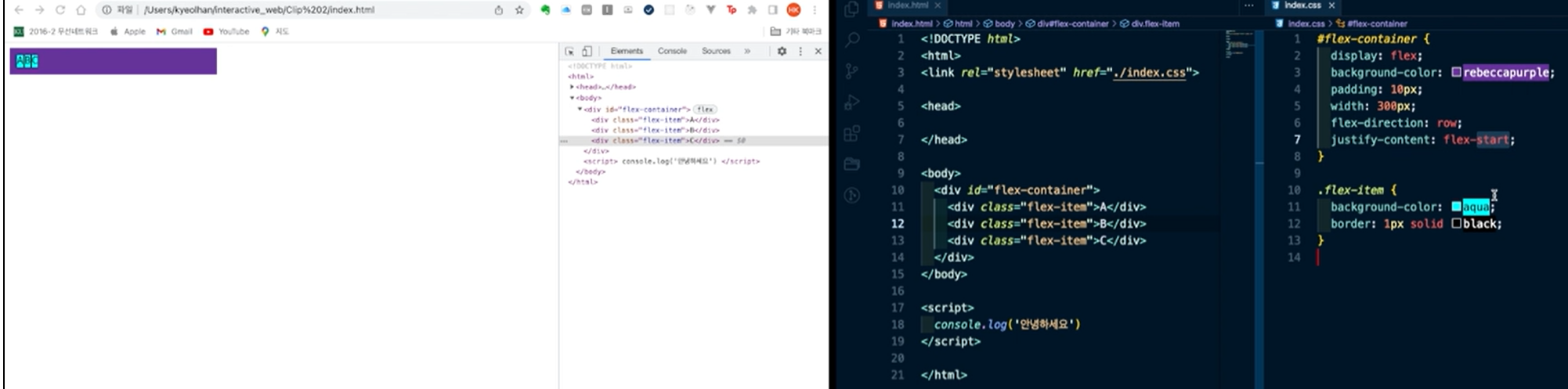
△ justify-content: flex-start는 일반적인 정렬과 같다. 주축이 가로방향 이므로, 왼쪽부터 오른쪽으로 가는 정렬이 된다.
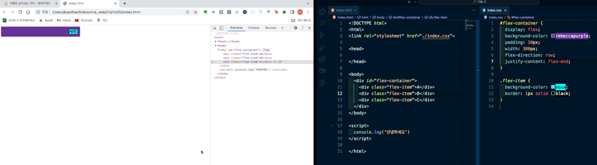
△ justify-content: flex-end정렬. 오른쪽에서 왼쪽으로 정렬 된 것을 볼 수 있다.
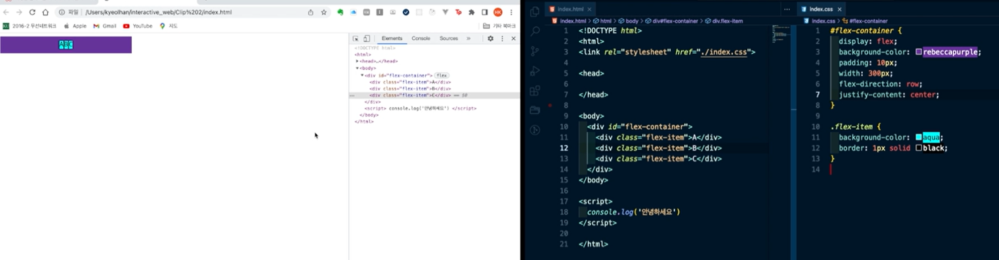
△ justify-content: center정렬. 가운데 정렬이다.
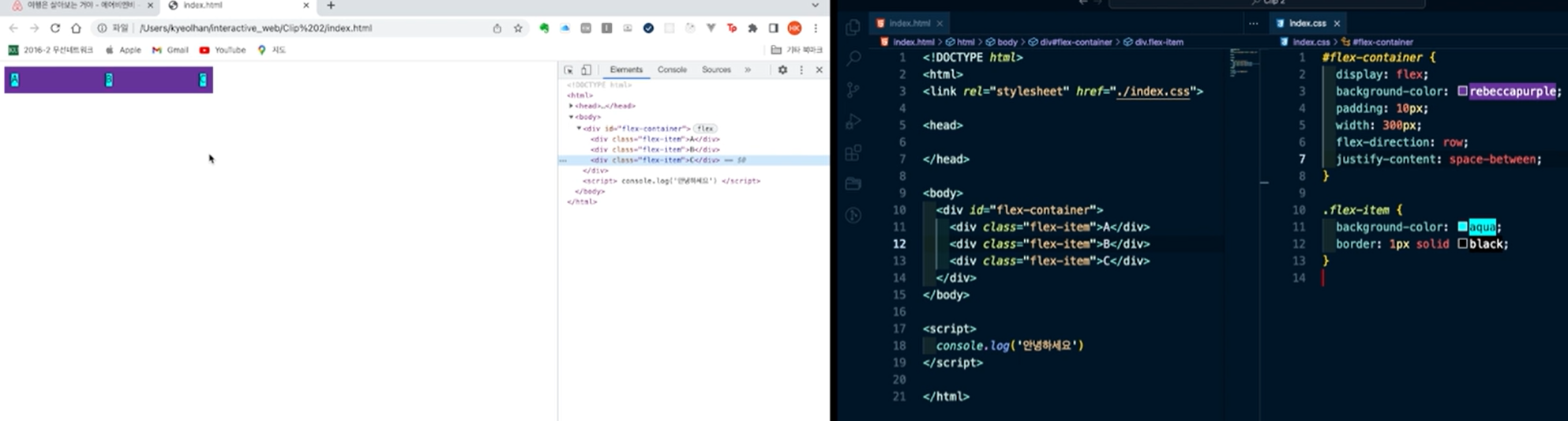
△ justify-content: between정렬. 각 끝 요소들이 컨테이너 끝에 붙고, 아이템의 간격이 일정하게 맞춰진다.
△ justify-content: space-around정렬. 아이템 간의 간격을 일정하게 하면서, 가장자리 아이템과 컨테이너 사이의 간격을 아이템 사이의 간격의 절반으로 유지시키는 정렬.
flex-direction
.container {
	flex-direction: row;
	/* flex-direction: column; */
	/* flex-direction: row-reverse; */
	/* flex-direction: column-reverse; */
}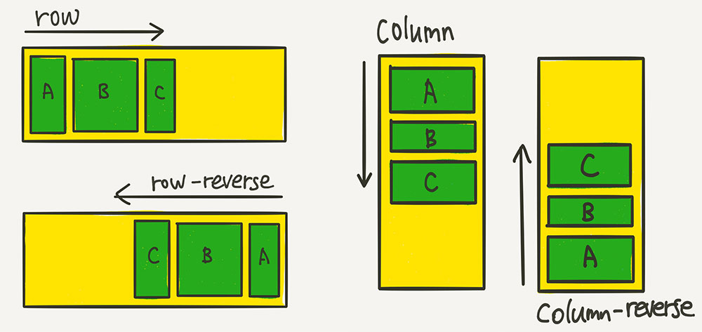
row(기본값): 아이템들이 가로 방향으로 배치된다.
row-reverse: 아이템들이 역순으로 가로 배치된다.
column: 아이템들이 세로 방향으로 배치된다.
column-reverse: 아이템들이 역순으로 세로 배치 된다.
align-items
justifyContent가 flex container의 main-axis을 따라 정렬을 정의하는 프로퍼티였다면, alignItems는 main-axis의 cross-axis를 따라 정렬되는 방식을 정의하는 프로퍼티이다.
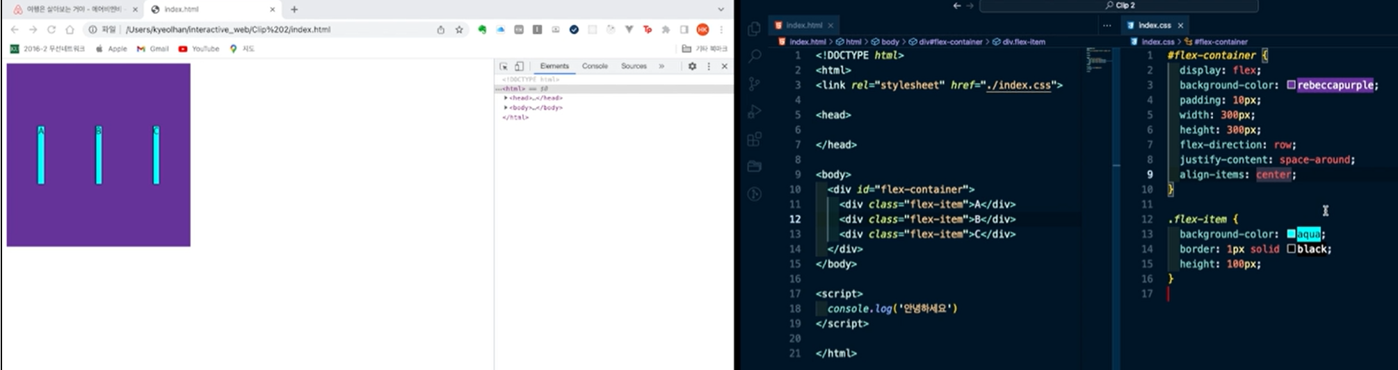
align-items기 center인 경우, 위와 같이 컨테이너 중간에 아이템이 배치된다.
헤더 영역 실습 - 1
<!DOCTYPE html>
<html lang="en">
<head>
    <meta charset="UTF-8">
    <meta http-equiv="X-UA-Compatible" content="IE=edge">
    <meta name="viewport" content="width=device-width, initial-scale=1.0">
    <link rel="stylesheet" href="./index.css">
    <title>Clone coding</title>
</head>
<body>
    <header>
        <img id="logo" src="./imgs/comp.jpg" alt="fast campus logo">
    </header>

</body>
</html>#logo{
height: 64px;
}위에선, 로고 이미지를 가져오고, 스타일시트에 index.css를 참조하게 짠 것이다.
css파일에선, 이미지 id가 logo인 것을 찾아서, 높이를 64픽셀로 지정해 주었다.
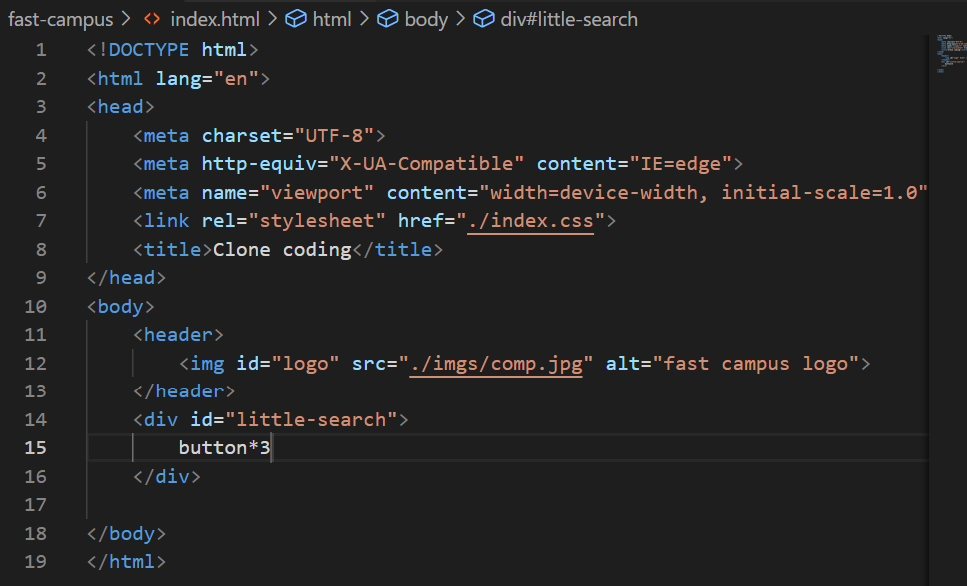
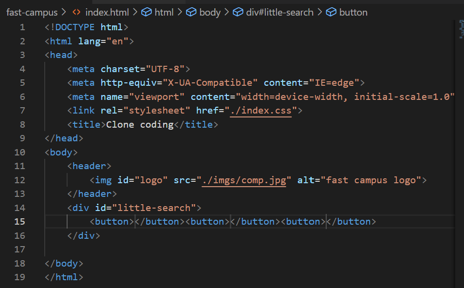
△ 위와 같이, button*3을 한 후에, 엔터를 누르면 버튼 세개가 생성된다.
<!DOCTYPE html>
<html lang="en">
<head>
<meta charset="UTF-8">
<meta http-equiv="X-UA-Compatible" content="IE=edge">
<meta name="viewport" content="width=device-width, initial-scale=1.0">
<link rel="stylesheet" href="./index.css">
<title>Clone coding</title>
</head>
<body>
<header>
<img id="logo" src="./imgs/comp.jpg" alt="fast campus logo">
</header>
<div id="little-search">
<button>
어디든지
</button>
<button>
언제든 일주일
</button>
<button>
게스트 추가
</button>
</div>
</body>
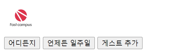
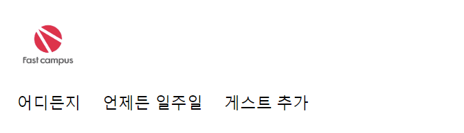
</html>위와 같이 html문서를 작성할 경우, 다음과 같이 보여진다.
여기에서, border을 none으로 지정하면,
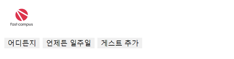
과 같이 경계선 영역이 안보이지만, 배경색은 여전히 보이는 것을 볼 수 있다. 배경색을 투명하게 하기 위해 transparent를 적용하자.
button {
    border: none;
    background: transparent;
}

#logo{
    height: 64px;
    cursor: pointer;
}
<!DOCTYPE html>
<html lang="en">
<head>
    <meta charset="UTF-8">
    <meta http-equiv="X-UA-Compatible" content="IE=edge">
    <meta name="viewport" content="width=device-width, initial-scale=1.0">
    <link rel="stylesheet" href="./index.css">
    <title>Clone coding</title>
</head>
<body>
    <header>
        <img id="logo" src="./imgs/comp.jpg" alt="fast campus logo">
    </header>
    <div id="little-search">
        <button>어디든지</button>
        <button>언제든 일주일</button>
        <button>게스트 추가</button>
        <img id="magnifying-glass-icon" src="./imgs/magnifying-glass-icon.png" alt="magnifying glass icon">
    </div>

</body>
</html>
button {
border: none;
background: transparent;
}
#logo{
height: 64px;
cursor: pointer;
}
#magnifying-glass-icon{
height: 12px;
}돋보기 아이콘을 넣고, 해당 아이콘을 12px로 지정하면, 다음과 같이 보이게 된다.
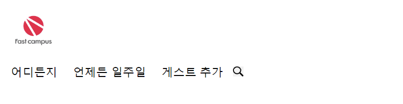
이제 돋보기에 빨간색 동그란 테두리를 넣기 위하여, <div id="little search"> 안에 <div id="magnifying-glass-wrapper">를 추가하고, 그 안에 돋보기 아이콘을 넣어 보았다. "magnifying-glass-wrapper"의 배경색은 빨간색, 곡률은 50으로 넣었다.
<!DOCTYPE html>
<html lang="en">
<head>
    <meta charset="UTF-8">
    <meta http-equiv="X-UA-Compatible" content="IE=edge">
    <meta name="viewport" content="width=device-width, initial-scale=1.0">
    <link rel="stylesheet" href="./index.css">
    <title>Clone coding</title>
</head>
<body>
    <header>
        <img id="logo" src="./imgs/comp.jpg" alt="fast campus logo">
    </header>
    <div id="little-search">
        <button>어디든지</button>
        <button>언제든 일주일</button>
        <button>게스트 추가</button>
        <div id="magnifying-glass-wrapper">
            <img id="magnifying-glass-icon" src="./imgs/magnifying-glass-icon.png" alt="magnifying glass icon">
        </div>
    </div>

</body>
</html>
button {
border: none;
background: transparent;
}
#logo{
height: 64px;
cursor: pointer;
}
#magnifying-glass-wrapper {
background-color: red;
border-radius: 50%;
}
#magnifying-glass-icon{
height: 12px;
}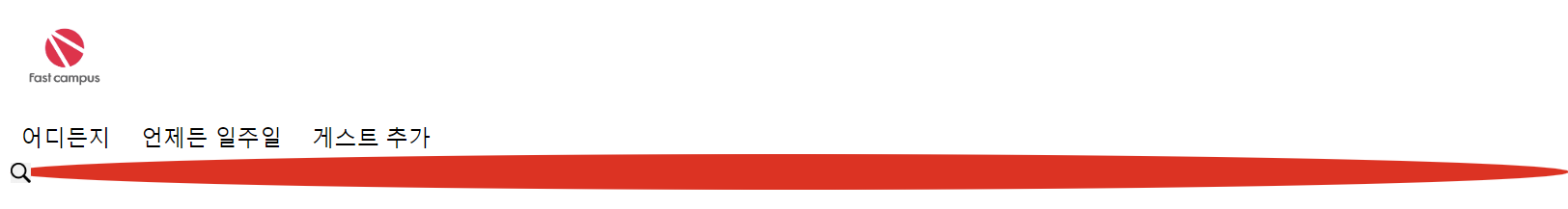
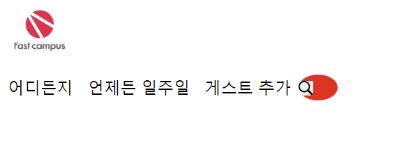
위와 같이, 가로로 길게 뻗어진 타원을 볼 수 있다. 해당 문제가 왜 발생하는지 이유는 일반적으로, 요소들이 세로로 배치되는 블록 수준 요소(block-level element)의 기본 동작 때문이다.
HTML요소는 기본적으로 블록 수준 요소 또는 인라인 수준 요소(inline-level element)로 분류된다. 블록 수준 요소는 새로운 줄에서 시작되고 그 후에 오는 요소도 새로운 줄에서 시작한다. 즉, 블록 수준 요소들은 세로로 쌓이는 경향이 있다.
<div>는 기본적으로 블록 수준 요소이다. 따라서, 별도의 스타일링이 없다면 <div id="magnifying-glass-wrapper">는 자신의 앞에 있는 요소 아래에 위치하게 된다.
이를 변경하려면 CSS를 사용하여 레이아웃을 조정해야 한다. 예를 들어, 부모 요소에 'display:flex'를 적요앟면 자식 요소들이 가로로 나열하게 된다.
그리하여, CSS를 사용하여 레이아웃을 조정해보자.
button {
border: none;
background: transparent;
}
#logo{
height: 64px;
cursor: pointer;
}
#little-search {
display: flex;
}
#magnifying-glass-wrapper {
background-color: red;
border-radius: 50%;
}
#magnifying-glass-icon{
height: 12px;
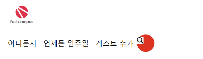
}little-search에 display: flex; 를 적용시키면 아래와 같이 보여진다.
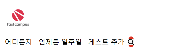
원의 크기를 조정해보자. flex-basis를 32픽셀로 조정하면 다음과 같다.
button {
    border: none;
    background: transparent;
}

#logo{
    height: 64px;
    cursor: pointer;
}

#little-search {
    display: flex;
  }

#magnifying-glass-wrapper {
    background-color: red;
    border-radius: 50%;
    flex-basis: 32px;
}

#magnifying-glass-icon{
    height: 12px;
}
이제 높이도 가로 길이와 마찬가지로 조정해보자.
button {
    border: none;
    background: transparent;
}

#logo{
    height: 64px;
    cursor: pointer;
}

#little-search {
    display: flex;
  }

#magnifying-glass-wrapper {
    background-color: red;
    border-radius: 50%;
    flex-basis: 32px;
    height: 32px;
}

#magnifying-glass-icon{
    height: 12px;
}
돋보기를 빨간 원 안에 가운데 정렬하기 위해, 메인 축과 교차 축의 정렬을 사용한다.
button {
    border: none;
    background: transparent;
}

#logo{
    height: 64px;
    cursor: pointer;
}

#little-search {
    display: flex;
  }

#magnifying-glass-wrapper {
    display: flex;
    justify-content: center; /*메인 축 정렬*/
    align-items: center; /*교차 축 정렬*/
    background-color: red;
    border-radius: 50%;
    flex-basis: 32px;
    height: 32px;
}

#magnifying-glass-icon{
    height: 12px;
}
이제, 각 버튼마다 영역을 나누기 위해, span divider를 추가해 보자.
<!DOCTYPE html>
<html lang="en">
<head>
    <meta charset="UTF-8">
    <meta http-equiv="X-UA-Compatible" content="IE=edge">
    <meta name="viewport" content="width=device-width, initial-scale=1.0">
    <link rel="stylesheet" href="./index.css">
    <title>Clone coding</title>
</head>
<body>
    <header>
        <img id="logo" src="./imgs/comp.jpg" alt="fast campus logo">
    </header>
    <div id="little-search">
        <button>어디든지</button><span class="divider"></span>
        <button>언제든 일주일</button><span class="divider"></span>
        <button>게스트 추가</button>
        <div id="magnifying-glass-wrapper">
            <img id="magnifying-glass-icon" src="./imgs/magnifying-glass-icon.png" alt="magnifying glass icon">
        </div>
    </div>

</body>
</html>
button {
border: none;
background: transparent;
}
#logo{
height: 64px;
cursor: pointer;
}
#little-search {
display: flex;
}
.divider {
flex-basis: 1px;
background-color: #DDDDDD;
height: 24px;
}
#magnifying-glass-wrapper {
display: flex;
justify-content: center;
align-items: center;
background-color: red;
border-radius: 50%;
flex-basis: 32px;
height: 32px;
}
#magnifying-glass-icon{
height: 12px;
}
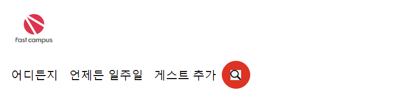
하지만, divider를 추가하고 나니, 버튼이 밑에 붙어있는 것을 볼 수 있다. 수직 정렬을 위해 주축의 교차축 정렬을 사용한다.
해당 아이템들은 little-search안에 있으므로, little-search에 교차 축 정렬을 사용해본다.
button {
    border: none;
    background: transparent;
}

#logo{
    height: 64px;
    cursor: pointer;
}

#little-search {
    display: flex;
    align-items: center;
}

.divider {
    flex-basis: 1px;
    background-color: #DDDDDD;
    height: 24px;
}

#magnifying-glass-wrapper {
    display: flex;
    justify-content: center;
    align-items: center;
    background-color: red;
    border-radius: 50%;
    flex-basis: 32px;
    height: 32px;
}

#magnifying-glass-icon{
    height: 12px;
}
세로 정렬이 잘 된 것을 볼 수 있다.
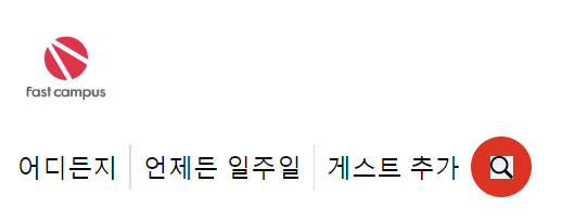
이제, 버튼의 좌우에 공백(padding)을 만들어 보자. 공백이 필요한 버튼들에게 동일한 class를 넣고, 한꺼번에 좌우의 공백값을 줘보자.
button {
    border: none;
    background: transparent;
}

#logo{
    height: 64px;
    cursor: pointer;
}

#little-search {
    display: flex;
    align-items: center;
}

.little-search_button {
    padding: 0 16px; /*상하 0px, 좌우 16px*/
}

.divider {
    flex-basis: 1px;
    background-color: #DDDDDD;
    height: 24px;
}

#magnifying-glass-wrapper {
    display: flex;
    justify-content: center;
    align-items: center;
    background-color: red;
    border-radius: 50%;
    flex-basis: 32px;
    height: 32px;
}

#magnifying-glass-icon{
    height: 12px;
}
div id="little-search"에 실선을 추가해 보자.
button {
    border: none;
    background: transparent;
}

#logo{
    height: 64px;
    cursor: pointer;
}

#little-search {
    display: flex;
    align-items: center;
    border: 1px solid #DDDDDD; /*1픽셀 실선 하얀색*/
}

.little-search_button {
    padding: 0 16px; /*상하 0px, 좌우 16px*/
}

.divider {
    flex-basis: 1px;
    background-color: #DDDDDD;
    height: 24px;
}

#magnifying-glass-wrapper {
    display: flex;
    justify-content: center;
    align-items: center;
    background-color: red;
    border-radius: 50%;
    flex-basis: 32px;
    height: 32px;
}

#magnifying-glass-icon{
    height: 12px;
}
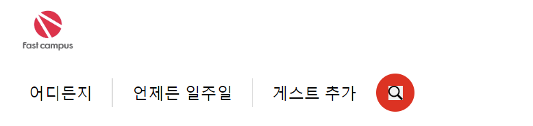
이제, 로고 옆에 버튼이 나올 수 있도록 해야한다. header밖에 잘못 빠져있던 요소들을 집어넣고, header의 display를 flex로 바꾸면 다음과 같이 나온다.
<!DOCTYPE html>
<html lang="en">
<head>
    <meta charset="UTF-8">
    <meta http-equiv="X-UA-Compatible" content="IE=edge">
    <meta name="viewport" content="width=device-width, initial-scale=1.0">
    <link rel="stylesheet" href="./index.css">
    <title>Clone coding</title>
</head>
<body>
    <header>
        <img id="logo" src="./imgs/comp.jpg" alt="fast campus logo">
        <div id="little-search">
            <button class="little-search_button">어디든지</button><span class="divider"></span>
            <button class="little-search_button">언제든 일주일</button><span class="divider"></span>
            <button class="little-search_button">게스트 추가</button>
            <div id="magnifying-glass-wrapper">
                <img id="magnifying-glass-icon" src="./imgs/magnifying-glass-icon.png" alt="magnifying glass icon">
            </div>
        </div>
    </header>
</body>
</html>
header {
display: flex;
}
button {
border: none;
background: transparent;
}
#logo{
height: 64px;
cursor: pointer;
}
#little-search {
display: flex;
align-items: center;
border: 1px solid #DDDDDD; /*1픽셀 실선 하얀색*/
}
.little-search_button {
padding: 0 16px; /*상하 0px, 좌우 16px*/
}
.divider {
flex-basis: 1px;
background-color: #DDDDDD;
height: 24px;
}
#magnifying-glass-wrapper {
display: flex;
justify-content: center;
align-items: center;
background-color: red;
border-radius: 50%;
flex-basis: 32px;
height: 32px;
}
#magnifying-glass-icon{
height: 12px;
}
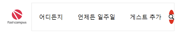
줄바꿈이 되버렸다. 줄바꿈을 없애기 위해서 CSS에서 줄바꿈을 없애보자. nowrap을 통하여, 부모의 가로길이 폭을 넘더라도 줄바꿈이 일어나지 않게 할 수 있다.
header {
    display: flex;
}

button {
    border: none;
    background: transparent;
}

#logo{
    height: 64px;
    cursor: pointer;
}

#little-search {
    display: flex;
    align-items: center;
    border: 1px solid #DDDDDD; /*1픽셀 실선 하얀색*/
}

.little-search_button {
    padding: 0 16px; /*상하 0px, 좌우 16px*/
    white-space: nowrap; /*줄바꿈 막기*/
}

.divider {
    flex-basis: 1px;
    background-color: #DDDDDD;
    height: 24px;
}

#magnifying-glass-wrapper {
    display: flex;
    justify-content: center;
    align-items: center;
    background-color: red;
    border-radius: 50%;
    flex-basis: 32px;
    height: 32px;
}

#magnifying-glass-icon{
    height: 12px;
}
그런데, 줄바꿈을 막으니, 원이 축소되어 타원으로 바뀌었다. 그것을 막기위해 flex-shrink를 0으로 설정하자.
header {
    display: flex;
}

button {
    border: none;
    background: transparent;
}

#logo{
    height: 64px;
    cursor: pointer;
}

#little-search {
    display: flex;
    align-items: center;
    border: 1px solid #DDDDDD; /*1픽셀 실선 하얀색*/
}

.little-search_button {
    padding: 0 16px; /*상하 0px, 좌우 16px*/
    white-space: nowrap; /*줄바꿈 막기*/
}

.divider {
    flex-basis: 1px;
    background-color: #DDDDDD;
    height: 24px;
}

#magnifying-glass-wrapper {
    display: flex;
    justify-content: center;
    align-items: center;
    background-color: red;
    border-radius: 50%;
    flex-basis: 32px;
    flex-shrink: 0;
    height: 32px;
}

#magnifying-glass-icon{
    height: 12px;
}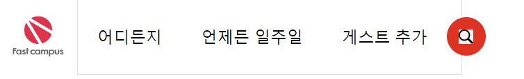
white-space: nowrap; /*줄바꿈 막기*/ 를 넣는 과정에서, divider이 증발하는 문제가 발생하였다. container의 여유공간이 충분히 없기 때문이다. 강의에서는 335px을 little-search영역의 min-width로 두었지만, 보다 넓게 설정하면 해당 오류가 일어나지 않는다. 또한, littler-search의 border-radius를 40px로 설정하면 little-search의 영역을 둥글게 만들 수 있다.
header {
    display: flex;
}

button {
    border: none;
    background: transparent;
}

#logo{
    height: 64px;
    cursor: pointer;
}

#little-search {
    display: flex;
    align-items: center;
    border: 1px solid #DDDDDD; /*1픽셀 실선 하얀색*/
    border-radius: 40px;
    min-width: 355px;
}

.little-search_button {
    padding: 0 16px; /*상하 0px, 좌우 16px*/
    white-space: nowrap; /*줄바꿈 막기*/
}

.divider {
    flex-basis: 1px;
    background-color: #DDDDDD;
    height: 24px;
}

#magnifying-glass-wrapper {
    display: flex;
    justify-content: center;
    align-items: center;
    background-color: red;
    border-radius: 50%;
    flex-basis: 32px;
    flex-shrink: 0;
    height: 32px;
}

#magnifying-glass-icon{
    height: 12px;
}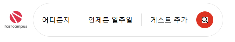
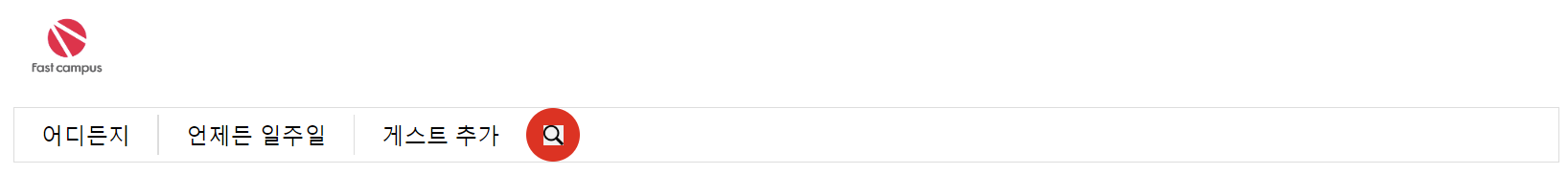
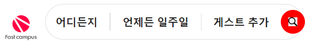
little-search에 주축 정렬을 하고, padding을 주어 좌우 8픽셀 여유를 준다.
또한, little-search를 48픽셀로 크기를 준다. (border에 1픽셀이 있으므로, 실제 크기는 50px.)
header {
    display: flex;
}

button {
    border: none;
    background: transparent;
}

#logo{
    height: 64px;
    cursor: pointer;
}

#little-search {
    display: flex;
    padding: 0 8px;
    justify-content: center;
    align-items: center;
    border: 1px solid #DDDDDD; /*1픽셀 실선 하얀색*/
    border-radius: 40px;
    min-width: 355px;
    height: 48px; /*높이 48픽셀로 크기를 맞춘다.*/
}

.little-search_button {
    padding: 0 16px; /*상하 0px, 좌우 16px*/
    white-space: nowrap; /*줄바꿈 막기*/
}

.divider {
    flex-basis: 1px;
    background-color: #DDDDDD;
    height: 24px;
}

#magnifying-glass-wrapper {
    display: flex;
    justify-content: center;
    align-items: center;
    background-color: red;
    border-radius: 50%;
    flex-basis: 32px;
    flex-shrink: 0;
    height: 32px;
}

#magnifying-glass-icon{
    height: 12px;
}
.little-search_button과 .divider 클래스에 적용된 display: block; 속성은 해당 요소들을 블록 수준 요소로 만든다. 이렇게 되면, 블록 수준 요소가 되므로, 항상 새로운 줄에서 시작하고, 가능한 한 많은 너비를 차지하고, 블록 요소는 위에서 아래로 쌓이는 방식으로 배치되며, 블록 요소 바로 앞 또는 뒤에 오는 텍스트나 인라인 요소는 새로운 줄에서 시작하거나 끝나며, 너비와 높이, 마진과 패딩을 자유롭게 조절할 수 있다.
하지만, .little-search_button과 .divider 클래스가 모두 flex container인 #little-search의 자식 요소로서의 속성을 가지고 있다. #little-search에 display: flex;가 설정되어 있으므로, 이 안에 있는 .little-search_button과 .divider 요소는 자신들의 display: block; 속성보다는 flex container의 규칙을 따르게 된다. 이 말은, .little-search_button과 .divider 요소는 새로운 줄에서 시작하지 않고, 가로로 배열된다.
box-sizing: border-box
box-sizing 속성은 요소의 너비와 높이가 계산되는 방식을 결정한다. border-box 값은 padding과 border가 요소의 너비와 높이에 포함되도록 한다. 예를 들어, 너비를 200px로 설정하고 padding을 20px, border를 2px로 설정했을 때, 콘텐츠 영역은 156px이 된다. 즉, 콘텐츠 영역 + padding + border = 설정한 너비 또는 높이가 되는 것이다.
header {
    display: flex;
}

button {
    border: none;
    background: transparent;
}

#logo{
    height: 64px;
    cursor: pointer;
}

#little-search {
    display: flex;
    padding: 0 8px;
    justify-content: center;
    align-items: center;
    border: 1px solid #DDDDDD; /*1픽셀 실선 하얀색*/
    border-radius: 40px;
    height: 48px;
    box-sizing: border-box;
    min-width: 330px;

.little-search_button {
    display: block;
    flex-shrink: 0;
    padding: 0 16px; /*상하 0px, 좌우 16px*/
    white-space: nowrap; /*줄바꿈 막기*/
    font-size: 14px;
    font-weight: 600; /*글자의 두께 지정. 100~900까지의 값을 가지며, 400은 보통, 700은 bold이다.*/
    color: rgb(34, 34, 34)
}

.divider {
    display: block;
    flex-basis: 1px;
    flex-shrink: 0;
    background-color: #DDDDDD;
    height: 24px;
}

#magnifying-glass-wrapper {
    display: flex;
    justify-content: center;
    align-items: center;
    background-color: red;
    border-radius: 50%;
    flex-basis: 32px;
    flex-shrink: 0;
    height: 32px;
}

#magnifying-glass-icon{
    height: 12px;
}
box-shadow
CSS에서 요소에 그림자 효과를 주는 속성이다. 여기에서 box-shadow: 0 1px 2px rgb(0 0 0 / 8%), 0 4px 12px rgb(0 0 0/ 5%);는 두 개의 그림자를 동시에 요소에 적용하고 있다. 쉼표(,)로 구분되는 각 그림자는 다음과 같은 값을 가진다
- 0 1px 2px rgb(0 0 0 / 8%): 첫 번째 그림자이다. 이 그림자는 0px의 수평 오프셋, 1px의 수직 오프셋, 2px의 흐림 반경을 가진다. 그림자의 색은 검정색 (0 0 0)이며, 투명도는 8%입니다. 오프셋이란 그림자가 투여될 위치를 지정하는 것이며, 흐림 반경은 그림자의 '부드러움'을 정의한다.
- 0 4px 12px rgb(0 0 0 / 5%): 두 번째 그림자이다. 이 그림자는 0px의 수평 오프셋, 4px의 수직 오프셋, 12px의 흐림 반경을 가진다. 그림자의 색은 검정색이며, 투명도는 5%이다.
이처럼 box-shadow를 사용하면, 하나 이상의 그림자를 동시에 적용할 수 있다. 이를 통하여 요소에 입체감을 주거나 시각적인 효과를 강조할 수 있다.
header {
display: flex;
}
button {
border: none;
background: transparent;
}
#logo{
height: 64px;
cursor: pointer;
}
#little-search {
display: flex;
padding: 0 8px;
justify-content: center;
align-items: center;
border: 1px solid #DDDDDD; /*1픽셀 실선 하얀색*/
border-radius: 40px;
height: 48px;
box-sizing: border-box;
min-width: 330px;
box-shadow: 0 1px 2px rgb(0 0 0 / 8%), 0 4px 12px rgb(0 0 0/ 5%);
}
.little-search_button {
display: block;
flex-shrink: 0;
padding: 0 16px; /*상하 0px, 좌우 16px*/
white-space: nowrap; /*줄바꿈 막기*/
font-size: 14px;
font-weight: 600; /*글자의 두께 지정. 100~900까지의 값을 가지며, 400은 보통, 700은 bold이다.*/
color: rgb(34, 34, 34)
}
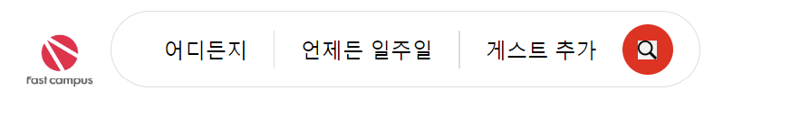
.little-search_button:nth-of-type(3) {
color: #717171;
}
.divider {
display: block;
flex-basis: 1px;
flex-shrink: 0;
background-color: #DDDDDD;
height: 24px;
}
#magnifying-glass-wrapper {
display: flex;
justify-content: center;
align-items: center;
background-color: red;
border-radius: 50%;
flex-basis: 32px;
flex-shrink: 0;
height: 32px;
}
#magnifying-glass-icon{
height: 12px;
}
<img> 태그의 alt 속성
<img> 태그의 alt 속성은 이미지를 보여줄 수 없을 때 해당 이미지를 대체할 텍스트를 명시한다. 이러한 alt 속성은 사용자가 느린 네트워크 환경이나 src 속성값의 오류, 시각 장애인용 스크린 리더의 사용 등 어떤 이유로든 사용자가 이미지를 볼 수 없을 때 이미지 대신 제공할 대체 정보를 제공한다. 예제는 아래와 같다.
<img src="/examples/images/monalisa.png" alt="모나리자">CSS에서 선택자 정의
CSS에서 선택자를 정의할 때 사용하는 #와 . 기호는 각각 다른 유형의 선택자를 가리킨다.
- # 기호는 ID 선택자를 가리킨다. ID 선택자는 HTML 요소의 id 속성과 일치하는 요소를 선택한다. 예를 들어, #logo는 id="logo"가 설정된 요소를 선택한다. ID 선택자는 웹 페이지에서 고유해야 하며 한 번만 사용할 수 있다.
- .기호는 클래스 선택자를 가리킵니다. 클래스 선택자는 HTML 요소의 class 속성과 일치하는 요소를 선택한다. 예를 들어, .divider는 class="divider"가 설정된 모든 요소를 선택한다. 클래스 선택자는 웹 페이지에 여러 번 사용할 수 있으며, 여러 클래스를 한 요소에 적용할 수 있다.
- 위의 코드에서 button은 태그 선택자다. 태그 선택자는 해당 태그 이름을 가진 모든 요소를 선택한다. 예를 들어, button은 모든 <button> 요소를 선택한다.
이 세 가지 선택자를 통해, CSS는 HTML 문서의 다양한 부분에 스타일을 적용하는 데 필요한 유연성을 제공한다. 이들 각각은 문서의 서로 다른 부분과 상황에 따라 사용된다.