2. EDA를 통해 데이터 탐색하기_BDAS
2.1.1당뇨병 데이터셋 미리보기
라이브러리 불러오기
import pandas as pd
import numpy as np
import seaborn as sns
import matplotib.pyplot as plt

pd.read_csv("data/diabetes.csv")
df.describe() -> 수치 데이터 요약값
[평균값 > 중위값 ==> 최대값이 높기 때문]
혈압,피부두께, BMI는 0이 될 수 없는데 최솟값 모두 0 임 ==> 결측치일 가능성 높음
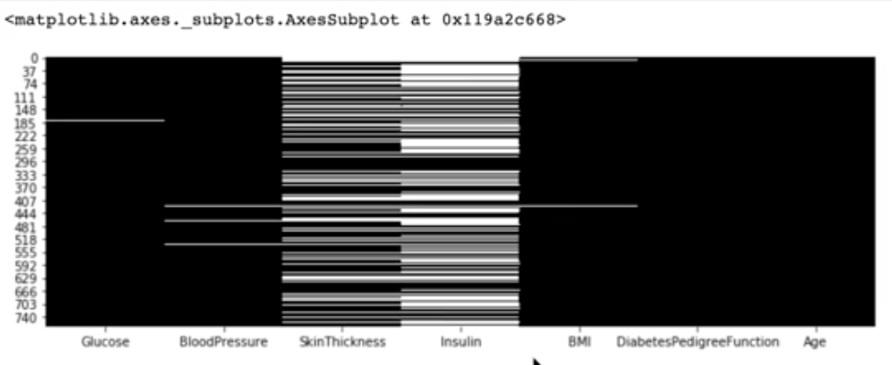
2.1.2 결측치 보기
- 0으로 기록된 값을 NULL처리 하고 결측치 알아내기
df_null = df[cols].replace(0,np.nan)
df_null = df_null.isnull()
#나온 결측치 각 갯수
df_null.sum()

# 결측치 수치 시각화
df_null.sum().plot.barh()

#히트맵 그리기
plt.figure(figsize = (15,4))
sns.heatmap(df_null, cmap="Greys_r")

2.1.3 훈련과 예측에 사용할 정답값을 시각화
- 정답값
모든 행의 결과 값 나타냄
df["Outcome"]
(1 = 발병 , 0 = 발병x)
-
정답값 빈도수
df["Outcome"].value_counts() -
정답값 비율
df["OUtcome"].value_counts(normalize=Treue) -
임신 횟수에 따른 발병 비율 그룹화
df.groupby(["pregnancies"])["Outcome"].mean()
-> 임신 횟수가 14번 이상이면 발병률이 100% (데이터 빈도 수가 적어서?)
- pregnancies라는 인덱스 값을 column값으로 사용하고 싶을 때 -> reset_index(), 리스트 형태로 agg에 알고싶은 값 넣기
df_po = df.groupby(["pregnancies"])["Outcome"].agg(["mean","count"]).reset_index()
- 시각화 그래프 그리기
df_po.plot()
- 막대 그래프로 확인(rot=0은 글씨를 세워넣는 거)
df_po["mean"].plot().bar(rot = 0)
- 임신 횟수 카운트한 거 시각화
sns.countplot(data = df, x = "Pregnancies")
- 임신 횟수에 따른 당뇨병 발병 빈도수 비교 시각화
sns.countplot(datda=df, x="Pregnancies", hue="Outcome")
--> 조건 숫자의 범위가 많아서 오버피팅 우려
! 범주로 묶어주기 (임신 횟수 적은 그룹 / 많은 그룹)
- 6번 이상 임신하면 T, 6번 미만이면 F
df["Pregnancies_high"] = df["Pregnancies"] >6
df[["Pregnancies","Pregnancies_high"]].head()
2.1.4 두 개의 변수를 정답값에 따라 시각화
- 당뇨병 발병 BMI수치 비교 (막대그래프 이용)
y축의 값은 평균값
sns.barplot(data=df, x= "Outcome", y="BMI")
그래프 위 세로로 그려진 까만 선 = 데이터 일부 샘플링하여 95%의 신뢰구간 (길 수록 신뢰구간 차이 큼)
- 임신 횟수에 대해 당뇨병 발병 비율 비교 시각화
sns.barplot(data=df, x="Pregnancies", y="Outcome")
- 임신 횟수에 따른 인슐린 수치를 당뇨병 발병 여부에 따라 시각화
sns.barplot(data=df, x="Pregnancies", y="Insulin",hue="Outcome")
--> 당뇨병 발병한 사람이 인슐린 수치 더 높음, 신뢰구간 차이 많이남
boxplot 똑같이 이용 가능
(주저 앉은 것은 0의 값이 많기 때문 0보다 큰 값으로 설정하기)
sns.boxplot(data=df[df["Insulin"] > 0], x="Pregnancies", y="Insulin", hue="Outcome")
violinplot 똑같이 이용 가능
(상자도표에서 상자 안 분포를 확인하기 힘든 점을 보완함)
plt.figure(figsize=(15, 4))
sns.violinplot(data=df[df["Insulin"] > 0], x="Pregnancies", y="Insulin", hue="Outcome", split=True)
swarmplot 똑같이 이용 가능
(산포도 그리는 데 적합)
plt.figure(figsize=(15, 4))
sns.violinplot(data=df[df["Insulin"] > 0], x="Pregnancies", y="Insulin", hue="Outcome")
2.1.5 수치형 변수 분포를 정답값에 따라 시각화
displot : 1개의 수치형 변수 표현할 때 사용
- 임신횟수에 따른 당뇨병 발병 여부 시각화 df_0 = df[df["Outcome"] == 0]
df_1 = df[df["Outcome"] == 0]
sns.distplot(df_0["Pregnancies"])
sns.distplot(df_1["Pregnancies"])
-->막대는 발생 빈도, 선그래프는 빈도의 밀도 정도를 나타냄
hist = Fales 사용하면 막대그래프 제거
rug = True 하면 밑에 러그 생김
lable = 0,1 옆에 선의 뜻(0/1) 표시
2.1.6 서브플롯으로 모든 변수 한번에 시각화
- histplot 그릴 땐 수치형 데이터만 있어야 하므로 int형으로 바꾸고 출력, bins는 막대 갯수 df["Pregnancies_high"] = df["Pregnancies_high"].astype(int)
h = df.hist(figsize=(15, 15), bins=20)
- 서브플롯 그리기 (빈 그래프들)
plt.subplots(nrows=3, ncols=3, figsize(15,15))
- Outcome을 x축으로 하는 diftplot을 그림 ax에 인덱싱해서 빈 그래프들에 원하는 위치로 지정 가능
sns.distplot(df["Outcome"], ax=axes[0][0])
- 반복문 활용해서 subplots 그리기
for i, col_name in enumerate(cols):
row = i // 3
col = i % 3
sns.distplot(df[col_name], ax=axes[row][col])
--> 빈도수를 y축 값으로 표현
- 연속된 수치 변수를 범주형 변수로 만들어서 표현
#4행 2열로 만듦
fig, axes = plt.subplots(nrows=4, ncols=2, figsize=(15, 15))

# df_0 = 값이 0인 것 df_1 = 값이 1인 것
for i, col_name in enumerate(cols[:-1]):
row = i // 2
col = i % 2
sns.distplot(df_0[col_name], ax=axes[row][col])
sns.distplot(df_1[col_name], ax=axes[row][col])
2.1.7 시각화를 통한 변수간의 차이 이해
- violinplot으로 서브플롯 그리기
fig, axes = plt.subplots(nrows=4, ncols=2, figsize=(15, 15))
for i, col_name in enumerate(cols[:-1]):
row = i // 2
col = i % 2
sns.violinplot(data=df, , x="Outcome", y=col_name, ax=axes[row][col])
--> 0의 값에 몰려있음 = 결측치
가설 : 포도당 수치와 인슐린 수치는 당뇨병과 관련 있을 것이다!
-
regplot으로 그리면 insulindl 0 인 값이 있음
sns.regplot(data=df, x="Glucose", y="Insulin")
-
regplot은 hue 옵션이 없어서 색상 지정을 못함
색상 다르게 하기 위해 lmplot 이용 + 인슐린이 0 이상일 때
sns.lmplot(data=df[df["Insulin"] > 0], x="Glucose", y="Insulin", hue="Outcome")
- PairGrid를 통해 모든 변수에 대해 Outcome에 따른 scatterplot을 그리기 g = sns.PairGrid(df, hue="Outcome")
g.map(plt.scatter)