[Git Hub]
1. eclipse→Git Hub로 관리
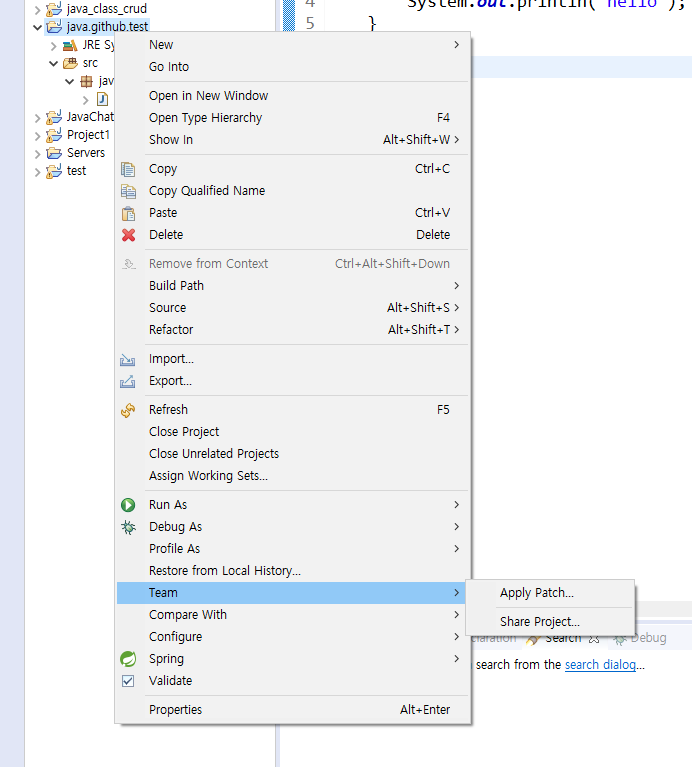
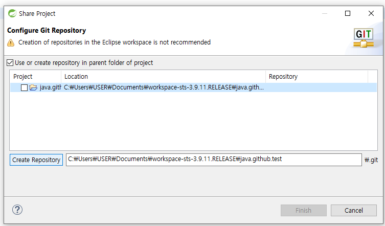
1. <Eclipse> Project→Team→Share Project
   - Use or create repository in parent folder of project 체크
   - 파일 클릭
   - Create Repository 클릭
   - Finish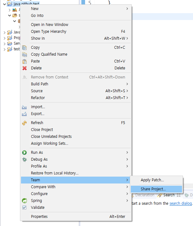
2. 해당 프로젝트 폴더 접속
- <Eclipse>Show In→System Explorer
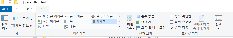
- <Windows> 리본메뉴→보기→숨긴항목 체크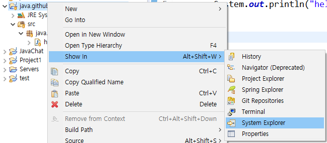
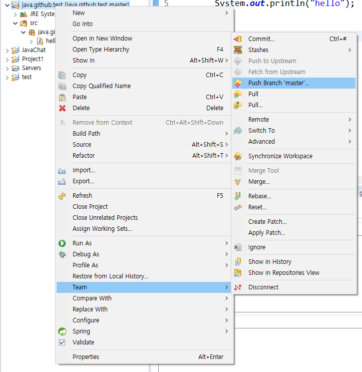
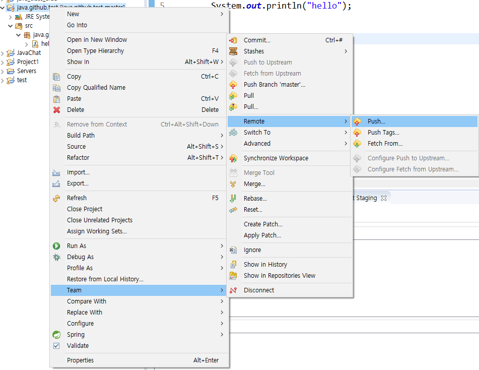
3. 커밋
   - <Eclipse> Project→Team→Commit
   - <Eclipse> Git Staging→Unstaged Changes(복사)→Staged Changes(붙여넣기)→Commit Message(입력)→Commit()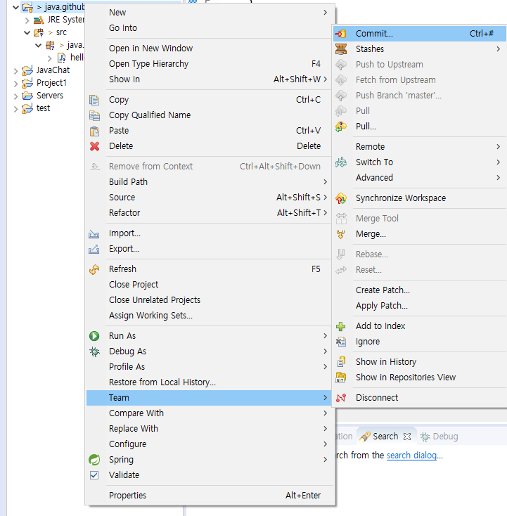
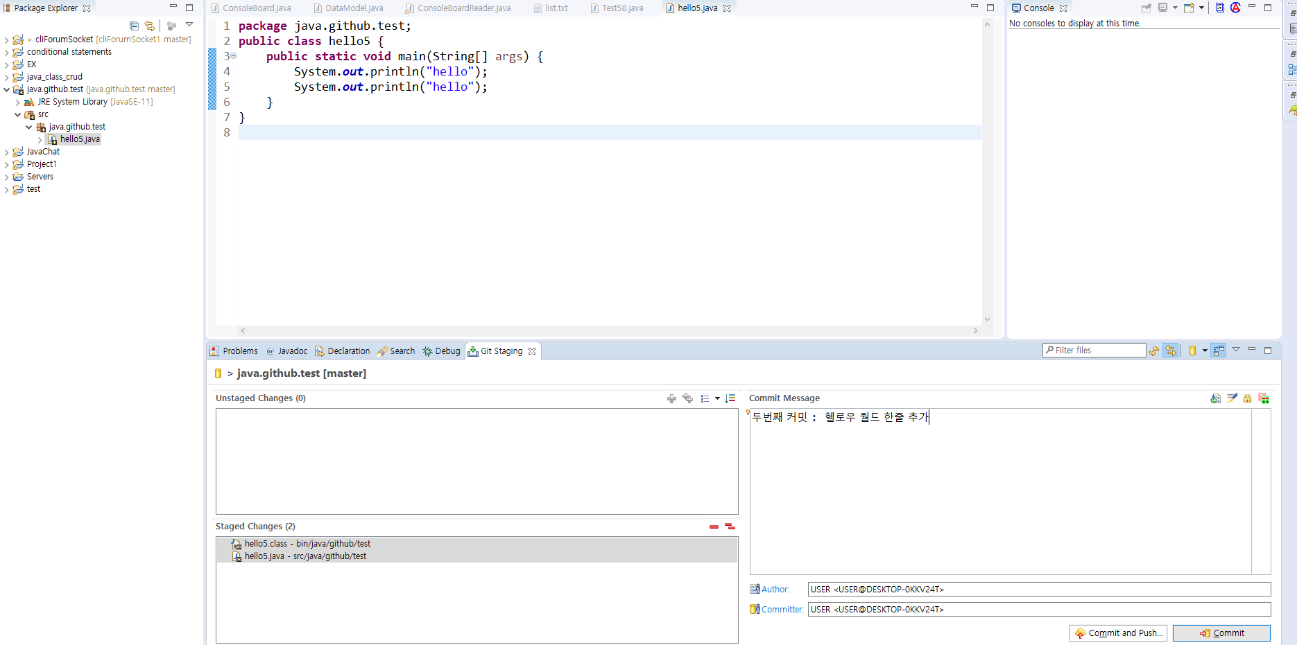
다른방법password : 토큰
*서버에 올라와 있는 코드와 eclipse의 코드를 비교하여 동일하게 바꿔주는 방법
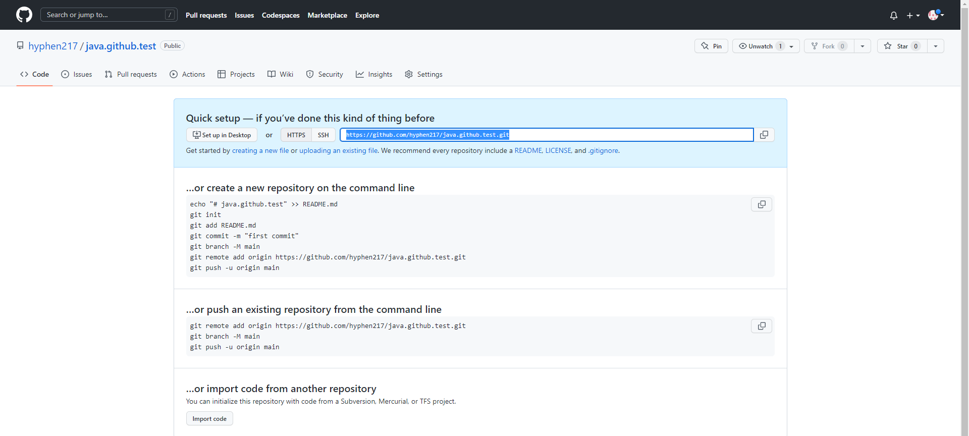
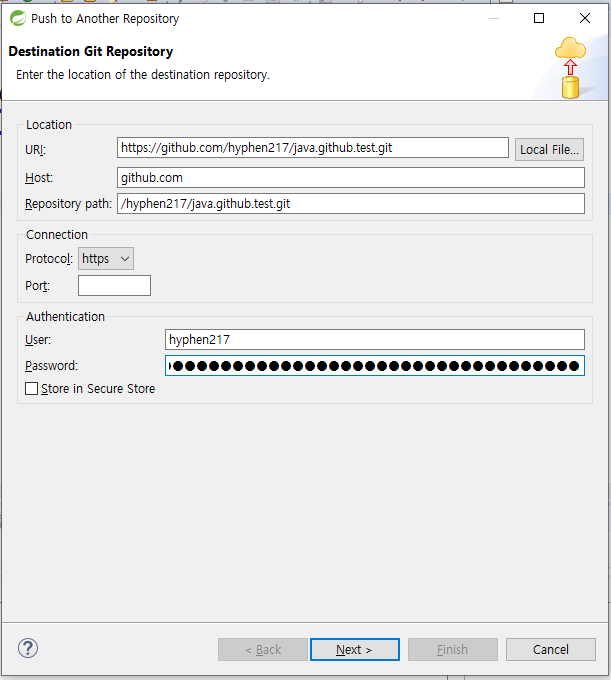
eclipse 상에서 git hub 접속방법
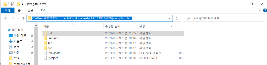
파일-숨겨진 파일 보기 >> .git
소스코드를 git으로 관리한다.
commit / push / pull
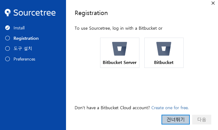
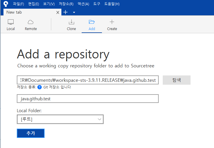
[소스트리]
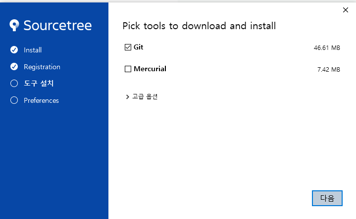
소스트리 다운 : https://www.sourcetreeapp.com/
- 건너뛰기
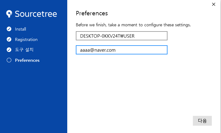
-
Mercurial 체크 해제
-
*작성법 add클릭
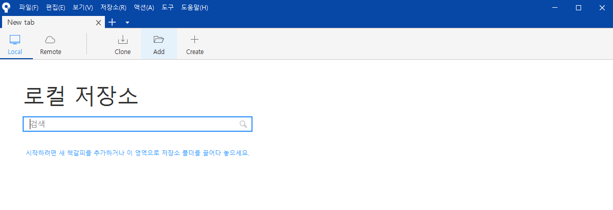
*.git 폴더 주소 복사
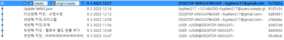
・origin/master : 미국 서버 코드와 내 코드가 동일하다라는 뜻(원격)
[CSS 연습]
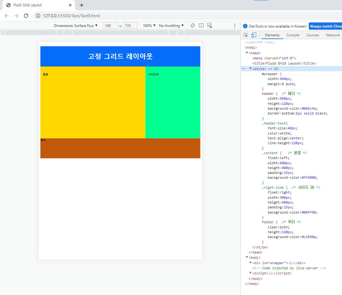
[계산]
<!doctype html>
<html>
<head>
<meta charset="utf-8">
<title>Fluid Grid Layout</title>
<style>
   #wrapper {
      width:960px;
      margin:0 auto;
   }
   header {  /* 헤더 */
      width:960px;
      height:120px;
      background-color:#066cfa;
      border-bottom:1px solid black;
   }
   .header-text{
      font-size:40px;
      color:white;
      text-align:center;
      line-height:120px;
   }
   .content {   /* 본문 */
      float:left;
      width:600px;
      height:400px;
      padding:15px;
      background-color:#ffd800;
   }
   .right-side {  /* 사이드 바 */
      float:right;
      width:300px;
      height:400px;
      padding:15px;
      background-color:#00ff90;
   }
   footer {  /* 푸터 */
      clear:both;
      height:120px;
      background-color:#c3590a;
   }
</style>
</head>
<body>
   <div id="wrapper">
      <header>
         <h1 class="header-text">고정 그리드 레이아웃</h1>
      </header>
      <section class="content">
         <h4>본문</h4>
      </section>
      <aside class="right-side">
         <h4>사이드바</h4>
      </aside>
      <footer>
         <h4>푸터</h4>
      </footer>
   </div>
</body>
</html>
[결과값]
[position 속성]
・position

- static(정적위치) : 기본값 | 위치를 지정하지 않은 상태를 표현
  → top이나 bottom 등의 요소가 먹혀들지 않음.

- relative(상대위치)
  : 자기자신을 기준점으로

- absolute(절대위치) : 부모 요소를 기준으로

- fixed(고정위치)
 : 뷰포트를 기준으로 | 화면 상에 정해진 기준으로(웹브라우저/핸드폰/모니터 등 모든 기기에서 0,0의 위치) | 스크롤을 내려도 계속 화면에 나온다
  → top으로 올라가는 버튼
[반응형 웹 디자인]
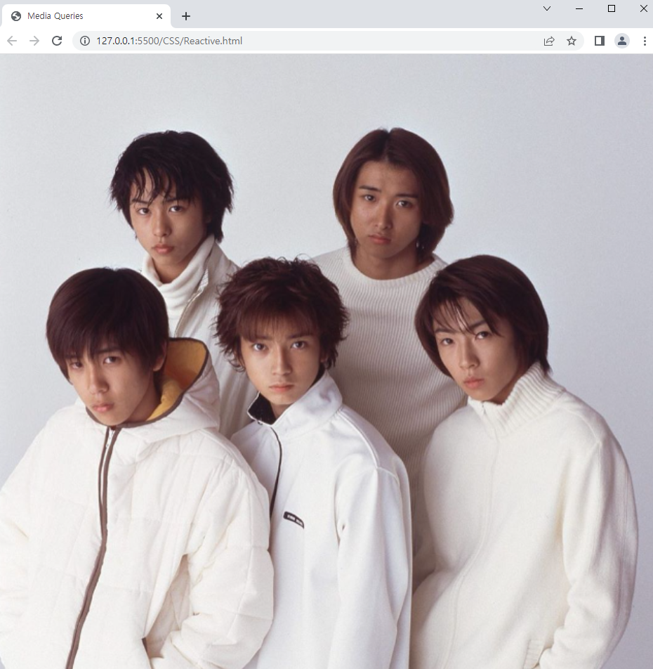
[계산]
<!doctype html>
<html>
<head>
<meta charset="utf-8">
<title>Media Queries</title>
<meta name="viewport" content="width=device-width, initial-scale=1">
<style>
    body {
        background: url(images/bg0.jpg) no-repeat fixed;
        background-size: cover;
    }
    @media screen and (max-width:1024px) { /*1024픽셀 밑으로 내려갈 시에는 하기 실행*/
        body {
            background: url(arashi.png) no-repeat fixed;
            background-size: cover;
        }
    }
    @media screen and (max-width:768px) { /*768픽셀 밑으로 내려갈 시에는 하기 실행*/
        body {
        background: url(arashi_MUSIC.PNG) no-repeat fixed;
        background-size:cover;
        }
    }
    @media screen and (max-width:320px) { /*320픽셀 밑으로 내려갈 시에는 하기 실행*/
        body {
        background: url(arashi_truth.png) no-repeat fixed;
        background-size: cover;
        }
    }
</style>
</head>
<body>
</body>
</html>
[결과값]
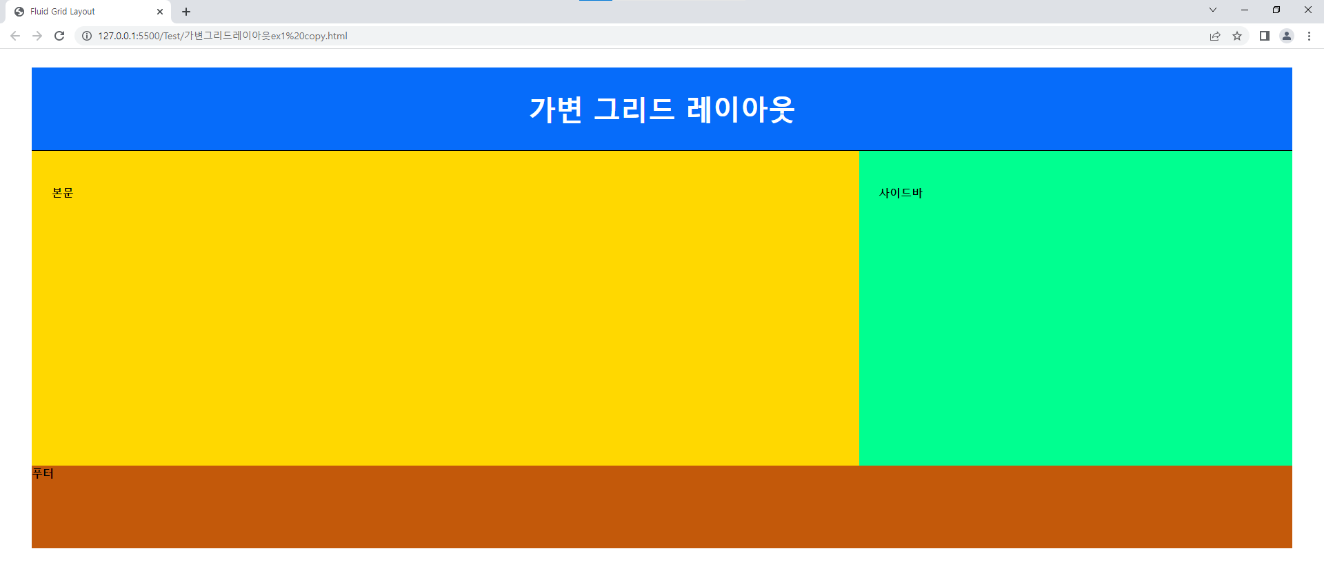
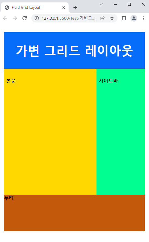
[계산]
<!doctype html>
<html>
<head>
<meta charset="utf-8">
<title>Fluid Grid Layout</title>
<style>
   #wrapper {
      width:96%;
      margin:0 auto;
   }
   header {  /* 헤더 */
      width:100%;
      height:120px;
      background-color:#066cfa;
      border-bottom:1px solid black;
   }
   .header-text{
      font-size:40px;
      color:white;
      text-align:center;
      line-height:120px;
   }
   .content {   /* 본문 */
      float:left;
      width:62.5%;
      height:400px;
      padding:1.5625%;
      background-color:#ffd800;
   }
   .right-side {  /* 사이드 바 */
      float:right;
      width:31.25%;
      height:400px;
      padding:1.5625%;
      background-color:#00ff90;
   }
   footer {  /* 푸터 */
      clear:both; /*옆이나 위에나 부모에 있는 float 영향을 받지 않겠다는 의미.*/
      width:100%;
      height:120px;
      background-color:#c3590a;
   }
</style>
</head>
<body>
   <div id="wrapper">
      <header>
         <h1 class="header-text">가변 그리드 레이아웃</h1>
      </header>
      <section class="content">
         <h4>본문</h4>
      </section>
      <aside class="right-side">
         <h4>사이드바</h4>
      </aside>
      <footer>
         <h4>푸터</h4>
      </footer>
   </div>
</body>
</html>
[결과값]