💸Flexbox
⭐Flexbox를 이용할 때 반드시 알아야 하는 것!
1. Flexbox의 구성
- flex-container : 정렬이 필요한 요소를 감싸는 요소 (부모)
- item: 정렬을 적용할 요소 (자식)
(flex-container와 item에 사용되는 flex 관련 css 속성이 나누어져 있음.)
- Flexbox의 축
- 중심축
- 교차축, 반대축
예시 준비 코드
    <div class="flex-container"> <!--부모 요소-->
        <div class="item item1">item1</div> <!--자식 요소-->
        <div class="item item2">item2</div>
        <div class="item item3">item3</div>
        <div class="item item4">item4</div>
        <div class="item item5">item5</div>
        <div class="item item6">item6</div>
        <div class="item item7">item7</div>
        <div class="item item8">item8</div>
        <div class="item item9">item9</div>
    </div>
div{
border : 1px solid black;
box-sizing: border-box;
/* content + padding + border 합으로 width/height 지정 */
}
.item{
width: 75px;
height: 75px;
}
.item1{background-color: red;}
.item2{background-color: orangered;}
.item3{background-color: orange;}
.item4{background-color: yellow;}
.item5{background-color: yellowgreen;}
.item6{background-color: green;}
.item7{background-color: lightblue;}
.item8{background-color: blue;}
.item9{background-color: violet;}⭐⭐
.flex-container {
height: 700px;
display: flex;
/* display: flex;는 부모한테만 주는 스타일! */
/* 부모 하위에 있는 자식들을 유연하게 움직일 수 있게 된다 */
/*
item(내부요소)를 감싸는 요소(부모)의 형식을 flex로 변경
-> item에 자동으로 지정된 margin 요소가 모두 사라지고
content 영역만큼의 크기만 가지게 됨 -> inline
*/
/* flex-direction (부모 전용 속성) */
/* 메인축의 방향과 시작위치를 지정하는 속성 */
/* 행 방향 (가로(row), 기본값) */
/* flex-direction: row; */
/* 행 방향(가로) + 순서 반대 */
/* flex-direction: row-reverse; */
/* 열 방향(세로) */
/* flex-direction: column; */
/* 열 방향 + 순서반대 */
/* flex-direction: column-reverse; */
/* flex-wrap (부모 전용 속성) */
/* 내부 item들을 포장하는 속성
item들이 강제로 한 줄에 배치되게 할지,
한 줄을 벗어나 여러 줄로 배치할 것인지 지정
*/
/* item을 한 줄로 배치 (기본값) */
/* flex-wrap: nowrap; */
/* item을 여러 줄로 배치 */
/* flex-wrap: wrap; */
/* item을 여러 줄로 배치 (뒤에서 배치) */
/* flex-wrap: wrap-reverse; */
/* flex-direction: column; */
/* justify-content */
/* 메인축 방향으로 item의 정렬 방법을 조정함 */
/* 메인축 방향으로 앞에서부터 정렬 (기본값) */
/* justify-content: flex-start; */
/* 메인축 방향으로 뒤에 붙어서 정렬 */
/* justify-content: flex-end; */
/* 메인축 방향으로 가운데 정렬 */
/* justify-content: center; */
/* item 주위에 메인축 방향 양쪽으로 일정한 크기의 공간을 추가
-> 양끝은 조금, item 중간은 넓게 떨어져있음
-> 브라우저 크기에 따라 변함
*/
/* 양 옆 여백과 아이템 사이 여백 다름 */
/* justify-content: space-around; */
/* 양 옆 여백과 아이템 사이 여백 동일 */
/* item이 메인 축 내에서 동일한 간격을 가진다 */
/* justify-content: space-evenly; */
/* 양 끝 쪽을 붙인 상태에서 item들의 간격을 일정하게 정렬시킨다 */
/* justify-content: space-between; */
/* align-items */
/* item들을 교차축 방향으로 정렬하는 방법을 지정하는 속성 */
/* align-items: flex-start; */
/* 메인축 바꾸기 : flex-direction
정렬 : justify content
align-items :교차축의 센터 위치 등으로 이동*/
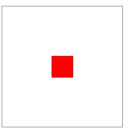
}Flexbox를 이용한 요소 정가운데 배치하기
   <div id="con">
        <div id="center"></div>
    </div>
#con {
width: 450px;
height: 450px;
display: flex;
justify-content: center;
align-items: center;
}
#center {
width: 80px;
height: 80px;
background-color: red;
}
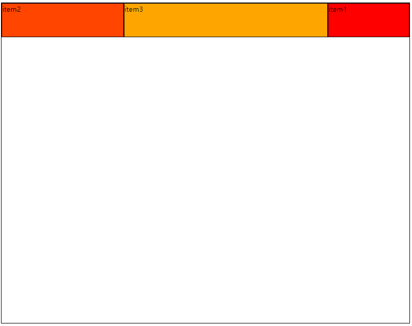
Flex-basis
- item의 메인 축 방향으로의 기본 점유율(크기)를 지정하는 속성
- item(자식)에게 주는 flex속성
    <div class="flex-container">
        <div class="item item1 basis-20">item1</div>
        <div class="item item2 basis-30">item2</div>
        <div class="item item3 basis-50">item3</div>
    </div>
.basis-20 { flex-basis: 20%;
order: 3;}
.basis-30 { flex-basis: 30%;}
.basis-50 { flex-basis: 50%;}