styled components
Visual primitives for the component age.
Use the best bits of ES6 and CSS to style your apps without stress 💅🏾
Installation
# with npm
npm install --save styled-components

# with yarn
yarn add styled-components
Getting Started
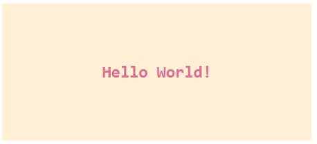
// Create a Title component that'll render an <h1> tag with some styles
const Title = styled.h1`
  font-size: 1.5em;
  text-align: center;
  color: palevioletred;
`;

// Create a Wrapper component that'll render a <section> tag with some styles
const Wrapper = styled.section`
  padding: 4em;
  background: papayawhip;
`;

// Use Title and Wrapper like any other React component – except they're styled!
render(
  <Wrapper>
    <Title>
      Hello World!
    </Title>
  </Wrapper>
);
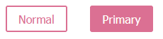
Adapting based on props
const Button = styled.button`
  /* Adapt the colors based on primary prop */
  background: ${props => props.primary ? "palevioletred" : "white"};
  color: ${props => props.primary ? "white" : "palevioletred"};

  font-size: 1em;
  margin: 1em;
  padding: 0.25em 1em;
  border: 2px solid palevioletred;
  border-radius: 3px;
`;

render(
  <div>
    <Button>Normal</Button>
    <Button primary>Primary</Button>
  </div>
);
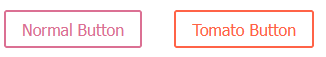
Extending Styles
// The Button from the last section without the interpolations
const Button = styled.button`
color: palevioletred;
font-size: 1em;
margin: 1em;
padding: 0.25em 1em;
border: 2px solid palevioletred;
border-radius: 3px;
`;
// A new component based on Button, but with some override styles
const TomatoButton = styled(Button)`
color: tomato;
border-color: tomato;
`;
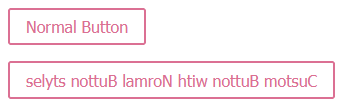
render(
<div>
<Button>Normal Button</Button>
<TomatoButton>Tomato Button</TomatoButton>
</div>
);
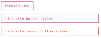
as 사용하여 Button을 a 태그로 사용하기
const Button = styled.button`
  display: inline-block;
  color: palevioletred;
  font-size: 1em;
  margin: 1em;
  padding: 0.25em 1em;
  border: 2px solid palevioletred;
  border-radius: 3px;
  display: block;
`;

const TomatoButton = styled(Button)`
  color: tomato;
  border-color: tomato;
`;

render(
  <div>
    <Button>Normal Button</Button>
    <Button as="a" href="#">Link with Button styles</Button>
    <TomatoButton as="a" href="#">Link with Tomato Button styles</TomatoButton>
  </div>
);
as 사용하여 Button custom 하기
const Button = styled.button`
  display: inline-block;
  color: palevioletred;
  font-size: 1em;
  margin: 1em;
  padding: 0.25em 1em;
  border: 2px solid palevioletred;
  border-radius: 3px;
  display: block;
`;

const ReversedButton = props => <Button {...props} children={props.children.split('').reverse()} />

render(
  <div>
    <Button>Normal Button</Button>
    <Button as={ReversedButton}>Custom Button with Normal Button styles</Button>
  </div>
);
Attaching additional props
Overriding .attrs
const Input = styled.input.attrs(props => ({
type: "text",
size: props.size || "1em",
}))`
border: 2px solid palevioletred;
margin: ${props => props.size};
padding: ${props => props.size};
`;
// Input's attrs will be applied first, and then this attrs obj
const PasswordInput = styled(Input).attrs({
type: "password",
})`
// similarly, border will override Input's border
border: 2px solid aqua;
`;
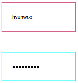
render(
<div>
<Input placeholder="A bigger text input" size="2em" />
<br />
{/* Notice we can still use the size attr from Input */}
<PasswordInput placeholder="A bigger password input" size="2em" />
</div>
);
Animations
import styled, { keyframes } from 'styled-components';
// Create the keyframes
const rotate = keyframes`
from {
transform: rotate(0deg);
}
to {
transform: rotate(360deg);
}
`;
// Here we create a component that will rotate everything we pass in over two seconds
const Rotate = styled.div`
display: inline-block;
animation: ${rotate} 2s linear infinite;
padding: 2rem 1rem;
font-size: 1.2rem;
`;
render(
<Rotate>< 💅🏾 ></Rotate>
);Theme
// Define our button, but with the use of props.theme this time
const Button = styled.button`
  font-size: 1em;
  margin: 1em;
  padding: 0.25em 1em;
  border-radius: 3px;

  /* Color the border and text with theme.main */
  color: ${props => props.theme.main};
  border: 2px solid ${props => props.theme.main};
`;

// We are passing a default theme for Buttons that arent wrapped in the ThemeProvider
Button.defaultProps = {
  theme: {
    main: "palevioletred"
  }
}

// Define what props.theme will look like
const theme = {
  main: "mediumseagreen"
};

render(
  <div>
    <Button>Normal</Button>

    <ThemeProvider theme={theme}>
      <Button>Themed</Button>
    </ThemeProvider>
  </div>
);
CSS prop
<div
  css={`
    background: papayawhip;
    color: ${props => props.theme.colors.text};
  `}
/>
<Button
  css="padding: 0.5em 1em;"
/>
createGlobalStyle
import styled, { createGlobalStyle } from 'styled-components';

const GlobalStyle = createGlobalStyle`
  body {
    color: ${props => (props.whiteColor ? 'white' : 'black')};
  }
`

// later in your app

<React.Fragment>
  <GlobalStyle whiteColor />
  <Navigation /> {/* example of other top-level stuff */}
</React.Fragment>