
0. Tableau Public Link
1. Date Schema
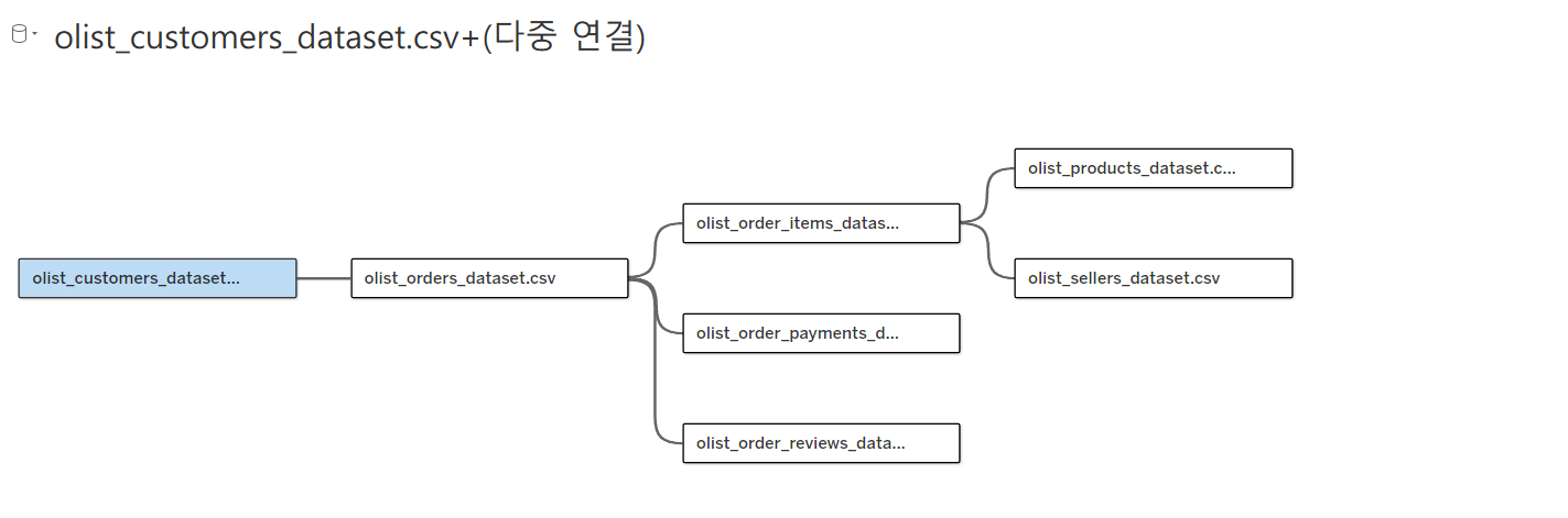
I have built multiple tables including customers, orders, order items, sellers, products, payments, and reviews of the Olist dataset.
This dashboard helps identify logistics bottlenecks and understand delivery performance across different regions and routes.
2. Sales Dashboard Overview
The Sales dashboard provides an overview of key business metrics and sales performance within the Olist e-commerce platform.
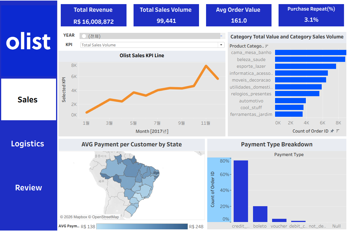
At the top of the dashboard, several key performance indicators (KPIs) summarize the overall business performance
The Sales KPI Line chart shows monthly sales performance trends, allowing users to track how sales volume changes over time.
On the right side, the Category Sales chart highlights the top-performing product categories based on order volume. Categories such as cama_mesa_banho, beleza_saude, and esporte_lazer generate the highest number of sales.
The Brazil map visualization displays the average payment amount per customer by state, providing insights into regional purchasing behavior.
Finally, the Payment Type Breakdown chart shows the distribution of payment methods used by customers. Credit cards account for the majority of transactions, followed by boleto payments.
Overall, this dashboard enables users to quickly understand sales performance, category trends, regional purchasing patterns, and payment behaviors within the Olist platform.
3. Logistics Dashboard Overview
The Logistics dashboard focuses on analyzing delivery performance and identifying potential logistics bottlenecks across the Olist platform.
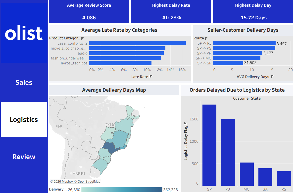
At the top of the dashboard, key indicators summarize the overall delivery performance
The Average Late Rate by Categories chart highlights product categories with the highest delivery delay rates. Categories such as casa_conforto, moveis_colchao, and audio show relatively higher delay rates compared to others.
The Seller-Customer Delivery Days chart analyzes the average delivery time by seller-to-customer routes. Routes such as SP → RJ and SP → RS show relatively longer delivery times, suggesting potential logistics challenges along these routes.
The Average Delivery Days Map provides a geographic overview of delivery performance across Brazilian states, helping identify regions with slower delivery times.
Finally, the Orders Delayed Due to Logistics by State chart shows the number of orders delayed due to logistics issues in each state. States such as SP and RJ account for the largest share of logistics-related delivery delays.
Overall, this dashboard helps identify delivery bottlenecks, high-delay product categories, and regional logistics performance within the Olist platform.
4. Review Dashboard Overview
The Review dashboard analyzes customer feedback and satisfaction across the Olist platform.
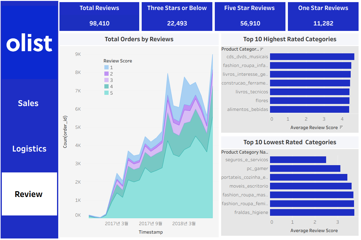
At the top of the dashboard, several key indicators summarize the overall review statistic.
The Total Orders by Reviews chart shows the distribution of review scores over time. Most orders receive high ratings (4–5 stars), indicating generally positive customer satisfaction across the platform.
The Top 10 Highest Rated Categories chart highlights product categories with the highest average review scores. Categories such as cds_dvds_musicais and fashion_roupa_infanto receive consistently high customer ratings.
In contrast, the Top 10 Lowest Rated Categories chart identifies product categories with relatively lower review scores. These categories may require further investigation to understand potential issues related to product quality, delivery, or customer expectations.
Overall, this dashboard helps identify customer satisfaction trends and category-level review performance within the Olist marketplace.