40 네이버 모바일 1
학습 내용
html
<!DOCTYPE html>
<html>
<head>
	<meta charset="utf-8">
	<meta name="vidwport" content="width=device-width, initial-scale=1.0">

	<title>네이버 모바일</title>

	<link rel="stylesheet" type="text/css" href="css/style.css">
</head>
<body>

	<div class="wrapper">

		<nav id="main-nav">
			<ul>
				<li><a href="#">홈</a></li>
				<li><a href="#">뉴스</a></li>
				<li><a href="#">연예</a></li>
				<li><a href="#">스포츠</a></li>
				<li><a href="#">쇼핑</a></li>
				<li><a href="#">MY구독</a></li>
				<li><a href="#">경제지표</a></li>
				<li><a href="#">책방</a></li>
				<li><a href="#">리빙</a></li>
				<li><a href="#">레시피</a></li>
				<li><a href="#">뭐하지</a></li>
			</ul>
		</nav>
	</div>

</body>
</html>
css
* {
	margin: 0;
	padding: 0;
	box-sizing: border-box;
}

html, body {
	width: 100%;
	height: 100%;
}

ol, ul {
	list-style: none;
}

img {
	vertical-align: middle;
}

a {
	text-decoration: none;
}

button {
	border: none;
	background-color: transparent;
}

input {
	border: none;
	background-color: transparent;
}

input:focus {
	outline: none;
}

.wrapper {
	overflow-x: hidden;
	overflow-y: auto;
	width: 375px;
	height: 100vh;
	background-color: blue;

	margin: 0 auto;
}


#main-nav {
	overflow: hidden;
	background-color: rgb(7, 189, 120);
	border-top: solid 1px #000000;
	border-bottom: solid 1px #000000;
}

#main-nav ul {
	overflow-x: auto;
	display: flex;
	align-items: center;

	white-space: nowrap;
}

/*
#main-nav ul {
	-ms-overflow-style: none;
	scrollbar-width: none;
}

#main-nav ul::-webkit-scrollbar {
	display: none;
}
*/

#main-nav ul li {
	height: 54px;
	text-align: center;
}

#main-nav ul li a {
	height: 100%;
	line-height: 54px;

	color: rgb(141, 223, 183);
	padding: 0 10px;
}
vh
v : viewport의 약자
h : height의 약자
주석처리한 부분 중 아래의 코드는
#main-nav ul::-webkit-scrollbar {
	display: none;
}
scrollbar 사라지게 됨

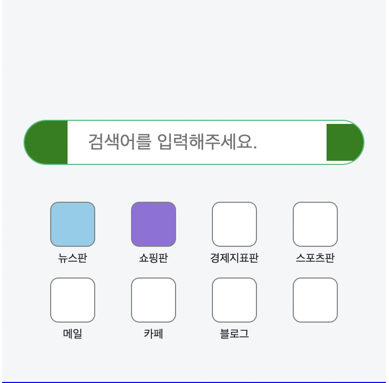
html
<header id="header">

			<div class="search-wrap">
				<a href="#" class="link-logo"></a>
				<input type="text" placeholder="검색어를 입력해주세요.">
				<a href="#" class="link-voice"></a>
			</div>

			<nav class="header-nav">
				<ul>
					<li>
						<a href="#">
							<i class="icon"></i>
							<span>뉴스판</span>
						</a>
					</li>
					<li>
						<a href="#">
							<i class="icon"></i>
							<span>쇼핑판</span>
						</a>
					</li>
					<li>
						<a href="#">
							<i class="icon"></i>
							<span>경제지표판</span>
						</a>
					</li>
					<li>
						<a href="#">
							<i class="icon"></i>
							<span>스포츠판</span>
						</a>
					</li>
					<li>
						<a href="#">
							<i class="icon"></i>
							<span>메일</span>
						</a>
					</li>
					<li>
						<a href="#">
							<i class="icon"></i>
							<span>카페</span>
						</a>
					</li>
					<li>
						<a href="#">
							<i class="icon"></i>
							<span>블로그</span>
						</a>
					</li>
					<li>
						<a href="#">
							<i class="icon"></i>
						</a>
					</li>
				</ul>
			</nav>

		</header>
css
#header {
	background-color: #f4f6f8;
	padding: 120px 0 50px;
}

#header .search-wrap {
	overflow: hidden;

	display: flex;
	flex-direction: row;
	flex-wrap: wrap;
	justify-content: flex-start;
	align-items: center;
	align-content: stretch;

	position: relative;
	width: 333px;
	background-color: #ffffff;
	border: solid 1px rgb(7, 189, 120);
	border-radius: 26px;

	margin: 0 auto;
}

#header .search-wrap .link-logo {
	display: block;
	width: 42px;
	height: 42px;
	background-color: green;
}

#header .search-wrap input {
	width: calc(100% - 78px);
	height: 22px;

	font-size: 18px;
	padding: 0 20px;
}

#header .search-wrap .link-voice {
	display: block;
	width: 36px;
	height: 36px;
	background-color: green;
}
css
#header {
	background-color: #f4f6f8;
	padding: 120px 0 40px;
}

#header .search-wrap {
	overflow: hidden;

	display: flex;
	flex-direction: row;
	flex-wrap: wrap;
	justify-content: flex-start;
	align-items: center;
	align-content: stretch;

	position: relative;
	width: 333px;
	background-color: #ffffff;
	border: solid 1px rgb(7, 189, 120);
	border-radius: 26px;

	margin: 0 auto 24px;
}

#header .search-wrap .link-logo {
	display: block;
	width: 42px;
	height: 42px;
	background-color: green;
}

#header .search-wrap input {
	width: calc(100% - 78px);
	height: 22px;

	font-size: 18px;
	padding: 0 20px;
}

#header .search-wrap .link-voice {
	display: block;
	width: 36px;
	height: 36px;
	background-color: green;
}

#header .header-nav {
	width: 316px;
	margin: 0 auto;
}

#header .header-nav ul {
	display: flex;
	flex-direction: row;
	flex-wrap: wrap;
	justify-content: flex-start;
	align-items: flex-start;
	align-content: flex-start;

	width: 100%;
}

#header .header-nav li {
	width: 25%;
	padding-top: 12px;
}

#header .header-nav a {
	display: block;
	width: 100%;

	text-align: center;
}

#header .header-nav .icon {
	display: inline-block;
	width: 44px;
	height: 44px;
	border-radius: 8px;
	border: solid 1px grey;
	background-color: #ffffff;
}

#header .header-nav .icon-1 {
	background-color: skyblue;
}

#header .header-nav .icon-2 {
	background-color: mediumpurple;
}

#header .header-nav span {
	display: block;

	font-size: 11px;
	color: #1e1e23;
	/*margin-top: 5px;*/
}
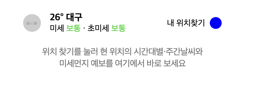
html
<div id="weather">

			<div class="container">

				<div class="weather-top">
					<div class="weather-left">
						<img src="https://via.placeholder.com/30">
						<div class="txt-wrap">
							<h3>26° 대구</h3>
							<p>미세 <span>보통</span> · 초미세 <span>보통</span></p>
						</div>
					</div>
					<div class="weather-right">
						<span>내 위치찾기</span>
						<i class="icon"></i>
					</div>
				</div>
				<div class="weather-bottom">
					<p>
						위치 찾기를 눌러 현 위치의 시간대별·주간날씨와<br>
						미세먼지 예보를 여기에서 바로 보세요
					</p>
				</div>

			</div>

		</div>
css
#banner-1 {
	background-color: #f4f;
}

#banner-1 .banner-wrap {
	width: 100%;
	margin: 0 auto;
}

#banner-1 .banner-wrap img {
	width: 100%;
}

#weather {
	background-color: #ffffff;
}

#weather .container {
	padding: 0 20px;
}

#weather .weather-top {
	display: flex;
	flex-direction: row;
	flex-wrap: wrap;
	justify-content: space-between;
	align-items: center;
	align-content: center;

	padding: 22px 0 16px;
}

#weather .weather-top .weather-left {
	display: flex;
	flex-direction: row;
	flex-wrap: wrap;
	justify-content: space-between;
	align-items: center;
	align-content: center;
}

#weather .weather-top .weather-left img {
	width: 30px;
	height: 30px;
	border-radius: 50%;

	margin-right: 15px;
}

#weather .weather-top .weather-left .txt-wrap {}

#weather .weather-top .weather-left .txt-wrap h3 {
	font-size: 16px;
}

#weather .weather-top .weather-left .txt-wrap p {
	font-size: 14px;
}

#weather .weather-top .weather-left .txt-wrap p span {
	color: #00d01d;
}

#weather .weather-top .weather-right {
	display: flex;
	flex-direction: row;
	flex-wrap: wrap;
	justify-content: flex-end;
	align-items: center;
	align-content: center;
}

#weather .weather-top .weather-right span {
	font-size: 14px;
	margin-right: 8px;
}

#weather .weather-top .weather-right .icon {
	display: inline-block;
	width: 20px;
	height: 20px;
	background-color: blue;
	border-radius: 50%;

	color: #767678;
}

#weather .weather-bottom {
	padding: 6px 0 30px;
}

#weather .weather-bottom p {
	color: #767678;
	font-weight: 400;
	font-size: 15px;
	line-height: 20px;
	letter-spacing: -0.5px;

	text-align: center;
}
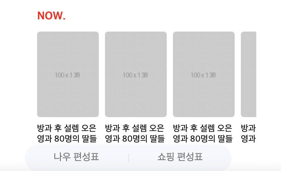
html
<div id="now">

			<h2>NOW.</h2>
			<ul>
				<li>
					<a href="#">
						<img src="https://via.placeholder.com/100x138">
						<p>방과 후 설렘 오은영과 80명의 딸들</p>
					</a>
				</li>
				<li>
					<a href="#">
						<img src="https://via.placeholder.com/100x138">
						<p>방과 후 설렘 오은영과 80명의 딸들</p>
					</a>
				</li>
				<li>
					<a href="#">
						<img src="https://via.placeholder.com/100x138">
						<p>방과 후 설렘 오은영과 80명의 딸들</p>
					</a>
				</li>
				<li>
					<a href="#">
						<img src="https://via.placeholder.com/100x138">
						<p>방과 후 설렘 오은영과 80명의 딸들</p>
					</a>
				</li>
				<li>
					<a href="#">
						<img src="https://via.placeholder.com/100x138">
						<p>방과 후 설렘 오은영과 80명의 딸들</p>
					</a>
				</li>
			</ul>

			<div class="btn-wrap">
				<a href="#" class="btn-now">나우 편성표</a>
				<a href="#" class="btn-shopping">쇼핑 편성표</a>
			</div>
		</div>
css
#now {
	background-color: #ffffff;
	padding: 20px 0 16px;
	margin-top: 10px;
}

#now h2 {
	font-size: 18px;
	font-weight: 700;
	color: red;

	margin-bottom: 14px;
	margin-left: 20px;
}

#now ul {
	overflow-y: auto;
	display: flex;
	flex-direction: row;
	flex-wrap: nowrap;
	justify-content: flex-start;
	align-items: center;
	align-content: center;

	padding-left: 20px;
}

#now ul li {
	margin-right: 10px;
}

#now ul li:last-child {
	margin-right: 0;
}

#now ul li a {
	color: #000000;
}

#now ul li a img {
	width: 100px;
	height: 138px;

	border-radius: 5px;
}

#now ul li a p {
	font-size: 14px;
	padding-top: 10px;
}

#now .btn-wrap {
	overflow: hidden;
	width: 335px;
	border-radius: 22px;
	background-color: #f5f8fb;

	display: flex;
	flex-direction: row;
	flex-wrap: nowrap;
	justify-content: space-between;
	align-items: center;
	align-content: center;

	margin: 20px auto 0;
}

#now .btn-wrap a {
	display: block;
	width: 50%;
	height: 44px;
	text-align: center;
	line-height: 44px;

	color: #767678;
}

#now .btn-wrap .btn-now {}

#now .btn-wrap .btn-shopping {}

#now .btn-wrap .btn-shopping:before {
	content: "";
	display: block;
	width: 1px;
	height: 14px;

	margin-top: 15px;
	background-color: rgba(125, 127, 133, 0.2);

	vertical-align: top;

	float: left;
}
html
<div id="banner-2">
			<div class="banner-wrap">
			<img src="https://via.placeholder.com/320x53">
			</div>
		</div>

		<div id="banner-3">
			<div class="banner-wrap">
			<img src="https://via.placeholder.com/320x75">
			</div>
		</div>

		<div id="banner-4">
			<div class="banner-wrap">
			<img src="https://via.placeholder.com/1250x370">
			</div>
		</div>
css
#banner-2 {
	background-color: #ffffff;
	margin-top: 10px;
}

#banner-2 .banner-wrap {
	width: 320px;
	margin: 0 auto;
}

#banner-2 .banner-wrap img {
	width: 100%;
}

#banner-3 {
	background-color: #ffffff;
	margin-top: 10px;
}

#banner-3 .banner-wrap {
	width: 320px;
	margin: 0 auto;
}

#banner-3 .banner-wrap img {
	width: 100%;
}

#banner-4 {
	overflow: hidden;
	background-color: #ffffff;
	margin-top: 10px;
}

#banner-4 .banner-wrap {
	width: 100%;
	height: 155px;
}

#banner-4 .banner-wrap img {
	position: relative;

	height: 100%;

	left: 50%;
	transform: translate(-50%);
}
html
<div id="covid19">
			<div class="container">
				<div class="covid19-wrap">
					<a href="#" class="left-covid19">
						<img src="https://via.placeholder.com/35">
						<div class="txt-wrap">
							<h3>코로나19</h3>
							<p>국내외 확진 현황</p>
						</div>
					</a>
					<a href="#" class="right-covid19">
						<img src="https://via.placeholder.com/35">
						<div class="txt-wrap">
							<h3>예방접종센터</h3>
							<p>내 주변 센터 찾기</p>
						</div>
					</a>
				</div>
			</div>
		</div>
css
#covid19 {
	background-color: #ffffff;
	margin-top: 10px;
}

#covid19 .container {
	padding: 0 20px;
}

#covid19 .covid19-wrap {
	display: flex;
	flex-direction: row;
	flex-wrap: nowrap;
	justify-content: space-between;
	align-items: center;
	align-content: center;
}

#covid19 .covid19-wrap a {
	position: relative;
	display: flex;
	flex-direction: row;
	flex-wrap: nowrap;
	justify-content: flex-start;
	align-items: center;
	align-content: center;

	padding: 20px 0;
}

#covid19 .covid19-wrap a.right-covid19 {
	padding-left: 11px;
}

#covid19 .covid19-wrap a.right-covid19:before {
	content: "";
	display: block;

	position: absolute;
	width: 1px;
	height: 42px;
	background-color: #efeff0;

	top: 20px;
	left: 0;
}

#covid19 .covid19-wrap img {
	width: 35px;
	margin-right: 8px;

	border-radius: 50%;
}

#covid19 .covid19-wrap .txt-wrap h3 {
	font-size: 16px;
	font-weight: 700;

	color: #000000;
}

#covid19 .covid19-wrap .txt-wrap p {
	font-size: 14px;
	font-weight: 400;
	margin-top: 4px;

	color: #000000;
}
html
<div id="ai">
			<div class="container">

				<div class="ai-wrap">

					<div class="ai-left">
						<img src="https://via.placeholder.com/40">
						<div class="txt-wrap">
							<p>
								더 편리해진 AI 검색 기능<br>
								네이버앱에서 만나보세요
							</p>
						</div>
					</div>

					<div class="ai-right">
						<span>앱 사용하기</span>
					</div>
				</div>
			</div>
		</div>
css
#ai {
	background-color: #ffffff;
	margin-top: 10px;
}

#ai .container {
	padding: 0 20px;
}

#ai .ai-wrap {
	display: flex;
	flex-direction: row;
	flex-wrap: nowrap;
	justify-content: space-between;
	align-items: center;
	align-content: center;

	padding: 20px 0;
}

#ai .ai-wrap .ai-left {
	display: flex;
	flex-direction: row;
	flex-wrap: nowrap;
	justify-content: flex-start;
	align-items: center;
	align-content: center;
}

#ai .ai-wrap .ai-left img {
	width: 40px;
	height: 40px;
	border-radius: 8px;

	margin-right: 8px;
}

#ai .ai-wrap .ai-left p {
	font-size: 15px;
	color: #424242;
	font-weight: 400;
}

#ai .ai-wrap .ai-right {
	display: flex;
	flex-direction: row;
	flex-wrap: nowrap;
	justify-content: flex-end;
	align-items: center;
	align-content: center;
}

#ai .ai-wrap .ai-right span {
	font-size: 14px;
	font-weight: 400;
	color: #03c95b;
}
어려웠던 점 & 해결 방법
학습 소감
모바일 버전 작업을 오랜만에 해서 처음에 조금 생소하게 느껴졌지만 기억이 조금씩 새록새록 났다. 애니메이션 부분과 모바일 버전 공부를 다시 해야할 것 같다.