데이터 시각화
데이터 시각화란?
- Data를 그래픽 요소로 매핑하여 시각적으로 표현하는 것
Principle of Proportion Ink
- 실제 값과 표현할 때 사용되는 잉크 양은 비례해야 함
- y축의 시작을 0으로 지정
- 차이를 나타내고 싶을 경우 Plot의 세로 비율을 늘리는 것을 추천
- 즉, Data 수치를 표시하는 시작 수치를 범위의 최저값으로 설정하는 것을 추천
- 다수의 시각화에서도 적용되는 원칙
데이터 셋의 종류
- 정형 데이터 : CSV 파일
- Row Data는 데이터 1개, Column은 Attribute
- 시각화가 가장 쉬움
- 데이터 간 관계, 데이터 간 비교, 통계적 특성과 Feature 사이의 관계
- 시계열 데이터(Time-Series) : 시간 흐름에 따른 Data
- 정형 데이터 : 기온, 주가
- 비정형 데이터 : 음성, 비디오
- 추세(Trend), 계절성(Seasonality), 주기성(Cycle) 등을 살핌
- 지리/지도 데이터
- 거리, 경로, 분포 등 다양한 실사용
- 관계 데이터 : 객체 간의 관계를 시각화
- 객체는 Node, 관계는 Link로 표현
- 크기, 색, 수 등으로 객체와 관계의 가중치 표현 가능
- Heuristic 방법을 많이 활요
- 계층적 데이터 : 포함 관계가 분명한 데이터
- Tree, TreeMap, Sunburst 등
데이터 종류
- 수치형 : 수 자체가 Data
- 연속형(Continuous) : 이전 상황이나 값과 관련이 있는 Data
- 길이, 무게, 온도 등
- 이산형(Discrete) : 독립적인 Data
- 주사위 눈금, 사람 수 등
- 연속형(Continuous) : 이전 상황이나 값과 관련이 있는 Data
- 범주형(Categorical) : Text 자체를 해석해야 실 Data가 되는 Data
- 명목형(nominal) : 해당 개념에 대해 미리 인지하고 있어야 하는 Data
- 혈액형, 종교 등
- 순서형(ordinal) : 등급에 관련된 Data
- 학년, 별잠, 등급 등
- 명목형(nominal) : 해당 개념에 대해 미리 인지하고 있어야 하는 Data
마크와 채널
- 마크(mark) : 점, 선, 면으로 이루어진 기본 데이터 시각화 요소
- 채널(Channel) : 마크를 변경할 수 있는 요소들, 마크에 뜻을 추가해주는 요소들
전주의적 속성(Pre-attentive Attribute)
- 따로 강조하지 않아도 강조되는 요소
- 색 차이, 글씨의 두께 등으로 표현 가능
- 동시에 사용하면 인지하기 어려움
- 강조가 너무 많으면, 강조 안 된 것이 더 강조되는 아이러니가 발생
- 적절히 사용하면 시각적 분리(Visual Pop-out) 가능
Matplotlib
Matplotlib이란
- 시각화 라이브러리 중 가장 범용성이 높은 라이브러리
- numpy와 scipy를 베이스로 함
- 둘을 활용하는 PyTorch, Tensorflow, Pandas와 호환성이 뛰어남
Matpotlib 기본 개념 및 활용법
- 모듈 가져오기
import matplotlib as mpl
import matplotlib.pyplot as plt-
항상
plt.show()를 마지막에 입력하여 지금까지 그린 그래프를 보여주라는 명령을 내려야 함- 정확히는 무조건은 아니지만, 명시해줘야 코드 리뷰 때 편해지고 내가 원하는 그림만 보여줄 수 있으므로 사용을 강력 추천
-
그래프 그리는 원리 : Figure라는 큰 틀에 Ax라는 Subplot을 추가해서, Ax에 그래프 그림
- Figure : 스케치북, Ax : 사과를 그리기 위해 할당된 영역
- ax 설정 방법
# 방법 1 : Ax를 하나씩 추가해 줌 fig = plt.figure() ax1 = fig.add_subplot(121) ax2 = fig.add_subplot(122) plt.show() """ fig.add_subplot(abc) Figure를 1 * 2 공간으로 쪼갠다. 이후, c번째 공간의 Ax를 할당시켜주는 것이다. 예를 들어, ax1같은 경우 1 * 2공간으로 figure를 쪼개고 첫번째 Ax를 할당 받은 것이다 """ # 방법 2 : Ax들을 한번에 (리스트 형식으로) 만들어줌 fig, ax = plt.subplots(1,2) """ figure를 생성한 이후 1*2 공간으로 쪼갬. 이후 생성된 공간을 리스트 형식으로 ax에 반환 ax[0] : 121공간, ax[1] : 122공간 """ -
Figure 크기 조정 : figsize 활용
fig = plt.figure(figsize=(x,y))
# Figure 크기를 x * y size로 맞춤(단위 : inch)- 색상 지정 : color Parameter에 색 지정
#방법 1 : 한 글자로 색상을 정함
ax.plot([1,1,1], color = 'r')

# 방법 2 : 미리 matplotlib에서 지정해 놓은 색상 이름 입력
ax.plot([2,2,2], color = 'forestgreen')

# 방법 3 : Hex Code를 활용해 색 표현
ax.plot([3,3,3], color='#000000') 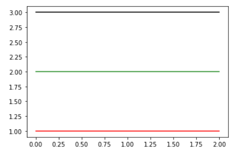
- Text : 나중에 자세히 기입
- label Parameter : 그래프에 대한 Label(범례; Legend) 추가
- Subplot(Ax)에 이름 붙이기 : ax.set_title({이름})
- Figure에 이름 붙이기 : figure.suptitle({이름})
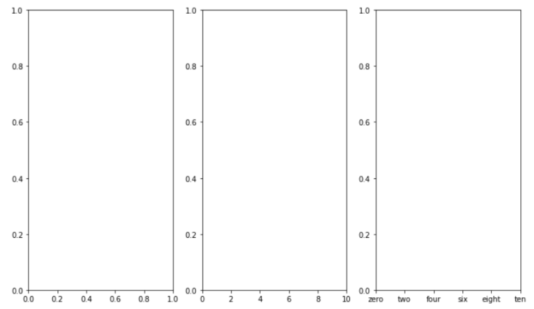
- 축에 적히는 값 변경
- ax.set_xticks([{표시할 값들 List}]) : x축 눈금 값을 List 값으로 변환(Only 수)
- ax.set_xticklabels([{표시할 값들 List}]) : x축 눈금 값을 List 값으로 변환(수 이외 Text도 가능)
- set_xticks 대신 set_yticks 등을 활용하여 y축 값들을 변경시킬 수도 있음
ax = fig.add_subplot(131)

ax2 = fig.add_subplot(132)
ax2.set_xticks([0,2,4,6,8,10])
# x축의 값을 0,2,4,6,8,10로 표기

ax3 = fig.add_subplot(133)
ax3.set_xticks([0,2,4,6,8,10])
ax3.set_xticklabels(['zero','two','four','six','eight','ten'])
"""
x축의 값을 해당 Text로 바꿈. 이 때, set_xticklabels로 Text를 입력하기 전
동일한 Size List를 활용하여 set_xticks로 값을 바꿔준 이후 set_xticklabels를
사용해야 UserWarning이 발생하지 않음
"""
Matplotlib(Text)
Text 종류
- Title : 큰 주제
- Label : 축에 해당하는 정보 제공
- Tick Label : 축의 눈금 Data를 활용하여 Scale 정보 추가
- Legend : 2개 이상 데이터를 한 개의 Ax에 표현할 때, 데이터 분류를 위해 활용하는 보조 정보
- Annotation & Text : 비슷해보지만 차이가 존재함
- Annotation : 지정한 지점을 "가리키는 Text"
- Text : 지정한 지점에 "위치한 Text"
Annotation VS Text
- Annotation : 지정한 지점을 "가리키는 Text"
Text : 지정한 지점에 "위치한 Text"- Annotation은 설정에 의해 특정 지점을 "가리킬 수" 있지만, Text는 해당 지점에 위치하는 Text이므로 다른 설정이 불가하다
- 아래 코드 참조
- Annotation : plt.annotate()로 추가 가능
Text : {Subplot 중 하나}.text()로 추가 가능
Text에서 활용하는 Parameter
- family : 글씨체
- sans-serif, serif, fantasy 등
- style : 글씨 모양
- normal, italic, italic 등
- weight : 글씨 두께
- light, normal, semibold 등
- 숫자로도 입력 가능
- size : 글씨 크기
- small, medium, large 등
- 숫자로도 입력 가능
- color(c) : 글씨 색
- linespacing : 줄 사이 간격
- 숫자(Float형)으로 입력
- alpha : 투명도
- 0 ~ 1 사이 값 중 하나로 입력
- backgroundcolor : Text의 배경 색
Text Alignment를 위해 활용하는 Parameter
- 만약 text의 위치를 (x,y)로 지정한다면, Text의 배경 박스의 왼쪽 아래 꼭짓점이 (x,y) 좌표를 가리키고 있는 것이 Default 설정임을 알고 이자
- va : Vertical Alignment를 위한 파라미터
- 설정 값 : 'top', 'bottom', 'center'
- va = "center"로 지정할 경우, Text 배경 박스의 중심이 x 좌표에 오도록 설정됨
- Default는 왼쪽 아랫점 꼭짓점이라고 했으니, "bottom"이 Default일 것이다
- ha : Horizontal Alignment를 위한 파라미터
- 설정 값 : 'right', 'left', 'center'
- ha = "center"로 지정할 경우, Text 배경 박스의 중심이 y 좌표에 오도록 설정됨
- Default는 왼쪽 아랫점 꼭짓점이라고 했으니, "left"가 Default일 것이다
- rotation : 배경 박스를 원하는 만큼 회전시킴
- 숫자 입력 : 숫자의 각도만큼 회전시킴
- 'horizontal' : Default 설정. Text 배경 박스를 가로로 설정
- 'vertical' : Text 배경 박스를 왼쪽으로 90도 만큼 돌림(왼쪽으로 회전시킴)
- loc : Text 정렬을 위한 Parameter
- ax.text에서는 사용 불가
- 'left' : 왼쪽 정렬, 'right' : 오른쪽 정렬, 'center' : 가운데 정렬
- loc = "pa1 pa2" 형식을 통해 위치 지정이 가능
- pa1 : lower(아래쪽), upper(위쪽), center(가운데) 중 하나
- pa2 : right(오른쪽), left(왼쪽), center(가운데) 중 하나
BBox
- Text를 감싸주는 Background Box를 의미함
- 대부분의 Matplotlib Text 설정은 Bbox에 적용되는 것
- 우리가 Word 파일을 만들 때, 설정을 Word에 입력하면 자동으로 쓰는 글에 적용되는 것을 생각하면 편함
- Word : BBox, 우리가 쓰는 글 : text
- Dict type을 통해 Parameter로 전달 가능
- bbox_to_anchor를 통해 BBox 위치 조정 가능
- ax.legend()의 Parameter로 활용 가능
bbox = dict(boxstyle='round', ec = 'blue', facecolor='wheat', alpha = 0.7)- boxstyle : BBox 모양.
- ec : BBox 테두리 색
- facecolor : BBox 색
- alpha : 투명도
- bbox_to_anchor 활용
- bbox_to_anchor = [x,y]
- 단, 차트 크기를 1 * 1로 생각하여 x, y에 "비율"을 입력하여 상대적 위치를 지정함
코드를 통해 확인하는 Text
Figure 및 ax 이름 지정
{figure}.suptitle("{Figure Name}"): Figure Name을 지정하는 방법{ax}.set_title("{ax Name}"): 지정한 Ax Name을 지정하는 방법
fig, ax = plt.subplots(1,2,figsize=(12,5))

fig.suptitle("Figure Tite")
ax[0].set_title("Ax[0]  Title")
ax[1].set_title("Ax[1] Title")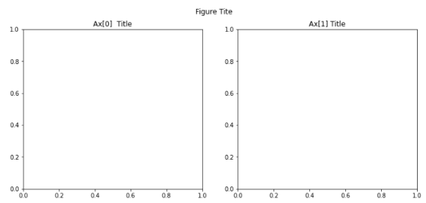
X Label, Y Label 이름 및 값 지정
{ax}.set_xlabel("{X축 이름}"): Ax의 X축에 지정한 Text를 나타냄
{ax}.set_ylabel("{Y축 이름}"): Ax의 Y축에 지정한 Text를 나타냄plt.xticks([{숫자형 list}]): 리스트에 들어 있는 값들로 X축 값을 바꿈
plt.yticks([{숫자형 list}]): 리스트에 들어 있는 값들로 Y축 값을 바꿈
ax.set_xlabel("X-label")
ax.set_ylabel("Y-label")

plt.xticks([0,1,2])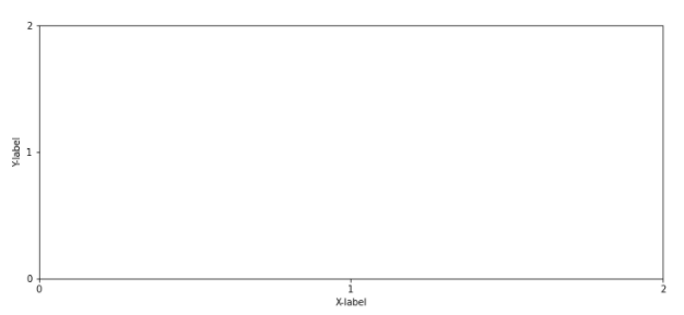
Label
ax.plot({그래프 그릴 Data}, label="{해당 그래프를 구분할 이름}"): 해당 그래프를 설명할 Label을 지정ax.legend(): 매우 중요! 만약 이 코드가 존재하지 않는다면 설정한 Legend가 보이지 않음- shadow : True일 경우 Legend Box에 그림자를 그림
- title : Legend Box의 이름
- linespacing : Legend Box 글 사이 간격 지정
- loc : 위치
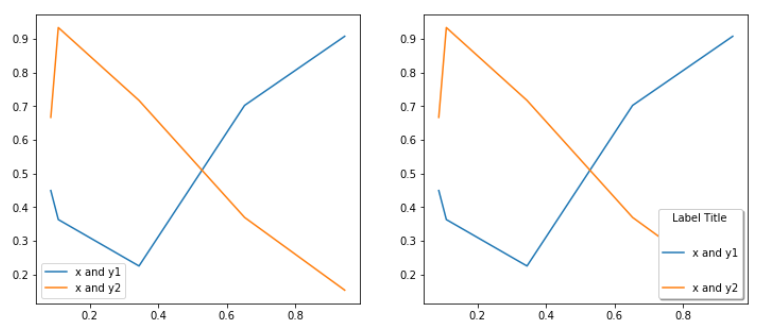
# 왼쪽 그래프
ax[0].plot(x,y, label="x and y1")
ax[0].plot(x,y2, label = "x and y2")
ax[0].legend()

# 오른쪽 그래프
ax[1].plot(x,y, label="x and y1")
ax[1].plot(x,y2, label = "x and y2")
ax[1].legend(
    shadow = True,
    title = "Label Title",
    labelspacing=2.3,
    loc = 'lower right'
)
Text, Annotate, bbox의 활용
- dict(a="b", ...)
- a 위치에 존재하는 값들을 Key로, "b" 값을 Value로 지정하여 Dict type으로 만들어 반환해줌
- dict(zip([Key List], [Value List]))
- zip() 메서드는 Key List와 Value List를 확인 후, 같은 index끼리 연결 시킴
- key[index]에 매칭되는 Value : value[index]
- dict()를 활용하여 연결시킨 것을 Dict type으로 변환시켜 반환해줌
- bbox : Dict type으로 존재해야지만 matplotlib에서 활용 가능
- boxstyle : bbox 모양
- ec : Edge color. bbox 테두리 색
- facecolor : bbox 내부 색
- alpha : 투명도
bbox = dict(boxstyle='round', ec='blue', facecolor='wheat',alpha=0.7)

ax.plot(x,y)

ax.text(x = x[0],y = y[0],s="index 0")
# x : Text가 나타날 x좌표, y : Text가 나타날 y 좌표
# s : 내가 입력하고 싶은 Text

plt.annotate(xy=(x[1],y[1]),text="index 1")
# Annotation. 이것만 보면 text와 뭔 차인가 싶다
plt.annotate(xy=(x[2],y[2]),text="index 2",
            xytext=(x[2], 0.9),
            arrowprops=dict(arrowstyle="->"),
            bbox = bbox)
"""
text : 중요한 점! Annotation은 문자 입력 시 s Parameter가
       아닌 text Parameter를 활용한다
arrowprops : Dict type으로 화살표에 대한 정보 값을 전달해줌
bbox : Annotation Text를 포함하고 있는 bbox에 대한 설정을 전달해줌
"""
Text와 Annotation의 Parameter를 보면 차이가 심함을 알 수 있다.
xy 뿐만 아니라 xytext라는 값이 따로 존재함을 알 수 있다
xy : Annotation이 "가리키고 있을" 위치.
즉, Annotation은 (x[2], y[2])를 가리키고 있다
xytext : Annotation이 "존재하고 있는" 위치.
Annoation은 (x[2],0.9) 위치에 존재하며 xy로 지정된
(x[2],y[2]) Point를 가리키고 있을 것임을 알 수 있다
fig.text(x,y,s="{입력할 문자}")를 통해 전체 Figure에 대해서도 Text를 쓸 수 있다
이 경우, Figure 가로 세로 끝을 각각 1로 두어 비율로써 Text 위치를 표현한다
하지만, 어디까지나 "비율"로 표현하기 때문에 정확하게 위치를 파악하기는 어려움이 있다.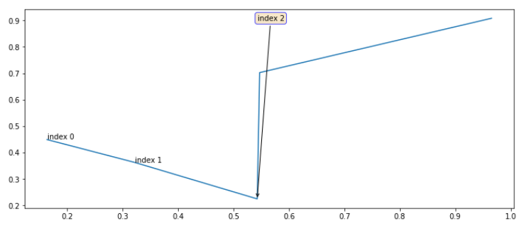
Parameter 활용
ax[0].plot(x,y)
ax[0].text(x[1],y[1],s="index 1",
           va = 'center', ha='center',
           family='fantasy',
           style='italic', weight='bold',size = 20,
           color = 'red',
           alpha=0.7,
           backgroundcolor='yellow'
          )

ax[1].plot(x,y)
ax[1].text(x[1],y[1],s="index 1", size = 20)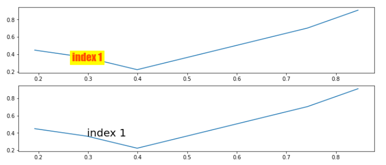
Matplotlib(Color)
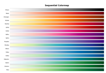
Color Palette
- 범주형(Categorical) : 독립된 색상을 활용하여 범주형 변수에 사용
- 연속형(Sequential) : 정렬된 값을 가지는 순서형, 연속형 변수에 적합
- 어두운 배경에서는 밝은 색이, 밝은 배경에는 어두운 색이 더 큰 값을 표현
- 단일 색조로 표현하고, 색상 변화를 균일하게 하는 것이 좋음
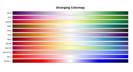
- 발산형(Diverge) : 연속형과 유사하지만, 중앙을 기준으로 발산
- 서로 상반된 2개 Data를 표현하는 데 적합
- 양 끝으로 갈수록 색이 진해지며, Data의 크기나 강도가 강하다는 것을 의미
- 중앙 색은 양쪽 점에 편향되어서는 안됨 ⇒ 주로 검은색이나 하얀색 활용
Highlighting
- 색상 대비를 활용하여 특정 Data를 강조할 수 있음
- 명도 대비 : 밝은 색 배경에는 어두운 색이 더 강조됨(반대도 가능)
- 색상 대비 : 이어져 있는 색은 인접한 색의 영향을 받아 조금 더 선명하게 보이는 현상
- 채도 대비 : 색을 1개만 선명하게 하고, 나머지를 회색이나 검정같은 무채색에 가까운 색으로 만들어 강조함
- 보색 대비 : 정반대 색상을 활용하면 선명하게 보임
Matplotlib(Facet)
Facet이란?
- 화면 상의 View를 분할 및 추가하여 다양한 관점을 전달
- 같은 형식의 차트로 여러 개 Feature를 보여주거나, 데이터의 일부분만 보여줌
- 같은 데이터에 대해 다른 차트 여러개를 표현하여 다양한 관점을 전달
코드로 보는 Facet
- 진정한 Facet은 Seaborn에서 볼 수 있다. Matplotlib에서 배우는 Facet은 Facet이라기 보다는 설정값 정도로만 생각하자
- DPI 설정(해상도 설정)
fig = plt.figure(dpi=150)- 현재 Figure를 png 파일로 저장
fig.savefig("{저장할 파일 이름}")- squeeze
- subplots()로 생성할 경우 Subplot의 ax의 형태는 다양한데, 이럴 경우 코드 짜기가 어려워지므로 항상 2차원으로 Subplot을 받을 수 있게하는 Parameter
- 1 * 1 = ax
- 1 N 또는 N 1 : ax[i]
- N * M : ax[i][j]
- squeeze=False : 항상 ax 배열을 2차원 배열로 생성함
- subplots()로 생성할 경우 Subplot의 ax의 형태는 다양한데, 이럴 경우 코드 짜기가 어려워지므로 항상 2차원으로 Subplot을 받을 수 있게하는 Parameter
fig, axes = plt.subplots(n, m, squeeze=False)
# 이 경우, n이나 m이 1이더라도 axes는 무조건 axes[i][j] 꼴로 접근해야함
# (n,m) = (1,3)일 경우 axes[2]로 접근하는 것이 아닌 axes[0][2]로 접근- flatten
- squeeze는 항상 2차원 배열로 받고 싶다면, flatten은 항상 ax 배열을 1차원으로 만드는 것
- axes.flatten()은 inplace한 Function이 아니므로, axes 자체가 바뀌지는 않음
axes.flatten()
# 만약 axes를 진짜로 flatten() 시키고 싶을 경우,
# axes = axes.flatten()으로 처리하면 됨
# 하지만, 굳이...? 그럴거면 첨부터 1*N으로 만들면 될 것이다- aspect : x축과 y축 눈금의 비(x:y값)
fig = plt.figure(figsize=(12, 5))
ax1 = fig.add_subplot(121, aspect=1)
ax2 = fig.add_subplot(122, aspect=0.5)

ax2.set_xlim(0, 1)
ax2.set_ylim(0, 2)
# ax1의 경우 aspect = 1이므로 x축의 눈금 Range와 y축의 Range가 같을 것이다
# ax2의 경우 0.5이므로, x축의 눈금 Range가 y축의 Range의 절반(0.5)가 될 것이다
-
ax들의 Size를 다르게 하는 방법
- 방법 1 : Slicing을 활용해 Size 조정(추천하는 방법)
- add_gridspec 활용
fig = plt.figure(figsize=(8, 5))

gs = fig.add_gridspec(3, 3)
# fig.add_gridspec(row,col)을 통해 Grid 형태로 쪼개줌
# row : Row 수, col : Column 수. 위 예시에서는 3*3 Grid Layout으로 쪼개졌음
# 이후, add_subplot을 통해 Slicing으로 원하는 Grid 영역을 가지고 올 수 있음

ax = [None for _ in range(5)]

ax[0] = fig.add_subplot(gs[0, :])
ax[0].set_title('gs[0, :]')
# gs[0,:] : gs[0][0], gs[0][1], gs[0][2]를 모두 가지고 와 하나의 공간으로 만듦
# 이렇게 만든 하나의 공간을 ax[0]에 할당하는 것

ax[1] = fig.add_subplot(gs[1, :-1])
ax[1].set_title('gs[1, :-1]')

...

for ix in range(5):
    ax[ix].set_xticks([])
    ax[ix].set_yticks([])

plt.tight_layout()
plt.show()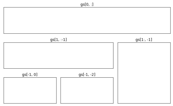
- 방법 2 : 시작 위치와 Size를 동시에 정해주어 Size 조정(subplot2grid)
fig = plt.figure(figsize=(8,5))

ax = [None for _ in range(6)]

"""
# plt.subplot2grid((생성할 grid의 row, 생성할 grid의 col),
                    (Ax의 초기점이 될 x, Ax의 초기점이 될 y),
                    rowspan={시작 지점부터 몇 개 Row를 합칠 것인가},
                    colspan={시작 지점부터 몇 개 Column을 합칠 것인가})
"""
ax[0] = plt.subplot2grid((3,4),(0,0), rowspan = 3, colspan = 2)
ax[1] = plt.subplot2grid((3,4),(0,2), colspan = 2)
ax[2] = plt.subplot2grid((3,4),(1,2), rowspan = 2)
"""
rowspan이나 colspan을 설정하지 않으면 1로 설정됨
ax[0]만 설명하겠다. 먼저, 3*4 grid로 쪼갰다.
먼저, row로 3만큼 확장했다. 따라서, 3*1 grid를 차지하고 있다
또한 col로 2만큼 확장했다. 따라서, 3*2 grid를 차지할 것이다
시작지점이 (0,0)이기 때문에 (0,0) Grid에서 시작된 3*2 Grid 모양을 가질 것이다
"""

for idx in range(3):
    ax[idx].set_title("Grid"+str(idx))
    # ax[i]에는 Grid{i}라는 title이 붙을 것임

fig.tight_layout() # 서로 눈금이 겹치지 않도록 하는 설정
plt.show()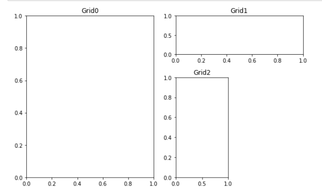
- 방법 1 : Slicing을 활용해 Size 조정(추천하는 방법)
-
기타 설정들(중요하진 않은 것 같아 코드 수행은 생략)
ax.inset_axes(): Ax 내부에 Subplot 추가make_axes_locatable(ax): ax를 (X축 기준으로) 잘라서 Ax를 하나 추가함
Matplotlib(기타 설정)
기타 방법들
-
Grid
- 바둑판 모양 Grid 뿐만이 아닌 여러 모양의 Grid 활용
- 단, Matplotlib은 여러 형태의 Grid를 지원하고 있지 않으며, plot() 등을 활용해 그래프를 그려야 함
- Grid 여러 가지 형태
- : 2 Feature 간 합이 중요한 Case
- : 2 Feature 간 곱이 중요한 Case
- : 2 Feature 간 비율이 중요한 Case
- : 오차가 중요하거나, 특정 지점부터의 거리가 중요한 Case
-
Grid Parameter
- which
- Option으로 가능한 값 : major, minor, both
- which="minor" : set_xticks()를 통해 minor=True로 설정된 Tick에 대해서만 Grid를 그림
- axis
- Option으로 가능한 값 : x,y
- 지정한 축에 대한 grid. axis = "x"일 경우 x축에 대한(y축에 평행한) grid를 그림
- grid line 설정
- linestyle : Grid 선 종류
- linewidth : 선 두께
- which
-
특별한 Data에 대한 선 추가하기
- 최댓값, 최솟값, 평균 등의 특별한 Data에 Text 등을 같이 활용하여 표기
- axvline, axhline
- 하지만, plot 등을 활용하는 것이 더 깔끔하고 활용성이 높아짐
-
차트에서 그룹을 표현하는 면 추가하기
- 차트를 몇 개 그룹으로 나누고, 특정 그룹을 면으로 묶어 차트에 그림
- 그룹에 대한 가독성을 높여 데이터가 어느 그룹에 존재하는지 알기 쉽게 함
-
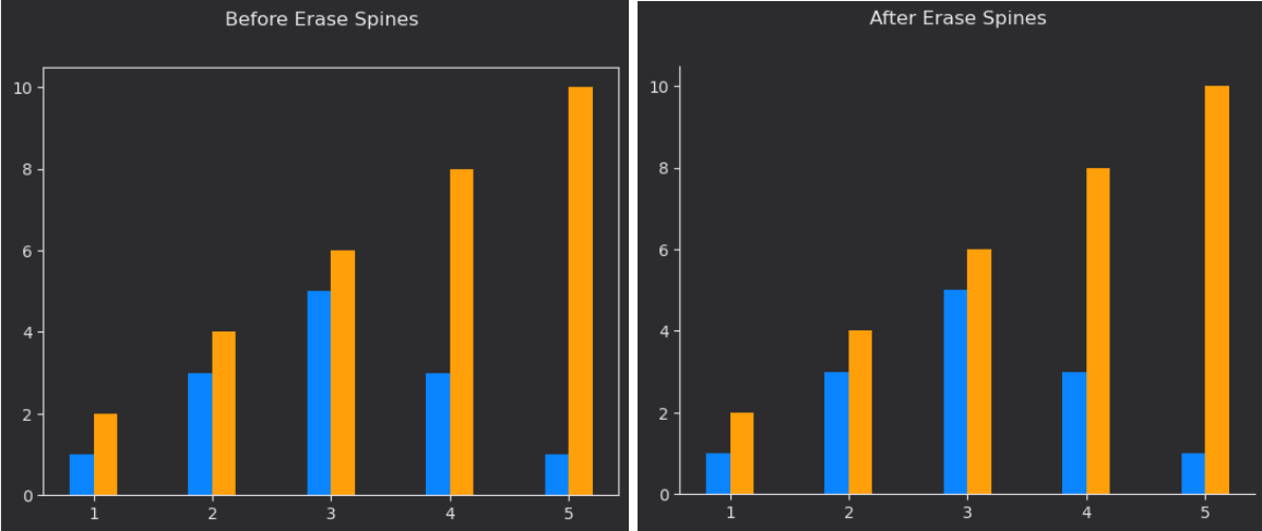
spines
- Ax의 테두리 요소
- ax.spines[{Option}]
- Option : 'top', 'bottom', 'left', 'right'
- spines의 메서드
- set_visible : False로 설정할 경우 테두리를 숨김
- set_linewidth : 테두리 두께
- set_position : 테두리 위치. "center", "zero"나 ('axes',0.2)를 통해 설정 가능
-
Theme 바꾸기
mpl.style.use('seaborn')
# seaborn이라는 Theme을 Deafult 설정으로 바꾸는 방법이다
# mpl.style.available을 통해 설정 가능한 Theme List를 볼 수 있다
Matplotlib Default 설정 바꾸기
- 사용 코드 :
plt.rcParams[] - Seaborn 같은 Matplotlib 기반 라이브러리들은 Matplotlib 설정을 바꿔주면 자동으로 해당 Setting이 적용됨
- 특히 색(Color), 축(spines)에 대한 Default 설정을 바꿔 Data 표현을 조금 더 명확하게 만듦
- 설정을 바꾸고, gridspec을 활용하면 User에게 보여줄 정보량을 조절할 수 있음
코드로 보는 설정 변환
- Color Palette 설정하기
- 색(Color palette) 추천 : https://developer.apple.com/design/human-interface-guidelines/ios/visual-design/color
- 아래 코드는 위 사이트의 색 Hex code를 그대로 따온 것에 불과함
- Color Palette 쉽게 만들어주는 사이트 : http://colormind.io/
from cycler import cycler

raw_light_palette = [
    (0, 122, 255), # Blue
    (255, 149, 0), # Orange
    (52, 199, 89), # Green
    (255, 59, 48), # Red
    (175, 82, 222),# Purple
    (255, 45, 85), # Pink
    (88, 86, 214), # Indigo
    (90, 200, 250),# Teal
    (255, 204, 0)  # Yellow
]

raw_dark_palette = [
    (10, 132, 255), # Blue
    (255, 159, 10), # Orange
    (48, 209, 88),  # Green
    (255, 69, 58),  # Red
    (191, 90, 242), # Purple
    (94, 92, 230),  # Indigo
    (255, 55, 95),  # Pink
    (100, 210, 255),# Teal
    (255, 214, 10)  # Yellow
]

raw_gray_light_palette = [
    (142, 142, 147),# Gray
    (174, 174, 178),# Gray (2)
    (199, 199, 204),# Gray (3)
    (209, 209, 214),# Gray (4)
    (229, 229, 234),# Gray (5)
    (242, 242, 247),# Gray (6)
]

raw_gray_dark_palette = [
    (142, 142, 147),# Gray
    (99, 99, 102),  # Gray (2)
    (72, 72, 74),   # Gray (3)
    (58, 58, 60),   # Gray (4)
    (44, 44, 46),   # Gray (5)
    (28, 28, 39),   # Gray (6)
]


light_palette = np.array(raw_light_palette)/255
dark_palette = np.array(raw_dark_palette)/255
gray_light_palette = np.array(raw_gray_light_palette)/255
gray_dark_palette = np.array(raw_gray_dark_palette)/255- 전체적인 Colormap 변경
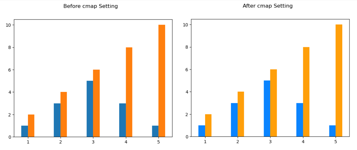
<설명>
Bar Plot 등을 그릴 때, 색깔을 지정해주지 않으면 Matplotlib에서 알아서
색 변경을 수행해줬다.
이 때의 색 변경이 맘에 들지 않을 경우, 내가 원하는 색 Palette로 지정하면
색 변화를 내가 원하는데로 지정해 줄 수 있다.mpl.rcParams['axes.prop_cycle'] = cycler('color', dark_palette)
"""
왼쪽 그래프는 위 코드를 수행하기 전 Default Matplotlib 설정에서 그린 그래프이고,
오른쪽 그래프는 위 코드를 수행시켜 내가 원하는 색을 지정한 것이다.
색을 잘 살펴보면 색과 색 변화가 다르다는 것을 볼 수 있다.
(오른쪽 색이 내가 위에서 지정한 dark_palette이다)
"""
- Figure 및 ax 배경색 지정
# Figure의 배경 색깔 변경
mpl.rcParams['figure.facecolor']  = gray_dark_palette[-2]

# Figure의 테두리 색 변경
mpl.rcParams['figure.edgecolor']  = gray_dark_palette[-2]

# ax의 배경색 변경
mpl.rcParams['axes.facecolor'] = gray_dark_palette[-2]<설명>
왼쪽 차트는 Figure 및 ax 색을 변경하기 전 차트, 오른쪽 차트는 Figure 및 ax 색을
변경한 이후 차트이다.(즉, 위 코드를 수행시킨 이후 그린 차트)
gray_dark_palette[-2]에 지정된 hex code로 배경색을 지정했으므로,
ax 및 Figure 색이 어둡게 변한 것을 볼 수 있다.(Gray(5)로 색을 지정해줬음)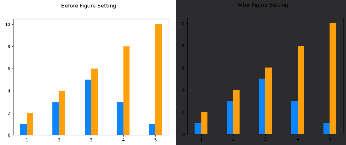
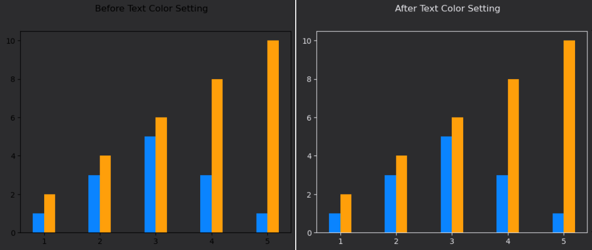
- Text 색상을 흰색으로 변경시키기
white_color = gray_light_palette[-2]
mpl.rcParams['text.color'] = white_color
mpl.rcParams['axes.labelcolor'] = white_color
mpl.rcParams['axes.edgecolor'] = white_color
mpl.rcParams['xtick.color'] = white_color
mpl.rcParams['ytick.color'] = white_color<설명>
Text의 color, axes Laebl의 color, axes 테두리 color, xtick 및 ytick color를
하얀색으로 변경했다.
오른쪽 차트가 위 코드를 수행시킨 이후 그린 그래프로써, 텍스트 색 및 ax 테두리 색,
xtick과 ytick 색도 변경된 것을 볼 수 있다.
또한 예시에서는 보이지 않지만 Label의 색도 하얀색으로 변경된 것을 알 수 있다.
- DPI 조정(해상도 조정)
mplrcParamas['figure.dpi'] = 200- Matplotlib Default 설정을 초기 설정으로 초기화(복구)
plt.rcParams.update(plt.rcParamsDefault)- ax들의 축에 대한 설정
- 주로 ax는 왼쪽 아래 구석부터 그래프가 시작되므로, 오른쪽 축과 위쪽 축을 삭제시키면 깔끔해지는 경우가 많음
- 아래 예시도 위쪽 축과 아래쪽 축을 삭제시키는 코드(Spines 활용)
mpl.rcParams['axes.spines.top'] = False
mpl.rcParams['axes.spines.right'] = False

"""
왼쪽 차트와 달리 오른쪽 차트는 위 코드를 실행시키고 난 뒤 그려진 차트이다.
보다시피, 오른쪽 축과 위쪽 축이 지워져있음을 확인할 수 있다.
"""
- 위 모든 설정을 수행한 이후, gridspec을 활용해 정보량을 조절한 Scatter Plot
- 전체 Data에 대한 Scatter Plot을 가운데 크게 그리고, 나머지 각 Group에 대한 Scatter Plot을 오른쪽에 작게 그렸음
- 나중에 배울 Interactive Graph로 만들 수도 있겠지만, 이 방법이 한 눈에 보기도 편하고 CPU 사용량도 훨씬 줄일 수 있음
def score_distribution(f1, f2):
# f1, f2 : 어떤 Feature 끼리 Scatter Plot을 그릴지 지정해줌
    fig = plt.figure(figsize=(12, 10))

    gs = fig.add_gridspec(5, 6)
    # 5 * 6 Grid로 Figure를 나눔

    ax = fig.add_subplot(gs[:,:5])
    ax.set_aspect(1)
    # ax의 x축과 y축 비율을 1:1로 정함
    # 즉, ax는 정사각형의 형태를 띄고 있을 것이다

    sns.scatterplot(x = f'{f1} score', y = f'{f2} score', data=student,
                hue_order = sorted(student['race/ethnicity'].unique()),
                s=20, alpha=0.6, linewidth=0.5, hue = 'race/ethnicity')
    # seaborn을 활용하여 전체 Data에 대한 Scatter Plot을 ax에 그림
    # Matplotlib 설정을 그대로 따름을 알 수 있다.

    sub_axes = [None] * 5
    for idx,group in enumerate(sorted(student['race/ethnicity'].unique())):
        sub_axes[idx] = fig.add_subplot(gs[idx,5], aspect=1)
        # 현재 Group에 해당되지 않는 다른 Data들에 대한 Scatter Plot
        sub_axes[idx].scatter(
             x = student[student['race/ethnicity']!=group][f'{f1} score'],
             y = student[student['race/ethnicity']!=group][f'{f2} score'],
             s=5, alpha=0.2, color= white_color, linewidth=0.7,
             label=group, zorder=5)

        # 이번 ax에 주로 표현하고 싶은 Group에 대한 Scatter Plot 그리기
        sub_axes[idx].scatter(
              x = student[student['race/ethnicity']==group][f'{f1} score'],
              y = student[student['race/ethnicity']==group][f'{f2} score'],
              s=5, alpha=0.6, color= dark_palette[idx], linewidth=0.5,
              label=group, zorder=10)

        cnt = (student['race/ethnicity']==group).sum()
        sub_axes[idx].set_title(f'{group} ({cnt})', loc='left', fontsize=9)
        sub_axes[idx].set_xticks([])
        sub_axes[idx].set_yticks([])

    for axes in [ax] + sub_axes:
        axes.set_xlim(-3, 103)
        axes.set_ylim(-3, 103)

    ax.set_title(
         f'{f1.capitalize()} & {f2.capitalize()} Score Distribution',
         loc='left', fontsize=15, fontweight='bold')
    ax.set_xlabel(f'{f1.capitalize()} Score', fontweight='medium')
    ax.set_ylabel(f'{f2.capitalize()} Score', fontweight='medium')
    ax.legend(title='Race/Ethnicity', fontsize=10)

    plt.show()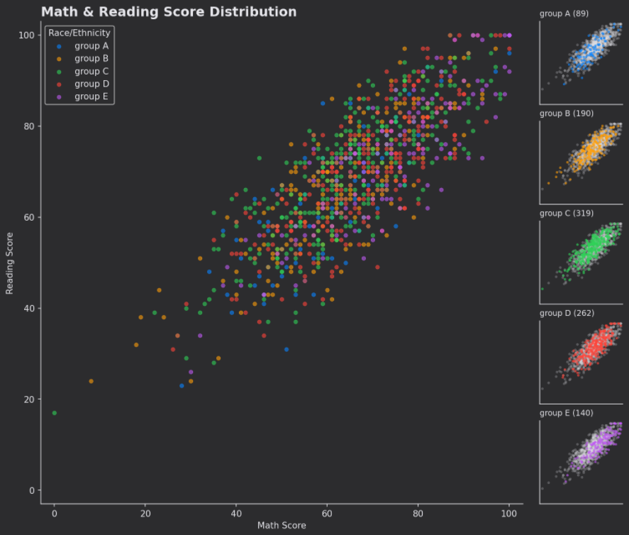
- Matplotlib과는 다르게 Pyplot은 원하는 설정으로 계속해서 바꿔줘야 함
- Default 설정 변경이 안됨

개념부터 확실히!