Seaborn이란?
- Matplotlib을 기반으로 한 시각화 도구
- 시각화 목적과 방법에 따라 API를 분류하여 제공하고 있음
- Categorical API : 데이터의 기본 통계량
- 이산 데이터 표시 때 많이 활용
- Distribution API : 범주형/연속형 모두 살펴볼 수 있는 분포 시각화
- Relational API : Feature 사이의 관계성 파악
- Regression API : 회귀 분석
- Matrix API : Matrix Data를 시각화
- Heatmap이 대표적
- Categorical API : 데이터의 기본 통계량
- 설치 방법 :
pip install seaborn==0.11 - import 시킬 때 주로 sns alias를 활용
import seaborn as snsCountplot
Countplot이란?
- Seaborn 중 Categoricla APi에서 대표적인 시각화 방법
- 범주를 이산적으로 세서 막대 그래프로 그려주는 함수
코드를 통한 Countplot 이해
- 아무런 설정도 하지 않은 countplot
- "Count"plot : Data 개수를 y축의 값으로 그래프를 그림
- data : 차트를 그리고 싶은 Data 입력
sns.countplot(data=student)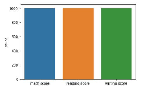
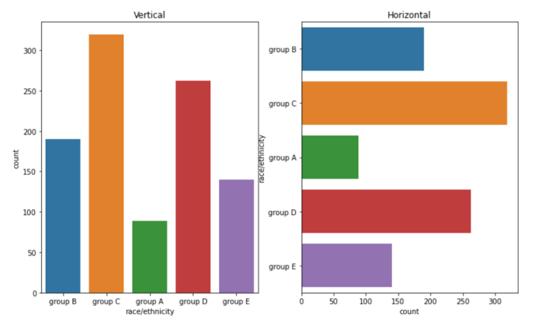
- 내가 원하는 Feature로 그래프를 그림
sns.countplot(x = "race/ethnicity", data=student) # Case 1

sns.countplot(y = "race/ethnicity", data=student) # Case 2
"""
x 파라미터나 y 파라미터를 통해 내가 원하는 Feature를 선택한다
Case 1 : x축을 race/ethnicity Feature 값으로 설정하여 countplot을 그린다
Case 2 : y축을 race/ethinicty Feature 값으로 설정하여 countplot을 그린다

Case 2를 조금 더 자세히 생각해보면, Horizontal Bar Plot임을 알 수 있다
(y축이 Feature, 즉 범주)
아래 그림에서 왼쪽 차트가 Case 1, 오른쪽 차트가 Case 2
"""
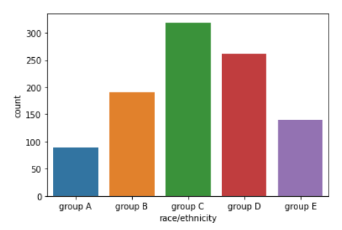
- Feature의 순서를 정함
- 범주형 차트 같은 경우 순서가 매우 중요함! 따라서, 범주(Feature) 순서 조정 방법을 꼭 익혀야 함
- order : Category를 어떤 식으로 Sorting할지 결정
sns.countplot(order = sorted(student['race/ethnicity'].unique()),
                    data=student, x = "race/ethnicity")
"""
order Parameter를 통해 내가 설정한 축에 대해 Order가 가능하다
sorted() 메서드를 활용했으므로, race/ethinicity Feature의 오름차순으로
그래프를 그림을 알 수 있다
아래 차트에서, group A -> group E 순으로 출력 되는 것을 볼 수 있다
"""
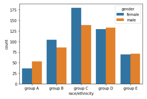
- hue 파라미터
- 계속해서 활용되는 매우 중요한 Parameter
- 그래프를 내가 원하는 Feature를 기준으로 나눌 때 활용
- Grouped Bar Plot을 생성할 때, 내가 원하는 Feature로 hue로 지정함으로써 생성 가능
- hue_order : Feature 값에 따른 Order을 위해 활용하는 Paramaeter
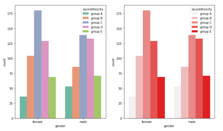
sns.countplot(hue = "gender", data=student, x = "race/ethnicity",
                     order = sorted(student['race/ethnicity'].unique()))
"""
hue Parameter를 통해 내가 원하는 Feature로 Group을 생성하여
Grouped Bar Plot을 생성할 수 있다
위 코드를 보면 hue = "gender"로 지정하였다.
즉, 성별으로 Group을 나눠 그래프를 그리는 것이다

아래 사진을 보면 결과적으로 gender에 저장된 "female", "male"로 Bar가
나눠짐을 볼 수 있다
"""
- Plot의 Group마다 색을 지정해줌 & 그래프를 다른 ax에 그림
- Group 색을 지정해주는 방법은 이산형, 범주형 Data 셋에서는 잘 활용하지 않고 연속형 데이터셋에서 자주 활용함
- ax : 그리고 싶은 ax를 지정하는 Parameter
- palette : Group(Hue Feature)에 대한 색을 칠할 때 미리 정해진 색으로 칠하는 Parameter
- color : Sequential Colormap의 색을 활용해 Group을 칠하는 Parameter
fig, ax = plt.subplots(1,2,figsize=(12,7))

# Case 1 : palette Parameter 활용
sns.countplot(ax = ax[0], palette="Set2",
               hue_order=sorted(student['race/ethnicity'].unique()),
                       hue = "race/ethnicity",data=student, x = "gender")

# Case 2 : color Parameter 활용
sns.countplot(ax = ax[1], color="red",
                hue_order=sorted(student['race/ethnicity'].unique()),
                       hue = "race/ethnicity",data=student, x = "gender")

"""
Case 1이 왼쪽 차트, Case 2가 오른쪽 차트임을 알고 가자
Case 1같은 경우 ax = ax[0], Case 2 같은 경우 ax[1]이므로
Case 1이 왼쪽, Case 2가 오른쪽에 그려진 것이다
"""
- saturation : 채도 조정 Parameter
- 존재하지만 추천하지는 않음
- 채도에 대한 설명이 있는 사이트 : https://life-of-panda.tistory.com/108
Categorical API
Categorical API 특징
- 활용하는 데이터 통계량
- count : 데이터 개수
- mean(평균), std(표준 편차), min(최솟값), max(최댓값)
- 25%(하위 25%번째 Data), 50%(하위 50%번째 Data), 75%(하위 75%번째 Data)
- IQR(Interquartile Range) : 25% ~ 75% data 사이의 거리
- x나 y 중 1개 값은 꼭 "통계치"를 구할 수 있는 Feature가 설정되어야 함
Box Plot
- 분포를 살피는 대표적인 시각화 방법
- 25%, 50%, 75% Data 모두 활용
- x,y Feature를 모두 입력하여 x Feature에 대한 y Feature 분포를 볼 수 있음
- 사용할 수 있는 Parameter
- width : Box 너비
- linewidth : 가운데 존재하는 라인 두께 결정
- fliersize : 예외치를 표현하는 그림 크기
- 사각형 중앙선 : median
사각형 왼쪽 선 : 25%
사각형 오른쪽 선 : 75% - 라인의 범위
- 라인 오른쪽 :
- 라인 왼쪽 :
- 라인에 포함되지 않은 데이터는 예외치로 생각하여 따로 그림(다이아몬드)로 표현
코드로 보는 Box Plot
fig, ax = plt.subplots(2,1, figsize= (12, 12))

sns.boxplot(x="math score", data = student, ax = ax[0])
# 기본 boxplot 그리는 방식.
# x 위치에 "어떤 Data의 통계치"로 Plot을 그릴지 결정해 줘야 함
# x Feature 기준으로 25%, 50%, 75% Data를 뽑고, 이를 활용해 그림

# ===========================================================#

sns.boxplot(x="race/ethnicity", y = "math score",
                          data = student, ax = ax[1])
# box plot에서 x와 y에 Feature를 모두 입력
# Math score에 대해 25%, 50%, 75% 값을 구하는 것 자체는 동일하지만,
# 이 값을 x Feature로 Group을 나눈 뒤 만든다
# 즉, x라는 Feature로 Group을 나눈 뒤 데이터를 뽑아 Box Plot을 그리는 것이다

# ===========================================================#

sns.boxplot(width=0.3, linewidth=2, fliersize=10,x="race/ethnicity",
                            y = "math score", data = student, ax = ax[2])
# ax[1] 차트에서 width, linewidth, fliersize만 변경하였다
# ax[2] 차트를 보면, width는 줄어들었으며, 라인의 두께는 두꺼워졌고,
# 예외치의 그림(다이아몬드) 크기는 커졌음을 볼 수 있다
plt.show()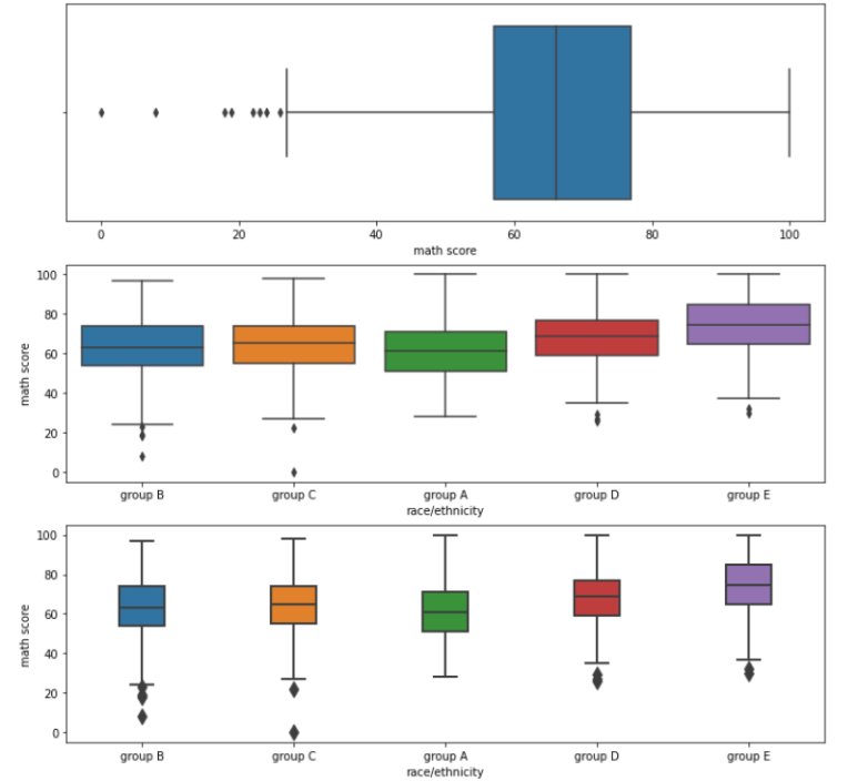
Violin Plot
- Box Plot보다 실제 분포를 표현하기에 더 좋은 Plot
- 오해가 생기기 충분한 표현 방식
<이유>
이산 데이터는 연속적이지 않기 때문에 중간 데이터가 존재하지 않는데,
Violine Plot을 활용하면 데이터 범위가 없는 곳까지 데이터가 있다고 표시하여
사용자가 해당 부분에 데이터가 존재한다고 착각할 수도 있다.

또한 Kernel Density Estimate를 활용하므로, Kernel의 모양에 따라
데이터의 손실이나 오차가 발생할 수 있음- Violin Plot 설명
- 라인의 중간 흰 점 : Median 값
- 중간 두꺼운 Line : 25 ~ 75% 값
- 존재하는 Line : Box Plot의 라인과 동일하게 설정됨
코드로 보는 Violin Plot
- 기본적인 Violin Plot
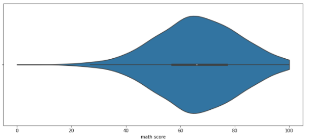
sns.violinplot(x='math score', data=student)
# x 위치에 "어떤 Data의 통계치"로 Plot을 그릴지 결정해 줘야 함
# 이 경우, math score의 통계치로 그래프를 그릴 것임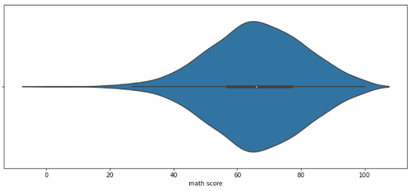
- Violin Plot 오해 줄이는 방법 1 : bw
- 분포 표현을 얼마나 자세하게 보여줄 것인가에 대한 Parameter
- bw가 작을 수록 분포 표현을 Histogram과 가깝게 그림
- 너무 작을 경우 차라리 Histogram이 효과적이므로 적절히 조절해야 함
sns.violinplot(x='math score', data=student,
              bw = 0.1)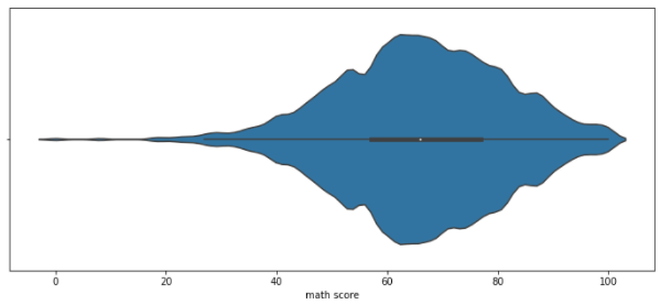
- Violin Plot 오해 줄이는 방법 2 : cut
- Violin Plot 양 끝 부분을 "어느 지점에서" 자를 것인지 정하는 Parameter
- Data의 Max와 Min 값에 대해 cut 수치만큼 추가로 그래프 그리는 것을 허가한다는 의미
<설명>
Violin Plot은 양쪽 끝이 한 점으로 수렴하는 그래프로써, 실제 데이터와 차이가 있다
예를 들어, 위 Violin Plot을 보면 Math score의 Max값은 100이지만,
그래프가 오른쪽 끝 점에서 만나야 하기 때문에 어쩔 수 없이 100을 넘어서도
(그래프의) 값이 존재하는 것을 볼 수 있고, 이를 보는 User는 실제로 100점이 넘는
점수가 존재한다고 오해를 할 수 있다.


아래 예시에서는 cut = 0이므로, Data의 Max값과 Min값에서 그래프를 추가로
그리는 것을 허락하지 않았다
따라서, Max값과 Min 값을 정확히 지키는 Violin Plot이 그려질 것이다
(잘라진 것처럼 보임)sns.violinplot(x='math score', data=student,
cut = 0)
- Violin Plot 오해 줄이는 방법 3 : inner
- 'stick' : "모든 Data"의 이산적 수치를 막대 모양으로 표시
- 'quartile' : "중앙값, 25%, 75%"의 이산적 수치를 점선으로 표시
sns.violinplot(x='math score', data=student, inner='stick', ax = ax[0])
sns.violinplot(x='math score', data=student, inner='quartile',ax = ax[1])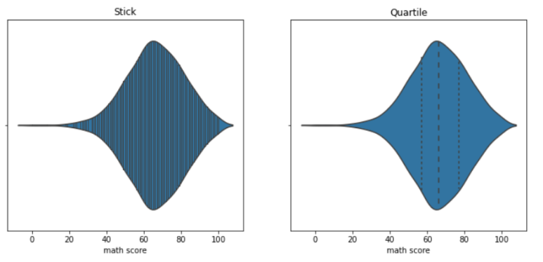
- Violin Plot의 적합한 비교를 위한 Parameter 1 : scale
- Feature 간 Violin Plot을 비교하려 할 때, 여러 개의 Violin Plot 그리는 방법 지정을 위한 Parameter
- 'count' : 실제 데이터 양에 비례하여 Violin Plot 너비를 결정
- 'width' : 모든 Violin Plot의 최대 너비를 동일하게 그림
- 'area' : 모든 Violin Plot의 총 넓이를 동일하게 그림
sns.violinplot(x='race/ethnicity', y = 'math score', data=student,
                                            ax = ax[0], scale = "count")
sns.violinplot(x='race/ethnicity', y = 'math score', data=student,
                                              ax = ax[1], scale="width")
sns.violinplot(x='race/ethnicity', y = 'math score', data=student,
                                               ax = ax[2], scale="area")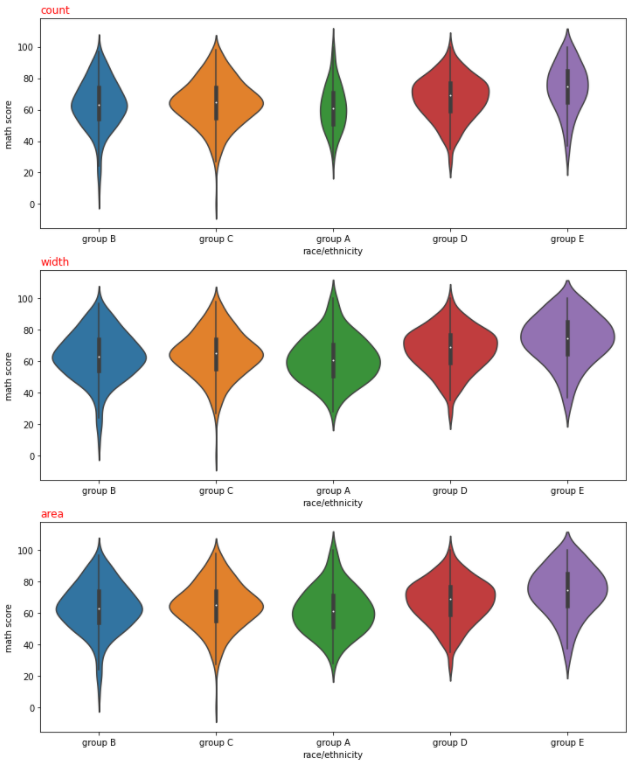
- Violin Plot의 적합한 비교를 위한 Parameter 2 : split
- Group 비교에 적합
<설명>
위에서 Violin Plot을 그리면서 가운데 라인을 기준으로 좌우가 같다는 것을 알 수 있다
즉, 가운데 라인을 기준으로 한 쪽 Part에 대한 Plot만 존재해도
Data 파악에 문제가 없다는 의미이다
만약, Hue를 통해 데이터 Group이 2개로 쪼개진다면, 2개 Group에 대한
Violin Plot을 반씩 쪼개서 붙여 한 개 Violin Plot으로 만들어 줄 수 있지 않을까?

"split = True"로 설정할 경우 이런 방법으로 Violin Plot을 구현해준다
1개의 Line에 hue로 생성된 group의 Violin Plot 절반 씩을 표현하게 하는 것이다
아래 코드에서는 "gender"로 gorup을 나눴고,
gender는 "female", "male" 밖에 존재하지 않으므로
2개 Violin Plot을 반으로 쪼개 1개 라인에 붙여 표현했다sns.violinplot(x='race/ethnicity', y = 'math score', data=student,
hue = 'gender', split = True)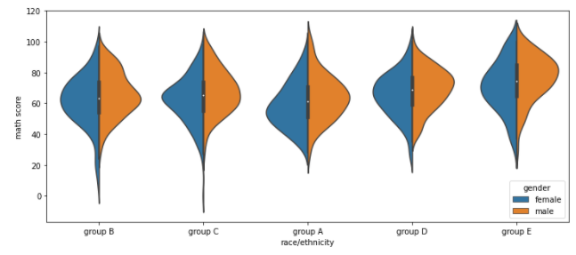
그 외 Categorical API
- boxenplot : Box Plot + Categorical Plot
- swarmplot : 데이터 분포 확인에 유리한 Plot
- stripplot : 데이터 밀도 확인에 유리한 Plot
fig, axes = plt.subplots(3,1, figsize=(12, 15))
sns.boxenplot(x='math score', data=student, ax=axes[0],
               order=sorted(student['race/ethnicity'].unique()))

sns.swarmplot(x='math score', data=student, ax=axes[1],
               order=sorted(student['race/ethnicity'].unique()))

sns.stripplot(x='math score', data=student, ax=axes[2],
               order=sorted(student['race/ethnicity'].unique()))

axes[0].set_title("boxenplot", loc = "left")
axes[1].set_title("swarmplot", loc = "left")
axes[2].set_title("stripplot", loc = "left")

plt.show()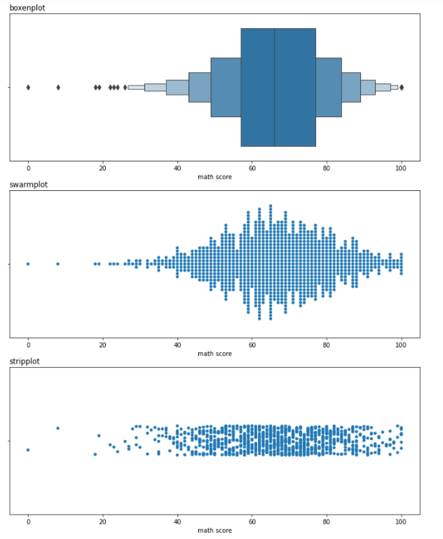
Distribution API
Distribution API에 관한 설명
- 1개 Feature에 대한 Distribution : Univariate Distribution
2개 Feature를 동시에 살펴 보는 Distribution : Bivariate Distribution(결합 확률 분포를 봄)- Bivariate Distribution도 Univariate Distribution에 축을 하나 더 추가하여 Feature를 하나 추가하는 차이밖에 존재하지 않음
Histplot
코드로 보는 Histogram
- 기본적인 Histogram
sns.histplot(x='math score', data= student)
# Categorial API와는 달리 Distribution API는
# 통계치를 구하지 못하는 Feature여도 x, y로 입력이 가능함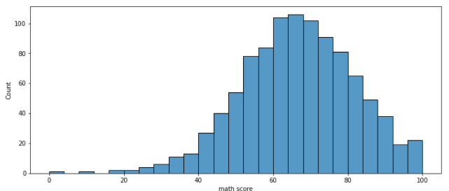
- 막대 개수 조정에 대한 Parameter
- binwidth : 어느 정도의 범위로 데이터를 묶어 Histogram으로 표혀날지 결정
- bins : 몇 개의 막대로 Histogram을 그릴지 결정
sns.histplot(binwidth=10, x='math score', data= student, ax = ax[0])

sns.histplot(bins = 25,x='math score', data= student, ax = ax[1])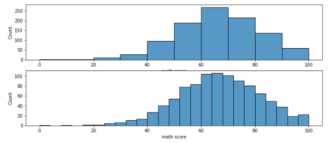
- element
- Histogram을 막대 형태 대신 다른 형태로 그리는 Parameter
- 'step' : 막대긴 하지만, 막대를 구분해 주는 구분선을 모두 지운 Histogram
- 'poly' : 막대 최대 높이 중간지점을 이어 다각형 형태로 그림
sns.histplot(element='step',x='math score', data= student, ax = ax[0])
sns.histplot(element='poly',x='math score', data= student, ax = ax[1])
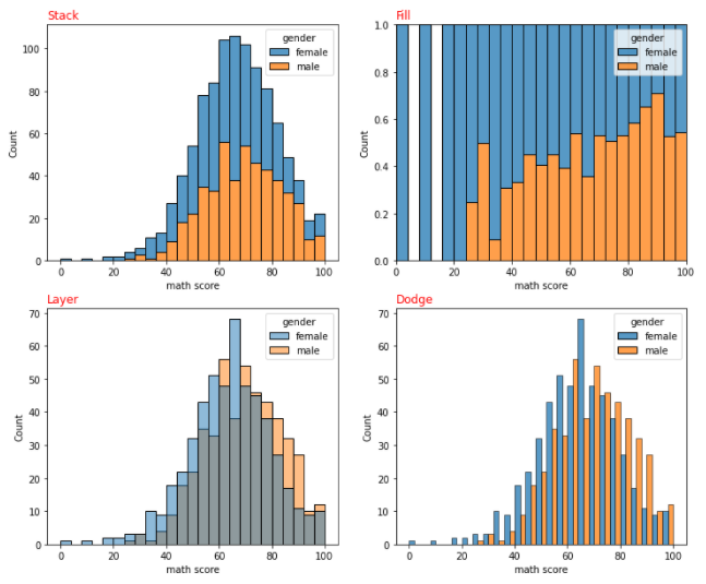
- multiple
- hue로 group에 대한 Histogram을 그릴 때 보여주는 방식 조정
- 'stack' : Stacked Bar Plot
- 'fill' : 각 구역 총합을 1로 처리하여, Group이 해당 구역에 존재하는 Percentage로 차트를 그림
- 'layer' : Default. 그래프를 겹치고 투명도(alpha)를 조정하여 보여줌
- 'dodge' : 그래프르 인접하게 그려 Grouped Bar Plot을 그림
kdeplot(Kernel Density Estimate)
- 데이터의 밀도를 활용하여 곡선으로 Plot을 그려줌
- Histogram의 연속적 표현
fill=TrueParameter 설정을 활용하여 가시성 높이는 것을 추천- Histogram의 multiple Parameter 활용 가능
코드로 보는 kdeplot
- 기본적인 kdeplot
- 기본적으로 y축이 Density로 설정되어 있음
sns.kdeplot(x= 'math score', data=student, ax = ax[0])
sns.kdeplot(fill = True, x= 'math score', data=student, ax = ax[1])
# fill = True로 가시성을 높이자(오른쪽 그림)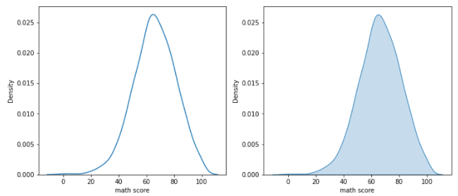
- bw_method
- 분포를 자세하기 표현하기 위한 Parameter
- 데이터 수집 구간을 짧게 하여 더 자세한 그래프를 그림
sns.kdeplot(bw_method = 0.05, x= 'math score', data=student, fill = True)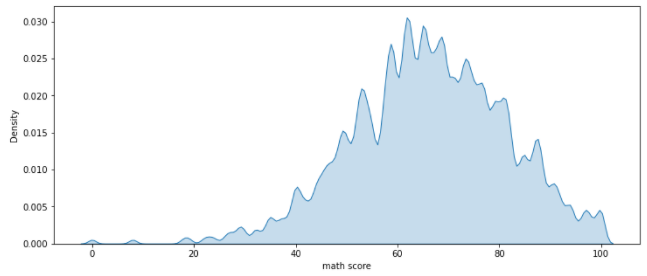
- cumulative
- 데이터를 쌓아서 밀도를 표현
- 이전 Data 값들을 포함시켜 연산
sns.kdeplot(cumulative = True, x='math score', data=student, fill = True)
# 결과를 보면 Density가 최종 지점의 y값이 1이 됨을 알 수 있다.
# 이전 Data 값들까지 현재 Data에 포함 시켜 밀도를 계산하기 때문에,
# 최종적인 지점에서 밀도는 모든 Data를 포함했다는 의미를 지닌 1.0 값을 가진다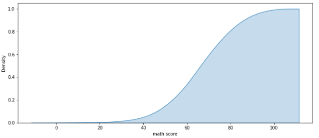
기타 Distribution API
- ecdfplot
- 누적 밀도 함수
- 많이 활용하지는 않음
- rugplot
- 선을 활용한 밀도 함수
- 실제 Data가 어디에 존재하는지 막대로 표시
- 추천하지는 않지만, 한정된 공간 내에서 분포를 표현하기엔 괜찮음
sns.ecdfplot(x = 'math score', data=student, ax=ax[0])
sns.rugplot(x = 'math score', data=student, ax=ax[1])
# 위 차트가 ecdfplot, 아래 차트가 rugplot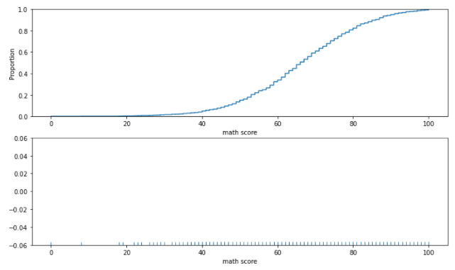
-
Bivariate Distribution
- 2개 이상의 Feature를 동시에 살펴봄
- 결합 확률 분포 파악
- histplot 활용법 : scatter보다 밀도를 표현하기가 좋음
sns.histplot(x = 'math score', y = 'reading score', data = student, cbar = True, bins = (20,20))<설명> x축에는 math score, y축에는 reading score Feature가 설정되어 있다 Bivariate Distribution은 2개 값이 겹치는 Data의 Count를 나타내는 것이다 예를 들어, math score = 60, reading score = 80일 경우, (60, 80) Point에 존재하는 Histogram을 확인하면 된다. 또한, 오른쪽 color bar를 통해 해당 Point의 점수를 가진 사람 수를 알 수 있다 cbar = True : color bar 활성화 bins : Data를 몇 개씩 묶어 차트로 표현할 것인가(위에 설명한 bins와 동일) (x bins, y bins) 쌍으로 입력함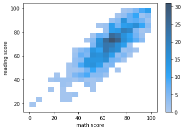
- kdeplot
- fill = True로 가시성 높이는 것을 추천
sns.kdeplot(x = 'math score', y = 'reading score', data = student, fill=True)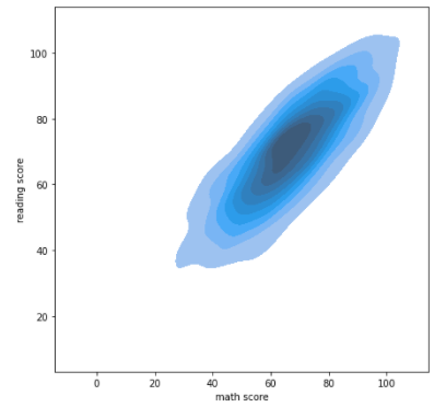
- 2개 이상의 Feature를 동시에 살펴봄
Relation & Regression API
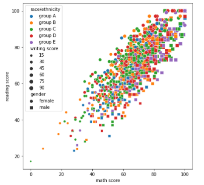
ScatterPlot
- style
- 지정된 Feature로 Group을 나눈 뒤, 각 Group의 Marker 모양을 다르게 하여 1개의 Scatter Plot에 나타나게 하는 Parameter
- Dict type data로 Marker 모양 설정 가능
- "feature data":"Marekr 모양" 형태의 Dict type data
- s : 사각형, o: 원
- size
- 지정된 Feature로 Group을 나눈 뒤, 각 Group의 Marker 크기를 다르게 하여 1개의 Scatter Plot에 나타나게 하는 Parameter
- size_order, hue_order, style_order를 통해 각각 size, hue, style 순서를 지정해 줄 수 있음
아래 예시 코드는 size, style, hue를 모두 활용할 수 있다는 것을 보여주기 위해
모든 Parameter를 활용했지만, 가시성이 매우 떨어지므로 실제로 활용할 때는
3개 Parameter 중 가장 가시성이 좋은 Grouping 방식으로 Feature를 전달해야 함sns.scatterplot(x='math score', y='reading score', data = student,
style = 'gender', markers={'male':'s', 'female':'o'},
hue = 'race/ethnicity',
hue_order=sorted(student['race/ethnicity'].unique()),
size = 'writing score')
"""
style : male을 s(사각형), female을 o(원) 모양으로 Marker를 변경 후
Scatter plot에 표현
hue : race/ethnicity를 기준으로 색을 다르게 하여 scatter plot에 표현
size : writing score의 값(점수)에 따라 Marker의 크기를 다르게 하여
Scatter Plot에 표현
"""
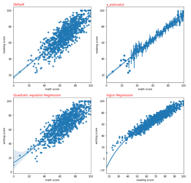
Regplot
- 회귀선을 추가한 Scatter Plot
- Parameter 설명
- x_bin : Scatter Plot의 점 개수 조정
- order : 지정한 차원의 그래프로 회귀선을 그림
- (ex) order = 3 : 형태의 회귀선 그림
- logx = True : 회귀선을 형태로 그림
- x_estimator
- 한 개 축에 1개 Mark만 표시하기 위해 활용하는 Parameter
- np.mean을 입력할 경우 동일한 축에 존재하는 모든 데이터의 평균 값만 Marker로 표시
- 대신, Data의 Range는 직선으로 표현
sns.regplot(x='math score', y='reading score', data=student, ax = ax[0][0])
sns.regplot(x_estimator=np.mean, x='math score', y='reading score',
                                               data=student, ax = ax[0][1])
sns.regplot(order=4, x='math score', y='writing score', data=student,
                                                             ax = ax[1][0])
sns.regplot(logx = True, x='reading score', y='writing score',
                                               data=student, ax = ax[1][1])

"""
그래프에 왼쪽 상단에 나온 Title이 값을 준 Parameter이다
Quadratic, 즉 order=4로 줬을 경우 4차 방정식으로 안보이겠지만 데이터가
너무 선형에 가까워서 그렇게 보이는 것이다
x_estimator를 np.mean으로 했으므로, 한 개 축에 대하여 1개 포인트
(축에 존재하는 모든 데이터 평균)만 존재하고, 직선으로 데이터 Range를 보여준다
"""
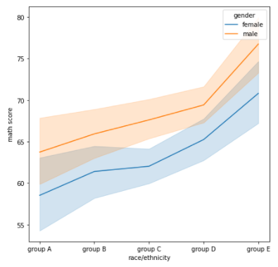
Line Plot
- Matplotlib의 Line Plot과 동일함
- 사용할 수 있는 Parameter
- style, hue 모두 활용 가능
- markers : True로 설정할 경우, 존재하는 Data를 Mark하여 포인트로 찍어줌
- dashes : False로 설정할 경우, 점선이 아닌 직선으로 Line Plot 그림
sns.lineplot(data=student, x='race/ethnicity',y='math score',
                                                       hue = 'gender')

"""
새로운 Data Set을 가져오기가 귀찮아 Student를 활용했지만, 제대로 활용하기 위해서는
시간 흐름에 연관된 시계열 데이터로 Line Plot을 그리는 것이 더 효과적이다
student는 시계열 데이터가 아니므로, Line Plot의 모든 기능을 끌어내기 어렵다
"""
Matrix API
- 데이터에 대한 행렬을 시각화 하는 API
Heatmap
- 상관 관계 시각화에서 많이 활용
- .corr() : 모든 Feature 사이의 상관 관계 수치를 Matrix 형태로 변환
- 활용할 수 있는 Parameter
- vmin, vmax : 최대, 최솟값을 설정해 줄 수 있음
- center : 특정 값을 기준으로 양의 상관 관계인지, 음의 상관관계인지 표현 가능
- Sequential Color Map과 같이 표현됨
- annot : True로 지정할 경우 Heatmap에 데이터 수치까지 표현
fmt='.2f'와 같이 표현할 Data의 소수 자릿수 제한까지 가능함
- cmap : 색 지정 가능
- linewidth : Matrix 칸 사이를 나누는 선 너비를 정함
코드로 보는 Heatmap
sns.heatmap(student.corr(),
           vmin = -1, vmax = 1,
           center = 0,
           cmap = 'coolwarm',
           annot=True, fmt='.2f',
           ax = ax[0])

sns.heatmap(student.corr(),
           vmin = -1, vmax = 1,
           center = 0,
           cmap = 'coolwarm',
           annot=True, fmt='.2f',
ax = ax[1], linewidth = 2.0)<설명>
먼저, student DataFrame이 Correlation이 너무 좋아서 사실 보여주기 좋은
DataSet은 아니다
먼저, correlation 값은 -1 ~ 1 사이의 값을 가진다. 따라서, 해당 Range를
벗어나는 값에 대하여 색을 지정해 줄 필요는 없을 것이다
따라서, vmin = -1, vmax = 1로써 최대, 최솟값을 지정하여 색을 할당해 줄 Range를
정해준다
또한 Correlation은 0 값을 기준으로 양의 상관관계, 음의 상관관계가 구분되므로
center = 0으로 지정했다
(cmap은 color 지정이므로 생략하겠다)
annot = True를 통해 Correlation 값을 matrix에 표기하였다.
fmt = '.2f'로 설정했으므로, 소수점 아래 2자릿수 까지 표현될 것이다
마지막으로 똑같은 그래프인데 오른쪽 차트는 linewidth를 2.0으로 설정하여
Matrix의 칸을 나눴다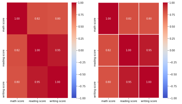
- mask
- 행렬 중 True 값을 가진 위치의 Data만 차트로 보여주는 Parameter
<설명>
참고로, 위의 Correlation 같은 경우 대각 성분을 기준으로 위아래가 대칭임을
알 수 있다.
이는 Correlation 특징이다.

그렇다면, 굳이 사각형의 모든 성분을 다 표현해야 할까? 그냥 아래나 위 요소만
표현하면 되지 않을까?
또한, 대각 행렬의 값 같은 경우 당연히 1 값을 가질텐데 생략할 수는 없을까?
(같은 Feature 끼리는 corr 값은 무조건 1)

아래 코드를 통해 구현할 수 있다.
mask = np.zeros_like(student.corr()) # corr과 같은 크기로 0 행렬 만듦
mask[np.triu_indices_from(mask)] = True
# 만든 0 행렬 중 내가 보여주기를 원하는 위치에만 True 값 설정해줌
sns.heatmap(student.corr(),
vmin = -1, vmax = 1,
center = 0,
cmap = 'coolwarm',
annot=True, fmt='.2f',
mask = mask)
# 위에서 대각 행렬 기준 아래 존재하는 행렬에만 True 값을 넣어줬으므로
# 아래와 같은 그림이 나옴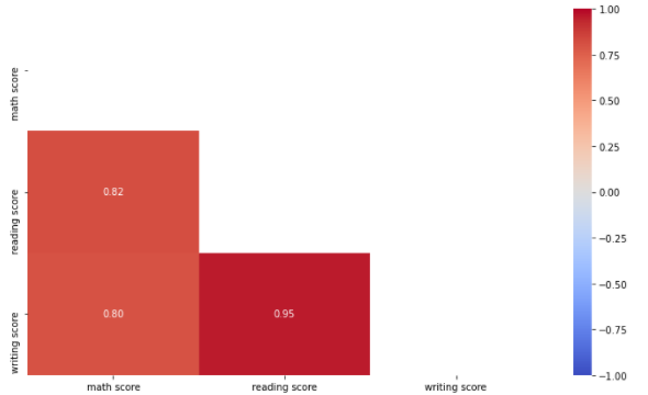
Multi Facet
- 여러 개의 Chart를 한꺼번에 활용하여 정보량을 높이는 방법
Jointplot
- 2개 Feature 사이 관계에 대한 그래프 & 각 Feature에 대한 그래프를 동시에 그리고 싶을 떄 활용
코드로 보는 Jointplot
- Default Jointplot
- Default는 x축과 y축 가운데 공간에 Scatter Plot을 그림
- x축, y축에는 각각의 Feature에 대한 Histogram을 그림
sns.jointplot(x = 'math score', y = 'reading score', data = student)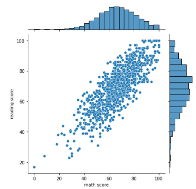
- kind : 차트 Type을 정하는 Parameter
- 'hist' : 중간의 Scatter Plot을 Histogram으로 바꿈
- 'scatter' : 중간은 Scatter Plot, 축에 그려지는 그래프는 kdeplot
- 'kde' : 가운데 및 축에 그려지는 그래프를 kdeplot으로 그림
fill = True를 통해 가시성 높이기
- 'hex' : 중간의 Scatter Plot Mark를 원이 아닌 육각형으로 바꿈
- 'reg' : 중간 Scatter Plot 및 축에 존재하는 Histogram에 회귀선 추가
- hue Parameter와 활용할 수 있는 kind : hist, scatter, kde
hue Parameter와 활용할 수 없는 kind : hex, reg
# hue Parameter와 같이 활용할 수 있는 kind
sns.jointplot(x = 'math score', y = 'reading score', data = student,
             hue="gender",
             kind = "hist")

sns.jointplot(x = 'math score', y = 'reading score', data = student,
             hue="gender",
             kind = "scatter")

sns.jointplot(x = 'math score', y = 'reading score', data = student,
             hue="gender",
             kind = "kde", fill = True)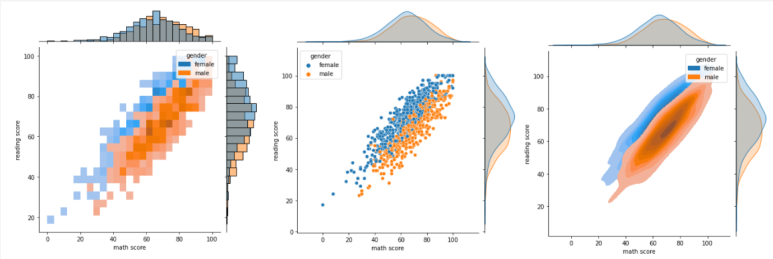
# hue Parameter와 같이 활용할 수 "없는" kind

sns.jointplot(x = 'math score', y = 'reading score', data = student,
             kind="hex")

sns.jointplot(x = 'math score', y = 'reading score', data = student,
             hue="gender",
             kind = "kde", fill = True)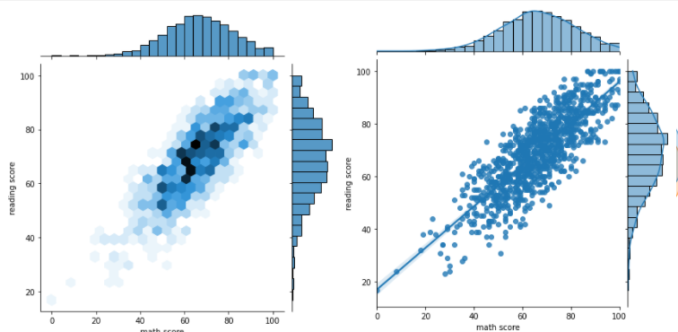
Pairplot
- 원하는 Feautre 끼리의 Pair-wise 관계를 시각화 해줌
- 별다른 설정이 없으면 모든 Feature 끼리 Pair를 만들어 차트를 그림
- Feature가 많아질 수록 시간이 느려지고, CPU가 너무 많이 필요하여 에러가 뜰 수 있음
- 이런 특징으로, Feature가 많을 경우 추천하지 않는 Plot
코드로 보는 Pairplot
- Default Pairplot
sns.pairplot(data=student, hue = "gender")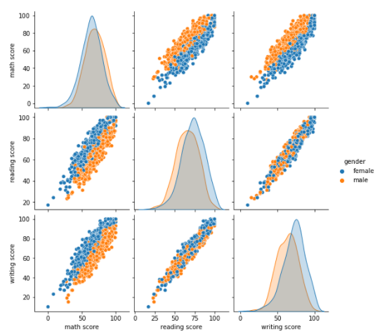
- kind
- 전체 Subplot 시각화 방법 조정 Parameter
- 'hist' : histogram으로 그림
- 'kde' : kdeplot으로 그림
fill=True로 가시성 높이기
- 'scatter' : deefault 설정. scatter Plot으로 그림
- 'reg' : 회귀선 추가
- corner = True
- 전체 Subplot도 대각 행렬을 기준으로 대칭이므로, 한쪽 그래프를 모두 삭제시켜도 됨
- corner 설정을 통해 대각 원소 위쪽 그래프를 그리지 않는다.
sns.pairplot(data=student, hue = "gender",
            kind = "hist", corner = True)
# corner = True로 설정했으므로 대각 성분 아래 Subplot들만 출력함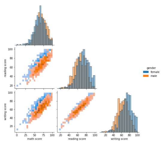
Facetgrid
- 내가 지정한 Feature 값을 바꿔가며 (x,y)로 지정한 Feature에 대한 그래프를 그림
- Feature Category 사이의 관계를 볼 수 있는 차트
- col_order, row_order를 통해 순서를 정해 줄 수 있음
- catplot : Categorical API 그래프
displot : Distribution API 그래프
relplot : Relational API 그래프
lmplot : Regression API 그래프(엘(L) 소문자) - kind Parameter 활용 가능
- Facetgrid Parameter 정보가 있는 사이트 : https://seaborn.pydata.org/api.html#distribution-plots
코드로 보는 Facetgrid
sns.catplot(x='math score', y='writing score', data=student,
           hue = "gender", col="test preparation course", row = "lunch")
<설명>
col을 test preparation course, row를 lunch feature로 설정하였다.
즉, col(Column)이 바뀔 때마다 test preparation course 값을 바꿔서
그래프를 그려볼 것이며 row(Row)가 바뀔 때마다 lunch 값을 바꿔 그래프를
그려볼 것이다

아래 그래프를 보면 알겠지만, [0,0]위치와 [0,1] 위치 그래프 위에
test preparation course 값이 바뀌었음을 볼 수 있다.
즉, (lunch, test preparation course)에 해당하는 Data에 대해서만
그래프를 그린 것이다
반대로, [0,0] 위치와 [1,0] 위치 그래프를 보면 row가 바뀌었으므로
lunch 값이 바뀌었음을 볼 수 있다 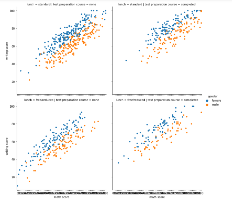

개념부터 확실히!