01 클릭 효과
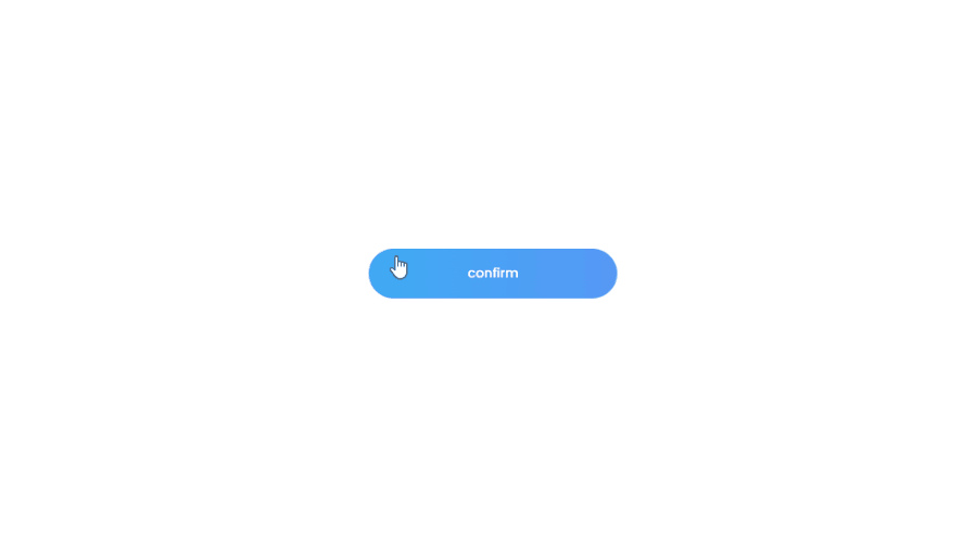
index.html
    <div class="container">
        <button>confirm</button>
    </div>
css
button {
    width:250px;
    height:50px;
    background: linear-gradient(to right, #3dacf5,#5697f5);
    border: none;
    border-radius:40px;
    color:#fff;
    font-weight: 500;
    font-size:13px;
    cursor: pointer;
    position: relative;
    margin: 1rem 0;
    overflow: hidden;
}

span{
    position: absolute;
    background:#e0ecf1;
    transform: translate(-50%,-50%);
    border-radius: 50%;
    pointer-events: none;
    animation:ripple 700ms linear infinite;
}

@keyframes ripple {
    0% {
        width: 0;
        height: 0;
        opacity: .5;
    }
    100% {
        width: 700px;
        height: 700px;
        opacity: 0;
    }
}
app.js
const button = document.querySelector('button');


button.addEventListener('click',e=>{
        let xAxis = e.clientX - e.target.offsetLeft;
        let yAxis = e.clientY - e.target.offsetTop;

        let span = document.createElement('span');
        span.style.left = `${xAxis}px`;
        span.style.top = `${yAxis}px`;
        btn.appendChild(span);

        console.log(e.clientY - e.target.offsetTop)

        setTimeout(()=>{
            span.remove();
        },700)
    })
02 마우스 오버
올라오는 효과
button {
    width:250px;
    height:50px;
    background: linear-gradient(to right, #3dacf5,#5697f5);
    border: none;
    border-radius:40px;
    color:#fff;
    font-weight: 500;
    font-family: 'Poppins', sans-serif;
    font-size:13px;
    cursor: pointer;
    position: relative;
    margin: 1rem 0;
    transition: 200ms ease-in-out transform;
}

button::before,
button::after{
    content:'';
    position: absolute;
    top:0;
    left:0;
    width:100%;
    height:100%;
    z-index: -1;
    border-radius:40px;
    transition: 200ms ease-in-out transform;
}

button::before{
    background: linear-gradient(to right, #3dacf5,#5697f5);
    opacity:0.9;
}

button::after{
    background: linear-gradient(to right, #3dacf5,#5697f5);
    opacity:0.8;
}

button:hover{
    transform:translate(-14px,-14px);
}

button:hover::before{
    transform:translate(8px,8px);
}

button:hover::after{
    transform:translate(14px,14px);
}

button:active,
button:active::before,
button:active::after{
    transform:translate(0,0);
    transition: 70ms ease-in-out transform'
}
그라데이션 효과
button {
    width:250px;
    height:50px;
    background-image: linear-gradient(45deg, #3fabf5 0%,#1b76fb 50%, #3fabf5 100%);
    background-size:300%;
    background-color: transparent;
    border: none;
    border-radius:40px;
    color:#fff;
    font-weight: 500;
    font-family: 'Poppins', sans-serif;
    font-size:13px;
    cursor: pointer;
    position: relative;
    margin: 1rem 0;
    transition: 200ms ease-in-out background-position;
}

button:hover{
    background-position: right top;
}