1. 레이아웃 소개
웹 페이지의 레이아웃이란?
메뉴, 컨텐츠, 부가정보 등과 같은 구성요소들을 필요한 곳에 위치하여 사용자가 효과적으로 웹사이트를 이용할 수 있게 배치하는 작업
종류
- 1단 레이아웃
- 다단(2단, 3단..) 레이아웃
- 고정(상, 하단 고정) 레이아웃
- 그 외의 다양한 레이아웃..
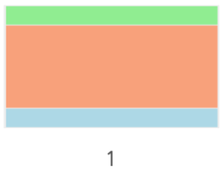
2. 1단 레이아웃 제작
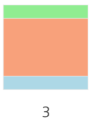
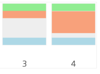
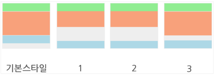
1단 레이아웃은 위의 이미지와 같이 하나의 행(column)으로 이루어진 레이아웃의 형태를 일컫는다.
상단(header), 중단(contents), 하단(footer)의 구성으로 이루어져있는 것이 가장 일반적이다.
스타일 정보
컨텐츠 최대 가로 길이: 1200
사이트 최소 가로 길이: 800
컨텐츠 가운데 정렬
주요 태그 및 속성
- HTML
div
header
section
footer - CSS
max-width
min-width
margin
1) HTML 실습
- 레이아웃을 제작하기 위해서 각 div의 class나 id에 해당영역에 대한 이름을 부여한다.
<!-- 1단 레이아웃 -->
<div class="header">header</div>
<div class="content">content</div>
<div class="footer">footer</div>- html5에서는 레이아웃 각 요소의 의미를 태그명 자체에 내포하고 있는 새로운 태그가 등장했고, 이 태그들을 이용한다면 다음과 같이 제작할 수 있다.
<!-- 1단 레이아웃 -->
<!-- html5의 태그를 이용한 1단 레이아웃 -->
<header>header</header>
<section>content</section>
<footer>footer</footer>- 레이아웃에 필요한 요소들을 body 태그 안에 바로 작성하지 않고 레이아웃과 관련된 아이템들을 감쌀 수 있는 wrap(또는 wrapper) 클래스를 가진 div를 만들어 레이아웃 컨테이너의 역할을 할 수 있도록 한다.
<!-- div를 이용한 1단 레이아웃 -->
<div class="wrap">
   <div class="header">header</div>
   <div class="content">content</div>
   <div class="footer">footer</div>
</div>

<!-- html5를 이용한 1단 레이아웃 -->
<div class="wrap">
    <header>header</header>
    <section>content</section>
    <footer>footer</footer>
</div>
2) CSS 실습
(1) 기본 태그에 스타일 부여
.header{
    height: 100px;
    background-color: lightgreen;
}
.content{
    height: 300px;
    background-color: lightsalmon;
}
.footer{
    height:100px;
    background-color: lightblue;
}
(2) 콘텐츠 영역 최대값 및 가운데 정렬
.header{
    height: 100px;
    background-color: lightgreen;
}
.content{
    max-width: 1200px; /* 최대 가로길이 1200px */
    height: 300px;
    margin: 0 auto; /* 블럭요소 가운데 정렬 */
    background-color: lightsalmon;
}
.footer{
    height:100px;
    background-color: lightblue;
}
(3) 전체 영역 최소값(800px)
.wrap {
    min-width: 800px; /* 최소 가로길이 800px */
}
.header{
    height: 100px;
    background-color: lightgreen;
}
.content{
    max-width: 1200px;
    height: 300px;
    margin: 0 auto;
    background-color: lightsalmon;
}
.footer{
    height:100px;
    background-color: lightblue;
}
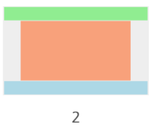
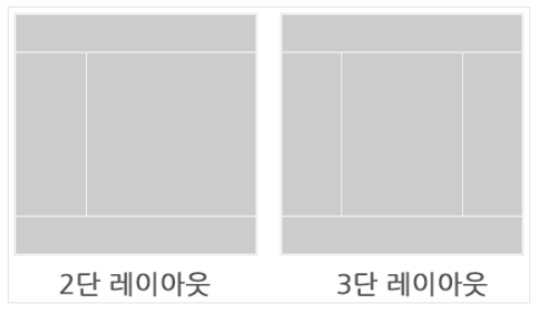
3. 다단 레이아웃 제작
- 콘텐츠의 영역이 2개 또는 그 이상의 행(column)으로 나눠진 레이아웃
1) HTML 실습
-
1단 레이아웃과 같이 각 항목을 생성한다. 2단 메뉴에서는 사이드영역이 추가되므로 aside라는 클래스명을 추가한다.
-
또한 행(coulmn)을 나누게 될 영역들을 container라는 클래스명을 가진 div로 묶는다.
<div class="wrap">
    <div class="header">header</div>
    <div class="container"> <!-- content와 aside의 묶음 영역 추가 -->
        <div class="content">content</div>
        <div class="aside">aside</div>
    </div>
    <div class="footer">footer</div>
</div>
</div>
2) CSS 실습 (float)
(1) 사전 스타일 부여
- 각 영역에 적당한 높이와 색상을 부여한다.
.header {
    height:100px;
    background-color: lightgreen;
}
.container {
    width: 800px;
    margin: 0 auto;
}
.content {
    height: 300px;
    background-color: lightsalmon;
}
.aside {
    height: 300px;
    background-color: lightseagreen;
}
.footer {
    height:100px;
    background-color: cornflowerblue;
}
(2) float 으로 정렬하기
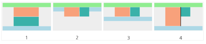
- content와 aside 영역에 float:left 속성을 주고 각각의 요구사항에 따라 가로사이즈를 부여한다.
.header {
    height:100px;
    background-color: lightgreen;
}
.container {
    width: 800px;
    margin: 0 auto;
}
.content {
    float: left; /* float */
    width: 500px; /* 가로사이즈 추가 */
    height: 300px;
    background-color: lightsalmon;
}
.aside {
    float: left; /* float */
    width: 300px; /* 가로사이즈 추가 */
    height: 300px;
    background-color: lightseagreen;
}
.footer {
    height:100px;
    background-color: cornflowerblue;
}- 푸터가 컨텐츠영역의 뒤로 가서 헤더에 붙어버리기 때문에 float 뒤에 오는 요소 (footer)를 float에서 해제해야 한다.
(3) float 해제하기
.header {
    height:100px;
    background-color: lightgreen;
}
.container {
    width: 800px;
    margin: 0 auto;
}
.container:after {  /* after를 이용하여 float해제하기 */
  display: block;
  clear: both;
  content: '';
}
.content {
    float: left;
    width: 500px;
    height: 300px;
    background-color: lightsalmon;
}
.aside {
    float: left;
    width: 300px;
    height: 300px;
    background-color: lightseagreen;
}
.footer {
    height:100px;
    background-color: cornflowerblue;
}
(4) 구분선 만들기
.header {
    height:100px;
    background-color: lightgreen;
}
.container {
    position: relative; /* position 기준영역 설정 */
    width: 800px;
    margin: 0 auto;
}
.container:after {
  display: block;
  clear: both;
  content: '';
}
.content {
    float: left;
    width: 500px;
    height: 300px;
    background-color: lightsalmon;
}
.aside {
    float: left;
    width: 300px;
    height: 300px;
    background-color: lightseagreen;
}
.aside:after{ /* 구분선 만들기 */
    content:'';
    position:absolute;
    right:300px;
    top: 0;
    bottom: 0;
    width:5px;
    background-color: #000;
}
.footer {
    height:100px;
    background-color: cornflowerblue;
}
3) CSS 실습 (display: table, table-cell)
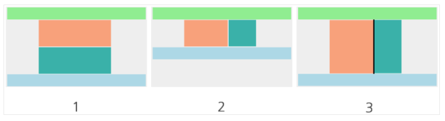
- 이번에는 동일한 html을 가지고 display: table, display: table-cell 속성을 이용하여 레이아웃을 만든다.
(1) 사전 스타일 부여
.header {
    height:100px;
    background-color: lightgreen;
}
.container {
    width: 800px;
    margin: 0 auto;
}
.content {
    height: 300px;
    background-color: lightsalmon;
}
.aside {
    height: 300px;
    background-color: lightseagreen;
}
.footer {
    height:100px;
    background-color: cornflowerblue;
}
(2) display: table, display: table-cell 속성으로 정렬하기
- content와 aside 영역에 float:left 속성을 주고 각각의 요구사항에 따라 가로사이즈를 부여한다.
.header {
    height:100px;
    background-color: lightgreen;
}
.container {
    display: table; /* 부모 요소에 display: table 추가 */
    width: 800px;
    margin: 0 auto;
}
.content {
    display: table-cell; /* 자식 요소에 display: table-cell 추가 */
    width: 500px; /* 가로 사이즈 부여 ( aside가로길이 =  container 가로길이 - content 가로길이) */
    height: 300px;
    background-color: lightsalmon;
}
.aside {
    display: table-cell;/* 자식 요소에 display: table-cell 추가 */
    height: 300px;
    background-color: lightseagreen;
}
.footer {
    height:100px;
    background-color: cornflowerblue;
}
(3) 구분선 추가
.header {
    height:100px;
    background-color: lightgreen;
}
.container {
    display: table;
    width: 800px;
    margin: 0 auto;
}
.content {
    display: table-cell;
    width: 495px; /* -5px 하여 추가된 구분선 만큼 빼기 */
    height: 300px;
    background-color: lightsalmon;
    border-right: 5px solid #000; /* border를 이용해 구분선 추가 */
}
.aside {
    display: table-cell;
    height: 300px;
    background-color: lightseagreen;
}
.footer {
    height:100px;
    background-color: cornflowerblue;
}- 구분선의 길이만큼 content의 가로길이에서 빼주어 구분선을 포함한 가로길이가 원래의 가로길이를 넘지 않게 한다.
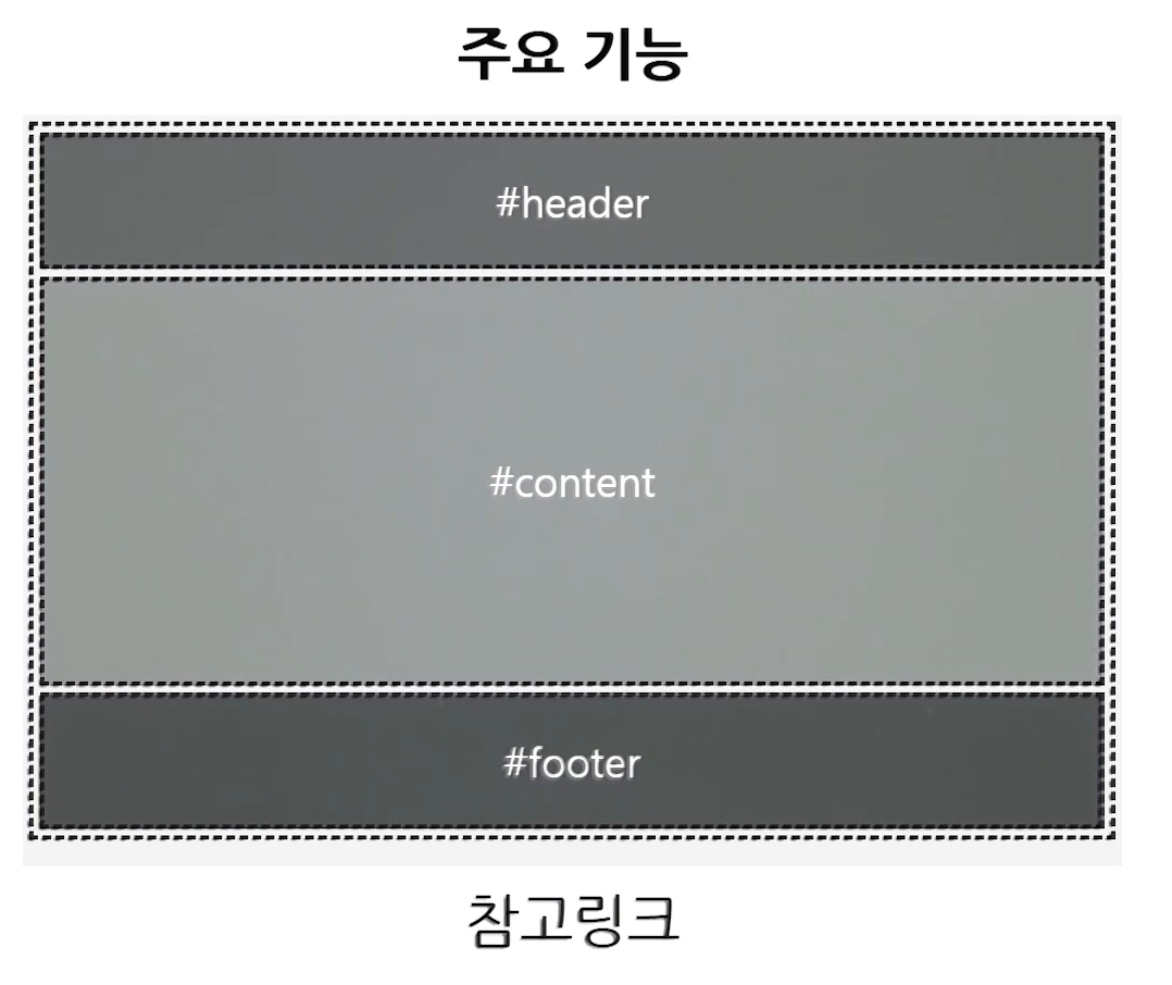
4. 고정 레이아웃
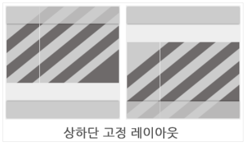
- 1단또는 2단 레이아웃의 형태에서 상단(header)과 하단(footer) 또는 그 두 영역이 모두 컨텐츠의 높이나 내용에 상관없이 항상 노출이 되도록 하는 레이아웃
-
주요 기능
header 영역과 footer 영역이 상하단에 고정노출
컨텐츠의 최소높이값이 100%인 레이아웃형태 만들기 -
스타일 정보
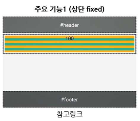
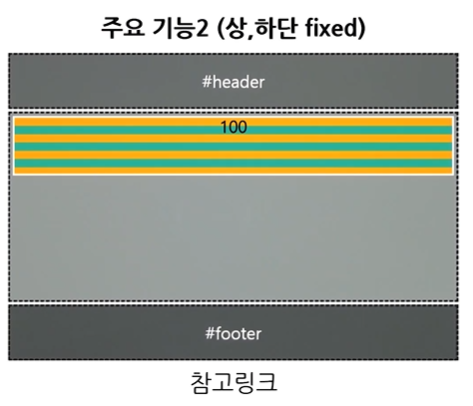
header 상단 고정
footer 하단 고정
콘텐츠 최소 높이값 100% -
주요 태그 및 속성
HTML
div
CSS
position: fixed
min-height
margin
padding
1) HTML 실습
<div class="wrap">
    <div class="header">header</div>
    <div class="container">
        <div class="content">content</div>
    </div>
    <div class="footer">footer</div>
</div>
2) CSS 실습 ①
(1) 기본 태그에 스타일 부여 (공통)
.header{
    height: 100px;
    background-color: lightgreen;
}
.content{
    height: 300px;
    background-color: lightsalmon;
}
.footer{
    height:100px;
    background-color: lightblue;
}
(2) header를 상단에 고정하기
.header{
    position: fixed;  /* position 고정 */
    top: 0; left: 0; right: 0; /* 상단 위치 */
    height: 100px;
    background-color: lightgreen;
}
.content{
    height: 300px;
    background-color: lightsalmon;
}
.footer{
    height:100px;
    background-color: lightblue;
}
(3) 콘텐츠 영역 최소 높이값 설정
.header {
    position: fixed;
    top: 0; left: 0; right: 0;
    height: 100px;
    background-color: lightgreen;
}
.container {
    min-height: 100%; /* 최소 높이값 100% */
}
.content{
    height: 300px;
    background-color: lightsalmon;
}
.footer{
    position: fixed;
    bottom: 0; left: 0; right: 0;
    height:100px;
    background-color: lightblue;
}- container의 높이값을 최소 100%를 유지하기 위해 min-height 설정을 한다.
- 콘텐츠는 스스로 높이값을 받을 수 없기 때문에 부모요소에서 부터 높이값을 상속받아야 한다.
- 그래서 html > body > .wrap > container 의 순서로 높이값을 상속받는다.
html,
body,
.wrap {
   height: 100%;
}
(4) footer 끌어올리기
html,
body,
.wrap {
   height: 100%;
}
.header {
    position: fixed;
    top: 0; left: 0; right: 0;
    height: 100px;
    background-color: lightgreen;
}
.container {
    min-height: 100%;
    margin-top: -100px; /* 음수 마진으로 푸터의 높이만큼 끌어올려주기 */
}
.content{
    height: 300px;
    background-color: lightsalmon;
}
.footer{
    position: fixed;
    bottom: 0; left: 0; right: 0;
    height:100px;
    background-color: lightblue;
}- 컨테이너의 height 100%의 수치에 footer의 높이값만큼이 포함되어 전체 컨텐츠가 우리가 요구했던 높이값보다 더 많아졌다.
- 따라서 margin top 방향으로 footer의 높이만큼 끌어올려주기 위해 -100px을 부여한다.
(5) content의 상단 보이기
html,
body,
.wrap {
   height: 100%;
}
.header {
    position: fixed;
    top: 0; left: 0; right: 0;
    height: 100px;
    background-color: lightgreen;
}
.container {
    min-height: 100%;
    margin-top: -100px;
}
.content{
    height: 300px;
    padding-top: 200px; /* 가려진 height의 높이값과 끌어올린 footer의 높이값을 합친 값을 padding-top으로 밀어줍니다. */
    background-color: lightsalmon;
}
.footer{
    position: fixed;
    bottom: 0; left: 0; right: 0;
    height:100px;
    background-color: lightblue;
}
3) CSS 실습 ②
box-sizing을 이용하여 상단을 고정하는 방법
(1) 상단 고정하기 (box-sizing: border-box)
html,
body,
.wrap {
   height: 100%;
}
.header {
    position: fixed;
    top: 0; left: 0; right: 0;
    height: 100px;
    background-color: lightgreen;
}
.container {
    min-height: 100%;
    margin-top: -100px;
}
.content{
    height: 300px;
    background-color: lightsalmon;
}
.footer{
    position: fixed;
    bottom: 0; left: 0; right: 0;
    height:100px;
    background-color: lightblue;
}
(2) box-sizing: border-box 속성으로 padding값 무시
html,
body,
.wrap {
   height: 100%;
}
.header {
    position: fixed;
    top: 0; left: 0; right: 0;
    height: 100px;
    background-color: lightgreen;
}
.container {
    min-height: 100%;
    margin-top: -100px;
    padding-top: 200px; /* 가려진 header와 끌어올린 footer의 높이값 만큼 부여 */
    box-sizing: border-box; /* padding이나 border를 컨텐츠에 부여된 높이값에 포함 */
}
.content{
    height: 300px;
    background-color: lightsalmon;
}
.footer{
    position: fixed;
    bottom: 0; left: 0; right: 0;
    height:100px;
    background-color: lightblue;
}
4) CSS 실습 ③
(1) 상 하단 고정하기 - header와 footer 고정시키기
.header{
    position: fixed;  /* position 고정 */
    top: 0; left: 0; right: 0; /* 상단 위치 */
    height: 100px;
    background-color: lightgreen;
}
.content{
    height: 300px;
    background-color: lightsalmon;
}
.footer{
    position: fixed;  /* position 고정 */
    bottom: 0; left: 0; right: 0; /* 하단 위치 */
    height:100px;
    background-color: lightblue;
}
(2) container 최소 높이값 설정
html,
body,
.wrap {
    height: 100%; /* 부모요소에 height 100% 부여 */
}
.header{
    position: fixed;
    top: 0; left: 0; right: 0;
    height: 100px;
    background-color: lightgreen;
}
.container {
    min-height: 100%; /* 최소높이값 100% 설정 */
}
.content{
    height: 300px;
    background-color: lightsalmon;
}
.footer{
    position: fixed;
    bottom: 0; left: 0; right: 0;
    height:100px;
    background-color: lightblue;
}
(3) container 노출영역 설정
html,
body,
.wrap {
    height: 100%; /* 부모요소에 height 100% 부여 */
}
.header{
    position: fixed;
    top: 0; left: 0; right: 0;
    height: 100px;
    background-color: lightgreen;
}
.container {
    min-height: 100%;
    padding: 100px 0; /* height, footer 뒤로 가려진 영역 노출 */
    box-sizing: border-box; /* padding값을 높이에서 무시하도록 속성 추가 */
}
.content{
    height: 300px;
    background-color: lightsalmon;
}
.footer{
    position: fixed;
    bottom: 0; left: 0; right: 0;
    height:100px;
    background-color: lightblue;
}
I can be your Genie🧞♀️ How ‘bout Aladdin? 🧞♂️